Is it possible to assign Y axis fields to different stacks in stacked bar charts?
Is it possible to create multiple stacked bar charts for individual fields? I know this can be done if you use the 'Color' option to cut a bar across a field (technically it is not a stacked bar with respect to the Y axis fields, but works in many cases).
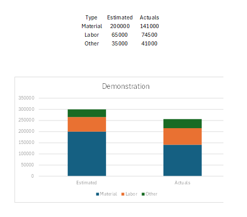
However, if you have individual fields that you want to stack in 2 different bars, is this possible? I can't seem to figure it out. I made an example in Excel. This would come from 6 different fields...
"Estimated Materials"
"Estimated Labor"
"Estimated Other"
.... and same for "Actual...."
These fields would all be Y axis fields in Analytics. Is it possible to then group which ones stack together? For example, below, if the 3 estimated ones are placed on one stack and the 3 actuals are placed in another.
Any help would be greatly appreciated!