Flex Your Creativity – A New component to Canvas in Zoho CRM
Hello Everyone
We’re excited to introduce Flex, a new component for Canvas in Zoho CRM! Flex is here to give you greater control over how your data is displayed in your layouts. This component enables responsive layouts that adapt across different screen sizes and devices, thus enhancing the end user's experience.
What can you do with Flex?
Adding the Flex component to your layout helps you create customizable and adaptive designs and improves data visualization and user interaction.
This component ensures that your canvas is designed optimally no matter the screen size.
Use a flex component when you want a layout that is :
Responsive : easily adapts to different screen sizes
Flexible : allows items to grow, shrink, or align dynamically
Centred : helps centre elements vertically or horizontally
Evenly Spaced : distributes items evenly within a component
Requires Row or Column layouts : makes arranging elements on rows or columns easy
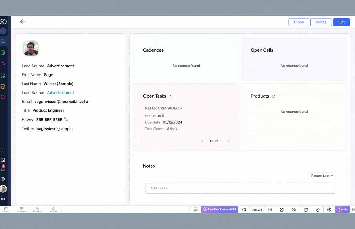
See below to understand how a record looks after using a canvas layout created with flex components that will automatically adjust as information is added to the interface.
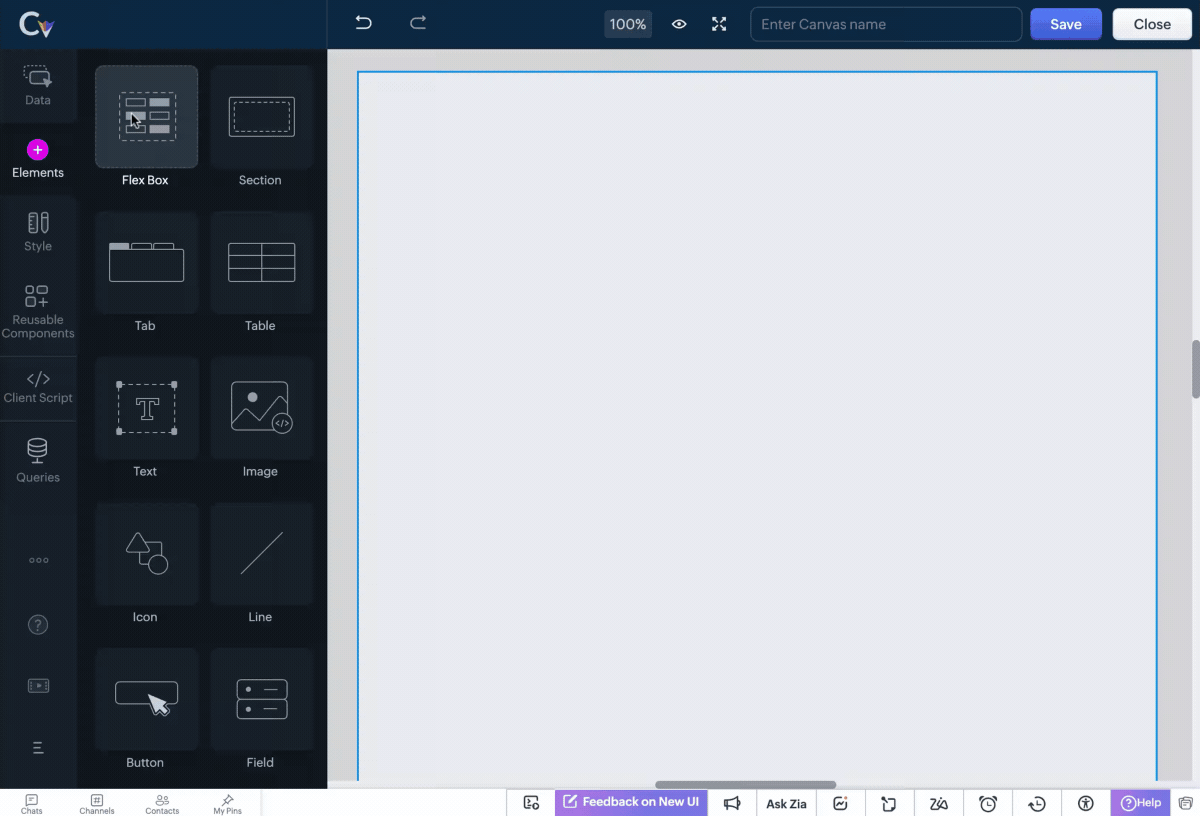
Types of Flex components
There are three types of flex components that you can choose from to create your canvas layout depending on your requirement.
Vertical Flex

Horizontal Flex

Wrap Flex
How does Flex help achieve responsive layouts?
The Flex Component brings in essential tools that automatically adjust elements of a layout, ensuring a seamless user experience. These include:
Auto Responsive

Auto Column

Minimum & Maximum Width for Items
 Note : You cannot select both auto responsive and auto columns tools for the selected component at the same time. Doing so will automatically deselect one of the options.
Advanced Flex Tools for Customization
Take full control over your CRM interface with these additional Flex Tools:
Flex Item Alignment - Align elements precisely within the layout for a polished and professional appearance.
Flex Item Gaps - Maintain consistency by adding uniform spacing between flex items, improving readability.
Flex Item Hug - Allow an element to shrink or expand based on content size, optimizing space usage.
Child Flex Items - Control how nested items behave within a flex component, improving adaptability.
Fill Width - Stretch components to occupy the full width of the vertical flex component for a seamless design.
Convert to Flex - Easily convert multiple elements into a flex component and save time and effort creating from scratch.
Replace with Section / Replace with Flex - Replace a flex component with a section or replace a section element with a flex component easily from the canvas builder without disrupting the layout's design.
For more details, please comment below, and we will get back to you at the earliest.