Introducing Radio Buttons and Numeric Range Sliders in Zoho CRM

For other DCs, this will be released by mid-March.
We are pleased to share with you that Zoho CRM's Layout Editor now includes two new field formats— Radio Buttons and Sliders for Numeric Fields. These additions will make it easier for your users to fill out forms across all your modules, given the convenience they offer, as well as visual appeal.
Let's take a closer look at how these new elements work.
Radio Buttons are ideal when a user has to input a single choice from a minimal set of options that are presented upfront, making selection clearer and faster.
Here are some common use cases where Radio buttons work the best:
Billing cycle, such as Monthly or Yearly
Subscription plan, such as Basic, Pro, or Enterprise
Property type in real estate, such as 1 BHK, 2 BHK, or 3 BHK
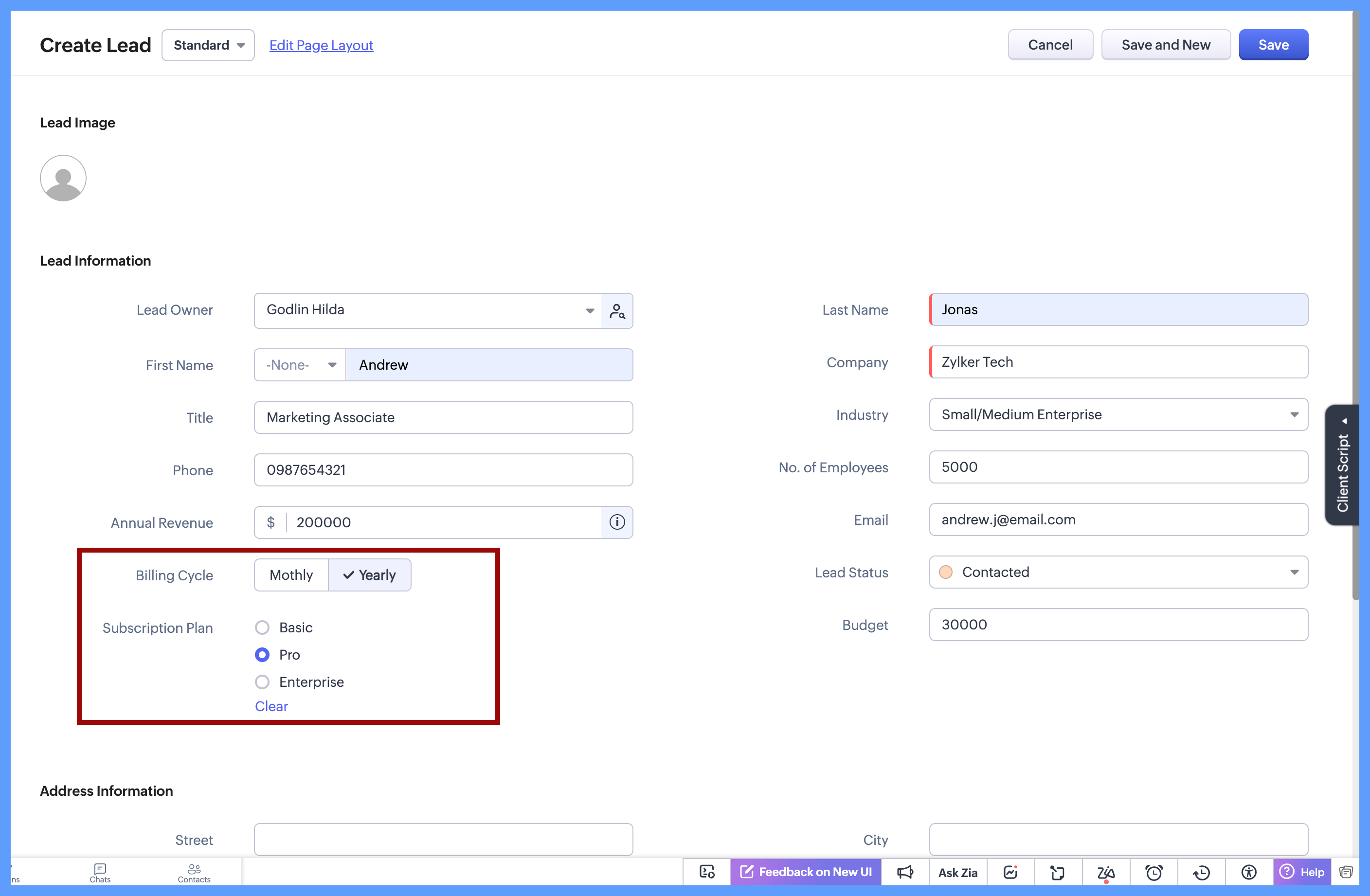
In each of these cases, the choices are limited to 2 or 3 options which are clearly defined, and the user needs to select just one option. Since all options are visible upfront, there’s no need to open a dropdown or scroll, making the selection quick and effortless.
Here's how to configure a radio button on the module's layout page: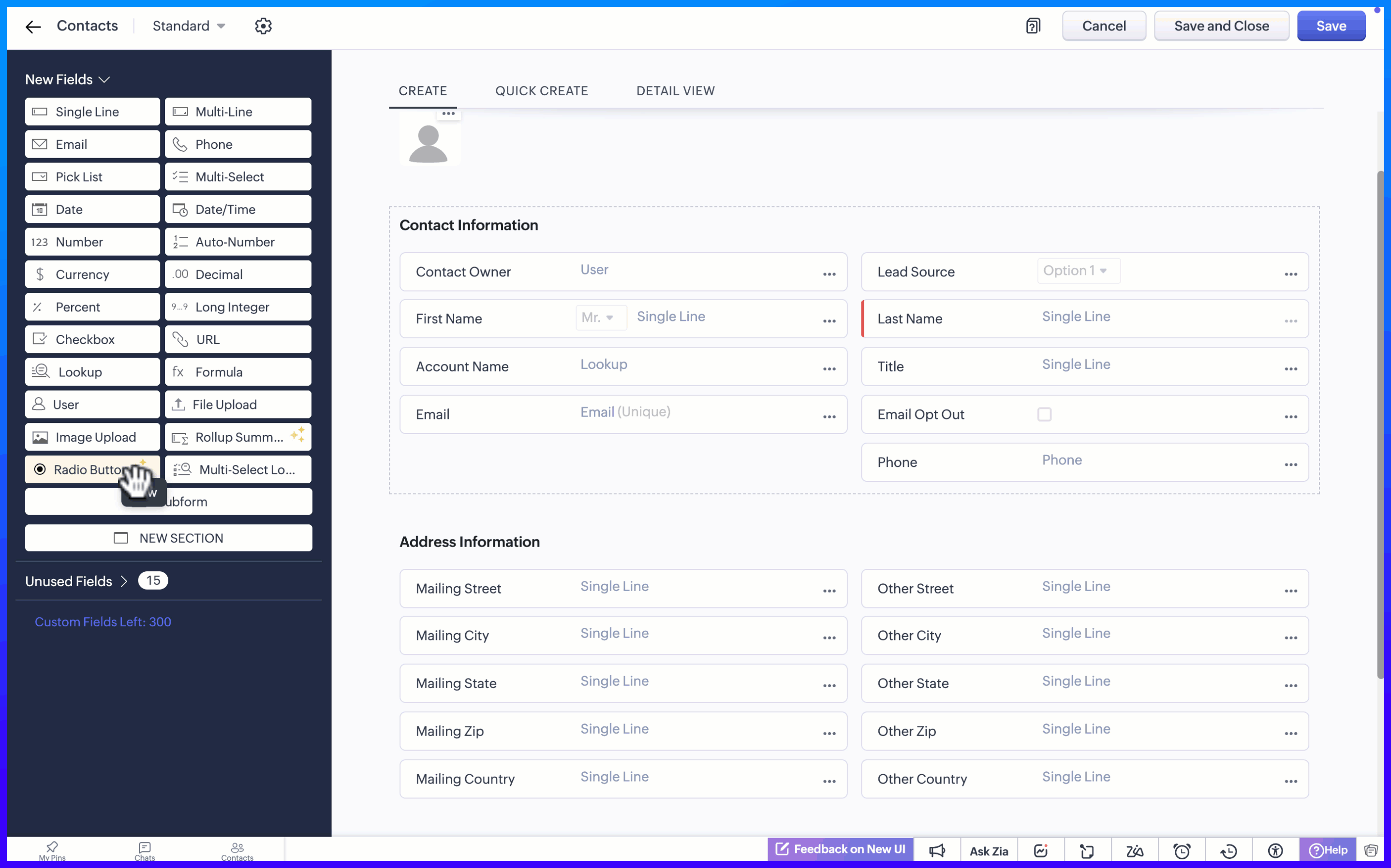
Display Format for options
When adding the radio button, the Radio Button Properties pop-up lets you choose how the options appear on the screen. Rather than using a fixed format, you can select a display style that best suits the field, making it easier for users to see and choose from the available options.
There are two display format options:
Radio button, where options are listed one below the other.
Group button, where options appear as a compact set of selectable buttons.
This flexibility helps you design forms that feel clear and easy to use, while letting users quickly understand their choices and select the right option.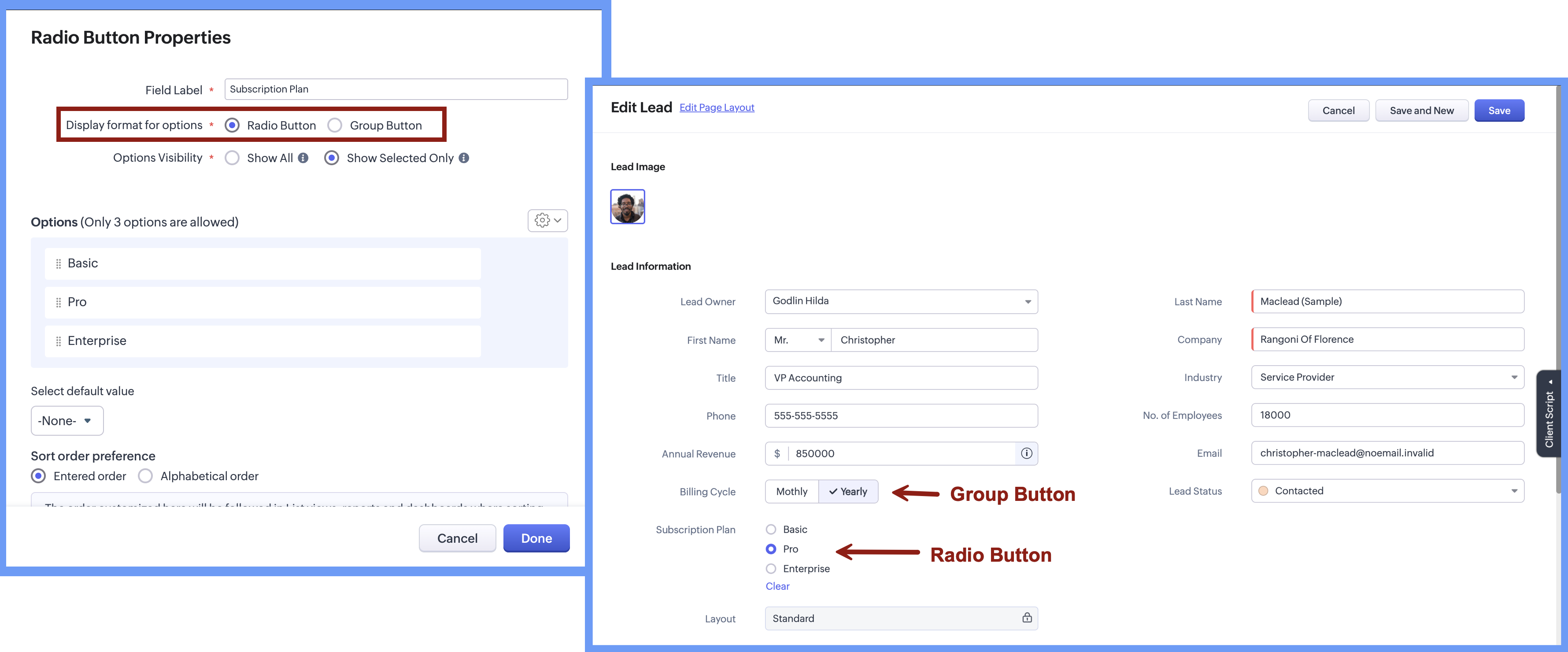
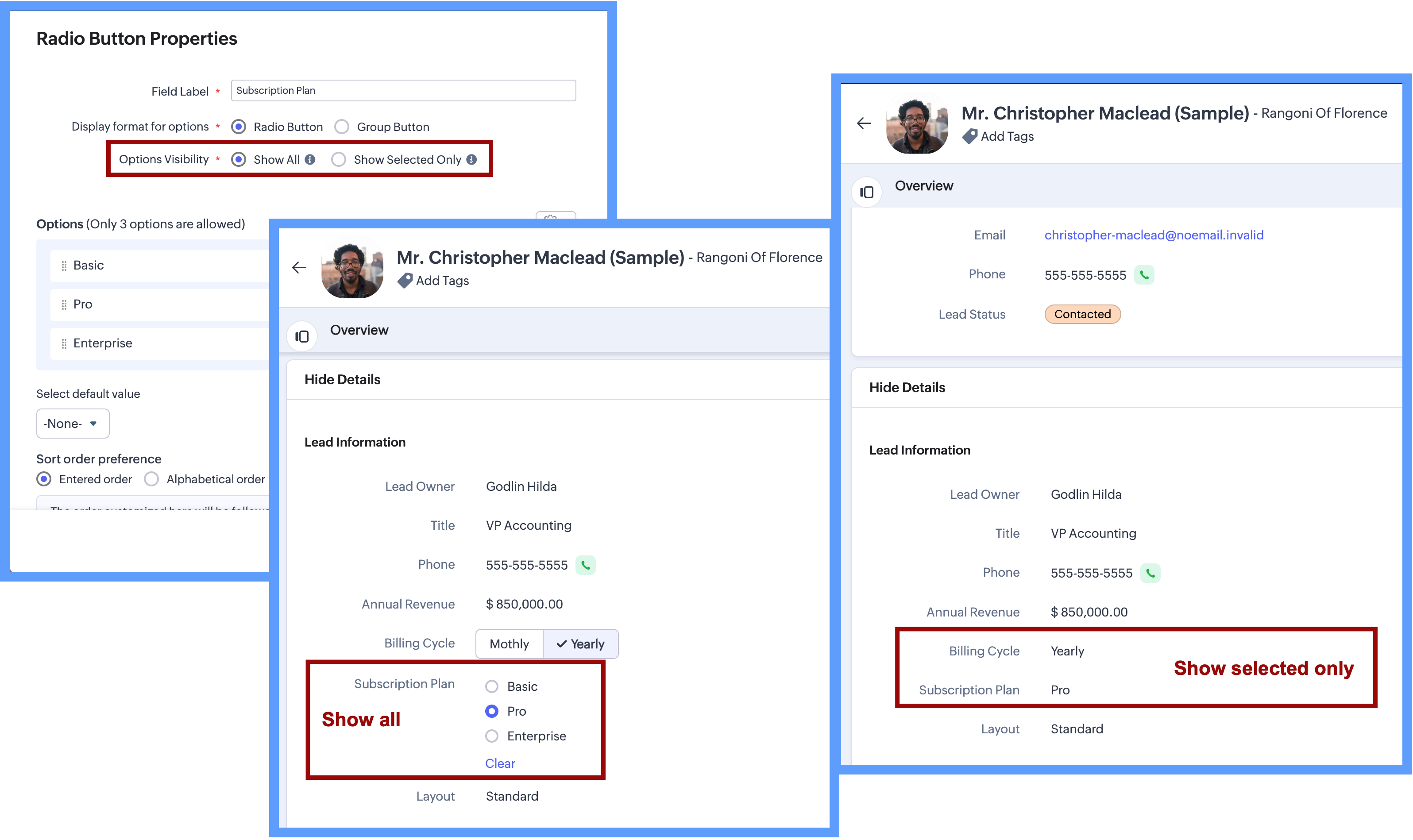
Option Visibility
The Option Visibility setting helps you decide how much information users need to see after a value is selected.
Show all: If users need to view all available options at all times and quickly update their choice on the go, you can select Show All. This keeps every option visible on the screen, making it easy to compare options and change the selection whenever needed.
Show selected only: If the field is mainly required during record creation and showing all options later adds little value, you can choose Show Selected Only. In this case, only the chosen value is displayed after selection, keeping the details page clean and focused while still capturing the required input.
Important Notes:
Consistent data, every time - Once a Radio Button field is configured with a fixed set of options, users can select only from those defined values while creating or updating records from any source. Any value outside the configured options is not accepted by the system, ensuring clean and consistent data across all records.
Options limit - 3 options per field in each layout. (Excluding Unused options)
Field Limits - This field is included under Text Field limits.
Edition Availability - In all editions except Free.
Modules Supported - Supported in all Modules, except Users.
Range and Sliders for Numeric Fields
Earlier, defining a default range for numeric fields was not straightforward. Users were not aware of what range was expected or acceptable until they saved the form. Let's say, for example, a Customer Satisfaction Score is being captured after a sales interaction. If the score is meant to be recorded on a scale of 1 to 5, there was previously no direct way to enforce or clearly communicate this range upfront.
Now, as we bring the setting of range for numeric fields, you will be able to define the minimum and maximum value for numeric fields. This sets clear boundaries on the values that can be entered, so the users know the expected range before they add any data.
Sliders are another prominent aspect that will help users to visually select a value within a defined range. When you choose to display sliding scale, the user can simply click on any interval or drag the slider to choose a value directly, making the selection more visual and guided.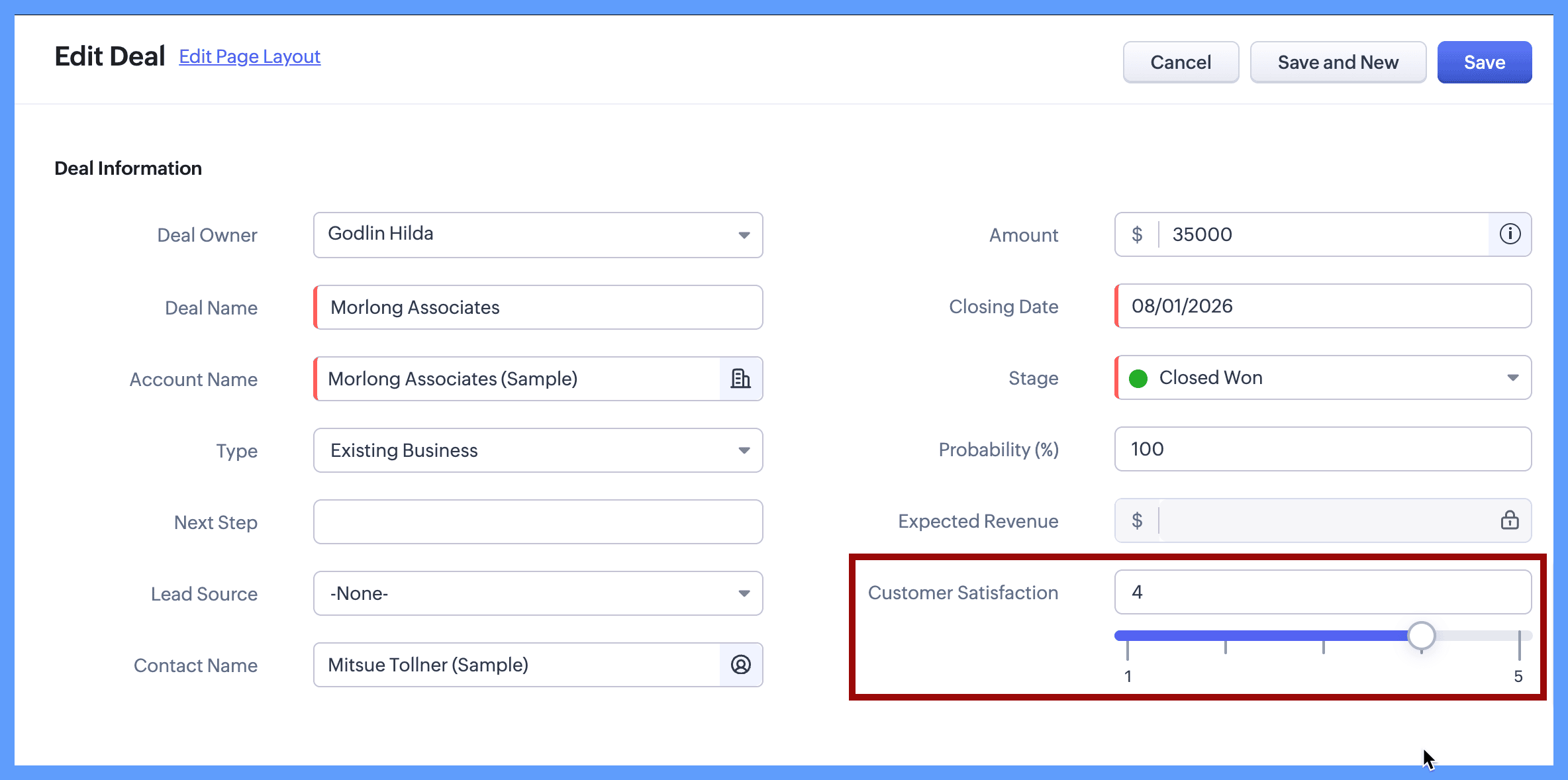
Continuing with the same example, you can define the customer satisfaction score by setting its minimum value to 1 and maximum value to 5. When the users create or edit a new record, they will clearly see that the value must fall within this range and can either type a number or use the sliding scale to select the score visually. The spaced intervals help users quickly understand the scale and choose the right value with confidence.
The same approach works well for other controlled scales, such as:
Setting a budget
Defining a probability range such as 10% to 100%
Defining priority levels on a numeric scale
Here's how to configure a sliding scale for a numeric field on the module's layout page:
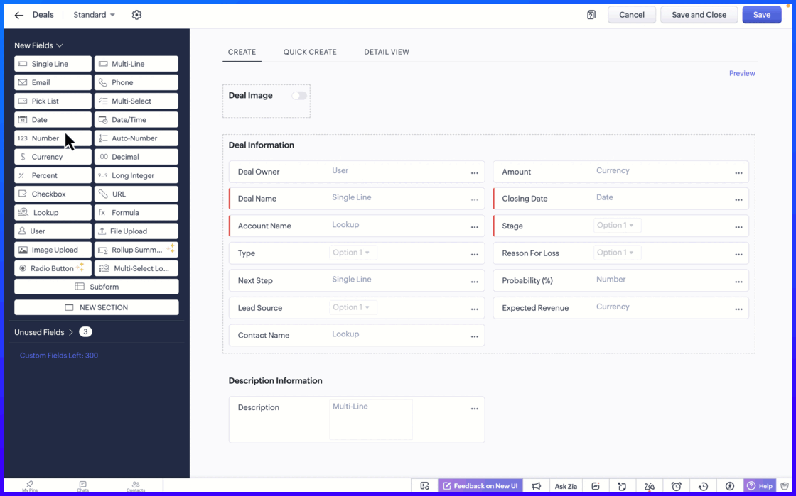
Setting the minimum and maximum limit values ensure that users can only enter values within an allowed range.
Important notes:
Sliding Scale depends on Limit Values: When you enable the Sliding Scale, you must define minimum and maximum liit values. However, Limit Values can be used on their own. If you do not need a Sliding Scale, you can simply set the limits to restrict the allowed range.
If the user tries to enter a value outside the allowed limits, an error message appears, preventing incorrect entries. This helps to keep the data accurate and consistent across records.Fields Supported: Number, Long Integer, Decimal, Percent, Currency.
Edition Availability: All editions
Module Availability: All Modules
Sliding Scale is not supported for Subforms.
We hope you find this update helpful!
To learn more check out our help resource here.
Topic Participants
Ann Antonite Parappurath
Haiku Technical Support
Ishwarya SG
Ivan Staykov
Jordan Talmor
Sticky Posts
Enhancement to ICR’s field prompting: Preferred data extraction using advanced field prompting
Dear Customers, We hope you’re well A quick background Intelligent Character Recognition (ICR) comes as part of Zia’s optical recognition capability called Zia Vision. When we introduced it last April, the data extraction was training-based and was applicableGood news! Calendar in Zoho CRM gets a face lift
Dear Customers, We are delighted to unveil the revamped calendar UI in Zoho CRM. With a complete visual overhaul aligned with CRM for Everyone, the calendar now offers a more intuitive and flexible scheduling experience. What’s new? Distinguish activitiesAccessibility in Zoho CRM: Not just a feature—a way to empower
For instructions on setting up these controls, please check this help document: Configuring accessibility controls. Hello everyone, Today (December 3, 2024), on the International Day of Persons with Disabilities, we begin our journey towards a CRM thatScaling the customer journey: What's new in CommandCenter
Dear Customers, The last time we connected about CommandCenter, it was about the tool's new controls and revamped UI. Personally, the overhaul of the UI from the last update, still excites me. Today, we're here with news about its scalability and addedZoho CRM's sales trend and sales follow-up trend dashboards are now customizable
Dear Customers, We're here with good news! Sales trend and sales follow-up trend are two system-defined dashboards that help you understand trends and anomalies in your sales outreach and conversion efforts. They use Zia's intelligence to identify patterns
Recent Topics
How do you print a refund check to customer?
Maybe this is a dumb question, but how does anyone print a refund check to a customer? We cant find anywhere to either just print a check and pick a customer, or where to do so from a credit note.Ability to assign Invoice Ownership through Deluge in FSM
Hi, As part of our process, when a service appointment is completed, we automated the creation of the invoice based on a specific business logic using Deluge. When we do that, the "Owner" of the invoice in Zoho FSM is defaulted to the SuperAdmin. ThisAll new Address Field in Zoho CRM: maintain structured and accurate address inputs
Availability Update: 29 September 2025: It's currently available for all new sign-ups and for existing Zoho CRM orgs which are in the Professional edition exclusively for IN DC users. 2 March 2026: Available to users in all DCs except US and EU DC. LatestEnhancement to ICR’s field prompting: Preferred data extraction using advanced field prompting
Dear Customers, We hope you’re well A quick background Intelligent Character Recognition (ICR) comes as part of Zia’s optical recognition capability called Zia Vision. When we introduced it last April, the data extraction was training-based and was applicableSee a list of all records enrolled in a cadence?
I am looking for a way to see a list of all leads or contact currently enrolled in a cadence. I do not see any way to do this through the cadence UI.Limitation in chart of accounts
There is a limitation of 4000 accounts in chart of accounts Zoho needs to remove this limitHow do I change the account bank charges are charged to?
I want bank charges charged to my Credit Card Fees account. Is there a way to do this?Real signature in Zoho Expense PDF report ?
Hello ! Is there a way to put a real signature on the signature line when a PDF report is generated in Zoho Expense? Through Zoho Sign or another way? Can't seem to make it work.Copy paste settings
Hello all i have 2 organizations running in ZOHO books in one organization i have customised Tax rates, codes and customized templates instead of manually doing again in org 2 can i have some shortcut to copy paste or export and import??Custom TDS on Vendor Credits via API
Hi, We are using Zoho Books APIs for posting Bills and vendor credits. We are unable to post custom TDS amount posting vendor credits. Can you please share the API spec and Payload that need to be sent for Custom TDS for Vendor Credits."Unlink" Advance from Bill without Deleting the Payment Record
I am writing to highlight a significant workflow issue in Zoho Books (India Edition) regarding Vendor Advances and Bills. The Scenario: I recorded an Advance Payment to a vendor. I matched/reconciled this payment in the Banking module. I received a BillAdvance Payment Record Removed When Deleting Applied Credit from Bill
Hello, So while working with vendor advance payments, I noticed that removing the applied credit from a bill also removes the corresponding entry from the Payments Made section. What I did : Recorded an advance payment to a vendor through Payments Made.What is the best way to convert MSG file to Word format?
The best way to convert MSG files to Word format is by using a reliable and professional tool Aryson MSG file Converter. Manual methods are often time-consuming and may not preserve email formatting, attachments, or metadata accurately. In contrast, ArysonAddress Typeahead Extension for Zoho Books
I installed the Address Typeahead extension for zoho books but when I went to configure it, it said that that version was deprecated. Is there a newer version somewhere?Zoho Projects : Task should auto-update to 'In Progress' if timer started
Namaskaram. Right now, if a Task's timer is started, the Task stays in 'Not Started' status. One has to manually update it to 'In Progress'. From a #uxdesign standpoint, it is an unnecessarily two step process to start working on a task. It would be better that, if I start the timer on a task, it should automatically change to 'In Progress' status. Crafted with ❤️ Zoho Gurus | Zoho One Practice Team @ CubeYogi Zoho Authorised Partner | 7+ Yrs | 200+ Projects | 100+ CustomersInvoice template with sales tax totals
Hi everyone, I am trying to edit my invoice template so that only the total sales tax collected for my tax group shows up. Right now, under by sub total, each individual tax shows up and that takes up a lot of unnessary space, so I just want the oneZoho Delayed Posting & Loss of Article Thumbnails on BlueSky
Hello! I am wondering if anyone else has had the either of the following issues when posting to socials via Zoho and if there is a fix? 1. Post says it is scheduled or it is live when sent off via Zoho but it doesn't show up on socials till some timeConnection Not Secure (Certificate Mismatch) Error
Hi, Just a fyi, when you go to https://bigin.zohocloud.ca/bigin/Home you get a "Your Connection Is Not private" error. (Certificate mismatch to domain.) I get to that page after I have signed up and signed in as a customer and select the Access BiginRecording the Investment
Hello, - One Investor Invested to our company, So how do we record investment which we received in our bank in the Zoho books ? - How do we record if we provide shares to the investor in the Zoho books? ThanksExport Invoices to XML file
Namaste! ZOHO suite of Apps is awesome and we as Partner, would like to use and implement the app´s from the Financial suite like ZOHO Invoice, but, in Portugal, we can only use certified Invoice Software and for this reason, we need to develop/customize on top of ZOHO Invoice to create an XML file with specific information and after this, go to the government and certified the software. As soon as we have for example, ZOHO CRM integrated with ZOHO Invoice up and running, our business opportunitiesClient and Vendor portal at the same time
We have companies that serve both as clients and vendors and they are linked. However, we have a problem giving them access to the vendor/client portal. If they accept the invitation from the client portal, when we try to invite them to the vendor portalIntegrate Multiple ZohoBooks organization with zoho projects
We have successfully connected our Zoho Books with Zoho Projects for synronizing timesheet data. Our Business specialty is, that the staff of the Main company (A) is working on several projects, but the Clients are sometimes contracted and paying to aWays to calculate the difference form two years or months
Hi to everyone I have this request: I need to show the difference or variation from two periods (years or months) whether using a Pivot View or a graph, in this is case is better in a Pivot view. In the pivot view I will have the amount or results fromCareer site URL - Suggestion to modify URL of non-english job posting
Hi, I would like to suggest making a few modification to career sites that are not in english. Currently, the URL are a mix of different languages and are very long. It makes for very unprofessional looking URLs... Here is an example of one of our URLCliq iOS can't see shared screen
Hello, I had this morning a video call with a colleague. She is using Cliq Desktop MacOS and wanted to share her screen with me. I'm on iPad. I noticed, while she shared her screen, I could only see her video, but not the shared screen... Does Cliq iOS is able to display shared screen, or is it somewhere else to be found ? RegardsIntroducing Contract Settings & Backdated Contracts in Zoho Contracts
We are rolling out updates that give you more control over how contracts are created and managed in Zoho Contracts. From defining default workflows with Contract Settings to aligning agreements with real timelines using Backdated Contracts, these enhancementsCelebrating our customers on International Client's Day
Hi everyone, Every customer is part of our Zoho Desk family, and we wouldn’t want to miss celebrating you on this special day. This International Client's Day, we’d like to take a moment to appreciate every customer who has helped us grow and build meaningfulZoho Books | Product updates | February 2026
Hello users, We’ve rolled out new features and enhancements in Zoho Books. From Advanced Reporting Tags to the ability to mark projects as completed, explore the latest updates designed to improve your bookkeeping experience. Introducing Advanced ReportingFaster Ticket Response with use of Snippets in comments
Hello everyone, Responding to tickets often involves repeating the same messages, whether it is sharing updates with customers or leaving notes for internal collaboration. To make this easier and more consistent, we are allowing agents to use snippetsImproving Zoho Creator's email deliverability
Hi all, We're pleased to announce updates to email handling in Zoho Creator to improve the deliverability of the emails sent from the Creator platform. These updates have been designed keeping in mind the fact that emails from domains with strong senderWhat's New in Zoho Billing | February 2026
February brings a powerful set of updates to Zoho Billing, from smarter subscription management and flexible payment options to better reporting and more control over your hosted pages. Here's everything that's new this February. Create SubscriptionsReassign Partially Saved Entries
Hi, I would like to be able to go to Partially Saved Entries and like the option to delete them I would like the option to multi-select and be able to reassign them to another user to complete (Such as when a user has left the company). Thanks DanCan we rely on order of returned ids when inserting multiple records?
Hello! API https://www.zoho.com/crm/developer/docs/api/v8/insert-records.html does not mention that the response array will match the input array*, keeping this important information implicit and someone might have doubts to rely on it. (*the responseDisplaying only unread tickets in ticket view
Hello, I was wondering if someone might be able to help me with this one. We use filters to display our ticket list, typically using a saved filter which displays the tickets which are overdue or due today. What I'd really like is another filter thatWhat is a realistic turnaround time for account review for ZeptoMail?
On signing up it said 2-3 business days. I am on business-day 6 and have had zero contact of any kind. No follow-up questions, no approval or decline. Attempts to "leave a message" or use the "Contact Us" form have just vanished without a trace. It stillZoho Books: tax is not automatically pulled from product-data anymore - why?
Hi, until a short time ago, you could set a default taxrate for each product/item. This taxrate automatically appeared each time the item was chosen in an invoice or quote. Why does this not work anymore? The field is still there at the product record,Issue creating a YTD report with last years numbers
I am looking to create a widget to compare the YTD leads we have in 2023 to the YTD leads we had in 2022. I'm having issues with the aggregate formula creation to gain access to the 2022 Leads YTD data point. Feeling like this is a common view of dataBrand Studio Projects in Analytics
Hi All, Currently pulling my hair out over trying to link together some social media posts for a reporting dashboard in Analytics, so I thought I'd see if anyone on here had a solution. Our Marketing Team created a LinkedIn campaign in Zoho Brand Studio,Manage Testing Process in Zoho Sprints
Agile framework supports a robust quality assurance system that incorporates continuous testing throughout the development lifecycle of the product. The agile testing team focuses on planning the testing around the development, identifying defects earlyAnnouncing the Zohotshots of the ZDC Hackathon 2025
Hey everyone, The wait is finally over! After weeks of building, experimenting, and pushing creative boundaries, we’re excited to announce the winners of the second edition of the ZDC Hackathon. This edition brought together an incredible community ofNext Page