Marketer's Space: Why mobile optimization deserves a place in your email strategy
Hello Marketers,
Welcome back to Marketer's Space! Today, we'll talk about the importance of creating mobile-friendly email designs.
While mobile phones were once used only to make phone calls, today they're used for almost everything, including texting, reading, browsing, shopping, and much more. As marketers, this shift means one thing: We must ensure that our email campaigns are mobile-friendly. This isn't an exaggeration; it's a real challenge that many marketers and business owners face, especially during peak seasons. Let's look at one such example.
David's challenge: Great email but low engagement
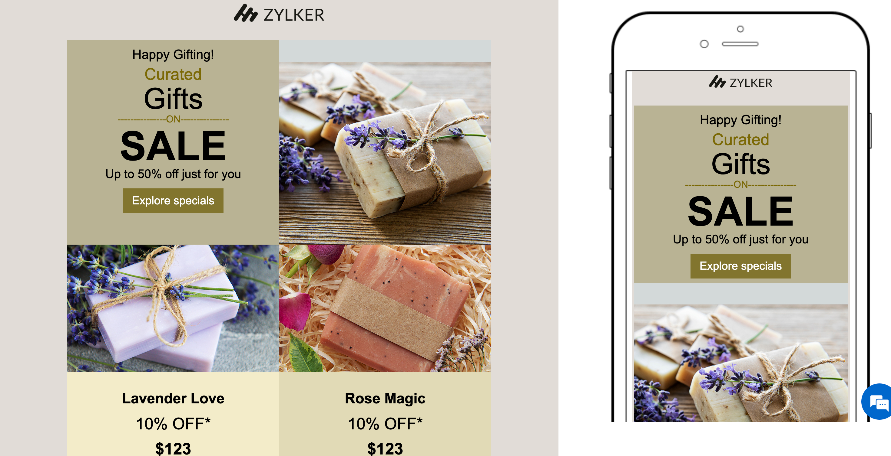
David runs a handmade gift store. He and his team create customized gifts and greeting cards. For the holiday season, he has crafted a thoughtful email from scratch to send to his new contacts and recurring customers to introduce his new festive collection. His email content is on point; he personalizes it with merge tags, segments his audience, automates his workflows, and even schedules the campaign to go out at his recipients' optimal open times. In short, David has done everything right—or, at least, that's what he thought.
Despite all his efforts, the results aren't as expected. When he analyzes his campaign reports, he sees that the emails have been successfully delivered and that most of his contacts have opened them. But that's it; he hasn't received any clicks, orders, or engagement from his contacts. Confused, David digs deeper into his email reports and notices that most of his recipients opened the email on their mobile devices. He gets curious and checks how his email looks on his phone—and is a bit taken aback! His email is readable but not mobile-friendly.
David's checklist to create mobile-friendly emails
David immediately decides to fix this and make his next campaign mobile-friendly. Here's what he does differently:
Use simple layouts
The first and most effective change David makes is removing the column layout in his email. While the layout looks stylish on his laptop, it doesn't render well on mobile screens. Having multiple columns of images increases the scroll time and makes the email harder to navigate on smaller devices. Fewer columns enable the content to flow more smoothly from top to bottom and makes it easier for recipients to read and scroll through on their phones.
Keep the content concise
Recipients who read emails on mobiles decide within seconds whether to keep reading or move on to a different screen. That's why brevity and structure matter. David breaks his content into short paragraphs, uses bullet points for clarity, and adds subheadings to guide the reader's eye.

Optimize visuals and CTAs
Images can enhance an email's appeal when they're optimized to suit different screen sizes. David uses lightweight images that load quickly and avoids large files that can slow down loading times. He also makes his call-to-action (CTA) buttons prominent, surrounds them with ample white space to prevent accidental taps, and uses action-oriented text like "Shop now" and "Get the offer."

Focus on readability
Tiny fonts that look elegant on desktops can be hard to read on mobile screens. David ensures that he uses at least 14px for body text and 22px or more for headings. He also makes sure there's proper spacing between lines, images, and buttons to make the design visually comfortable.
Test across devices before sending
Even the best-designed emails can appear differently across multiple devices and email clients. Using the Preview and Test feature in Zoho Campaigns, David previews his campaign to gauge how his email will look both on desktop and mobile screens. He also sends test emails to his team to identify any inconsistencies before finally sending the campaign to his contacts.

Avoid large, fixed-width elements
Fixed-width components like wide banners or tables can force users to scroll horizontally on small screens. David switches to flexible, percentage-based widths to ensure his content automatically adjusts to fit any device without users needing to pinch or zoom.
How Zoho Campaigns helps David get it right
Let's look at which features in Zoho Campaigns have helped David create mobile-friendly email campaigns in no time:
- Mobile-friendly templates: All pre-designed email templates available in Zoho Campaigns are mobile-friendly by default.
- Drag-and-drop editor: Zoho Campaigns' template editor enables users to customize text, image, and button elements. You can easily adjust font, color, size, and padding to create mobile-optimized designs.
- Preview and test options: View how your email looks on desktop and mobile screens and send test emails to your team before sending campaigns to your audience.

- Customize using HTML: If you're comfortable with coding, you can use the built-in HTML editor to code your content manually or import your own HTML and CSS files through the Import/Upload HTML option. Learn more
In a nutshell
By making these small yet impactful changes, David ensures that his emails not only reach his contacts but also engage with them effectively—regardless of the devices they use.
Regards,
Aiswarya Jayaprakash
User Education
Zoho Campaigns
Topic Participants
Aiswarya Jayaprakash
Sticky Posts
Marketer's Space: Why mobile optimization deserves a place in your email strategy
Hello Marketers, Welcome back to Marketer's Space! Today, we'll talk about the importance of creating mobile-friendly email designs. While mobile phones were once used only to make phone calls, today they're used for almost everything, including texting,Gmail is ramping up its email sender policy as of November 2025
Hello marketers, As you may be aware, Gmail introduced a guideline for bulk senders starting February 2024. If not, here's a quick refresher straight from Google: After this policy was announced first in 2023 and soft-implemented in February 2024, weMarketer’s Space - Get Holiday-Ready with Zoho Campaigns
Hello marketers, Welcome back to another post in Marketer’s Space! Q4 is packed with opportunities to connect with your audience - from Halloween, Black Friday, and Cyber Monday, to Thanksgiving, Christmas, and New Year. In this post, we’ll look at howMarketer's Space - Going beyond basics: Smarter ecommerce marketing with Zoho Campaigns
Hello Marketers, Welcome back to this week's Marketer's Space. In the last post, we discussed the basics of email marketing and how to get started with email marketing in ecommerce. In this part, we'll dive much deeper into some other advanced featuresMarketer's Space - Why email marketing matters in ecommerce (and how to get started with Zoho Campaigns)
Hello Marketers, Welcome to this week's Marketer's space post. Today, we'll discus why email marketing matters in ecommerce businesses. Running an online store is exciting but challenging. If you're running an online store, you've probably experienced
Recent Topics
Add co-hosts in meetings, manage webinar registration and other enhancements
Hello all, This month's updates allow you to add co-hosts while scheduling meetings. You can also control your webinar registrations better by allowing or blocking registrations from the domain or country of your choice. Read on to learn more. MeetingA new UI for distraction-free engagement in online meetings and webinars that scale up for 3000 attendees
Hello all, We're excited to share our new, refined UI for online meetings. Here's how the new UI will improve your experience during online meetings: We've re-designed Zoho Meeting's online meeting UI to enable users to fully engage in conversationsI Can't Clone Webinar that I Co-Organize
How do i get our account admin to give me permission to clone our webinars? I am a co-organizerLatest updates in Zoho Meeting | Calendar view, Zia integration with OpenAI, edit the recurring pattern in a recurring meeting, device error notifications revamp, and more.
Hello everyone, We’re glad to share a few updates and enhancements in Zoho Meeting, including the Calendar view, being able to edit the recurring pattern in a recurring meeting, revamped device error notifications, and other enhancements that you’ll findNew enhancements in the latest version of the Zoho Meeting Android mobile app.
Hello all, In the latest version of Zoho meeting Android mobile app (v2.2.6), we have brought in support for the below enhancements. Close account: Now users will be able to close their Zoho account directly from the app. Unmute toast message: If a userShare material, Lock Meeting and revamped feedback UI in the latest version of the Meeting iOS app.
Hello all, In the latest version of the Zoho Meeting iOS mobile app (v1.6), we have brought in the below enhancements. Share material in meeting: We have introduced share material during meeting that allows participants to view supported materials suchLatest updates in Zoho Meeting | New chat feature between an organizer and co-organizer in webinars, recording consent for webinar co-organizers and attendees in the Android app, and more.
Hello everyone, We’re excited to share a few updates for Zoho Meeting. Here's what we've been working on lately: A new chat feature between an organizer and co-organizer in webinars, recording consent for webinar co-organizers and attendees in the AndroidLatest updates in Zoho Meeting | A new Files tab to manage all your PDFs, PPTs, Video files and recordings, live transcription , ability to lock settings and adaptive echo cancellation.
Hello everyone, We’re excited to share a few updates for Zoho Meeting. Here's what we've been working on lately: A new Files tab to manage all your PDFs, PPTs, Video files and recordings, live transcription during sessions, ability to lock settings andLatest updates in Zoho Meeting | Meeting Rooms , Pin video feeds and customize from and reply-to email addresses
Hello everyone, We’re excited to share a few updates for Zoho Meeting. Here's what we've been working on lately: Introducing Zoho Meeting Rooms, an immersive solution for teams to connect over virtual meetings in video conference rooms. You can also pinLatest updates in Zoho Meeting | New top bar video layout, a revamp of our in-session settings and now import webinar registrations with a CSV file
Hello everyone, We’re excited to share a few updates for Zoho Meeting. Here's are some of them : We have moved audio, video, virtual background and preferences under a single settings pop-up for better user navigation. You can now upload a CSV file containingImportant update: Changes in email sender policies
Hello, This is to announce important changes to email sender policies from Google that may impact your use of Zoho Meeting. Restriction on public domains Effective February 1, 2024, Google is implementing policies that will affect the configuration ofCamera access
My picture doesn't appear in a group discussion. (The audio is fine.) The guide says "Click the lock icon on address bar," but I can't find it. Advise, pleaseChat for webinar session, schedule meeting session for 24 hours - Zoho Meeting iOS app update
Hello, everyone! In the most recent iOS version of the Zoho Meeting app, we have introduced the chat functionality for the webinar session. To access this feature, the Organizer should have the 'Public chat' option enabled on the Zoho Meeting desktopInvoice Copy 2005116990189
Please provide the invoice for the trancaction 2005116990189Darshan Hiranandani About
Hi, I’m Darshan Hiranandani, a dedicated software developer with a strong passion for creating efficient and user-friendly applications. With a degree in Computer Science and several years of experience in the tech industry, I specialize in full-stackLatest update in Zoho Meeting | On-demand webinars
Hello everyone, We’re excited to introduce our new on-demand webinar feature, you can now provide pre-recorded sessions that your audience can access immediately, no need to wait for scheduled sessions. Benefits of On-demand webinars : Scheduling flexibilityZoho Meeting iOS app update - Join breakout rooms, access polls, paste links and join sessions, in session host controls
Hello, everyone! In the latest iOS version(v1.7) of the Zoho Meeting app, we have brought in support for the following features: Polls in meeting session Join Breakout rooms Paste link in join meeting screen Foreign time zone in the meeting details screen.Zoho Meeting app update.
Hello, everyone! In the latest Android (v2.3.7) and iOS (v1.7.1) versions of the Zoho Meeting app, we have brought in support for the following features: Report Abuse option. WorkDrive integration. Report Abuse option You can now report to us any deceptiveZoho Meeting Android app update - v2.4.0
Hello everyone! We are excited to announce that we have brought in support for the following features in the latest version of the Zoho Meeting Android app(v2.4.0): 1. Start Personal Meeting Rooms 2. Revamp of the schedule meeting screen and meeting detailsIntroducing Zoho Desk integration and a few minor enhancements
Zoho Desk Integration We've now introduced an integration between Zoho Meeting and Zoho Desk to efficiently manage meeting-related customer inquiries. With this integration, you can track, respond to, and resolve meeting-related tickets directly fromZoho Meeting iOS app update: Hearing aid, bluetooth car audio and AirPlay audio support.
Hello everyone! We are excited to announce the below new features in the latest iOS update(v1.7.4) of the Zoho Meeting app: 1. Hearing aid support: Hearing aid support has been integrated into the application. 2. Bluetooth car Audio, AirPlay audio support:Zoho Meeting Android app update: Breakout rooms, noise cancellation
Hello everyone! In the latest version(v2.6.1) of the Zoho Meeting app update, we have brought in support for the following features: 1. Join Breakout rooms. 2. Noise cancellation Join Breakout rooms. Breakout Rooms are virtual rooms created within a meetingiOS 12 update: Introducing autofill passwords and Siri Shortcuts in Zoho Vault
With this iOS 12 release, Zoho Vault users can now autofill usernames and passwords on Safari and other third-party apps. Users can enjoy a seamless login experience to their everyday apps without compromising security and also access passwords stored in Zoho vault with Siri Shortcuts by adding personalized phrases. How to enable autofill password on your iOS device? First, you need to update your device to iOS 12. Apple recommends you to take a backup before you update your device to the latestZoho Vault: A look at what's new for iOS, iPadOS, and macOS
Hi everyone, At Zoho Vault, we constantly aim to improve your security experience. Based on both internal and external feedback, we have recently rolled out updates across our iOS, iPadOS, and support for macOS platforms. Introducing the desktop app forBiometric Access Support on Zoho Vault Desktop App
Is there any plans to add biometric authentication (fingerprint, face recognition) for Vault desktop apps (Windows/macOS) to enhance security and ease of access. I would love to hear other members view on thisFree webinar: Learn the benefits of migrating to Zoho Vault's new interface
With remote work becoming more and more common across the globe, productivity and time management are now pivotal concerns for every organization. With the number of business applications employed by companies constantly increasing, a password manager like Zoho Vault saves a lot of productive hours for your team. Vault's new interface has been carefully designed to address these pressing needs, helping users increase their productivity while improving their overall online experience. This July,Free Webinar: An exclusive live Q&A session with the Zoho Vault team
As 2020 draws to an end, we're closing out a year that has seen drastic changes all around the world. Many businesses have adopted cloud solutions and a remote work culture for the first time, and this has given rise to newer cyber risks and threats thatWhy passwordless authentication should be your top security project for 2021
Hello users! We know that nobody likes to remember passwords, yet they form an indispensable part of our lives. Many of us working with any kind of technology today manage numerous passwords for personal and business accounts. With the widespread adoptionFree Webinar: See why Zoho Vault is the best alternative to LastPass
When LastPass was acquired by LogMeIn in Oct 2015, we expressed our genuine concern about how this would change the LastPass business model and how customer trust would transfer from one company to another. As we suspected, LastPass doubled their pricingManaging cyber threats when working remotely | A Customer Survey Report
The nearly universal adoption of remote work has changed the way businesses function. Globally, enterprises continue to work to find new ways to make life easier for employees working remotely. However, a commonly cited concern has been the lack of cybersecurityWorld Password Day: 5 interesting facts about passwords
It's World Password Day: that time of the year when we talk about password hygiene and the importance of safe password management. World Password Day is observed on the first Thursday of every May, and this year, we'd like to talk about some of the mostFree Webinar: Go passwordless in 2022 with Zoho Vault
Passwords have long been the preferred authentication method, largely due to their universal appeal. While they're easy for people to use and implement, they're also convenient for hackers to exploit. Reports from 2021 state that weak and stolen passwordsMyki has announced EOL for its services | Learn why Zoho Vault password manager is the best alternative
Hello Myki users, Myki has announced end-of-life for its Teams, MSP, and GUARD services, after being acquired by JumpCloud. In their recent announcement, Myki stated that they will be removing their apps and extensions from the respective stores, turningJoin our exclusive meetup with Zoho's Real Estate community
Hey there, The Zoho Vault team is conducting a meetup for all real-estate users from Zoho. During this session, we will be discussing the need for secure password management and how Vault can help you and your clients safely protect passwords and otherFree webinar: A quick walkthrough of Zoho Vault and major updates in 2023
Managing passwords is crucial for all businesses. You can securely store, share, and manage passwords effectively from anywhere with Zoho Vault. We have introduced several new features in 2023 to offer the best online experience for our users. Join ourFree webinar: Why a password manager is a “must-have” for everyone in 2024
In the past decade, we've witnessed numerous cybersecurity breaches globally, with a significant portion resulting from the "it won't happen to me" mindset. Shockingly, in 2023, 86% of breaches involved weak and stolen passwords. Password hygiene is crucialZoho Vault - Webinars 2023 - Video Recordings and Slide Decks
Hello, We wanted to offer a consolidated list of Zoho Vault webinar resources from 2023. Therefore, we're putting together a list that includes links to our webinar recordings and slide decks for easy access. Webinar Video recording Slide deck GettingFree webinar: Focal point: Building a financial ecosystem with Zoho Vault and Zoho Workplace
Hi everyone! Cyber threats against the financial sector are escalating. In the last two decades, nearly one-fifth of reported incidents targeted financial institutions, causing $12 billion in direct losses. Cybercriminals are becoming more sophisticated,New features in Zoho Vault
We’re thrilled to introduce a wave of powerful updates in Zoho Vault, designed to enhance security, streamline workflows, and improve your overall experience. Let’s dive into what’s new! Folder creation restrictions Limit who can create folders in yourJoin our World Password and Passkey Day expert Q&A 2025
Hey everyone! World Password and Passkey Day is almost here, and there's no better time to talk about something we all rely on daily—secure authentication. Did you know that a staggering 60% of hacking-related breaches are tied to weak or stolen passwords?Next Page