Geo-Powered Retail Intelligence with Zoho Analytics
In today’s highly competitive retail landscape, data-driven decisions are no longer optional — they’re essential. While businesses collect vast volumes of data across regions, stores, and customer segments, the real value lies in how effectively this data is visualized and interpreted.
Geo Maps in Zoho Analytics bring location intelligence to the forefront of decision-making. With powerful spatial analytics capabilities, retail businesses can now visualize store performance, identify untapped opportunities, and track customer behavior trends with a simple glance at a map.

This solution demonstrates how Zoho Analytics' Geo Maps can be leveraged to solve real retail business problems, using a step-by-step approach grounded in a practical, ready-to-use dataset.
- Business scenario
- Dataset Overview
- Problem Description
- Why Geo Maps Become a Game-Changer
- Solution Implementation – Report Creation
- Store Performance Analysis (Map – Bubble)
- Revenue-to-Traffic Ratio with Ghost Zone Detection (Map - Filled + Scatter)
- Competitor Pressure Zones (Map – Scatter)
- Customer Gender Distribution (Map - Pie)
- Summary
Business scenario
Imagine you're a retail chain operating hundreds of stores across the United States. Each store generates data—sales, visitor footfall, customer satisfaction, marketing spend—but these numbers alone don’t explain why some stores succeed while others under-perform.
Key challenges include:
- Identifying stores that are struggling before sales drop significantly.
- Understanding whether poor performance is due to location, low visibility, or intense competition.
- Evaluating which regions offer true expansion potential—and which are over-saturated.
With no visual correlation between location and business KPIs, many decisions remain reactive instead of proactive. This is where Geo Maps make all the difference—by transforming isolated data into contextual geographic insights.
Dataset Overview
To power this solution, we’ve created a comprehensive and realistic retail dataset that mirrors how actual store data behaves across geographies.
The dataset includes:
- Store-level performance data: revenue, average purchase value, and satisfaction.
- Customer insights: foot traffic, age, gender distribution.
- Market context: competitor presence and market share, population density, and economic growth rate.
- Geospatial data: zip code, city, state, latitude, and longitude of each store location.
Problem Description
Retail chains often operate on thin margins, and even minor under-performance at store level can have significant impacts across the organization. While dashboards provide revenue and performance trends, they often miss one critical dimension—geography.
Without geographic context, businesses face several recurring challenges:
- Underperforming stores go unnoticed until major losses occur.
- Ghost zones—areas with low store presence but high potential—remain unexplored.
- Marketing budgets get wasted in regions where returns are consistently low.
- Competitor pressure is misjudged due to lack of visibility on regional saturation.
- Store closures become reactive decisions, made after performance has already declined.
In short, data without location awareness leaves decision-makers blind to spatial trends and risks. Businesses need a smarter, more intuitive way to analyze store performance with geographical clarity—before it’s too late.
Why Geo Maps Become a Game-Changer
Geo Maps in Zoho Analytics address this gap by unlocking a visual layer of intelligence that traditional charts can’t offer.

Here’s what makes them a game-changer:
- Location-first insights: Instantly identify how store performance varies across the map - by city, state, or neighborhood.
- Visual correlation of multiple KPIs: Compare revenue, satisfaction, and foot traffic geographically to detect hidden patterns.
- Clutter-free, customizable visuals: Choose the right map type - bubble, filled, pie, or scatter - to match the data you want to analyze.
Unlike static dashboards, Geo Maps enable you to see the problem, context, and opportunity—all in one frame. Whether it's spotting trends, reallocating marketing spend, or planning expansion, this spatial layer puts decision-makers back in control.
Solution Implementation – Report Creation
This section walks through the step-by-step creation of four key Geo Map reports that reveal business insights from store-level data.
1. Store Performance Analysis (Map – Bubble)
To identify how stores are performing across different regions in terms of revenue and customer satisfaction, using a clean, visual-first map representation.
This helps uncover:
- High-performing stores in key zones
- Underperforming regions needing intervention
- Patterns related to location-based store success
Why Map - Bubble?
The Map - Bubble chart is ideal for visualizing store-level metrics using geolocation.
- Size indicates magnitude (e.g., Monthly Revenue)
- Color indicates health or quality (e.g., Customer Satisfaction)
- Each store appears as a distinct bubble based on its lat/long.
Procedure
- From the dataset, click the Create icon and select Chart View.
- On the designer page, drag and drop the following columns into their respective shelves:
- Latitude → X-Axis
- Longitude → Y-Axis
- Customer Satisfaction (out of 10) → Color
- Monthly Revenue (USD) → Size
- Store ID, Store Type, City → Tooltip
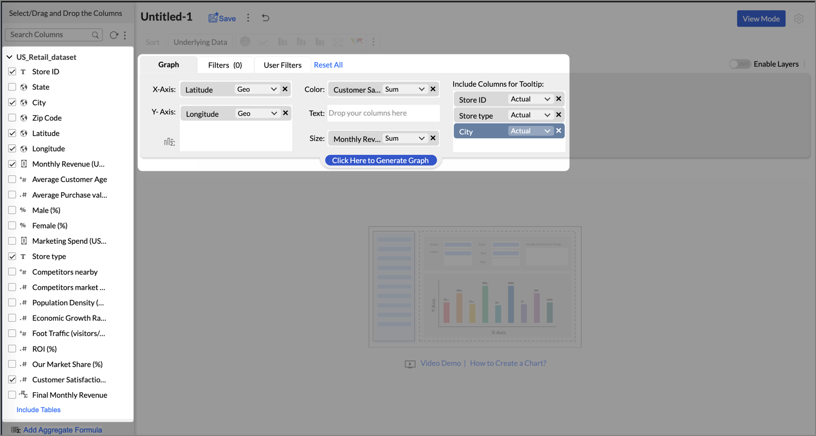
- Click Generate Graph.
- Click on the ellipsis icon and select the chart type as Map - Bubble.
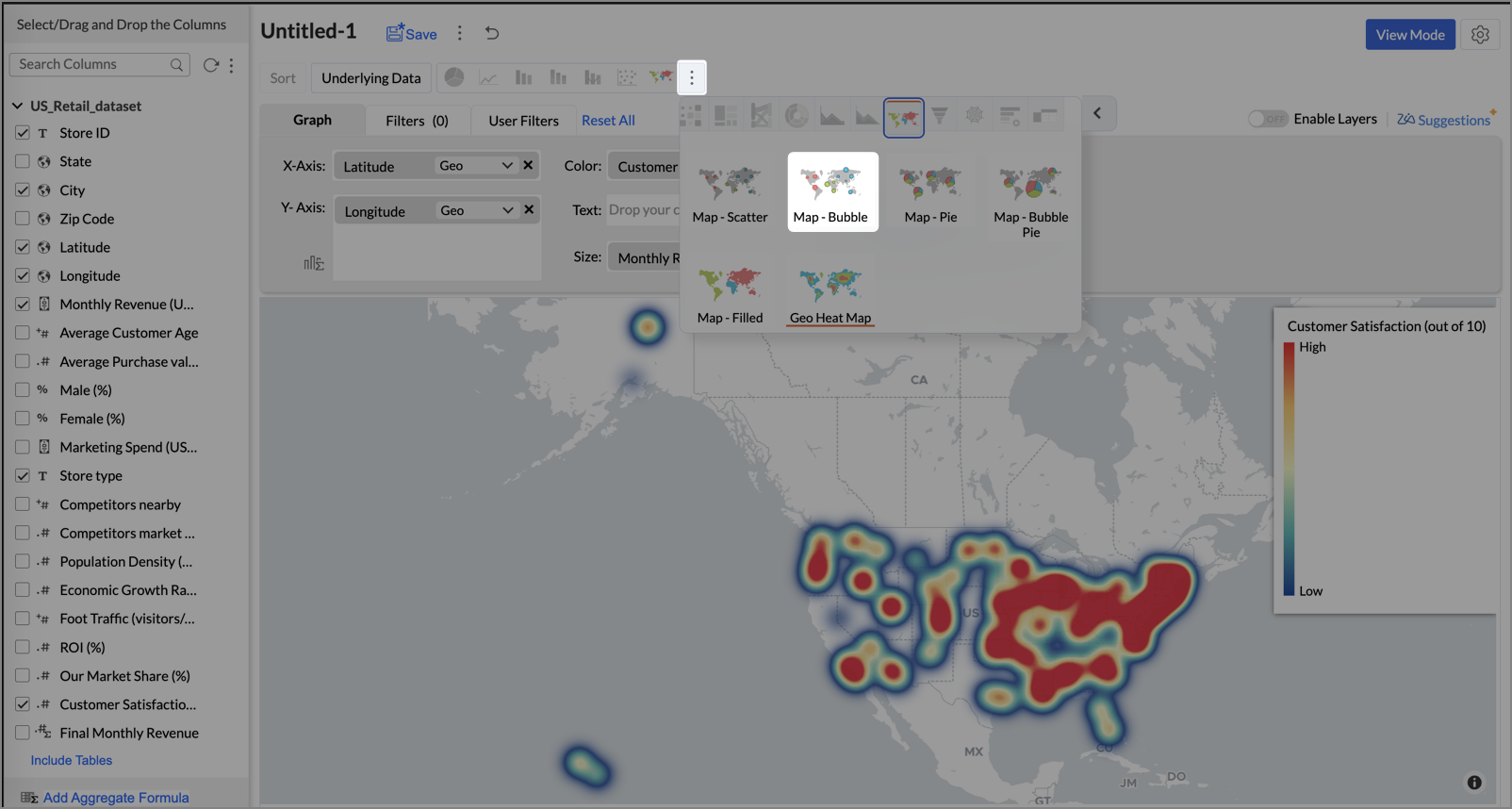
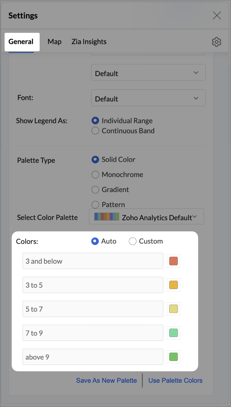
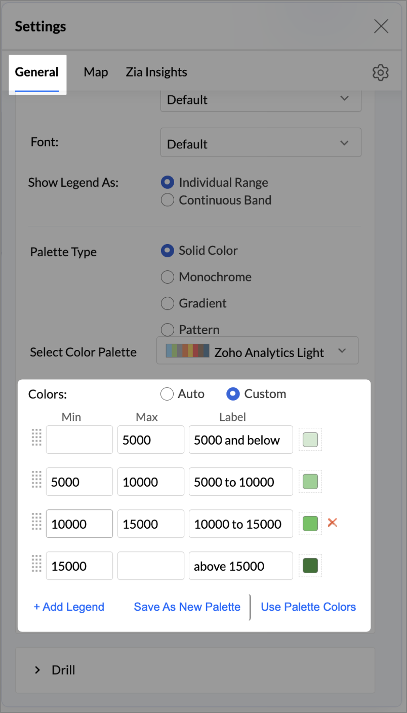
- Click the Settings icon, and under the General tab, click Legend.
- In the Colors section, customize the color scale from red to green to represent satisfaction ranges.
- Under the Map tab, click Map control and enable Display Specific Country Map.
- From the drop-down, select Albers USA Projection. This displays the USA map by placing Alaska and Hawaii below the mainland USA on a single map.
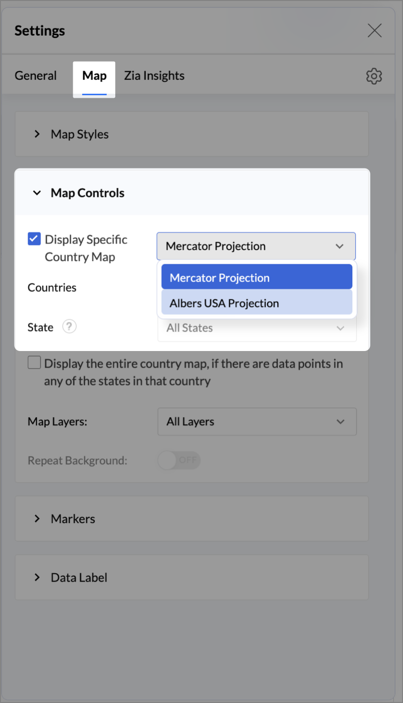
- Rename the report as Store Performance and click Save.
Tip:
Add a User filter such as Store type or State to analyze performance by segment.
This configuration creates a bubble for every store, sized by its revenue and colored by customer satisfaction — instantly showing how happy customers are in high- or low-revenue zones.
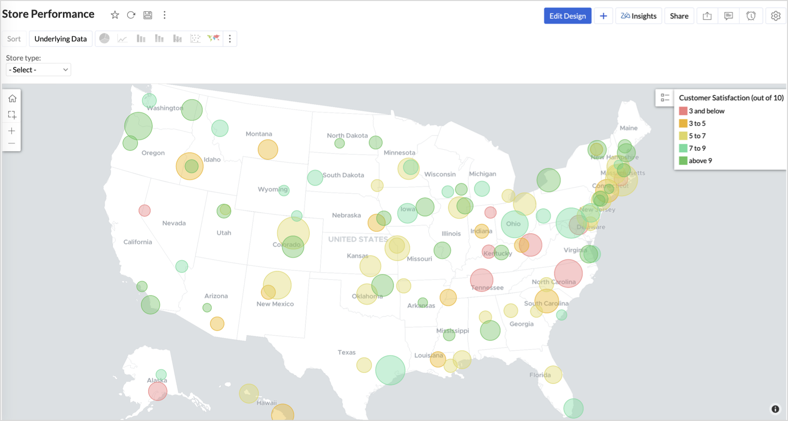
Key Insights
Large bubble + Red color - High revenue but poor satisfaction — risk of churn!
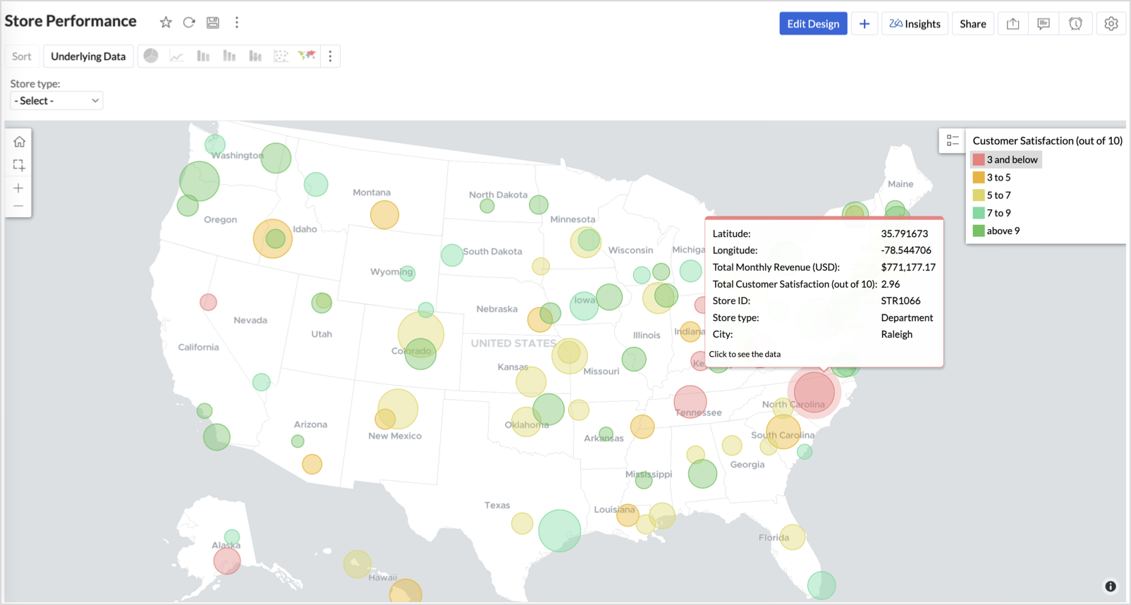
Small bubble + Green color - Low revenue but high satisfaction — possibly underserved
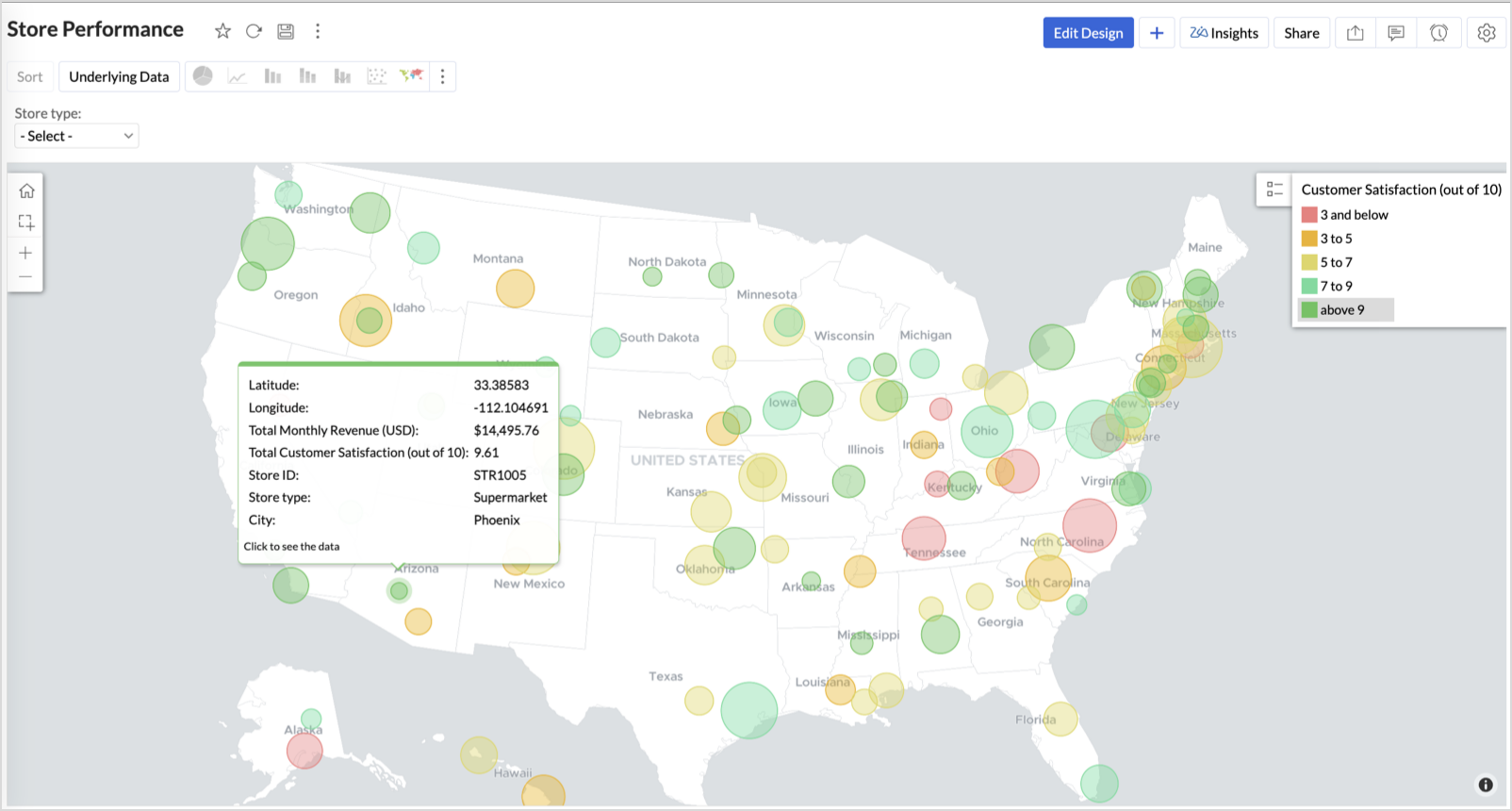
Large bubble + Green color - Healthy performers — consider replicating success
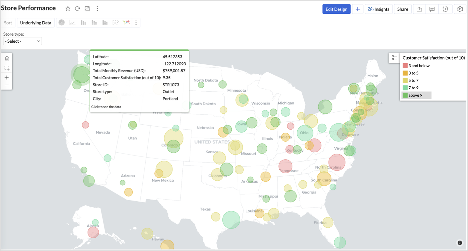
Small bubble + Red color - Low performers — review for possible closure or revamp.
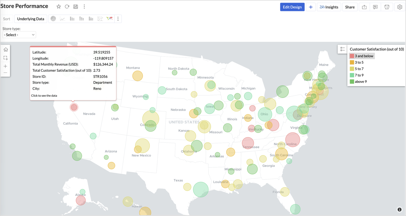
Business Interpretation
This chart acts as a live performance map for executives and analysts. Instead of scanning through tables or KPIs, stakeholders can instantly spot outliers, prioritize investments, and plan corrective actions by just glancing at the map.
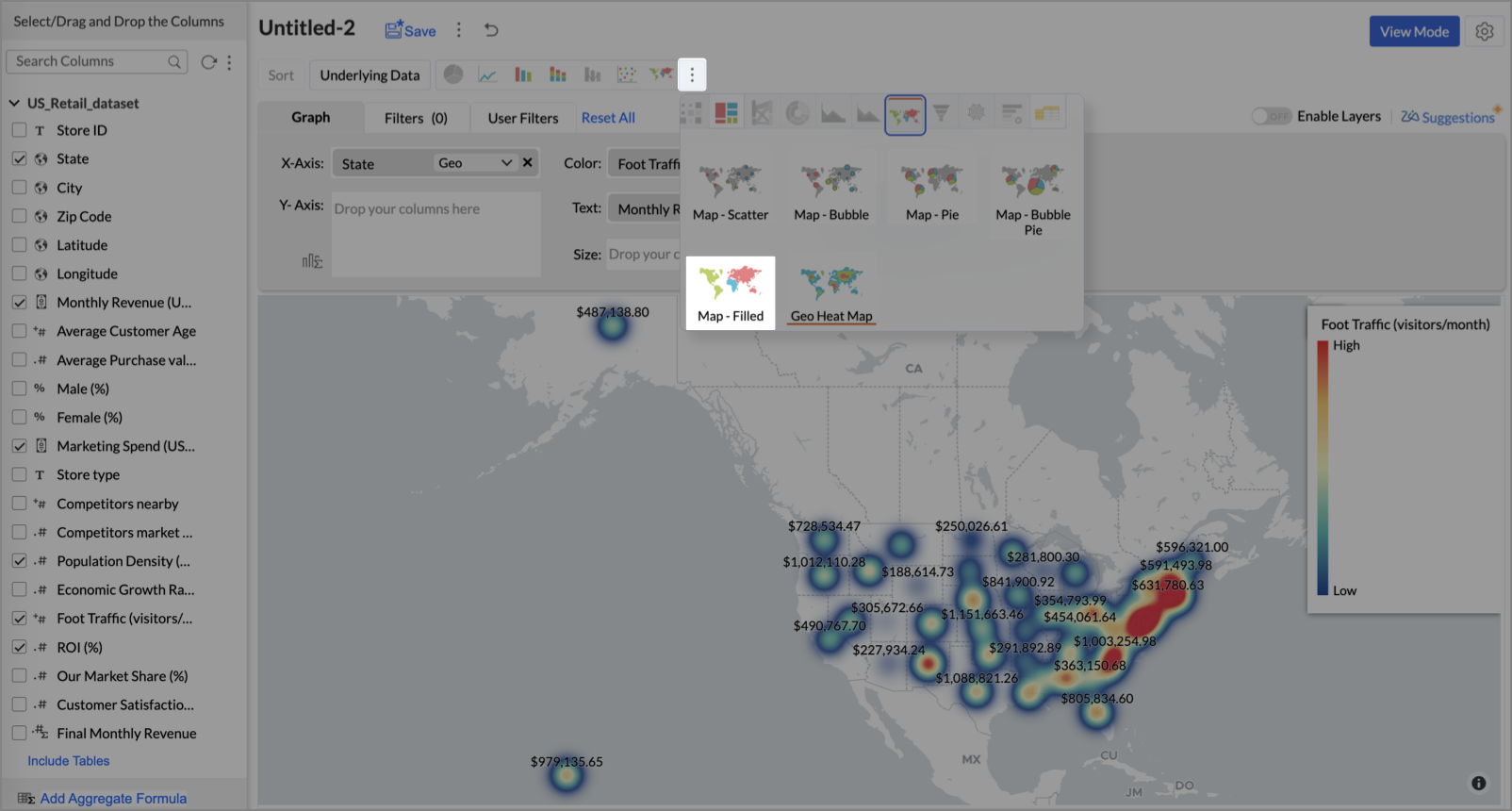
2. Revenue-to-Traffic Ratio with Ghost Zone Detection (Map - Filled + Scatter)
To evaluate how efficiently each state is converting foot traffic into store revenue — and more importantly, to identify high-footfall regions without store presence, often referred to as ghost zones.
This chart helps:
- Compare state-level foot traffic against actual revenue
- Spot underutilized or over-performing regions
- Discover untapped markets with high visitor potential but less to no physical stores
Why Map - Filled + Scatter?
- The Map - Filled chart provides a regional perspective of traffic density and revenue generation.
- The Scatter layer overlays actual store locations based on latitude and longitude.
This powerful combo allows you to measure performance where you’re active and spot opportunities where you're not.
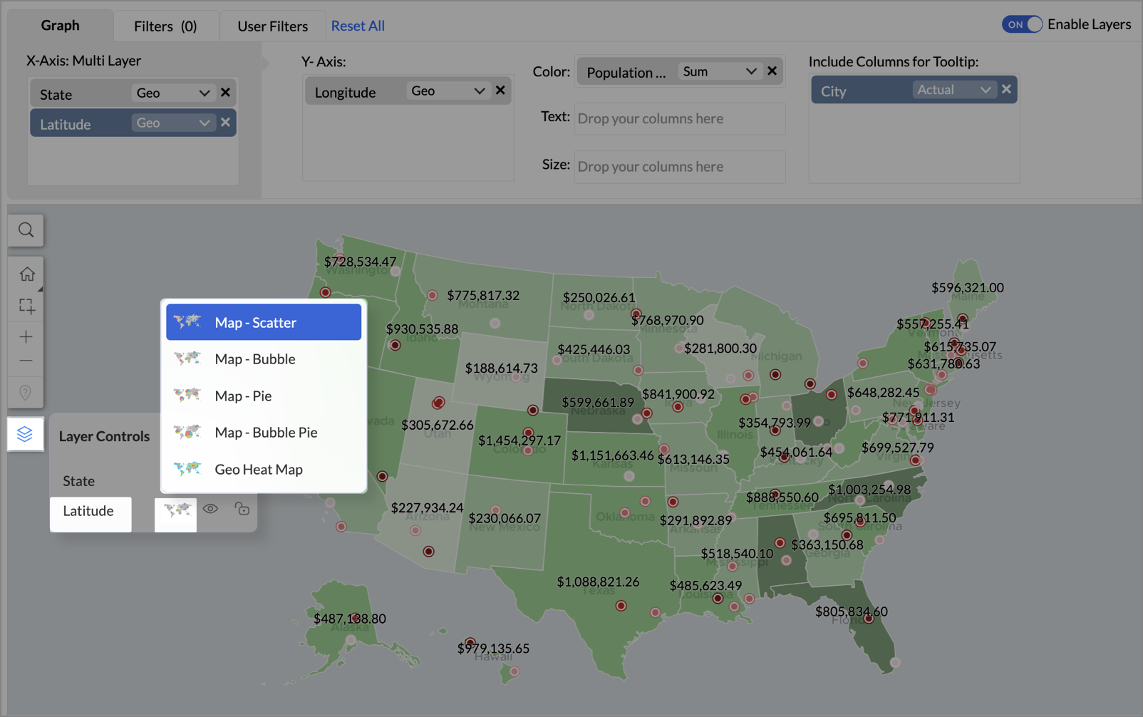
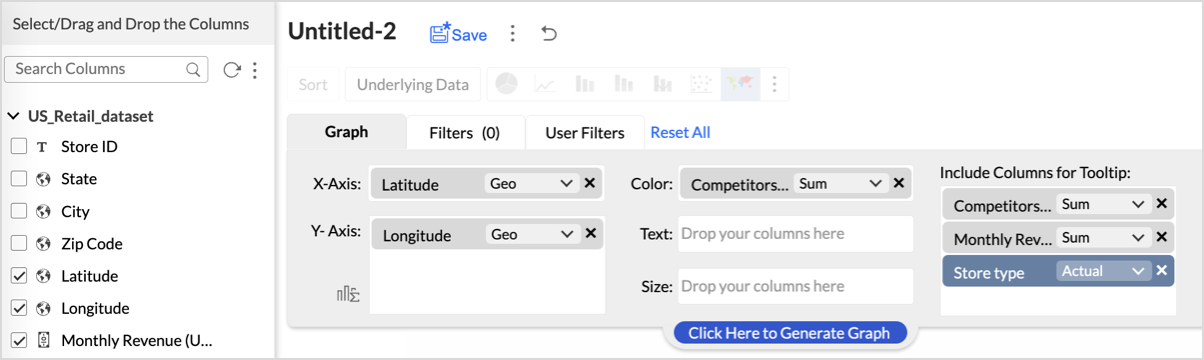
Procedure
- From the dataset, click the Create icon and select Chart View.
- On the designer page, drag and drop the following columns into their respective shelves:
- State → X-Axis
- Foot Traffic (visitors/month) → Color
- Monthly Revenue (USD) → Text
- Marketing Spend (USD), Population Density (people/sq km), ROI (%) → Tooltip
- Click Generate Graph.
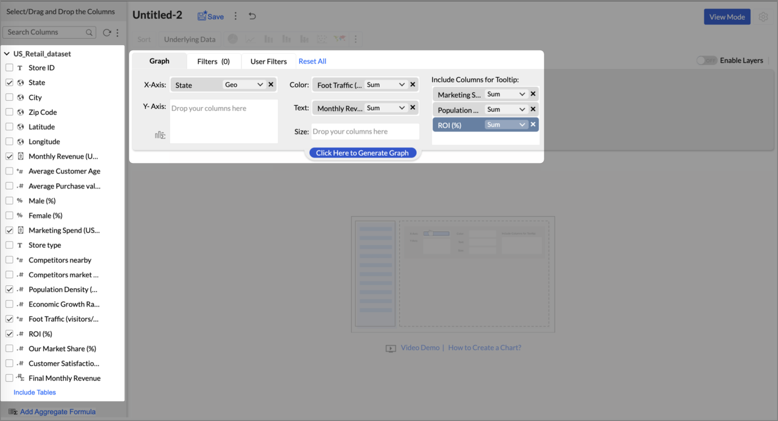
- Click on more option and select the chart type as Map-Filled.
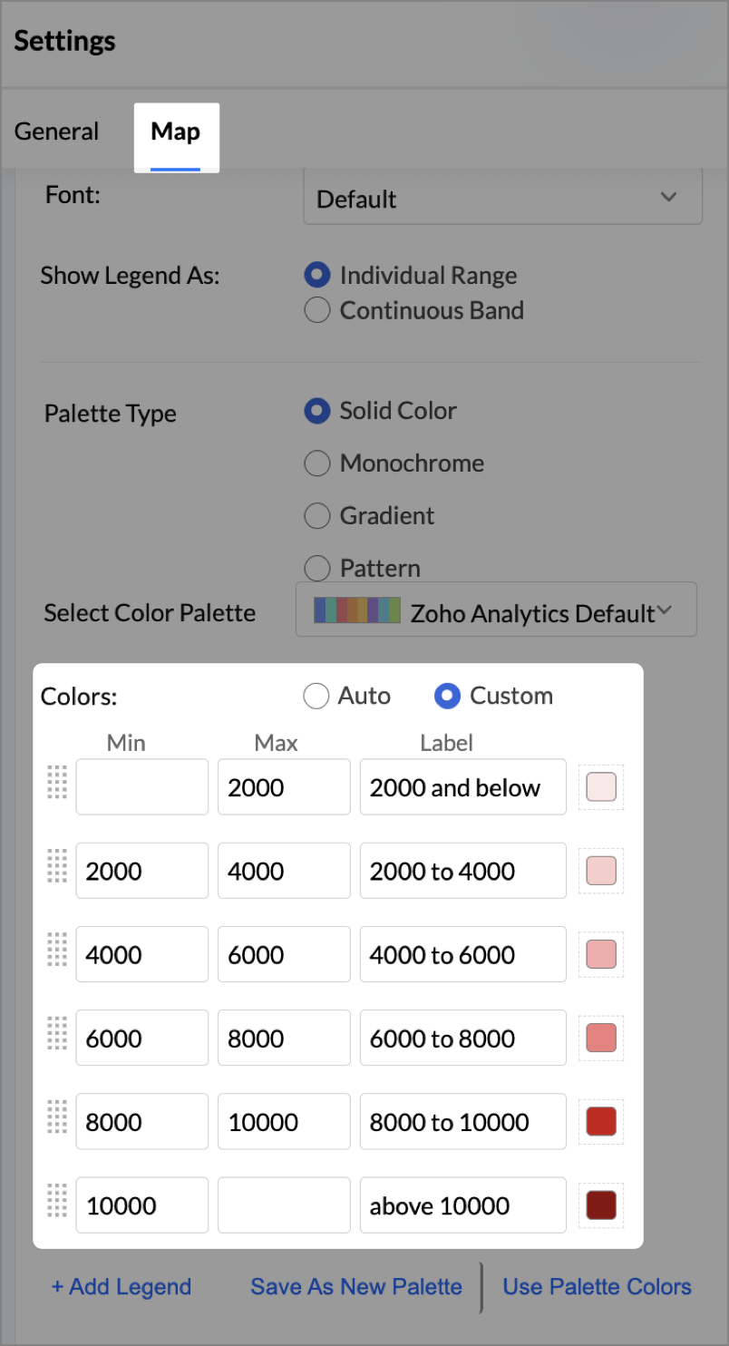
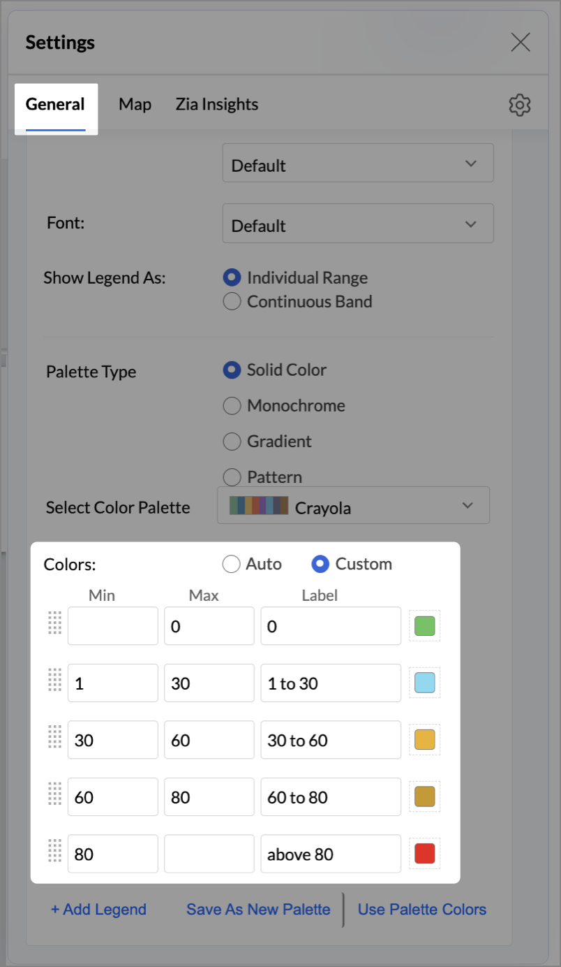
- Click the Settings icon, then click Legend.
- In the Colors section, assign from light to dark green colors for the below range of foot traffic:
- Below 5,000
- 5,000–10,000
- 10,000–15,000
- Above 15,000
- Under the Map tab, change the map to Albers USA Projection.
This filled layer highlights traffic and revenue across states.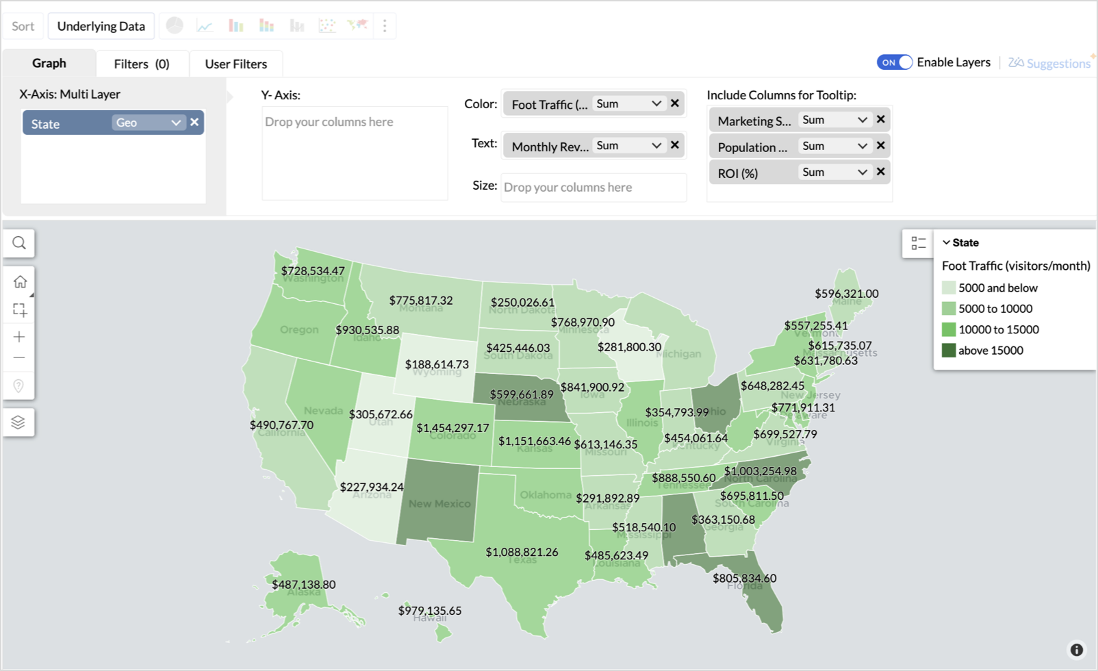
- Toggle Enable Layers to add a second layer.
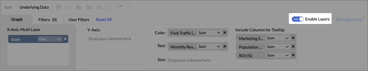
- In the new layer, drag and drop Latitude and Longitude into the X-Axis and Y-Axis respectively, Population density into the Color shelf, and click Generate Graph.
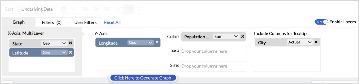
- Click Layer Controls, select Chart Chooser besides Latitude and choose the map as Map - Scatter from the list.
- To customize the second layer, go to Settings → Map → Latitude → Legend, and assign from light to dark red colors for the below range of population density:
- Below 2,000
- 2,000-4,000
- 4,000-6,000
- 6,000-8,000
- 8,000-10000
- Above 10,000
- Rename the report as Revenue-to-Traffic Ratio with Ghost Zone Detection and click Save.
This scatter layer marks the exact store locations, allowing visual correlation with high-traffic regions, revenue, and population density.

Key Insights
Dark green filled (high traffic) + Low revenue - Poor conversion - evaluate strategy or in-store experience
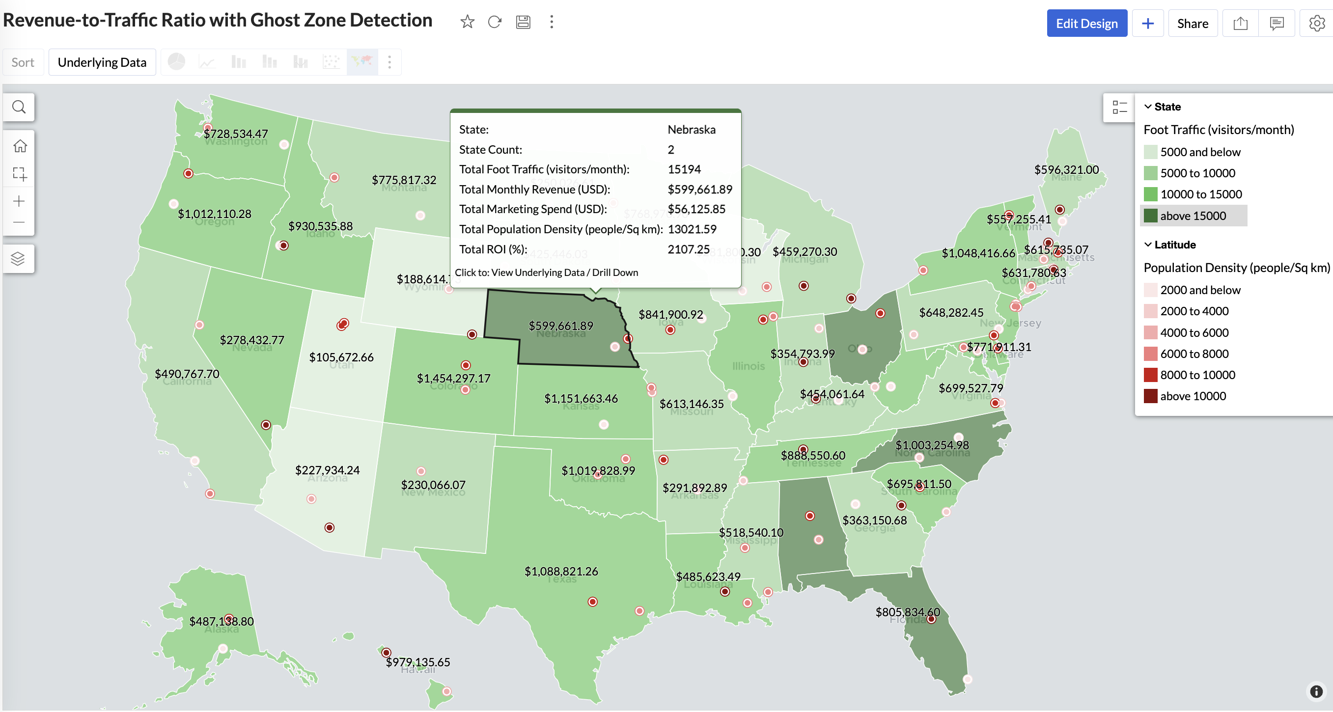
Mid to Dark green filled (high to mid traffic) + balanced revenue - Efficient zones — consider scaling efforts
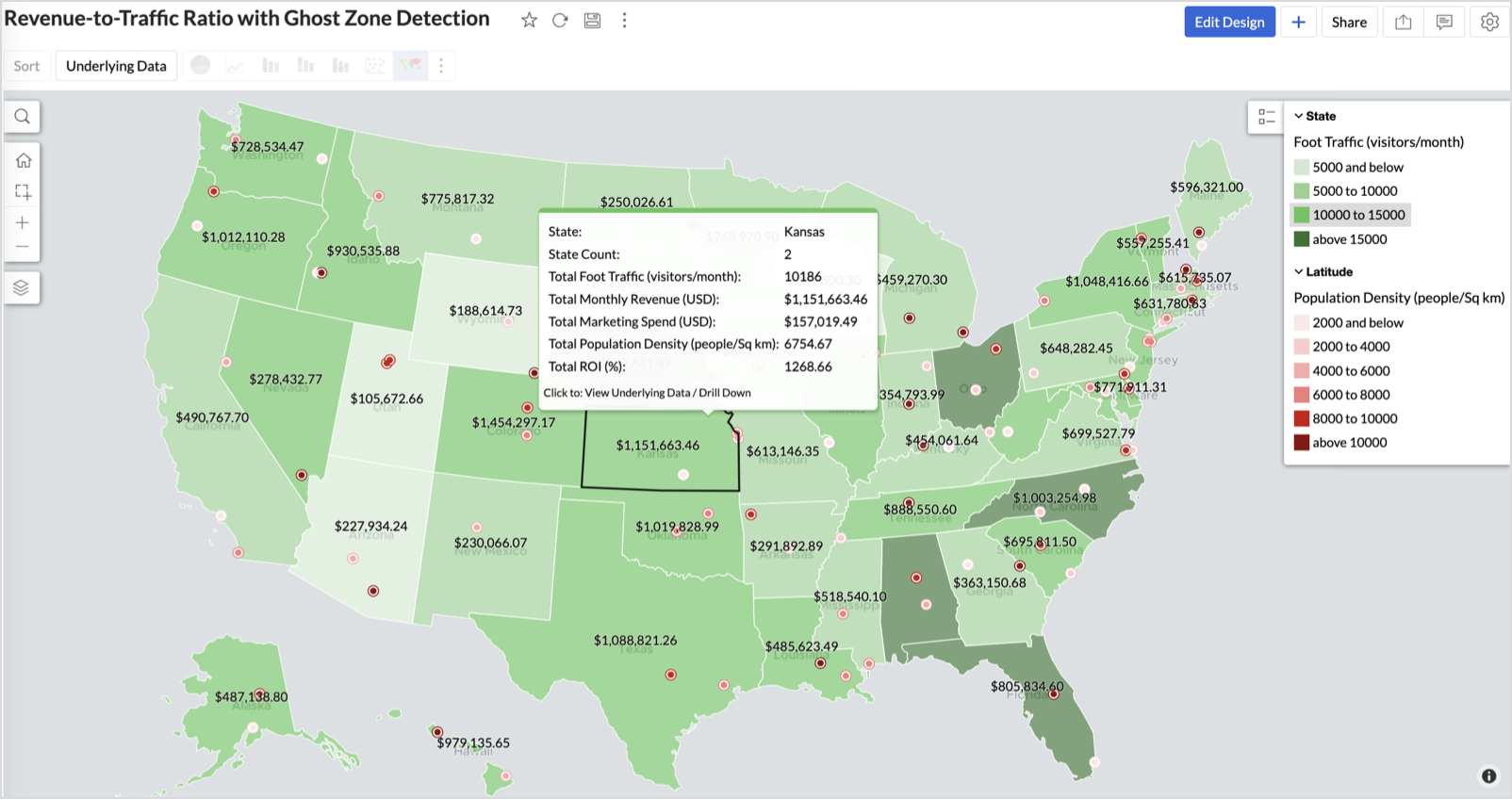
Light green filled (low traffic) + high marketing spend (from tooltip) - Budget drain — reduce spend or re-evaluate targeting
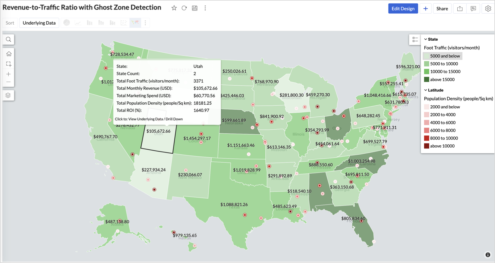
Dark red marker (high population density) + less to no store markers - Ghost Zones — high opportunity areas for expansion
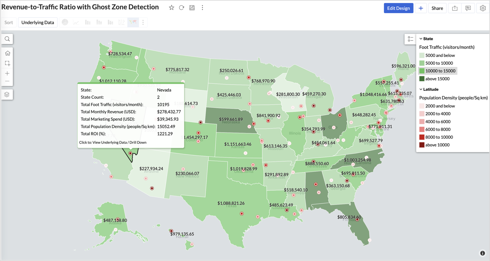
Example: In Las Vegas from Nevada, with a population density of 10,428 people/sq km and only two stores handling 10K–15K visitors/month, monthly revenue of the state remains modest at ~$278K. This indicates a high-opportunity zone for expansion, with strong footfall but untapped revenue potential.
Interpretation & Use
This map is designed for marketing and expansion teams who need to:
- Justify where to open new stores
- Optimize existing resource allocation
It visually answers the question:
Are we generating revenue where people are actually showing up?
Also, with the scatter layer:
Where are we not present — but should be?
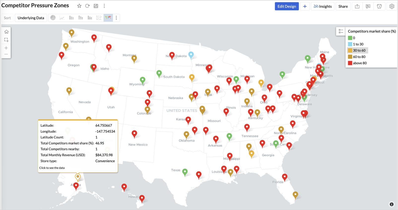
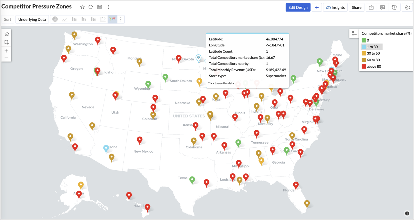
3. Competitor Pressure Zones (Map – Scatter)
To evaluate how store performance is impacted by nearby competition, using a scatter map that plots every store across the U.S. and reflects competitor market share through color intensity.
This view helps:
- Detect locations under competitive stress
- Identify high-risk zones where your market share is at risk
- Correlate competitor presence with satisfaction and store performance
Why Map - Scatter?
Map - Scatter offers a clean and lightweight visual that plots each store based on its exact coordinates. By encoding competitor market share as color and overlaying other attributes via tooltip, this chart becomes a competitive pressure radar.
Procedure
- From the dataset, click the Create icon and select Chart View.
- In the chart designer, drag and drop the following columns into their respective shelves:
- Latitude → X-Axis
- Longitude → Y-Axis
- Competitors market share → Color
- Competitors nearby, Monthly Revenue, and Store Type → Tooltip
- Click Generate Graph.
- Click on the more option and select the chart type as Map-Scatter.
- In the Settings panel, adjust the color gradient to reflect pressure levels
- 0 → Green
- 1-30 → Cyan
- 30-60 → Orange
- 60-80 → Pale red
- Above 80 → Red
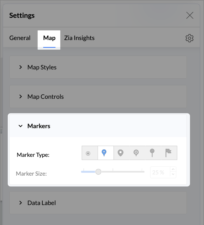
- Change the Marker type under Maps → Marker tab.
- Under the Map tab, change the map to Albers USA Projection.
- Rename the report as Competitor Pressure Zones and click Save.
The resulting chart uses color to signal competitive heat around each store, allowing you to scan pressure zones across all regions visually.
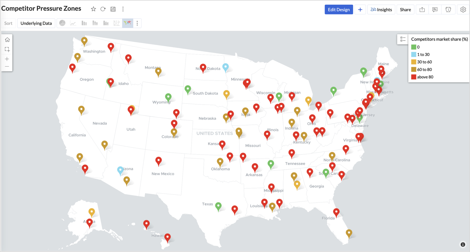
Key Insights
Red (80-100%) - High competitor dominance — urgent intervention zone
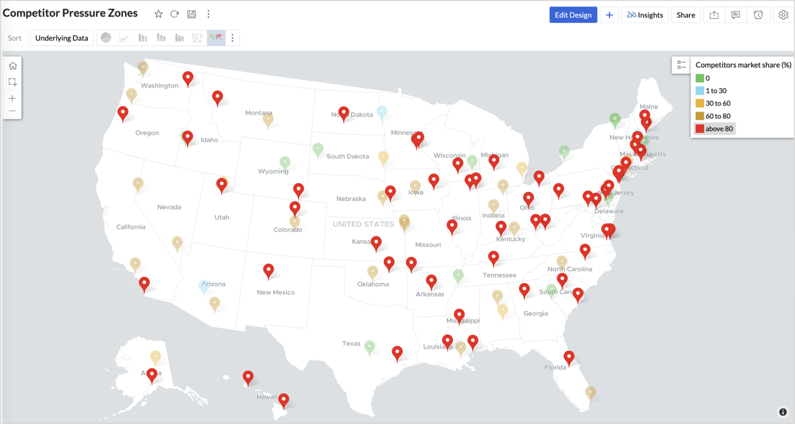
Orange (30-60%) + low revenue - Growing pressure — performance risk emerging
Green (0%) + strong revenue - Market leader — low competition, strong position
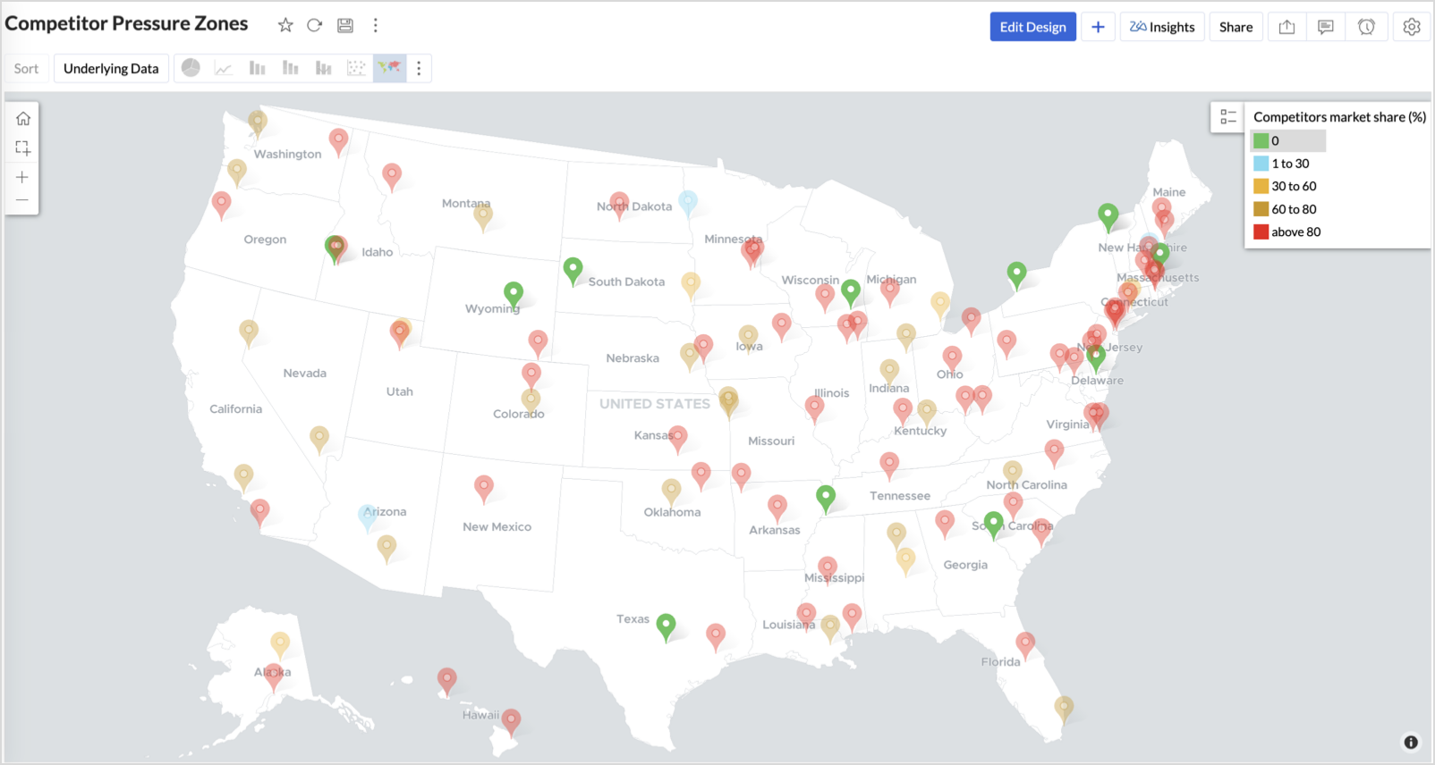
Cyan (1-30%) + moderate revenue - Mild competition — possible opportunity to scale further
Business Interpretation
This chart empowers regional and strategy teams to:
- Detect overcrowded areas where stores are losing share
- Identify safe zones where your brand leads the market
- Spot emerging competitor influence before it cuts into your margins
It acts as a competitive intelligence dashboard, mapping how your store network stands against external threats.
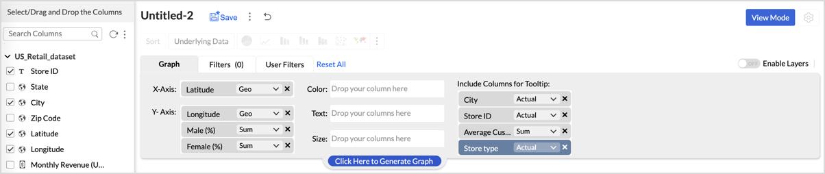
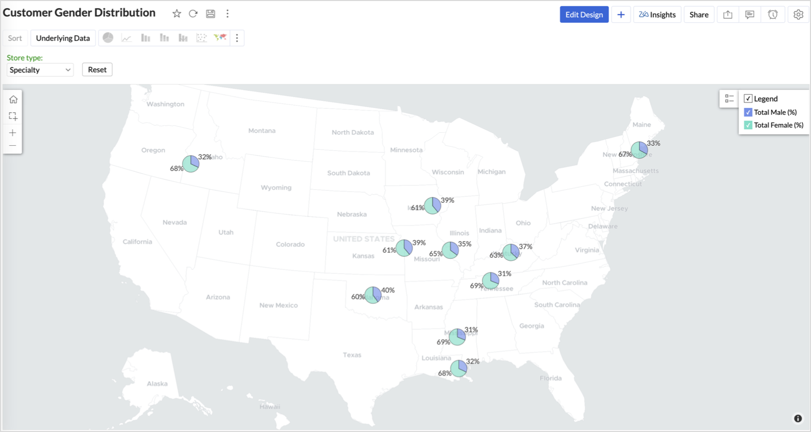
4. Customer Gender Distribution (Map - Pie)
To visualize how the gender distribution of customers varies across store locations. This helps identify stores with significant demographic skews, allowing for more personalized marketing, product selection, and in-store experience.
Why Map - Pie?
The Map - Pie chart is ideal for visualizing data composition across geographical locations.By breaking down each store’s customer base into Male (%) and Female (%) segments, this chart reveals who your customers are and where gender-targeted strategies might work best.
Procedure
- From the dataset, click the Create icon and select Chart View.
- In the chart designer, drag and drop the following columns into their respective shelves:
- Latitude → X-Axis
- Longitude, Male (%), Female (%) → Y-Axis
- City, Store ID, Average Customer Age, Store Type → Tooltip
- Click Generate Graph.
- In Settings, under the Map tab, change the map to Albers USA Projection.
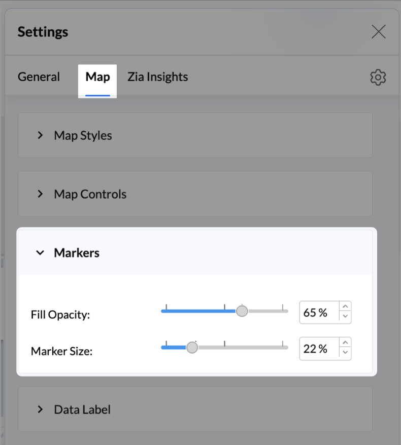
- Click on Markers, adjust the Marker Size as shown.
- Click on Data Label, and enable the Show corresponding Y axis value as data label on the chart to display the percentage values on the map.
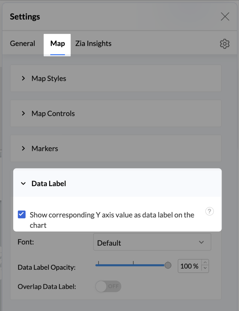
- Add Store Type as User Filters to slice down store-wise gender distribution.
- Rename the report as Customer Gender Distribution and click Save.
Each store will now display a pie chart representing the gender split among its customers, directly on the map.

Key Insights
Uneven gender split (e.g., 70% Male) - Potential to tailor offerings, branding, or promotions for the dominant gender
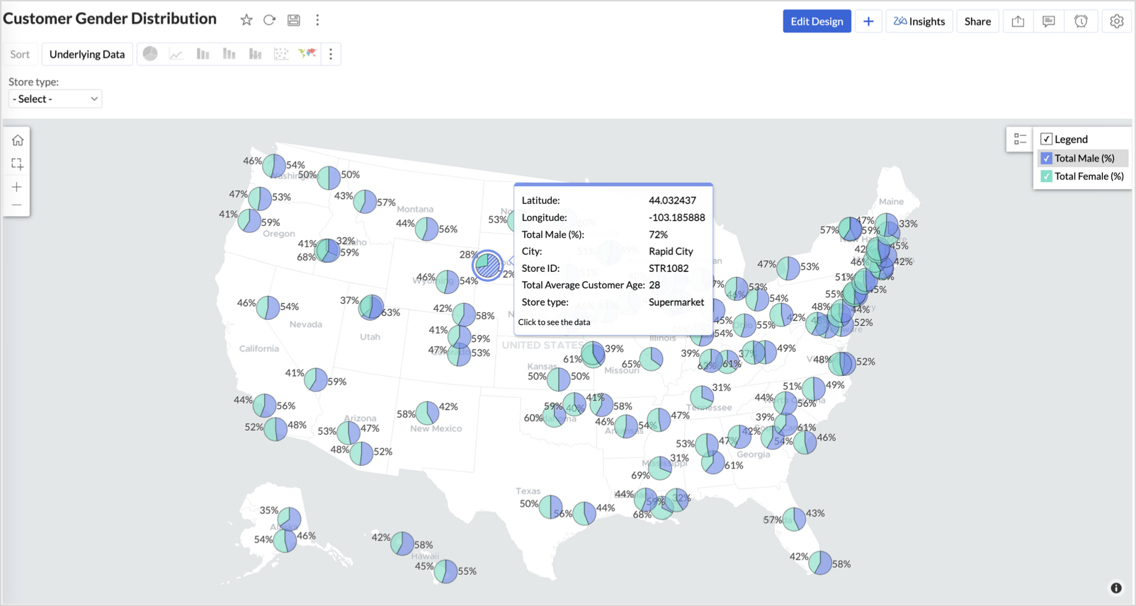
Balanced split (≈50/50) - Opportunity to run inclusive or diversified campaigns
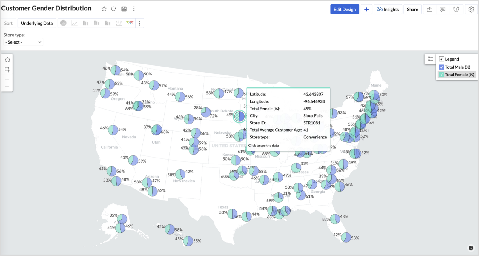
High female ratio + specialty store - Indicates demand for niche products — expand category offerings
Business Interpretation
This chart allows marketing and merchandising teams to:
- Understand gender-based customer clustering across regions
- Launch targeted campaigns (e.g., loyalty programs, promotions)
- Refine product assortments to suit local preferences
For example: A store with 70% female shoppers may benefit from deeper investment in lifestyle categories, while a balanced store could serve as a testing ground for unisex offerings.
Summary
In this phase, we laid the foundation for geo-powered retail intelligence using Zoho Analytics. Through a single, well-structured dataset and four powerful geo map visualizations, we transformed raw store data into real, actionable business insights.
Here’s what we achieved:
|
Report
|
Business Insights
|
|
Store Performance (Bubble)
|
Identified stores that are over performing or at churn risk based on revenue and satisfaction.
|
|
Revenue-to-Traffic Ratio (Filled + Scatter)
|
Detected ghost zones and optimized marketing ROI by comparing traffic and revenue.
|
|
Competitor Pressure Zones (Scatter)
|
Mapped out competitor dominance and spotted at-risk or saturated regions.
|
|
Customer Gender Distribution (Pie)
|
Uncovered demographic patterns to tailor product, marketing, and in-store experience.
|
Click here to access the sample workspace.
These visualizations brought spatial awareness into every performance metric — turning maps into a strategic business tool.
And this... is just the beginning.
Stay tuned for Phase 2 — where Multi-Layer Geo Maps and Network Charts come together to supercharge your business strategy with even deeper spatial insights.
Topic Participants
Pradeepkumar R
Sticky Posts
What's New in Zoho Analytics - October 2025
Hello Users! We're are back with a fresh set of updates and enhancements to make data analysis faster and more insightful. Take a quick look at what’s new and see how these updates can power up your reports and dashboards. Explore What's New! ExtremeWhat’s New in Zoho Analytics – September 2025
Hello Users!! In this month’s update, we’re raising the bar across multiple touchpoints, from how you bring in data, plan and track projects to how you design and brand your dashboards. We’ve added the all-new Gantt chart for project visualization, expandedAnnouncing Agentic AI - Ask Zia!
We are delighted to roll out the new agentic AI capabilities in Ask Zia, where every stage of the BI workflow is assisted by AI. With a human-in-the-loop approach, Ask Zia ensures that you’re in command of the decision, while AI handles the complexity.Invitation-Based User Access in Zoho Analytics
Hello everyone, We’re rolling out an important update on how users are added to your Zoho Analytics Organization and Workspaces. Previously, when admins added users, they were automatically added to the organization. Moving forward, to improve securityZoholics Europe 2025: Your Ultimate Data Analysis (Zoho Analytics) Workshop Experience
Why should you attend? This year, Zoholics Europe 2025 is putting data analysis centre stage. With a dedicated workshop designed to answer all your data-related questions, you’ll gain practical skills, real-time solutions, and expert insights that you
Recent Topics
CRM verify details pop-up
Was there a UI change recently that involves the Verify Details pop-up when changing the Stage of a Deal to certain things? I can't for the life of me find a workflow or function, blueprint, validation rule, layout rule ect that would randomly make itCustom templates for calendar report
What about being able to design custom templates for the calendar report, as well as for other types of reports? I think more users are waiting for this.Print a price list or price book
Hi Community. Am I right in concluding that Zoho has no functionality to print a price list from either Zoho CRM, Zoho Inventory or Zoho Books? I won't get stuck on the fact that Zoho doesn't sync price books between Zoho CRM and Books/Inventory (moreDisable payment thank-you emails
Hello, can someone please tell me how to disable sending of the "Payment Thank-You" emails?Maximum tags possible in Contacts Records
I read in some documentation that Zoho allows a total of 200 tags across all records. Is this correct? So is it not possible to have one tag per record for 500 records?Any way to "Pay with Check" or "Refund with Check" for Credit Notes?
When we have a Bill in Zoho Books, we can select the "Pay with Check" option which then allows us to print/cut the check directly out of Zoho Books. When we created a Credit Note and want to refund the customer, is there any way to Refund with Check,CRM Mobile reports
When our engineers finish a job they like to email the customer a job report. This is best done todate as an email template but we can find no way to include an image field from that module. Is there any other options?When Zoho Tables Beta will be open to EU data center
Hello all, We in EU are looking at you all using and testing and are getting jealous :) When we will be able to get into the beta also? We don't mind testing and playing with beta software. Thank you!Start Form on a different page (i.e., hide form pages)?
I have a Zoho form that uses the `Field Alias - Prefill URL` feature. My goal is to have a pre-filled field that directs the user to a specific starting page in the form. For example: The URL will have a field alias that will auto-populate a field withHow can we disable "My Requests"?
We are not using this functionality in our system at all and our users get confused.PayPal payment received recording problem
Hi, A little while back one of our customers used the PayPal payment option to pay an invoice For some reason though the payment is showing up twice within the Payments section of the invoice! Instead of setting the invoice value to ZERO, it now shows a negative value Anyone else face this problem? I've checked PayPal and there is only 1 payment in reality... A bug? Actonia ps: for anyone from Zoho Customer Service or tech team, its Invoice 785 in our accountstring(87) "{"code":"INVALID_TOKEN","details":{},"message":"invalid oauth token","status":"error"} " grtting this error
Using access token i am trying to add sales orders through api but it is throwing errors like the above i have mentioned. Please help me for thatHow to mute chat notification sound by default in Zoho SalesIQ?
We’ve recently embedded the Zoho SalesIQ chatbot on our website, and we’ve noticed that notification sounds sometimes play even when the visitor hasn’t interacted with the chat widget yet. We’re trying to understand two things: Why do these sounds occurKanban View for Projects.
At our organization, we describe active projects with various statuses like "In Proofing" or "Printing" or "Mailing". In the Projects view, one can set these project statuses by selecting from the appropriate drop-down. While this works, it's difficult to view and comprehend the progress of all of your projects relative to each other in a table. Creating a Kanban view for projects where I can move them from one status to another allows me to see where each project is in the order of our workflow.How to Hide Article Links in SalesIQ Answer Bot Responses
I have published an article in SalesIQ, and the Answer Bot is fetching the data and responding correctly. However, it is also displaying the article link, which I don’t want. How can I remove the link so that only the message is shown?Add RECURRING option when adding email to calendar events
When you add an email to a calendar event, there is no option to make that new calendar event into a recurring event. It is counterproductive to make an event from your email to then have to go to your calendar, find the event, and make it recurring.LINE Auto Message Connect to Zoho
When I integrated LINE into the CRM, I was prompted to disable “Chat,” “Auto Response,” and “Greeting Messages,” and to enable the webhook. However, since I have already set up some auto-reply features in LINE, including Rich Messages and greeting automation,Option to block bookings from specific email address or ip adresss in zoho booking
Sometime few of our client keep booking irrelevant booking service just to resolve their queries and they keep booking it again and again whenever they have queries. Currently its disturbing our current communication process and hierarchy which we haveThreaded conversations for emails sent via automation
Hi Guys, I hope you are doing well. Don't you guys think we should have an option in a workflow to notify users either as a new email or the previous email thread. For example, if you have one deal in the process and there are 10 different stages duringCreate folder is fetch fails
coming from zapier... zapier has a google drive task that searches for a specific folder in google drive, and if it fails to find the folder it will create a folder based on the search criteria, and contine along the singluar path of the flow. TryingMeetups de Usuarios de Zoho - Noviembre 2025
¡Hola, Comunidad! Durante el mes de noviembre celebraremos los Meetups de usuarios de Zoho, encuentros presenciales pensados para quienes queráis mejorar vuestras estrategias de lead nurturing y aprender a sacar el máximo partido a herramientas como ZohoIntroducing 7 New Connectors in Zoho DataPrep!
We’ve just made data management even easier - Zoho DataPrep now supports 7 new external connectors to help you build more robust, scalable ETL pipelines. Why it matters: ✅ Broader data access ✅ More automation, less manual work ✅ Smarter pipelines, betterSales Order, Invoice and Payment numbers
Hi zoho friends, it is me again, the slow learner. I'm wondering if there is a way to have it so the Sales order, invoice and payment numbers are all the same? It would be easier for me if they were the same number so there is not so many reference numbersFirst day of trying FSM in the field.
What we found. 1. with out a network connection we were unable to start a service call? 2. if you go to an appointment and then want to add an asset it does not seem possible. 3. disappointed not to be able to actually take a payment from within the appZoho Desk app update: AI powered features
Hello everyone! We’ve introduced various AI-powered services on the Zoho Desk app. Let's take a look at what's new. Generate Content: Generate Content uses AI to formulate responses based on the your query and provides a ready-to-use reply which can beHow to Automate Email Sequence
I'm having trouble trying to set up a workflow to automate an email sequence. Once a group of emails in a Task has been tagged by a certain tag, I want an instant email template to be sent. After 7 days with no response, another email template would beTurning off the new UI
Tried the new 'enhanced' UI and actively dislike it. Anyone know how to revert back?Zoho Sprints Android v2.0.4 app update: Item reminders, archive Epics, Kanban projects, Epic progress
Hello everyone! In the latest version(v2.0.4) of the Zoho Sprints Android app update, we have introduced various new features. Let's take a look at what's new! Item Reminder Stay organized and never miss an important date with the all-new Item ReminderCredit Management: #3 Setting Credit Limit for Customers
Think about that one familiar customer of yours who always buys on credit. They usually pay on time, maybe a little late here and there, but not alarming. So, you are fine saying, "Sure, pay later." Then, one day, they place a significantly bigger orderAdding Reports to Portals
Is there a way to add Reports to portals so only the user can see report templates relevant to them?Update on the client portal URL for Guest users
We’re updating the way Guest users access their Connect network. As part of this change, all client organization portals used by Guest users will now be accessible through a dedicated domain specific to each data center. The access URLs mentioned herePreserve Ticket Issue Mapping When Migrating from Jira to Zoho Projects
Hello Zoho Projects Team, We hope you are doing well. We are currently exploring a full migration from Jira to Zoho Projects, and we identified a critical limitation during the migration process involving Zoho Desk integration. Current Situation: We useEnhancements to Zoho Map integration tasks
Hello everyone, We're excited to announce enhancements to the Zoho Map integration tasks in Deluge, which will boost its performance. This post will walk you through the upcoming changes, explain why we're making them, and detail the steps you need toUnable to see Zoho contacts in Zoho app on ios
Hi Support Team, I am a new user, I have created my account and installed zohomail app on iOS 16 which works. I was also able to import my Gmail contacts into Zoho Contacts, which I can see. The problem is that I can’t see these imported cobalts in ZohomailTask Due Date greater than 10 years.
We use recurring tasks in Projects where every week, month, year etc Some of our projects are greater than 10 years and we are unable to set a new due date because the difference between start date and due date is greater than 10 years. As an exampleExternal User onboarding for zoho connect is not really intuitive.
So the external user is sent an invite, which has a button that directs them to login to zoho to view the invite, but if they don't have a zoho account, they cannot access that invite, which seems kinda silly, as there is not real way on for them to createHosting external websites on Zoho?
How can I host my external website on zoho? Do we have that option? I am currently with hostinger and am looking to switch to zoho. Kindly help. Thanks.How to Add Time Formula Duration (hh:mm)
Hi everyone — I’m trying to create a formula field in Zoho CRM that calculates the difference between a “Call Start Time” and “Call End Time” and displays the duration in HH:MM format (for example: 1:04 for one hour and four minutes). My current setupHow can I calculate the physical stock available for sale?
Hey Zoho Team, I've tried to calculate the physical stock on hand in various ways - but always receive a mismatch between what's displayed in Zoho Inventory & analytics. Can you please let me know how the physical stock available for sale is calculated?Set Custom Icon for Custom Modules in new Zoho CRM UI
Next Page