Charts

Some of the options mentioned in this document are being released in a phased manner and may only be available to specific users.

In Zoho CRM charts, you can:
- Create different types of charts depending on your business requirement.
- Present information in a graphical pattern that is more comprehensible.
- Customize, reorder, and organize the charts in the dashboards.
- Group data by day, calendar week, fiscal week, month, fiscal quarter, year, by fiscal year or fiscal quarter.
Based on your business requirement you can select from the below mentioned list of charts:
| Chart Type | Description |
| Bar chart & Horizontal chart | To display two or more kinds of data, that can be used to compare values across categories. |
| Line Chart | To display a trend over a period with the variations in the multiple values in a single chart. |
| Pie Chart & Donut Chart | To display data that is divided into triangular areas proportional to the percentages of the whole and used to illustrate the relationship of parts to the whole. |
| Table Chart | To show sum of the values in each category of the data. |
| Funnel Chart | To display different stages in a process and the associated data across categories |
|
Treemap chart
|
To visually represent large, hierarchical datasets as nested tiles in varying proportions and compare them all at a glance.
|
|
Cluster chart
|
To compare multiple categories of a participating variable grouped as vertical columns.
|
|
Butterfly chart
|
To represent two related datasets side-by-side and compare their own values across duration or stages, as well as with the values of the comparison metric. |
| Area Chart | To visually represent one or more quantities that change over time. |
Create Chart Using Reports
You can create charts from the existing reports in your CRM account. The data from the selected report will be represented graphically.
To create chart from reports
- Click the Analytics tab.
- In the Analytics page, select the dashboard in which the chart has to be added.
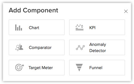
- Click Add Component.
- In the Add Component page, click the Chart.
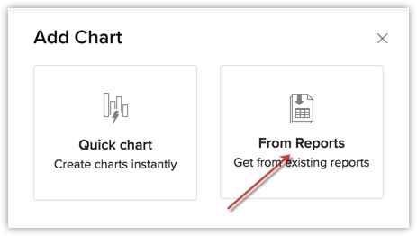
- In the Add Chart page, choose From Reports.
- In the Add Chart page, do the following:
- Enter the component name.
- Select a report from Report drop-down list.
- Select an option, in the Measure (Y-axis) and Grouping,from the list of available fields.
-
If you have two Y-axis measures and if the measuring scales are the same or similar, you can merge them to one and the data will be represented per the merged scale.
-
- Click on Create Category Field if you want to combine related values from the grouping field into categories.
This option is available when the selected grouping is a picklist or a numeric field. Learn more. - Click More Options to choose Sort by, Maximum grouping, Benchmark for y-axis, and Display as shortened numbers, Display Total Summary to show the total of the participating values (amount or quantity) for quick reference.
- In the top-right, you can select the desired chart type using the drop-down list.
- Click Save, to add the component to Dashboard.
- Click the Add & Reorder to add and rearrange the components.

Create Chart Using Quick Chart
In quick charts you can create charts by defining your own metrics, based on which the data will be represented in a graphical manner.
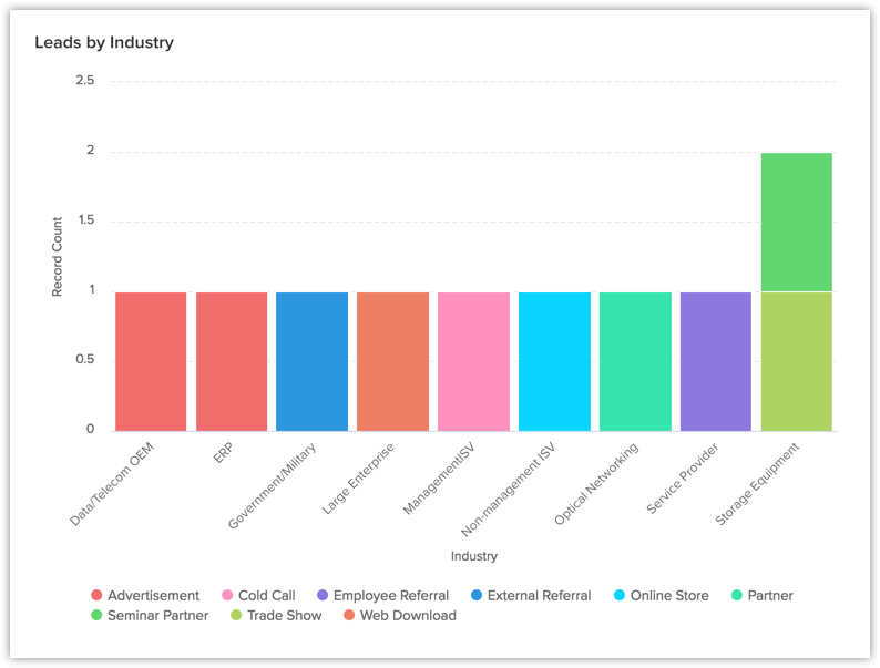
You can also view the total number of records by clicking on any single bar in the chart.
To create chart from quick chart
- In the Add Chart page, click Quick Chart.
- In the next page that appears, do the following:
- Enter the component name.
- Select the Module and the related module for the chart from the drop down list.
- Select an option in the Measure (Y-axis) and Grouping fields from the list of available components.
-
If you have two Y-axis measures and if the measuring scales are the same or similar, you can merge them to one and the data will be represented per the merged scale.
-
- Click on Create Category Field if you want to combine related values from the grouping field into categories.
This option is available when the selected grouping is a picklist or a numeric field. Learn more. - Click Criteria Filter to further specify the criteria for filtering records.
You can add up to 10 criteria. - Click the More Options to select Sort by, Maximum grouping, Benchmark for y-axis, Display as shortened numbers, and Display Total Summary to show the total of the participating values (amount or quantity) for quick reference.
- Select the Chart type from the drop-down list.
- Click Save.
- Click Add & Reorder to save the chart in a dashboard and to rearrange it instantly.

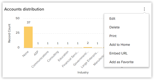
- You can Clone, Edit, Delete, Print, Add to Home, Embed URL or Add a chart to favourite by clicking on the More icon in a component.
- If the charts are grouped using one field then 75 groupings (that is, bars, lines, sectors etc.) will be displayed in a graph. If, two fields are used to group data, then 150 groupings will be shown in a single graph.
- When you enable Display as shortened numbers, you can choose the format (for example, display thousands as K) and decimal places. If you've chosen the format as Millions (M) and decimal places as 2, the number 135,532,000 will be displayed as 135.53 M.
Supported formats are:
Thousands (K)
Millions (M)
Billions (B)
Lakhs (L)
Crores (C)- Number of decimal places supported are: 0, 1, 2, and 3.
- Along with viewing unconverted leads, you can also view converted leads based on analytical components from the Leads module. Utilize the "Is Converted" field in the filters to display both converted and unconverted leads with the criteria "Is Converted is Selected" and "Is Converted is Not Selected" respectively.
- For date/time, currency, number-related, roll-up summaries, and checkbox fields: You can filter records either based on specific values or by comparing with a similar field.
Zia's Suggestions for Charts

- A maximum of 10 suggestions will be available.