Yes/No
Overview
The Yes/No field in Zoho Forms lets you collect binary responses, Yes or No, from respondents. It’s ideal for quick confirmations, agreements, or consent-based questions where a simple positive or negative response is required.
This field eliminates the need to manually create a two-option Radio or Decision Box field and provides a clean, preconfigured way to ask binary questions. It ensures consistency across forms while offering flexibility in styling and configuration.
Use the Yes/No field to collect clear decisions. It is ideal for use cases such as:
Agreements: “Do you agree to the terms and conditions?”
Approvals and Rejections: “Approve this request?”
Feedback: “Was this service helpful?”
Decision-Based Inputs: “Should this task be marked as complete?”
Consent & Subscription: “Would you like to receive notifications or newsletters?”
Adding a Yes/No Field
To add a Yes/No field to your form:
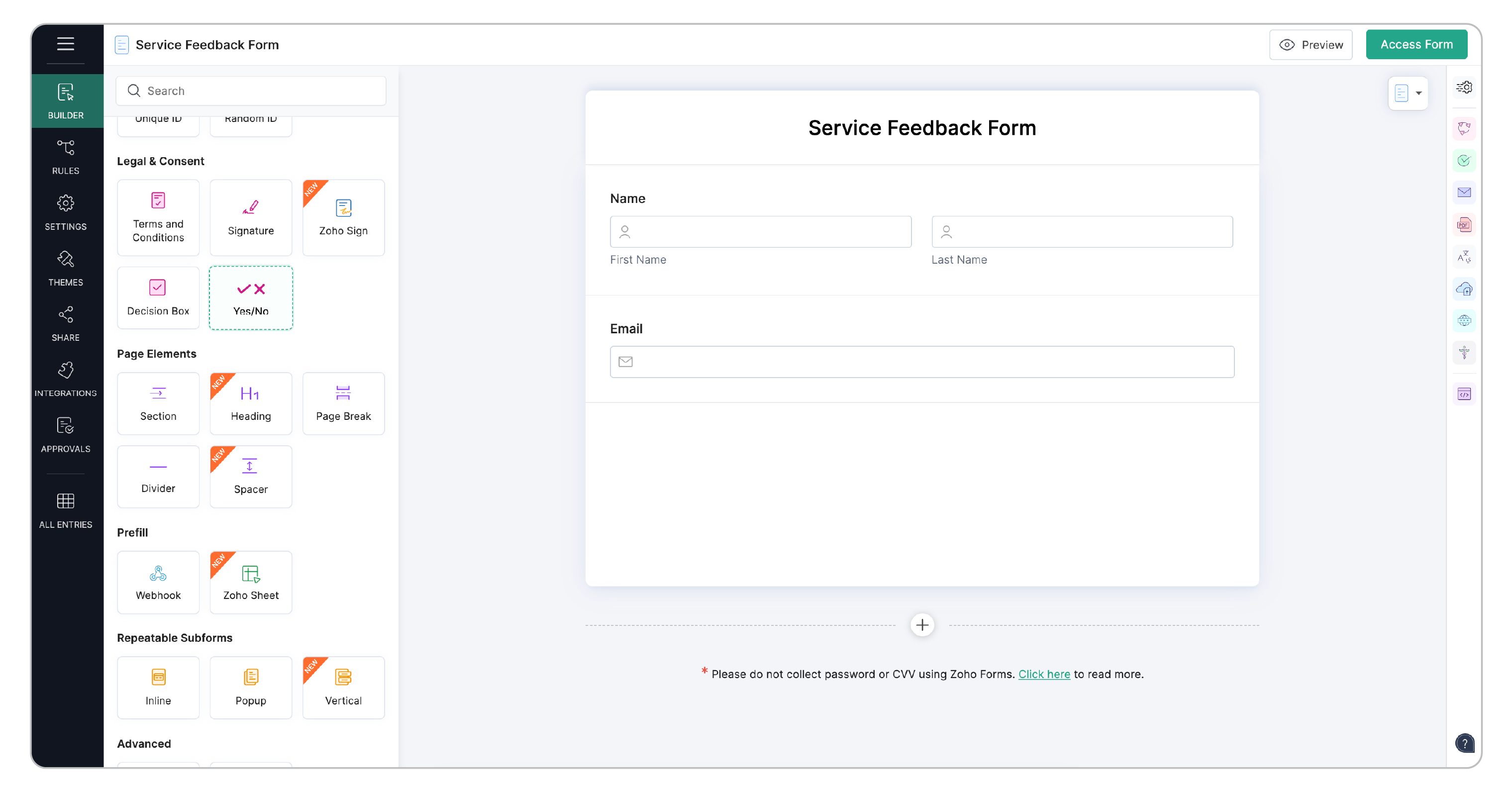
In your form builder, locate the Yes/No field under the Legal & Consent section.
Click or drag and drop the field into your form.
The field will be added in the default toggle style with the text labels Yes and No.
Select the field and open the Field Properties panel on the right to customize it as needed.
 Note:
Note:- The Yes/No field is supported only in the latest version of Zoho Forms.
- The Yes/No field supports exactly two options. For more than two choices, use a Checkbox or Multiple Choice field.
Field Properties
When you select the field in the builder, you can customize its properties to control how it looks and behaves.
Style 1 - Default: Displays “Yes” and “No” as toggle-style buttons, similar to radio buttons — Best suited for straightforward yes/no questions where text-based clarity is preferred.
Style 2 - Like/Dislike Icons: Displays a thumbs-up (like 👍) for Yes and thumbs-down(👎 dislike) — great for surveys or feedback forms that use visual cues.
Style 3 - Checkmark/Cross Icons: Displays a checkmark (✔) for Yes and a cross (✖) — Suitable for approval or verification questions.
Label-1 & Label-2: They represent the two available options (positive and negative) and are named as Yes and No by default. You can rename them to suit your context (for example, Like/Dislike, Agree/Disagree, Accept/Reject, or Allow/Deny). You may also set a default selection (Label-1 or Label-2) if needed, or leave it unselected for users to choose an option.
Show Icon Labels: This property appears only for Style 2 (Like/Dislike Icons) and Style 3 (Checkmark/Cross Icons). Enable it to display the text labels along with the icons. Disable it for a minimal icon-only layout.
Validation
Mandatory: Enable this to require respondents to select an option before submitting the form. If left blank, form submission cannot be submitted until a choice is made.
Visibility
You can choose to show/hide and enable/disable your form fields in the live form.
Hide Field: Select this option to hide the field from the respondents.
Disable Field: Select this option to display the field but to prevent the interaction from the respondents.
Privacy
To ensure that the sensitive data shared by your respondents is securely stored and handled, use the Mark as Personal and Encrypt options under Privacy.
Note: - Label-1 and Label-2 support up to 20 characters each.
- Label names remain unchanged even if the icon style is modified.
- In Default Style, labels are always visible and cannot be hidden.
Theme Customization
You can style the Yes/No field via Themes to match your form’s visual design.
Standard Forms: Themes > Special Fields > Yes/No
Card Forms: Themes > Advanced > Yes/No
Label-1 Background: Sets the background color of Label-1. This applies to all three styles.
Label-1 Text: Sets the text color of Label-1 in Default style (toggle) and icon color in Styles 2 and 3 ( like/dislike & checkmark/cross).
Label-2 Background: Sets the background color of Label-2. This applies to all three styles.
Label-2 Text: Sets the text color of Label-2 in Default style (toggle) and icon color in Styles 2 and 3 ( like/dislike & checkmark/cross).
Border: Defines the border color for the Yes/No field. Applies to all styles.
Choose background and text colors that complement your form theme and offer clear contrast for readability and accessibility.