Improve UX and UI of booking interface
What's the goal of a Booking tools if not create a high incentive to books meetings?
Zoho Bookings works fine on the backend but offers a relatively poor user experience for the visitor. Yes, it includes several options but it falls behind when in comes to creating and experience that unleashes Zoho customers growth.
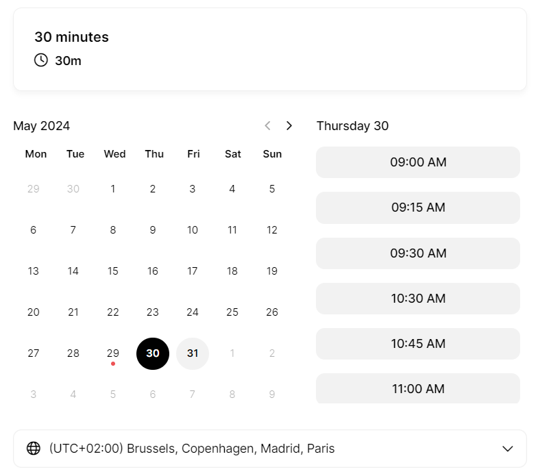
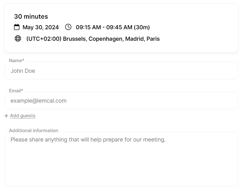
Have a look at Lemcal visual interface: It's straight forward, a single type of calendat which follows the calendly reference and is expected by everyone booking a call, yet they bring visual appeal to the next level with:
- Linkedin picture,
- Linkedin banner,
- minimal yet very intuitive design that encourage booking.
You will notice that Lemcal uses:
1/ minimal space needed to enjoy the user experience and yet fit into any screen size.
2/ a succession of windows that automatically resize to the content. This ensures "no scrolling". The user always operate at the center of the screen without disruption.
As Zoho Bookings customers we are down to trying to replicate such experience but are blocked on several areas:
1/ despite all possible options, we can't come close to a Calendly or Lemcal experience because the Zoho proposition takes too much space on the screen.
2/ It's hard to embed calendars in snippets. Since we can't play on the CSS directly.Even Zoho team isn't able to embed it properly on their own page.
What your customers need?
A core experience, that is intuitive, enjoyable and takes limited space so that we can use it as a snippet anywhere:
Screen 1:
Screen 2:
Zoho Bookings has great potential but the UX,UI isn't at the level of competitors.
Please, help us triple income with outstanding "closing deal" experience. Bookings plays a key role in that area.
Hope this is helpful,
Paul