Is it possible to assign Y axis fields to different stacks in stacked bar charts?
Is it possible to create multiple stacked bar charts for individual fields? I know this can be done if you use the 'Color' option to cut a bar across a field (technically it is not a stacked bar with respect to the Y axis fields, but works in many cases).
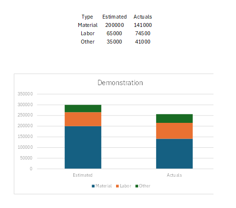
However, if you have individual fields that you want to stack in 2 different bars, is this possible? I can't seem to figure it out. I made an example in Excel. This would come from 6 different fields...
"Estimated Materials"
"Estimated Labor"
"Estimated Other"
.... and same for "Actual...."
These fields would all be Y axis fields in Analytics. Is it possible to then group which ones stack together? For example, below, if the 3 estimated ones are placed on one stack and the 3 actuals are placed in another.
Any help would be greatly appreciated!
Topic Participants
Derek Brown
Naresh Kumar K K R
Sticky Posts
What's New in Zoho Analytics - February 2026
Hello Users! We're back with another round of updates for Zoho Analytics. This month's release focuses on giving you greater flexibility in how you visualize, manage, and act on your data - with new features like custom visualizations, remote MCP server,What's New in Zoho Analytics - January 2026
Hello Users! We are starting the year with a strong lineup of updates, marking the beginning of many improvements planned to enhance your analytics experience. Explore the latest improvements built to boost performance, simplify analysis, and help youWhat's New in Zoho Analytics - November 2025
We're thrilled to announce a significant update focused on expanding your data connectivity, enhancing visualization capabilities, and delivering a more powerful, intuitive, and performant analytics experience. Here’s a look at what’s new. Explore What'sWhat's New in Zoho Analytics - October 2025
Hello Users! We're are back with a fresh set of updates and enhancements to make data analysis faster and more insightful. Take a quick look at what’s new and see how these updates can power up your reports and dashboards. Explore What's New! ExtremeWhat’s New in Zoho Analytics – September 2025
Hello Users!! In this month’s update, we’re raising the bar across multiple touchpoints, from how you bring in data, plan and track projects to how you design and brand your dashboards. We’ve added the all-new Gantt chart for project visualization, expanded
Recent Topics
Zoho calendar not working in browser
Hello, I am new to Zoho. I have two accounts for two separate businesses. In one of them, calendar loads in a browser no problem. However, if I use this account (sairfeetmusic.co.uk) calendar does not load. I also cannot add it to my Thunderbird LighteningAuthentication Failure when adding POP3 accounts
Hi everyone, I am a new user currently migrating from Gmail to Zoho Mail. I decided to make the switch following Google's decision to discontinue POP3 fetching. I previously used Gmail as my primary mail hub, and Zoho seems like the perfect alternativeTrident Application Folder
Hi, How to choose installation folder for Trident, by default it gets installed in C drive. How to change drive?Email disappeared to specific contact
Good afternoon, this morning I emailed somebody. This email isn’t showing up in my sent folder. They sent me a response which I clicked on and it disappeared immediately. Why could this be?Create an Eye-Catching Announcement Widget for Your Help Center
Hello Everyone! In this week’s edition, let’s explore how to keep your customers updated with exciting news in the Help Center. See how ZylkerMobile wowed their customers by bringing updates right to their portal. ZylkerMobile, the renowned brand forUpdating records through Zoho Sheets View doesn't update timeline or trigger workflow rules
I have noticed that when i update a series of record with the zoho sheets view (see here http://d.pr/i/ahnR) it doesn't update timeline history or trigger workflow rules. I am using it in the Deals module. Looking forward for some more info. DenisHow do I change the account bank charges are charged to?
I want bank charges charged to my Credit Card Fees account. Is there a way to do this?Mail Search should allow grouping by conversation like Gmail.
Having switched from gmail I have found the search function hard to use. Mostly because mail is not grouped by conversation in search. If I search for a word when looking for a conversation had with someone then sometimes 10 emails will come up from theUpdation of Old Browsers Versions for Zoho CRM
We have upgraded the default browser version for CRM to facilitate features like widgets and scripts that are often implemented aside from advanced functionalities for various business requirements. The latest version is aimed to provide better performanceProject-Based Inventory Consumption and Proforma Invoice in Zoho ERP
While working with customers across different industries, we have identified a few functional questions and gaps that commonly arise—especially for project-based and service-oriented businesses. Many organizations, such as those in shipping, construction,Zoho Desk domain Mapping not Working Showing CNAME Error
I have created the subdomain and created the Cname as well as its instracted on the Zoho website but when i try add the domain on help desk its showing error msg : Make sure you've mapped the CNAME entry and linked it to desk.cs.zohohost.com.au on yourFounders using Zoho — are you leveraging Zoho Campaigns + Zoho Social for thought leadership… or just sending emails?
I’ve noticed something interesting in the Zoho ecosystem. Many founders use Zoho Campaigns and Zoho Social for basic marketing—newsletters, scheduled posts, and announcements. But very few are using these tools strategically to: • Position themselvesIMAP stopped working after enabling 2 factor authentication
IMAP stopped working after enabling 2 factor authentication. Is there any solution for this?Rename Service Report
Some of our customers are requesting the name of the service report PDF to be in a specific format, for example, instead of REP-001.PDF some are requesting to include their name like customername.pdf. is that possible?Outgoing emails rejected due to SpamCop RBL listing (IP 136.143.188.12)
Hi All, I am writing to report a deliverability issue affecting outgoing emails from my Zoho Mail account. Recently, several messages sent from my domain (example.com) to external recipients have been rejected with the following error message (redactedShare Record Ownership in Zoho Recruit
We’re introducing User Fields in Zoho Recruit designed to make collaboration easier when multiple team members need to work on the same record. With User Fields, you can extend record ownership beyond a single user and enable smoother teamwork acrossRecherche d'un développeur
Bonjour, j'ai un projet de SAAS sur une base de zoho créator et zoho CRM et je recherche un développeur qualifié français pour créer l'application créator (fonctionnel et graphique) et les workflow et blueprint de CRMDisplay actual mileage on an invoice
My users are creating expenses in Zoho expense. For example, they expense 10 miles and get paid 7 dollars (10 miles * IRS rate of .70). If I look at the expenses in Zoho Books, it does show them at 10 miles at .70 cent When I add these expense to an invoiceCustomer Parent Account or Sub-Customer Account
Some of clients as they have 50 to 300 branches, they required separate account statement with outlet name and number; which means we have to open new account for each branch individually. However, the main issue is that, when they make a payment, theyCloning a Pick List
I have an existing Pick List in my Contacts that I want to drop into my Leads. Is there a way to copy or clone the field with it's accompanying Pick List? Thanks for your time.I wish to upload 40000 Resumes in Zoho Recruit Database. Can I do this in batch of 1000 Resumes ?
I would like to upload thousand or few hundred of resumes in Zoho Recruit in one go. Please let me know how can I do this Or migrate my 40000 resumes from previous ATS to Zoho Recruit.Zoho Writer for Proposals
Hi, one of the things we've struggled with since moving to Zoho ecosystem is our proposal software Qwilr does not integrate well. It surprises me Zoho doesn't have proposal software but given all the capabilities of Zoho Writer, I'm wonder if anyone isCustom Fonts in Zoho CRM Template Builder
Hi, I am currently creating a new template for our quotes using the Zoho CRM template builder. However, I noticed that there is no option to add custom fonts to the template builder. It would greatly enhance the flexibility and branding capabilities ifFoutmelding bij uitvoering/opslaan functie 'Left expression is of type TEXT and right expression is of type NUMBER'
Hoi! Ik heb een workflow (zie bijlage) die wordt getriggerd zodra de verwachte weekomzet van een bedrijf wordt aangepast naar een bedrag hoger dan 0. Op dat moment moet een functie (zie bijlage) gaan berekenen wat het benodigde kredietlimiet moet zijn.Hoe kun je Nederlandse loonstroken boek in Zoho Books?
Beste Community, Heeft er iemand een idee hoe je standaard loonstroken kunt inboeken in Zoho Books? Ik ben benieuwd hoe jullie dit doen en wat de mogelijkheden zijn.Unable to Filter Retail Sales Orders & Need Paid/Unpaid Filter – Zoho Books
Hi Zoho Team, Recently you introduced Retail – Standard and Retail – Premium templates for Sales Orders. However, in the Sales Order module we still cannot filter or segregate Retail Sales Orders separately from normal B2B sales orders. Because of this,Service op locatie organiseren met Zoho FSM: waar lopen organisaties tegenaan?
Bij organisaties met service teams op locatie merken we vaak dat de complexiteit niet zozeer in de planning zelf zit, maar in wat er rond die planning gebeurt. Denk aan opvolging na interventies, consistente servicerapporten, en het bijhouden van installatiesPossible to delete the "Big Deal Alert" in Zoho CRM?
Hi, Is it possible to delete the "Big Deal Alert" in Zoho CRM? My company has no need for it and I want to remove it to clean up my email templates list. Thank you. Moderation Update: Currently, the option to delete the "Big Deal Alert" template is inAllow selection of select inactive users in User data fields
Hello, We sometimes need to select a previous employee that has an inactive account in the User data field. For example, when doing database cleanup and indicating actions are done by a certain employee that weren't filled out when they were part of the[Webinar] Top 10 Most Used Zoho Analytics Features in 2025
Zoho Analytics has evolved significantly over the past year. Discover the most widely adopted features in Zoho Analytics in 2025, based on real customer usage patterns, best practices, and high-impact use cases. Learn how leading teams are turning dataNeed advice for product/item search functionality when adding invoices.
My client uses "Catalog or Vendor" name and Product code to search for his items. But Zoho only allow to search by product name and SKU when adding items to Invoices/Estimates. Clients product codes are not unique as they may overlap from different catalogs/vendors.Do buttons and vba msgbox work on mobile, specifially the iPhone zoho sheets app?
In Zoho sheets on the web, I inserted a button and assigned a VBA macro to it. It pops up a msgbox with some text. When I go onto the iPhone mobile zoho sheets app, the button is there. When I click on that button, the spinning asterisk appears for a[Webinar] Solving business challenges- Handling the challenge of transitioning to Zoho Writer from legacy tools
Moving to Zoho Writer is a great way to consolidate your business tools and become more agile. With multiple accessibility modes, no-code automation, and extensive integration with business apps and content platforms, Zoho Writer helps solve your organization'sHow can I effectively manage a website with your help?
I’m wondering if it’s possible to develop a custom website with specific features using Zoho as an alternative platform. My goal is to create a website similar to https://tmsim.ph, with the same kind of functionality and user experience. I would trulyIntroducing the Yes/No field: Binary decisions made beautiful
Greetings, form architects! What would you do when you need a simple yes/no answer on your form? Normally, you add a Radio field. Type Yes. Type No. Until now. The new Yes/No field is purpose-built for binary decisions. It is preconfigured, visually consistent,Move email between inboxes?
Is it possible to move emails from one team inbox to another? We would like to be able to have a single "catch-all" inbox for incoming requests, and then move the email to the appropriate department inbox. I was hoping we would be able to accomplish thisThe power of workflows in Zoho Marketing Automation - Video Webinar
In this Zoho Marketing Automation video webinar, our experts walk you through: Why you may want to create marketing workflows How to create marketing workflows Use Zoho CRM data and apply workflows to automate your marketing strategy How workflows canZoho CRM's sales trend and sales follow-up trend dashboards are now customizable
Dear Customers, We're here with good news! Sales trend and sales follow-up trend are two system-defined dashboards that help you understand trends and anomalies in your sales outreach and conversion efforts. They use Zia's intelligence to identify patternsIntroducing Rule-Based AI Coding Assistants for Zoho Finance Widgets
Hello customers, We’ve introduced rule-based AI coding assistants to speed up Zoho Finance widget development. You can try them out in Cursor AI and GitHub Copilot. This helps you build widgets quickly using simple prompts, while ensuring the generatedMarketing Tip #21: Create an About Us page
People don’t just buy products, they buy from brands they trust. An About Us page helps customers understand who you are, what you stand for, and why your business exists. It adds a human touch to your store and reassures shoppers that there’s a realNext Page