Tip #13: 3 important chart customizations to make them more readable
Charts are great tools for representing data. Visualizing can give you a new perspective, and help you unlock new insights from your data. Here are three customization options that can enhance your charts for maximum impact.

Labels: Cover all the basics
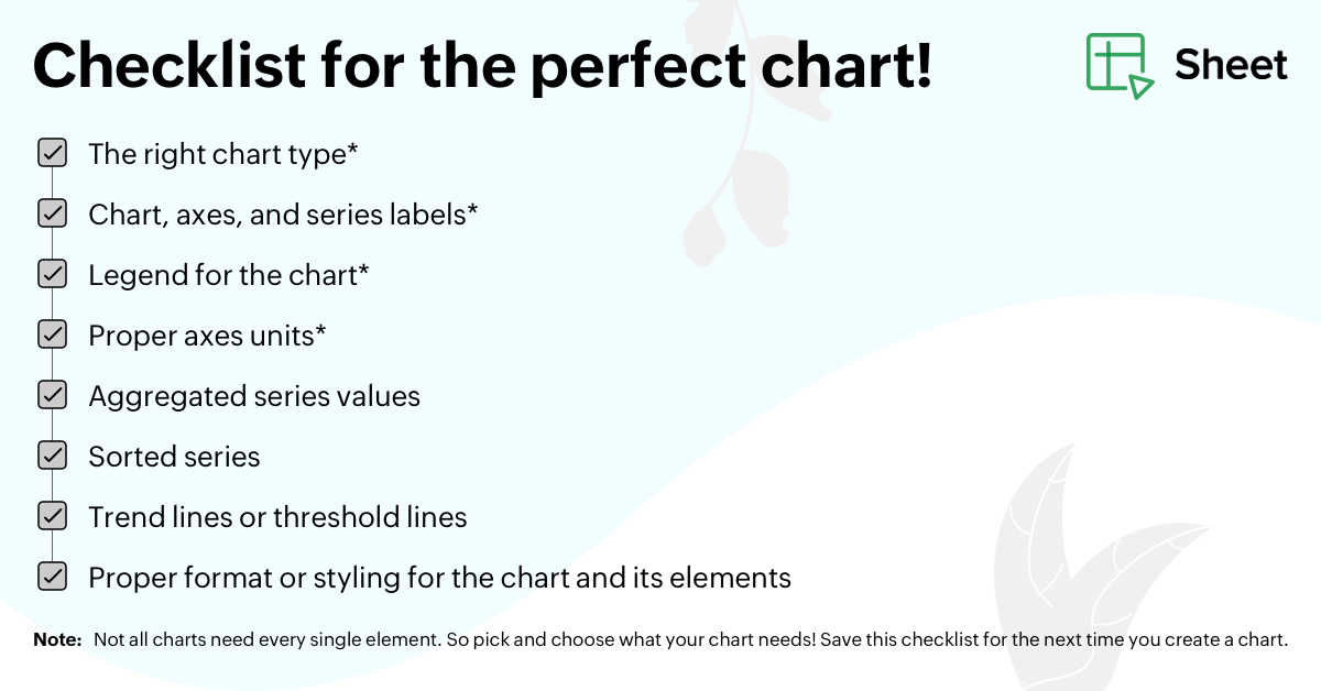
- Pick the right chart type for your data. Not all charts have to be pies and bars.
- Use explanatory chart and series labels.
- Create a legend for the chart.
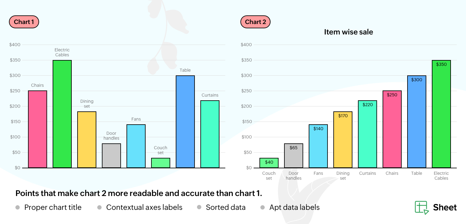
Applying labels, and playing around with their formatting and positioning, can make it easier for an audience to understand what the chart is all about—before even looking at the data.

Axes: Keeping things in line
Most charts are bound by the vertical and horizontal axes. Making them self-explanatory helps you build an easy-to-understand chart. With Zoho Sheet, you can specify the starting point of the vertical axis, the minimum and maximum values the axis will run through, the data interval, scale factor, and number formats.
Data: Decide the "what" and "how"
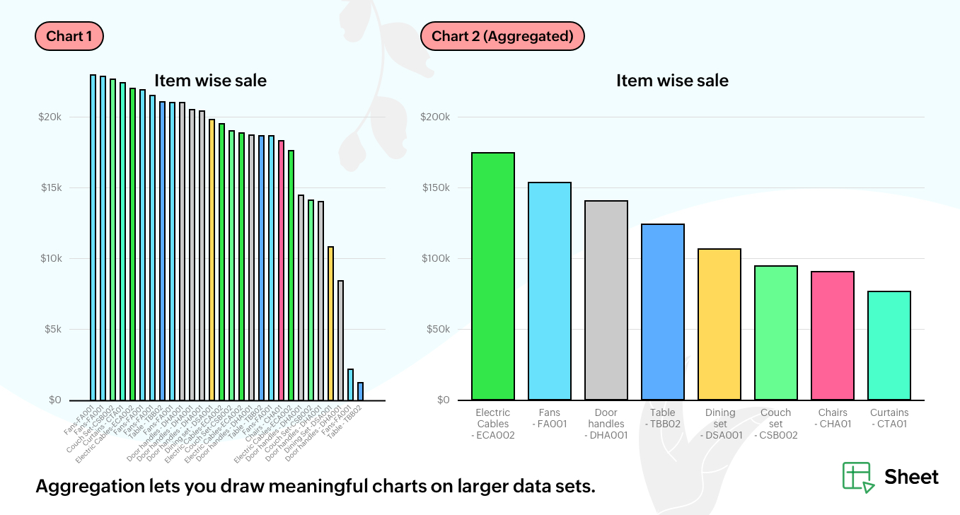
When there's too much data, charts cannot function as concise visual tools. It's always best to keep the data simple, sorted, and aggregated. You can depict just a selected portion of the data, either from the top or the bottom. Zoho Sheet helps you sort chart series from either higher to lower or lower to higher, and aggregate to keep your chart clutter free.

Note: Trend lines and threshold lines can serve as simple, but effective, ways of conveying ancillary information. If you can, try to incorporate them in your charts!
These customizations will ensure that your charts are not only aesthetically pleasing, but highly effective as well. Here's a checklist that you can save for future references.

Topic Participants
Selva Sundaram M
Sticky Posts
Tip #20 - Three things you probably didn't know you can do with picklists
Hello Zoho Sheet users! We’re back with another quick tip to help you make your spreadsheets smarter. Picklists are a great tool to maintain consistency in your spreadsheet. Manually entering data is time-consuming and often leaves typos and irregularTip #18: 6 Trendlines and when to use them in your spreadsheet data?
Charts are a great tool for visualizing and interpreting large chunks of data in spreadsheets. Zoho Sheet offers you 35+ chart options, along with AI-powered chart recommendations based on the data set you select. There are various chart elements thatTip #17: Easily share spreadsheets with non-Zoho account users
With efficient, collaboration-friendly options, Zoho Sheet is a popular choice among users. Sheet's external share links help you collaborate more effectively by sharing your spreadsheets with anyone outside your organization, including users who do notTip #16: Ask Zia your data-related questions and get powerful insights
Zoho Sheet provides a variety of tools and functionalities to help you analyze your data from end to end. But what if you could analyze all your data sets with a single AI-powered tool? Meet Zia, our smart virtual assistant who will answer all your data-relatedTip #7: Four things you didn't know you can do with Conditional Formatting
Conditional formatting helps you highlight and visualize data in your spreadsheet based on provided rules. Zoho Sheet offers three types of conditional formatting: Classic, Color Scales, and Icon Sets. If you're already familiar with how Conditional Formatting works, here are some bonus tips for Classic formats: Customize rules with formulas Zoho Sheet allows you to create personalized rules based on formulas. For example, in a task list you can use customized formulas to highlight tasks which are
Recent Topics
ZOHO Reports are taking longer time to get refresh
Hi Team, Since last few days, I'm facing issues in getting updated reports. For eg: right after making an expense entry or even posting a journal, it is taking longer then expected for the updated reports. Refer below: "You are viewing the report thatInvalid scope choice: Workdrive integration in CRM
Bug: There is an invalid option in the permission choices for Workdrive integration in CRM. If the entry "WorkDrive.teamfolder.CREATE" is selected, it will return a message indicating invalid OAuth scope scope does not exist.How to add line breaks in zoho.cliq.postToUser(...) message?
In a CRM function using Deluge I'm sending this message and attempting to add some line breaks but they are ignored. Is there another way to add these breaks? My message: message: New urgent task\nDescription \nThis is a fake description.\n A new line?Enable Free External Collaboration on Notecards in Zoho Notebook
Hi Zoho Notebook Team, I would like to suggest a feature enhancement regarding external collaboration in Zoho Notebook. Currently, we can share notes with external users, and they are able to view the content without any issue. However, when these externalemailing estimates
Shows up in the customer mail logs as sent but nobody is receiving them, even when I send them to myself I don't get them ??? Something wrong with the mail server or my end ?Powering Customer Support with our women
In Zoho Desk support, women make up 50% of our team. We see this as one of our strengths, reflecting the spirit of this year’s theme, "Give to Gain". Our women find their balance Women carry many responsibilities — they represent frontline support, leadHow to use OR when filtering using two fields
I want to create return a list of Account Names by filtering on Field1 = "yes" OR Field 2 = "no" I can't see how to use the OR in the filter.Mobile phone version not working well
I am working on the Zoho Site Builder. In the preview the desktop version looks okay, but in the mobile phone preview many words are cut off in the weirdest (wrong) way. How can I fix that?Zoho - Please explain difference between Thread view and Conversation view on Ticket
I have reviewed the help document here but am still not clear on the difference between the two views. As an example, I just had a back and forth on a ticket: - Customer emails support email. - I email back from Desk. - Customer responds back. - I email back from Desk. On the upper left drop down box on the ticket Zoho Desk now says this is "4 Threads" and "4 Conversations" . How is that 4 threads?? By my count it is 1 thread and 4 conversations (assuming by "conversation" Zoho means number of totalCan't rename groups on Mac desktop app
I'm working on an up-to-date Mac with a freshly downloaded Notebook app. I'm trying to rename a group within a notebook. Here I have, left to right, a note, a group, and a note. I select the group. On the top left, I select Action. On the dropdown, "Rename"Zoho Forms - Feature Request - Year Field
Hi Zoho Forms Team, You currently have the following date and time fields: Date Time Date and Time Year and Month It would be useful if you could include a "Year" field For example a recent application I completed said "What year was your house built?"I need help to take Reports for tickets moved between departments.
Hi, I need help to take Reports for tickets moved between different departments. Pls guide ShyamExport to excel stored amounts as text instead of numbers or accounting
Good Afternoon, We have a quarterly billing report that we generate from our Requests. It exports to excel. However if we need to add a formula (something as simple as a sum of the column), it doesn't read the dollar amounts because the export storesIncrease Round Robin Scheduler Frequency in Zoho Desk
Dear Zoho Desk Team, We hope this message finds you well. We would like to request an enhancement to the Round Robin Scheduler in Zoho Desk to better address ticket assignment efficiency. Current Behavior At present, the Round Robin Scheduler operatesAutomation #6 - Prevent Re-opening of Closed Tickets
This is a monthly series where we pick some common use cases that have been either discussed or most asked about in our community and explain how they can be achieved using one of the automation capabilities in Zoho Desk. Typically when a customer submitsZoho Desk EU slow/unresponsive
Has anyone else got issues with ZohoDesk today in the EU? It takes an age to come back and if you do start typing something and try and send or save it looks like it times out. We are also getting this pic. ot I can't see anything on https://status.zoho.eu/EU DC Partial Outage Resolved: A Detailed RCA
Incident Summary Due to an overload on one of the nodes in the EU DC for Zoho Desk, the system was unable to handle the heavy load, causing a slowdown in requests and resulting in a partial outage for customers with data residing in that node. On MayUse Zoho Creator as a source for merge templates in Zoho Writer
Hello all! We're excited to share that we've enhanced Zoho Creator's integration with Zoho Writer to make this combination even more powerful. You can now use Zoho Creator as a data source for mail merge templates in Zoho Writer. Making more data fromPerfomance Management - Zoho People
Hi team, I am looking for performance management data such as KRA, goals, feedback, appraisals, etc., in Zoho Analytics. However, I am unable to find these metrics while editing the setup. Could you please confirm whether these fields are available inDeprecation of the Zoho OAuth connector
Hello everyone, At Zoho, we continuously evaluate our integrations to ensure they meet the highest standards of security, reliability, and compliance. As part of these ongoing efforts, we've made the decision to deprecate the Zoho OAuth default connectorGood news! Calendar in Zoho CRM gets a face lift
Dear Customers, We are delighted to unveil the revamped calendar UI in Zoho CRM. With a complete visual overhaul aligned with CRM for Everyone, the calendar now offers a more intuitive and flexible scheduling experience. What’s new? Distinguish activitiesZoho Mail iOS app update: Display recipient's nickname on contact suggestion
Hello everyone! In the most recent version(v3.3.1) of the Zoho Mail iOS app update we have brought in support to display recipient's nickname in contacts suggestion. Please update the app to the latest version directly from the App Store or using theDigest Février - Un résumé de ce qui s'est passé le mois dernier sur Community
Bonjour chers utilisateurs, Le 26 février, nous avons organisé notre première session Ask the Expert de 2026. Nous sommes heureux de partager que ce fut une session très interactive, avec de nombreuses questions intéressantes posées par nos clients. SiZoho CRM Case Notes - Share to Customer
Hi team does anyone know the Api to set a note, against a case, to shared with customer? i cant seem to find it cheersZoho Forms - Feature Request - Past Into Scanning/OCR Field
Hi Zoho Forms Team, You recently introduced the OCR/Scanning field which I have found great use for with one client who receives work orders as a screenshot from one customer. I want to raise a feature request here which would make that field even moreSynching changes to Stripe when changes are made in Zoho Billing
We have a situation where we have merged customers in Zoho BIlling and then found out later that the payment in Stripe was not updated and still associated with the old customer record. The card gets updated and billed, but that payment is still associatedSend out follow-up email in the same thread (threaded conversations in individual emails) from Zoho CRM
Hi, I'm new to Zoho. I'm trying to send individual emails to my leads one by one. And I'll send out follow up email if I don't hear back from them later. However, instead of sending a new email, I want to reply in the same email thread so that the recipientsDepositing funds to account
Hello, I have been using Quickbooks for many years but am considering moving to Zoho Books so I am currently running through various workflows and am working on the Invoicing aspect. In QB, the process is to create an invoice, receive payment and thenIs Zoho Sites still actively being developed?
Hello, Is Zoho Sites still actively being developed as part of the Zoho ecosystem? I noticed that the What's New page (https://www.zoho.com/sites/whats-new.html) does not show any updates since Q1 2025. We were considering migrating our website from SquarespaceFSM integration with Books
Hi, I have spent a few months working with FSM and have come across a critical gap in the functionality, which I find almost shocking....either that, or I am an idiot. The lack of bi-directional sync between Books and FSM on Sales Orders/ Work Ordersweb to lead
Can anyone help me how to create web to lead from zoho marketing automationIntroducing Workqueue: your all-in-one view to manage daily work
Hello all, We’re excited to introduce a major productivity boost to your CRM experience: Workqueue, a dynamic, all-in-one workspace that brings every important sales activity, approval, and follow-up right to your fingertips. What is Workqueue? SalesUI issue with Organize Tabs
When looking at the organize Tabs window (bellow) you can see that some tabs are grayed out. there is also a "Add Module/Web Tab" button. When looking at this screen it's clear that the grayed out tabs can not be removed from the portal user's screenI created a signup form in Zoho Marketing Automation with the correct field mapping, but the data is not being reflected under Leads in Zoho CRM.
web to lead from zoho marketing automationPasted Images not being embedded in custom mail
Hi, I'm making a custom report by email based on commentaries. I have the email ready, all working great except for images that are being pasted in the commentaries. Zoho deals with them as temp images and so it requires authentication to view them, somethingKaizen #232 - Building a Ticket Escalation Mechanism from Zoho CRM
Howdy, Tech Wizards! Picking up the thread from last week, we will continue our Zoho CRM and Zoho Desk integration. In Kaizen #231 - Embedding Zoho Desk Tickets in Zoho CRM, we built a Related List widget that displays open Zoho Desk tickets within theInactive License for free account.
I recently upgraded my Cliq subscription not my team (on the free version), are unable to login to their accounts. The error message received is Inactive License Looks like you have not been covered under the current free plan of users. Please contactDeluge scripts
Why is there not a search function to make it easier to find the script of interest when modifications are required.Zoho Sheet for Desktop
Does Zoho plans to develop a Desktop version of Sheet that installs on the computer like was done with Writer?Zoho Books (and other Finance Suite Apps) - Clickable Item Name on Invoices and Reports
Hi Zoho Books team, It would be really helpful if the Item Name on Reports were clicable to take me to the item. The same on Invoices, often I am looking at an invoice and I want to look at the deails of a product. A link here would be helpful to jumpNext Page