Visualize your data with a new set of charts: Treemap, Butterfly, Sankey, and Cluster charts in Zoho CRM
Dear customers,
When it comes to analytics, it's not just about the numbers; it's about understanding the story behind them.
With that philosophy in mind, we’re excited to introduce a line of representations to the existing array of chart types in Zoho CRM: Treemap, butterfly, sankey and cluster charts. Let's go!
Treemaps
Treemap charts are used to visually represent hierarchical datasets in a rectangular layout. It aligns its parent categories as larger tiles with their sub-categories nested within them. The size of each tile is proportional to its corresponding value, making it easy to compare different segments within the hierarchy.
This is how a treemap chart looks:

These structured data representations help you understand overall performance and contributions, as well as compare participating entities at a glance.
Unlike traditional bar charts or pie charts, treemaps can be used if your datasets are large and exhibit parent-child relationships.
Here are some examples to better understand their usage:
Comparing revenue distribution between functions
A company's revenue is distributed among its functions before it gets further disbursed to its employees. Treemap charts can be used to depict this distribution and compare it between functions. As you can see below, the hierarchy can be represented as a treemap to compare it directly with other functions:

The hierarchy at the top shows just the numbers and levels, but the treemap chart represents the numbers proportionally, allowing leaders to visualize the difference in distribution.
Interpretation: As you can easily see in the treemap, sales and marketing receive the same amount of revenue, while engineering is given significantly more than the other two.
Likewise, with treemap charts, you can:
- Compare popular lead sources with lead counts is the measure and lead source being the participating entity—a classic single-grouping configuration.
- View cost savings achieved across departments. With the departments as the grouping parameters and the cost saved as the measured amount, the chart lays out all the departments as tiles in proportion, based on money saved.
- Compare ad spends across channels, where channels are the parent grouping and ad spend is the measured unit.
Butterfly
Butterfly charts are used to compare two related datasets side-by-side, resulting in a representation that looks like a butterfly or tornado.
Now, how does it differ from bar charts?
The standard bar chart can compare two entities for a given measure. Say, you are comparing the performance of Mary and Charles. The two users' data is represented using bars, and the length will denote their performances. But, when it comes to comparing their performances over a period or their contribution across different stages, a bar chart is not sufficient.


With butterfly charts, you can:
- Compare revenue between two of your branches each month. With branches being compared for sum of sales revenue, grouped by closing date.
- Compare the performance of two reps in a given quarter. Compared between two users for average of amount of deals, grouped by closing date until today.
In addition to the user-based comparison above, butterfly charts are well-suited to visualizing other types of data comparisons, like:
- Picklist-based comparisons
- Duration-based comparisons
- Aggregate-based comparisons
Business scenario
Comparing the number of deals closed for each lead sources: Duration-based comparison
You can identify the productive lead source by comparing the number of deal closures for every lead source in your organization based on their closing week.

Analyzing effective sales methodology, inbound vs. outbound: Picklist-based comparison
Businesses use both inbound and outbound lead generation strategies, and each of these methods can reap different results based on the season and occasion. By comparing inbound versus outbound each month, you can identify which works best at what time.

Analyze the amount versus the expected revenue between accounts: Aggregate-based comparison
Expected revenue is a result of a deal's progression in the sales pipeline. Comparing the amount versus their expected revenue will not only help visualize the expected revenue of participating accounts but also indicate the accounts' stage in the sales pipeline.

Sankey
A Sankey Chart is designed to visualize the movement of data across different data groups. Unlike traditional charts—such as bar, column, pie, or donut—that mainly provide a static distribution of values, the Sankey Chart focuses on illustrating the flow between multiple segments or grouping fields. This makes it an ideal choice when you want to track how values (like lead counts, revenue, or deal statuses) move from one category to the next.

Key features
- Flow visualization: With the Sankey Chart, you can observe the movement of data between different groups.
- Multiple grouping fields: This chart works best when you have at least two grouping fields. You can go even further and add a third grouping to see an even more detailed mapping of your data flow.
- Simple configuration: The configuration for the Sankey Chart is as simple as any other chart type in Analytics.
Business scenarios:
Imagine you’re a sales manager trying to get a better handle on your team’s performance and your company’s pipeline. You want to understand not just how many deals are coming in, but also which sources are contributing the most value—and how those deals are progressing through different sales stages.
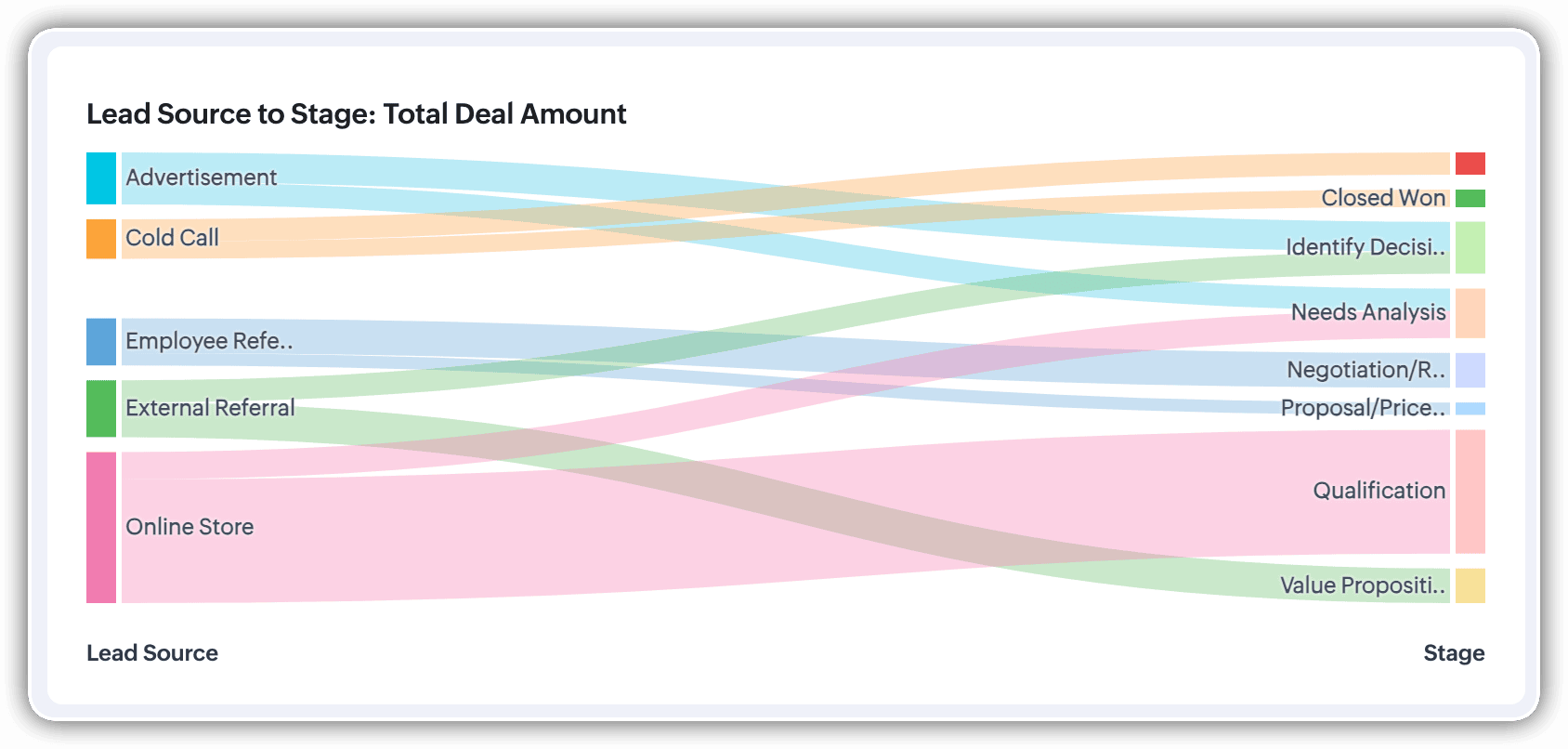
Let’s say you want to understand which lead sources are driving the most deal activity and how those deals progress through the pipeline. You can create a Sankey chart that maps the count of deals from Lead Source to Stage.

After analyzing the chart, you might notice that Online Store brings in a high volume of early-stage deals, while sources like External Referral contribute fewer deals that are more likely to reach advanced stages like Proposal or Negotiation.
This insight helps you prioritize nurturing the most profitable channels.
Sankey charts can also be helpful in other operational scenarios where understanding transitions across stages or teams is essential:
- Regional revenue distribution: Visualize how revenue flows across different regions, product categories, and their corresponding annual revenue. This helps you compare which regions contribute the most to each product line and where your high-value segments lie.
- Ticket handling flow: Visualize the flow of support tickets from their origin channel to internal departments and finally to resolution statuses. This can reveal workload imbalances or common points of delay in your support process.
Cluster
A cluster chart is similar to stacked column charts, but instead of stacking horizontally, the data is represented as vertical bars. As you create a column chart with multiple groupings, you can change the type of column chart to a cluster chart to achieve this representation.

In the above image, you can see the stacked column chart compares the number of lead conversions based on popular sources between countries. The stacks appearing on top of existing stacks ask you to calibrate the record count (y-axis) based on the previous stacks, which can lead to inaccurate interpretations. In this case, a cluster representation will paint a clearer picture of the analyses.
Other minor enhancements:
In addition to the three charts we mentioned above, we've also made the following minor changes:
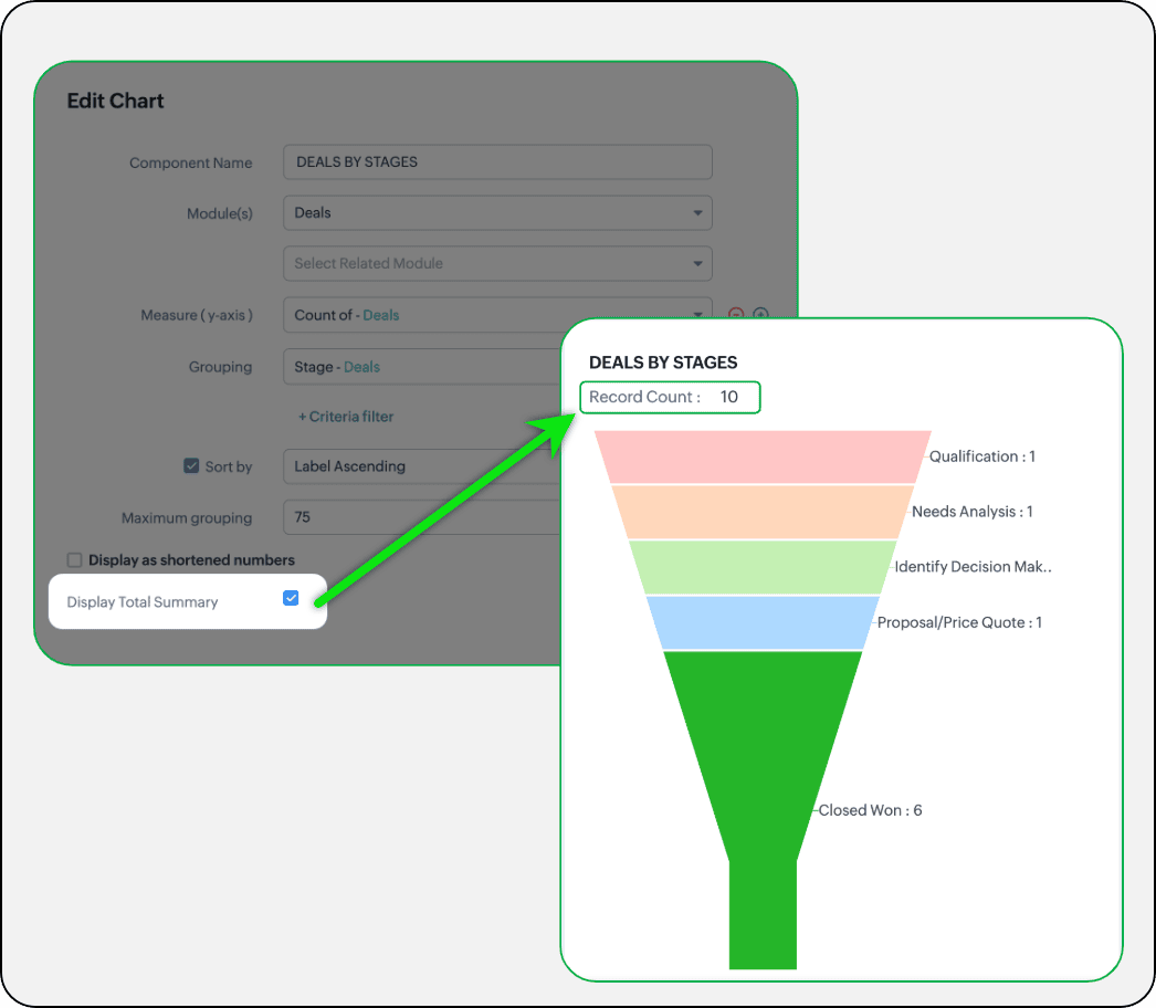
- Display total summary: Thus far, for all charts, each participating measure included labels. Now, to better understand overall contributions, a check box to display the total summary is provided under More options on the Chart Configuration page. Based on the configuration, the total revenue or the rolled-up quantities will be prominently displayed.
- Merge Y-axis: For charts that use two y-axis measurements, the intention is to view the progression of one entity against these two measures. Despite the scale, if the y-axis on the left is disproportionate to the values of the y-axis on the right, the plotted graph will result in a graphically and logically incorrect representation.
As you can see in the image below, the plot area of the sum of amount bar and the sum of expected revenue aligns close together, while, the difference between $700,000 and $40,500 is drastic, creating inaccurate interpretations.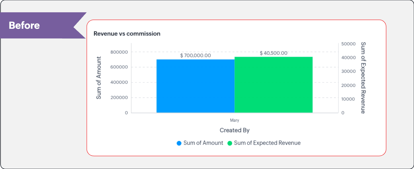
In this enhancement, we're allowing neighboring values of measures to merge so that the interpretation can be more visually accurate.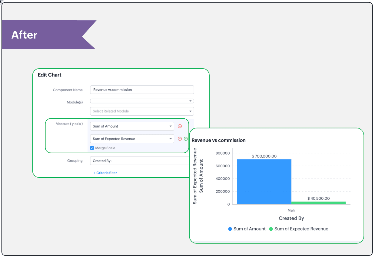
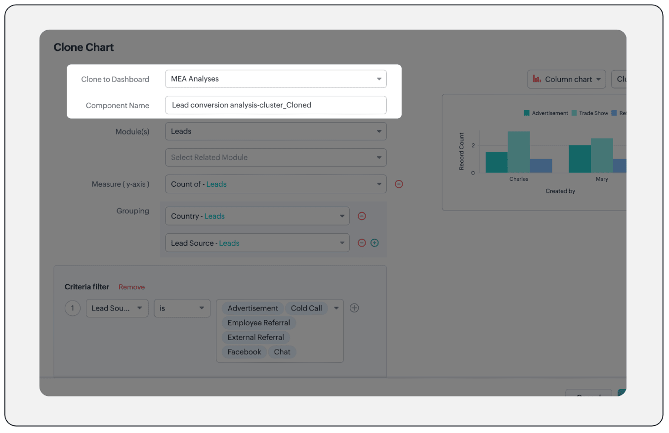
- Clone components to a different dashboard: Dashboards in Analytics serve in unique ways for various audiences—there can be separate dashboards for the sales team, marketing team, engineering team, and so on, and the chances of using the same measure for reference is common. Thus, when you clone a chart, you can now determine the target dashboard in which the cloned chart can be placed.
Resource: Help document
Thanks and have a good one!
Kind regards,
Saranya Balasubramanian
Saranya Balasubramanian
Topic Participants
Saranya Balasubramanian
Sticky Posts
Good news! Calendar in Zoho CRM gets a face lift
Dear Customers, We are delighted to unveil the revamped calendar UI in Zoho CRM. With a complete visual overhaul aligned with CRM for Everyone, the calendar now offers a more intuitive and flexible scheduling experience. What’s new? Distinguish activitiesConsumers are talking about your business. Are you listening?👂
A loyal customer might be praising your product in a forum. A frustrated user could be posting a harsh review on a public site. An excited partner may have left a comment on your campaign. A domain expert might be deconstructing your product. A prospectEnhancements to the formula field in Zoho CRM: Auto-refresh formulas with the "Now" function, stop formula executions based on criteria, and include formulas within formulas
Dear Customers, We hope you're well! By their nature, modern businesses rely every day on computations, whether it's to calculate the price of a product, assess ROI, evaluate the lifetime value of a customer, or even determine the age of a record. WithElevate your CX delivery using CommandCenter 2.0: Simplified builder; seamless orchestration
Most businesses want to create memorable customer experiences—but they often find it hard to keep them smooth, especially as they grow. To achieve a state of flow across their processes, teams often stitch together a series of automations using WorkflowPresenting ABM for Zoho CRM: Expand and retain your customers with precision
Picture this scenario: You're a growing SaaS company ready to launch a powerful business suite, and are looking to gain traction and momentum. But as a business with a tight budget, you know acquiring new customers is slow, expensive, and often delivers
Recent Topics
Email task creator when task is updated/marked complete
I am looking for a way to notify the creator of a task in zoho todo when - Task is updated Task is closed Comments entered 1 and 2 are critical, and I cannot find a zoho flow to do this. There is no way that as a manager I will know when someone has completedHow to move emails to Shared Mailbox?
Hello, I created a Shred Mailbox instead of using a distribution group. But I cannot move previous emails to certain shared mailbox. Is it possible move some emails from inbox to shared mailbox?How to implement new online payment gateway?
Hello, Can you tell me how to proceed to implement my local payment gateway? DIBS has an open avaiable API that should be easy to implement into ZOHO BOOKS. http://tech.dibspayment.com/dibs_payment_windowZoho CRM - Portal Users Edit Their Own Account Information
Hi Community, I'm working on a client portal and it seems like the only I can make the Account record editable to the Contact, is if I add another lookup on the Account to the Contact record. Am I missing something as the account already has a list ofI’ve noticed that Zoho Sheet currently doesn’t have a feature similar to the QUERY formula in Google Sheets or Power Query in Microsoft Excel.
These tools are extremely helpful for: Filtering and extracting data using simple SQL-like queries Combining or transforming data from multiple sheets or tables Creating dynamic reports without using complex formulas Having a Query-like function in ZohoConnecting Zoho Mail with Apollo.io
Hi, I am trying to connect my Zoho Mail account with my Apollo.io account to start sending cold email for prospecting purposes. I have activated the IMAP setting but I am still unable to connect to the Apollo account. I am using my email credentials butWhere does this report come from in the Zoho One ecosystems?
Is this directly from MA, Analytics or ??? ???Contact's title in "Contact Role Mapping"
When I'm creating a deal, I'd like to see the contacts title in the listing. Right now, I only see this: How can I get the contact's title in there?Zoho CRM - Client Portal - Hide Notes Related List
Hi Community, I'm building a customer portal and I can't find a way to hide the notes related list. I don't want the client to see the notes I have about them. Is there a way to do this as it is no bin/trash icon when I hover over."Pivot Table" Conditional Formatting
Team, I there a way to use conditional formatting a "Pivot Table" report? Thanks, Arron Blue Pumpkin Hosting | Solutions Made SimpleHow many clients can be added to Zoho Practice?
How many clients can be added to Zoho Practice without having their zoho app?Stage History
when viewing a ticket , and you look at stage history tab (kanban view) and look at the stage duration column in days, it shows the current stage of the ticket as " current stage ". Should it not rather show the amount of days it has been in that currentSend Automated WhatsApp Messages and Leverage the Improved WhatsApp Templates
Greetings, I hope all of you are doing well. We're excited to announce a major upgrade to Bigin's WhatsApp integration that brings more flexibility, interactivity, and automation to your customer messaging. WhatsApp message automation You can now useAutomating Ticket Responses Using Zoho Desk's AI Features
We’re looking to set up an automation within Zoho Desk that can analyze incoming emails or tickets and automatically respond with relevant knowledge base articles based on the content of the request. Could you please guide us on how to configure thisOptimising CRM-Projects workflows to manage requests, using Forms as an intermediary
Is it possible to create a workflow between three apps with traceability between them all? We send information from Zoho CRM Deals over to Zoho Projects for project management and execution. We have used a lookup of sorts to create tasks in the past,Service locations are tied to contacts?
Trying the system out. And what I discovered is that it seems that the whole logic of the app is, I'd say, backwards. There is a Customer - a company. The company has contact persons and service locations can be associated with different contact persons.Enhancements to Zoho Maps integration tasks
Hello everyone, We're excited to announce enhancements to the Zoho Maps integration tasks in Deluge, which will boost its performance. This post will walk you through the upcoming changes, explain why we're making them, and detail the steps you need toBug in Total Hour Calculation in Regularization for past dates
There is a bug in Zoho People Regularization For example today is the date is 10 if I choose a previous Date like 9 and add the Check in and Check out time The total hours aren't calculated properly, in the example the check in time is 10:40 AM checkCliq iOS can't see shared screen
Hello, I had this morning a video call with a colleague. She is using Cliq Desktop MacOS and wanted to share her screen with me. I'm on iPad. I noticed, while she shared her screen, I could only see her video, but not the shared screen... Does Cliq iOS is able to display shared screen, or is it somewhere else to be found ? RegardsUPS Label size when generated via Zoho
We've integrated UPS with Zoho inventory. When creating and downloading the shipping labels they are created in a larger paper size. I'd like them to be generated to print on a 4x6 printer. Zoho have told me I need to do this within our UPS portal. UPSNarrative 12: Sandbox - Testing without the risk
Behind the scenes of a successful ticketing system: BTS Series Narrative 12: Sandbox - Testing without the risk What is a sandbox environment? A sandbox environment is a virtual playground that allows you to test freely and experiment with various elementsDynamically catching new file creations
I have a team folder with many subfolders, and in those folders we add new documents all the time. I'd like to have a workflow or script to notify me (and then take other actions) when a file is added anywhere in that structure that ends in "summary.txt".Announcing new features in Trident for Mac (1.27.0)
Hello everyone! Trident for macOS (v1.27.0) is here with new features and enhancements to improve scheduling and managing your calendar events. Let's take a quick look at them. Stay aligned across time zones. Both the scheduled and original time zonesBranding of native system emails
Make system emails adjustable in terms of branding. We want our system to be completely white label, because it is not a CRM anymore, it's way more than that. We are following the strategy of "CRM for everyone" to use the CRM in all departments, not onlySlow uploads of large files
I'm wanting to use Workdrive for transferring large images and video (we're talking things from 100MB-5GB). I'm running solo on a 500MBit/sec fiber connection. I'm getting upload speeds to Workdrive of no more than about 1-3Mbytes/sec when going throughNotes of Tasks in Zoho CRM
Hello, Is there a way to filter the Notes that appear on a Task to only show the notes related to that specific Task and not display all the Notes of the objects related to that Task (Accounts, Contacts, Deal, etc). In essence, our team struggles to understandMigrate Your Notes from OneNote to Zoho Notebook Today
Greetings Notebook Users, We’re excited to introduce a powerful new feature that lets you migrate your notes from Microsoft OneNote to Zoho Notebook—making your transition faster and more seamless than ever. ✨ What’s New One-click migration: Easily importneed to upload from airtable to google drive
I have a zapier zap that automates between airtable and google drive. When a customer uploads a new file into airtable via a client portal interface, zapier uploads that file into a folder linked to that customer's project record. I need to replicateCan't delete functions that are associated with deleted workflow rules
We have a handful of functions that were once associated with a workflow rule, but the rule has been deleted. The function still thinks it is associated so I can't assign it to a new rule. It is starting to get really messy because we have a list of functionsDefault Sorting on Related Lists
Is it possible to set the default sorting options on the related lists. For example on the Contact Details view I have related lists for activities, emails, products cases, notes etc... currently: Activities 'created date' newest first Emails - 'createdCredit Management: #1 Credit You Owe vs Credits Owed to the Business
Think about the last time you ordered food online. You might have paid in advance through your card, but you received a $20 refund because your order got delayed or cancelled. In most apps, refunds don't go into the bank account directly; instead, they'reTip #46- Turn Every Session into an Insight with Zoho Assist survey report- 'Insider Insights'
Delivering exceptional remote support isn’t just about resolving issues, it’s about understanding how both customers and technicians experience each session. That’s where Survey Report in Zoho Assist come in. You can configure and customize survey questionsEnhancing Zia's service with better contextual responses and article generation
Hello everyone, We are enhancing Zia's Generative AI service to make your support experience smarter. Here's how: Increased accuracy with Qwen One of the key challenges in AI is delivering responses that are both contextually accurate and empathetic whileAllow the usage of Multi-Select fields as the primary field on "Layout Rules"
We want to force our users to enter some explanation strings when a multi-select field has been utilized. I can't understand the reason for the usage restriction of Multi-Select fields as a primary field. This is a simple "Display hidden mandatory fieldCRM/Bookings integration edits Contact names
Hi there, I've installed the extension that connects Zoho CRM and Zoho Bookings. When we get a new appointment from Bookings from an existing Contact, that Contact's record shows this: First Name was updated from asd to blank value Last Name was updatedDomain Change
“Please update my Email-in domain from @biginmail.biginmail.in to @biginmail.zoho.com. Messages to the .in domain are bouncing.”Webhooks Limit Exceeded
Today, I received an error message saying, 'Total number of Webhook call exceeded', but when I look at Manage > Billing, it doesn't look like any of my invokeURL calls are being logged. Following the advice from this thread: https://help.zoho.com/portal/en/community/topic/webhooks-daily-limits-in-zoho-creatorOption to block bookings from specific email address or ip adresss in zoho booking
Sometime few of our client keep booking irrelevant booking service just to resolve their queries and they keep booking it again and again whenever they have queries. Currently its disturbing our current communication process and hierarchy which we haveAuto select option in CRM after Zoho Form merge
Hi, I have a dropdown field in Zoho CRM that is filled with a Zoho Form. The data is filled but not automatically shown. After selecting the right value in the dropdown the information a second field is shown. So the question is; how can I make the dropdownスマホでキャンペンメールを見ると正しく表示されない
キャンペーンのメール(HTML)を作成しましたが、スマホ表示に切り替えると正しく表示されません(添付参照)過去に作成したキャンペーンでは特に意識してませんでしたが、問題なく表示されていたようです。うまく表示される場合とされない場合の違いは何でしょうか?Next Page