Introducing Data Bars: Graphically represent changes in data within the cells
Conditional formatting has helped millions of spreadsheet users analyze and highlight their data more efficiently. In addition to the classic rules, color scales, and icon sets available in Zoho Sheet, you can now apply Data Bars, a convenient method of visually analyzing the values in a cell range.
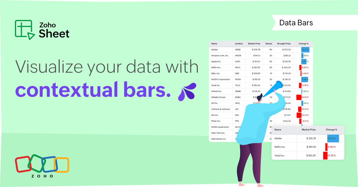
What are Data Bars?
Data Bars are cell-level bars that can be used to visually represent the position of a value in a given range, with longer bars representing higher values. This helps users summarize data sets at a glance. Let's say you have a monthly sales report and wish to see which months have the highest and lowest sales figures. Find these results in an instant using Data Bars!
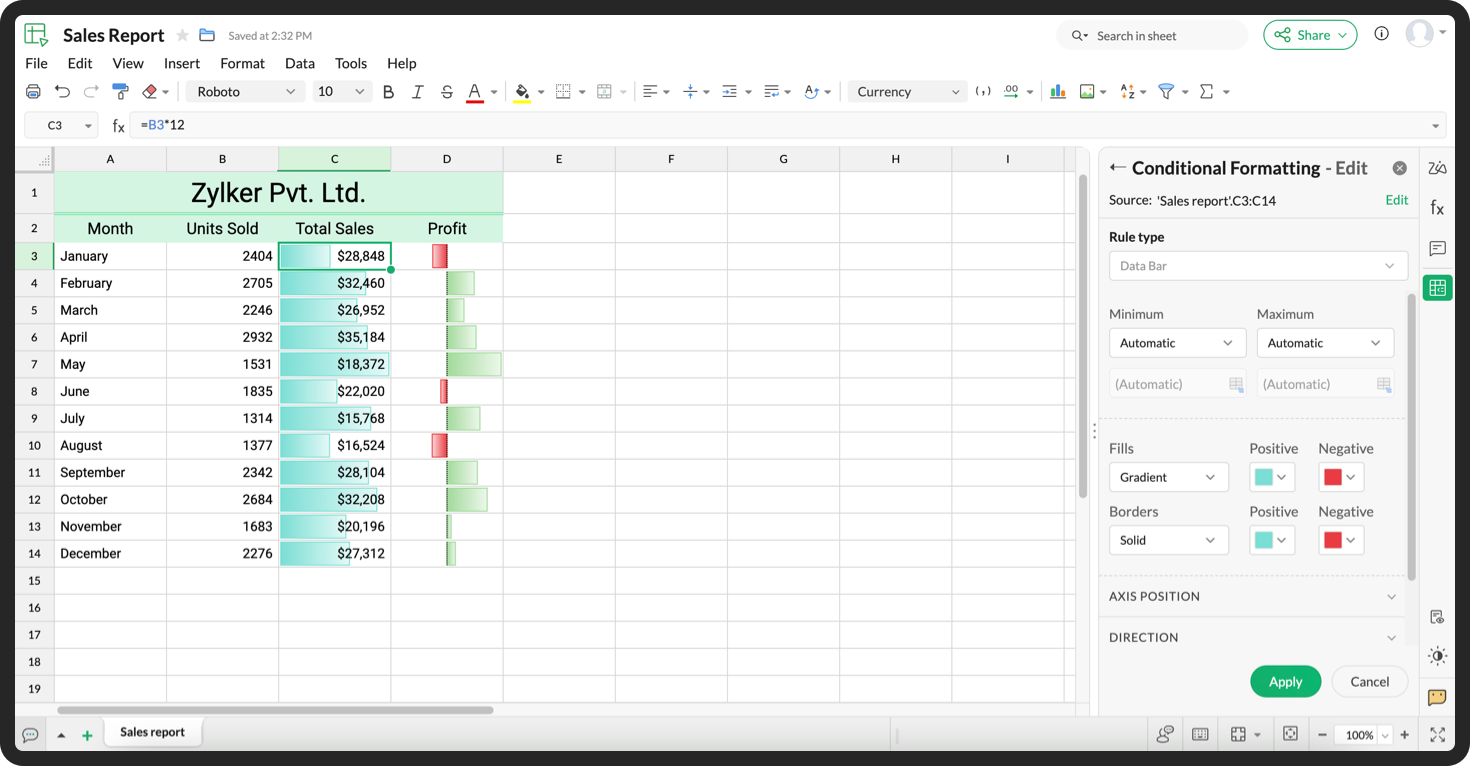
Customizations
Customize your data bars, by adjusting the border, color, and gradient of your bars. You can also choose the direction of the bars and the axis position in the cell, and hide cell content so that only your bars are displayed.
You can also use Data Bars in combination with other conditional formats, like color scales, to analyze your data. Not sure how to get started? Zia now offers suggestions on conditional formatting too!
Read more
Topic Participants
Jaya Shankari S
Aashok Kumar Sharma
Murugalakshmi S
Sticky Posts
What's new in Zoho Sheet: Simplify data entry and collaboration
Hello, Zoho Sheet community! Last year, our team was focused on research and development so we could deliver updates that enhance your spreadsheet experience. This year, we’re excited to deliver those enhancements—but we'll be rolling them out incrementallyNew Features: Repeat Last Action, Insert Cut/Copied Rows/Columns and Hyperlink
You might have noticed the constant updates to Zoho Sheet of late. Here are 3 more features that have been added to Zoho Sheet recently: F4 - Repeat Last Action Insert Cut/Copied Rows and Columns Insert Hyperlink Here is a screen cast demonstrating each of these features. Read further below to learn more about these new features. F4 - Repeat Last Action: You can now repeat the last action you made on your spreadsheet by using the keyboard shortcut, F4. It is quite handy and helps you get your workIntroducing Forms in Zoho Sheet
We hereby bring you the power of forms in Zoho Sheet. Now, build and create your own customized forms using Zoho Sheet. Be it compiling a questionnaire or rolling out a survey, Zoho Sheet can do it all for you. Forms is an excellent feature that helps you collect information in the simplest of ways and having it in Zoho Sheet takes it a notch higher. Build Simple yet Powerful forms Building forms using Zoho Sheet is fairly simple. The exclusive 'Form' tab lets you create one quickly. Whether youSlicers are now available in Zoho Sheet—filter your data interactively
At Zoho Sheet, we diligently track user requests and feedback. In line with this, based on extensive user requests, we've integrated Slicers to pivot tables and are delighted to announce its release. Slicers are interactive visual filters that have add,Introducing Data Bars: Graphically represent changes in data within the cells
Conditional formatting has helped millions of spreadsheet users analyze and highlight their data more efficiently. In addition to the classic rules, color scales, and icon sets available in Zoho Sheet, you can now apply Data Bars, a convenient method
Nederlandse Hulpbronnen

Recent Topics
Updation of Old Browsers Versions for Zoho CRM
We have upgraded the default browser version for CRM to facilitate features like widgets and scripts that are often implemented aside from advanced functionalities for various business requirements. The latest version is aimed to provide better performanceProject-Based Inventory Consumption and Proforma Invoice in Zoho ERP
While working with customers across different industries, we have identified a few functional questions and gaps that commonly arise—especially for project-based and service-oriented businesses. Many organizations, such as those in shipping, construction,Zoho Desk domain Mapping not Working Showing CNAME Error
I have created the subdomain and created the Cname as well as its instracted on the Zoho website but when i try add the domain on help desk its showing error msg : Make sure you've mapped the CNAME entry and linked it to desk.cs.zohohost.com.au on yourFounders using Zoho — are you leveraging Zoho Campaigns + Zoho Social for thought leadership… or just sending emails?
I’ve noticed something interesting in the Zoho ecosystem. Many founders use Zoho Campaigns and Zoho Social for basic marketing—newsletters, scheduled posts, and announcements. But very few are using these tools strategically to: • Position themselvesI have the item field and Quantity field in the sub form , on the submit of the form if the quantity is grater than inventory means show alert on submit validation only for item type goods ,
I have the item field and Quantity field in the sub form , on the submit of the form if the quantity is grater than inventory means show alert on submit validation . Stock Check Validation only for item type goods , not for item type service . For theIMAP stopped working after enabling 2 factor authentication
IMAP stopped working after enabling 2 factor authentication. Is there any solution for this?Rename Service Report
Some of our customers are requesting the name of the service report PDF to be in a specific format, for example, instead of REP-001.PDF some are requesting to include their name like customername.pdf. is that possible?Approvals in Zoho Creator
Hi, This is Surya, in one of my creator application I have a form called job posting, and I created an approval process for that form. When a user submits that form the record directly adding to that form's report, even it is in the review for approval.Outgoing emails rejected due to SpamCop RBL listing (IP 136.143.188.12)
Hi All, I am writing to report a deliverability issue affecting outgoing emails from my Zoho Mail account. Recently, several messages sent from my domain (example.com) to external recipients have been rejected with the following error message (redactedIntroducing Workqueue: your all-in-one view to manage daily work
Hello all, We’re excited to introduce a major productivity boost to your CRM experience: Workqueue, a dynamic, all-in-one workspace that brings every important sales activity, approval, and follow-up right to your fingertips. What is Workqueue? SalesShare Record Ownership in Zoho Recruit
We’re introducing User Fields in Zoho Recruit designed to make collaboration easier when multiple team members need to work on the same record. With User Fields, you can extend record ownership beyond a single user and enable smoother teamwork acrossRecherche d'un développeur
Bonjour, j'ai un projet de SAAS sur une base de zoho créator et zoho CRM et je recherche un développeur qualifié français pour créer l'application créator (fonctionnel et graphique) et les workflow et blueprint de CRMAPI to Apply Retainer invoice payment to Invoice
Hi Team, I could not find API to apply the Retainer invoice payment to existing Invoice. Can you please help ? Attaching the screenshotDisplay actual mileage on an invoice
My users are creating expenses in Zoho expense. For example, they expense 10 miles and get paid 7 dollars (10 miles * IRS rate of .70). If I look at the expenses in Zoho Books, it does show them at 10 miles at .70 cent When I add these expense to an invoiceCustomer Parent Account or Sub-Customer Account
Some of clients as they have 50 to 300 branches, they required separate account statement with outlet name and number; which means we have to open new account for each branch individually. However, the main issue is that, when they make a payment, theyCloning a Pick List
I have an existing Pick List in my Contacts that I want to drop into my Leads. Is there a way to copy or clone the field with it's accompanying Pick List? Thanks for your time.How do I link my invoice to an estimate?
There has been instances where I have created estimates, however, invoices for the same estimate were created independently. The status of these estimates hasn't converted to 'invoiced'.I wish to upload 40000 Resumes in Zoho Recruit Database. Can I do this in batch of 1000 Resumes ?
I would like to upload thousand or few hundred of resumes in Zoho Recruit in one go. Please let me know how can I do this Or migrate my 40000 resumes from previous ATS to Zoho Recruit.Zoho Writer for Proposals
Hi, one of the things we've struggled with since moving to Zoho ecosystem is our proposal software Qwilr does not integrate well. It surprises me Zoho doesn't have proposal software but given all the capabilities of Zoho Writer, I'm wonder if anyone isCustom Fonts in Zoho CRM Template Builder
Hi, I am currently creating a new template for our quotes using the Zoho CRM template builder. However, I noticed that there is no option to add custom fonts to the template builder. It would greatly enhance the flexibility and branding capabilities ifHow do I edit the Calendar Invite notifications for Interviews in Recruit?
I'm setting up the Zoho Recruit Interview Calendar system but there's some notifications I don't have any control over. I've turned off all Workflows and Automations related to the Calendar Scheduling and it seems that it's the notification that is sentFoutmelding bij uitvoering/opslaan functie 'Left expression is of type TEXT and right expression is of type NUMBER'
Hoi! Ik heb een workflow (zie bijlage) die wordt getriggerd zodra de verwachte weekomzet van een bedrijf wordt aangepast naar een bedrag hoger dan 0. Op dat moment moet een functie (zie bijlage) gaan berekenen wat het benodigde kredietlimiet moet zijn.Hoe kun je Nederlandse loonstroken boek in Zoho Books?
Beste Community, Heeft er iemand een idee hoe je standaard loonstroken kunt inboeken in Zoho Books? Ik ben benieuwd hoe jullie dit doen en wat de mogelijkheden zijn.Unable to Filter Retail Sales Orders & Need Paid/Unpaid Filter – Zoho Books
Hi Zoho Team, Recently you introduced Retail – Standard and Retail – Premium templates for Sales Orders. However, in the Sales Order module we still cannot filter or segregate Retail Sales Orders separately from normal B2B sales orders. Because of this,Service op locatie organiseren met Zoho FSM: waar lopen organisaties tegenaan?
Bij organisaties met service teams op locatie merken we vaak dat de complexiteit niet zozeer in de planning zelf zit, maar in wat er rond die planning gebeurt. Denk aan opvolging na interventies, consistente servicerapporten, en het bijhouden van installatiesPossible to delete the "Big Deal Alert" in Zoho CRM?
Hi, Is it possible to delete the "Big Deal Alert" in Zoho CRM? My company has no need for it and I want to remove it to clean up my email templates list. Thank you. Moderation Update: Currently, the option to delete the "Big Deal Alert" template is inUsers may not pick the fields to be shown as columns in the Choose Account window when creating a new Deal record
Hi there, by talking with other users I found out that I, as an Admin, am the only one who can pick fields to be shown as columns in the Choose Account window when creating a new Deal record. In fact, if other users click on the "Add Column" symbol onAllow selection of select inactive users in User data fields
Hello, We sometimes need to select a previous employee that has an inactive account in the User data field. For example, when doing database cleanup and indicating actions are done by a certain employee that weren't filled out when they were part of the[Webinar] Top 10 Most Used Zoho Analytics Features in 2025
Zoho Analytics has evolved significantly over the past year. Discover the most widely adopted features in Zoho Analytics in 2025, based on real customer usage patterns, best practices, and high-impact use cases. Learn how leading teams are turning dataNeed advice for product/item search functionality when adding invoices.
My client uses "Catalog or Vendor" name and Product code to search for his items. But Zoho only allow to search by product name and SKU when adding items to Invoices/Estimates. Clients product codes are not unique as they may overlap from different catalogs/vendors.Super Admin Logging in as another User
How can a Super Admin login as another user. For example, I have a sales rep that is having issues with their Accounts and I want to view their Zoho Account with out having to do a GTM and sharing screens. Moderation Update (8th Aug 2025): We are workingDo buttons and vba msgbox work on mobile, specifially the iPhone zoho sheets app?
In Zoho sheets on the web, I inserted a button and assigned a VBA macro to it. It pops up a msgbox with some text. When I go onto the iPhone mobile zoho sheets app, the button is there. When I click on that button, the spinning asterisk appears for a[Webinar] Solving business challenges- Handling the challenge of transitioning to Zoho Writer from legacy tools
Moving to Zoho Writer is a great way to consolidate your business tools and become more agile. With multiple accessibility modes, no-code automation, and extensive integration with business apps and content platforms, Zoho Writer helps solve your organization'sHow can I effectively manage a website with your help?
I’m wondering if it’s possible to develop a custom website with specific features using Zoho as an alternative platform. My goal is to create a website similar to https://tmsim.ph, with the same kind of functionality and user experience. I would trulyIntroducing the Yes/No field: Binary decisions made beautiful
Greetings, form architects! What would you do when you need a simple yes/no answer on your form? Normally, you add a Radio field. Type Yes. Type No. Until now. The new Yes/No field is purpose-built for binary decisions. It is preconfigured, visually consistent,Move email between inboxes?
Is it possible to move emails from one team inbox to another? We would like to be able to have a single "catch-all" inbox for incoming requests, and then move the email to the appropriate department inbox. I was hoping we would be able to accomplish thisThe power of workflows in Zoho Marketing Automation - Video Webinar
In this Zoho Marketing Automation video webinar, our experts walk you through: Why you may want to create marketing workflows How to create marketing workflows Use Zoho CRM data and apply workflows to automate your marketing strategy How workflows canOffer already made- but I withdrew it
I made an offer letter, but made a mistake on it. I withdrew the offer but now I can't recreate the correct offer. Zoho keeps saying that "A same offer has already been made". I look in the "offers" and there are NO offers (this is the first time I'veZoho CRM's sales trend and sales follow-up trend dashboards are now customizable
Dear Customers, We're here with good news! Sales trend and sales follow-up trend are two system-defined dashboards that help you understand trends and anomalies in your sales outreach and conversion efforts. They use Zia's intelligence to identify patternsIntroducing Rule-Based AI Coding Assistants for Zoho Finance Widgets
Hello customers, We’ve introduced rule-based AI coding assistants to speed up Zoho Finance widget development. You can try them out in Cursor AI and GitHub Copilot. This helps you build widgets quickly using simple prompts, while ensuring the generatedNext Page