Customizing your spotlight form
The Themes Builder lets you customize the appearance of your Spotlight form to match your brand. Adjust backgrounds, fonts, and other visual elements to create a polished, consistent look
To customize the theme of your form,
-
After building the form, navigate to the Themes tab.
Click one of the following:
- Create from Scratch: If you are yet to set a theme for your form and want to build one from the beginning.
- Customize Theme: If a theme is already applied and you want to modify it using the theme builder.
- Generate with AI: To generate a theme by describing the look you want and letting Zia create one for you. To learn more, see Generate Themes with AI in Zoho Forms.
Under Form Customization, you can customize your form's
General
General settings allow you to customize your form's overall layout and visual presentation. Here, you can tailor the appearance of your form's fonts, banner and wallpaper.
General
This section allows you to customize your form's container background and popup background.
Background: The Background allows you to set the background color of your form container. You can choose to set your background in solid or gradient colors.
Popup Background: You can set background color for popups that appear within your live form like subform popups, save popup, and review popup. The background color of these popups can be customized to improve the user experience. You can choose to set a solid or gradient background color to these popups.
Wallpaper
The Wallpaper section lets you personalize the background of your online form, offering a variety of customization options to create a visually engaging forms.
Background: The Background allows you to set the background color of your online form, influencing its overall visual appeal and user experience. You can choose to set your background as
- Solid Color Background: To apply a solid color background, you can choose colors from pre-defined color palette or color picker to select colors that precisely match your existing brand color.
- Gradient Color Background: Gradient color allows you to create a background with smooth color transition. Here, you can choose two distinct colors for the starting and ending points of the gradient.
- Angle: It has a slider that allows you to adjust the angle of the color transition within the gradient. This lets you control the direction of the color blend.
Background Image: This allows you to add an image to your form's background to grab the attention of your audience and to relate to your brand. Here, you can choose to upload images from your device or use Wallpaper Gallery or add an image from Pixabay or Unsplash or Pexels.
- Image Alignment: This allows you to control how your image is positioned within your form. You can choose to place the image as left aligned, center aligned or right aligned.
- Image Fit: This controls how the image fills the background area. There are three different fit options for background image which can affect how the image appears in your form.
- Opacity: This allows you to control the transparency of your background image. Lower opacity creates a more transparent background and higher opacity creates a more solid background.
Font
The Font section empowers you to tailor the typography of your online form, allowing you to refine its overall look.
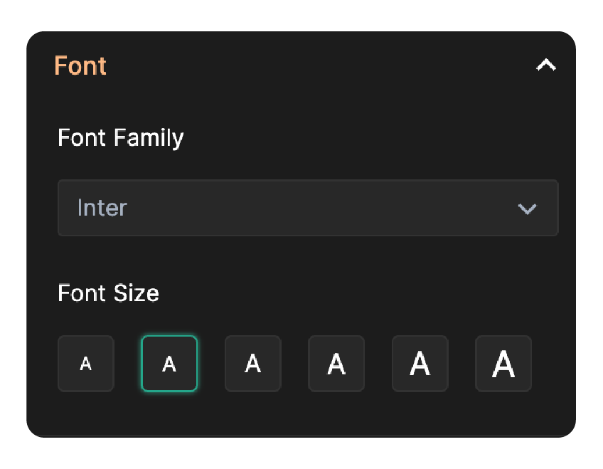
Here, you can customize 2 key aspects:
Font Family: Font Family allows you to choose the type of font used for your form. Choose a clear and easy-to-read font that compliments your brand identity.
Font Size: This setting allows you to control the size of the text displayed within your form. Choosing the appropriate font size is crucial for ensuring optimal readability across different screen sizes and devices.
Header
The header is the topmost section of your form, typically displaying the form's title, description and logo. This section serves to introduce the purpose of the form, providing users with essential context and branding elements right at the beginning.
Style
Style allows you to customize you header style and background.
Header: You can control how the header interacts with the container by selecting one of the two styles:
- Scrollable: This style allows the header to move along with the form as the user scrolls through it. This is ideal for shorter forms where the header may take up too much space and obstruct the user's view.
- Fixed: This style will keep the header in a fixed position at the top of the container, even when the user scrolls down the form. This is useful for longer forms where users may need to refer back to the header for information.
Background: The Background allows you to set the background color of your form container. You can choose to set your background in solid or gradient colors.
Text
Under Text, choose the font family and customize the header's title, description.
Font Family: Font Family allows you to choose the type of font used for your form's header text. Choose a clear and easy-to-read font that compliments your brand identity.
Form Title: This allows you to choose a color for the form's title. Set a distinct color for your title, making it the central focus of the header. This grabs user attention and clearly communicates the form's purpose.
Form Description: If you have an additional description, select a color that complements the title and ensures readability. Briefly explain the forms purpose or provide any necessary instructions.
Text Alignment: This allows you to control how your header text is positioned. You can choose to place it as left aligned, right aligned, or center aligned.
Branding
Under Branding, customize the logo and header image.
Logo
Logos are symbol that represent your brand or company. Upload your logo from your device or choose one from Noun Project (a dedicated icon source added to give access to a large library of free and customizable icons) ,Pixabay or Unsplash or Pexels. You can also add an alternative text to your image to make it accessible for users with visual impairments. Learn more
Logos are symbol that represent your brand or company. Upload your logo from your device or choose one from Noun Project (a dedicated icon source added to give access to a large library of free and customizable icons) ,Pixabay or Unsplash or Pexels. You can also add an alternative text to your image to make it accessible for users with visual impairments. Learn more
- Image Size: This allows you to control the size of the logo image. You can resize the logo using the slider based on the need.
- Image Alignment: This controls how the logo, for title and description are aligned within the form header. Choose an image alignment based on the styles provided to create an organized layout.
Header Image
You can add a header image that suits your business at the space on the top of your form container. Choose from Pixabay, Unsplash, Pexels, or upload an image from your device. After uploading an image, click the Edit icon in the top right corner to crop, rotate, flip images before applying them to your form's banner image. You can also add an alternative text to your image to make it accessible for users with visual impairments. Learn More
Style:
- Style 1: The header image stays attached to the top of the form container.
- Style 2: The header image is positioned independent of the form container.
Image Size: This option allows you to control the size of the header image.
Image Alignment: This allows you to control how your header image is positioned. You can choose to place the banner image as left aligned, center aligned or right aligned.
Stretch Image: This option allows you to expand the size of your header image to fit the container size.

Note: Header Image cannot be configured when Form Layout is set to Left Banner or Right Banner. To add a Header Image, set Form Layout to Plain first.
Border
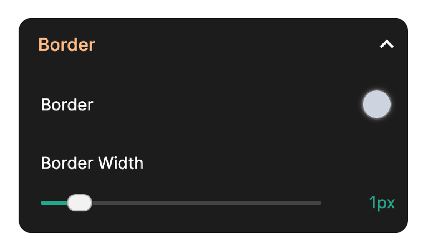
- Border Color: This allows you to choose a color for the border line surrounding the form header.
- Border Width: This allows you to control the thickness of the form header border.
Edges & Spacing
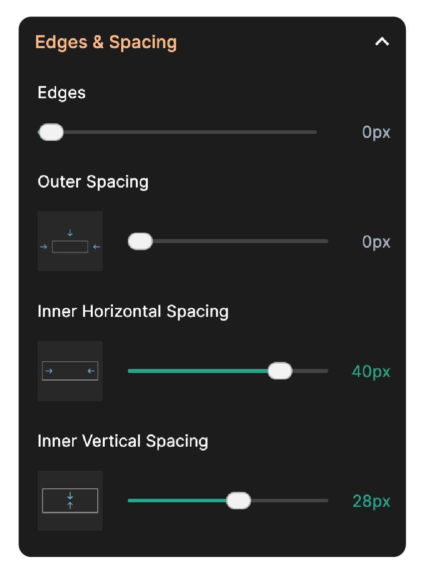
- Edges: The edges slider allows you to control the corners of your form's header.
- Outer Spacing: This allows you to adjust the spacing of your header from the top, left and right edges of the form.
- Inner Horizontal Spacing: This allows you to adjust the spacing of header content from the left and right edges of the form header.
- Inner Vertical Spacing: This allows you to adjust the top to bottom spacing of the form header.
Fields
Fields section allows you to tailor the visual appearance of each field within your form.
Fields
- Label: This lets you choose the color for the field label.
- Instruction: This property allows you to control the color of any instruction text associated with a field.
- Focus: You can choose the color to highlight a field, whenever a user clicks or navigate to the field. This helps users identify the currently active field, improving user experience.
- Mandatory Asterisk: This allows you to choose the color of the symbol (*) that indicates a mandatory field.
Input
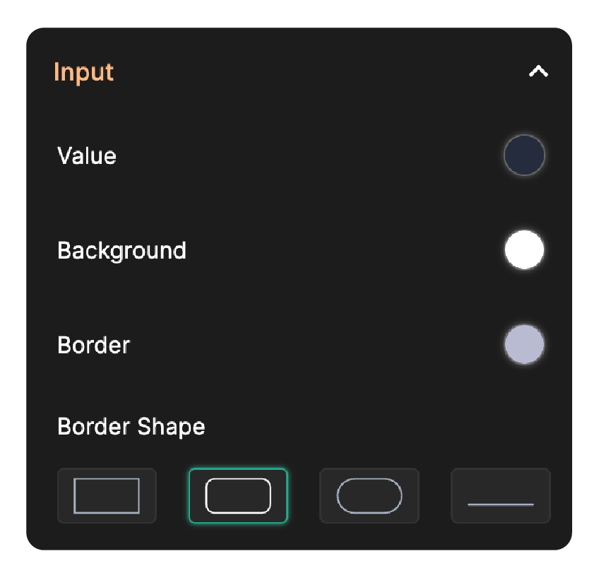
- Value: This defines the color of the text a user enters into the field.
- Background: This controls the color of the background area in the field.
- Border: This allows you to customize the color of the field's border.
- Border Shape: Here, you can choose the style of the field's border that suits your form.
Under Picker, you can customize the background color of the picker
- Background: This allows you to control the background color of the picker fields like Multiple Choice field, Slider field, dropdowns, date pickers, and hover text.
Border & Spacing

- Border Width: This allows you to control the thickness of the input field's border.
- Horizontal Spacing: This allows you to adjust the spacing of fields from the left and right borders of the form container.
- Vertical Spacing - Between Fields: This allows you to adjust the space between fields.
Error Message
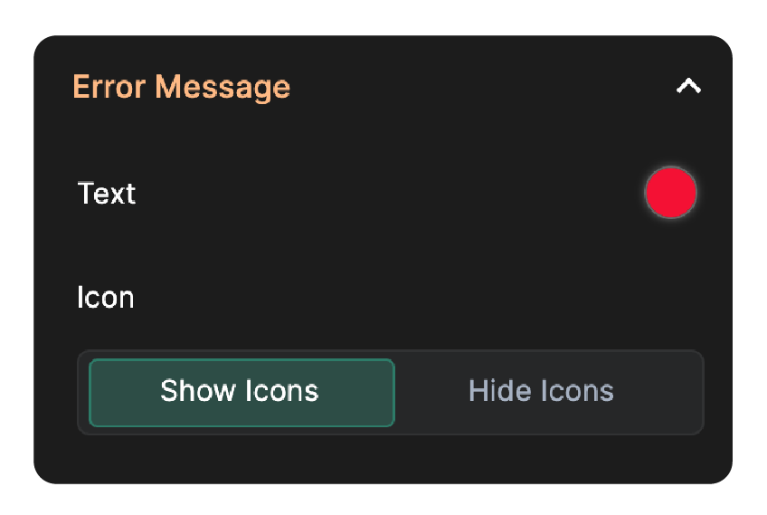
- Text: Here, you can choose the color of the text of the error messages.
- Icon: This allows you to control the visibility of icon within each field. You can choose to show or hide them.
Container
The Container encloses all the fields and buttons within your form. You can customize the container of your form by configuring:
Container
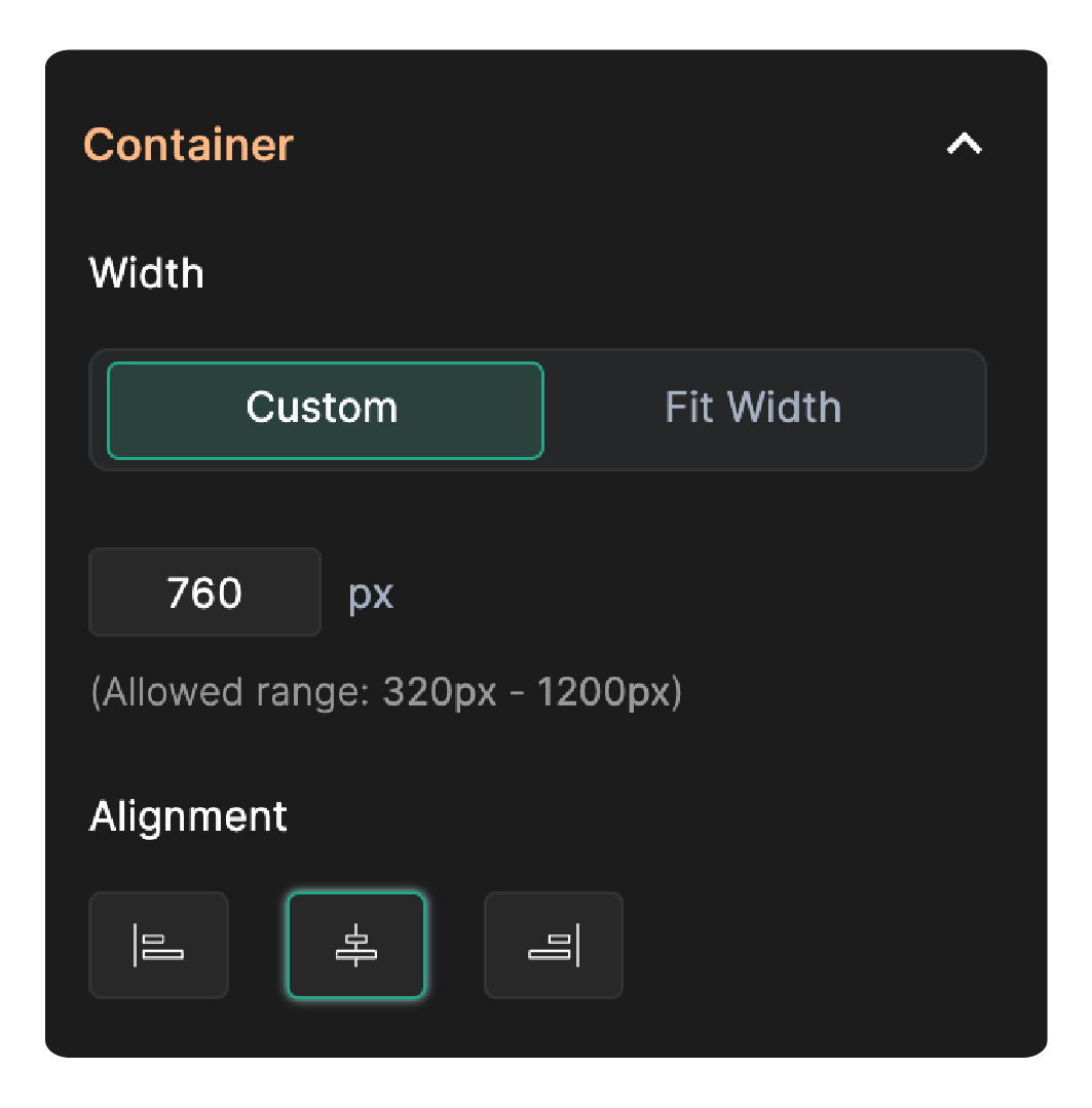
Width
Container Width allows you to define the overall width of your form container. You can set your container width as:
- Custom: This allows you to set the width for your container in pixel value within the allowed range. It offers a precise control over form size.
- Fit Width: This allows the container to expand and adjust itself to match the width of the background area, without extending to the full screen width.
Alignment
This allows you to control how your container is positioned. You can choose to place the container as left aligned, right aligned, or center aligned.
Border
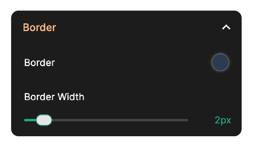
- Border: This allows you to choose a color for the border line surrounding the form container.
- Border Width: This allows you to control the thickness of the border line surrounding the form container.
Edges, Spacing & Shadow
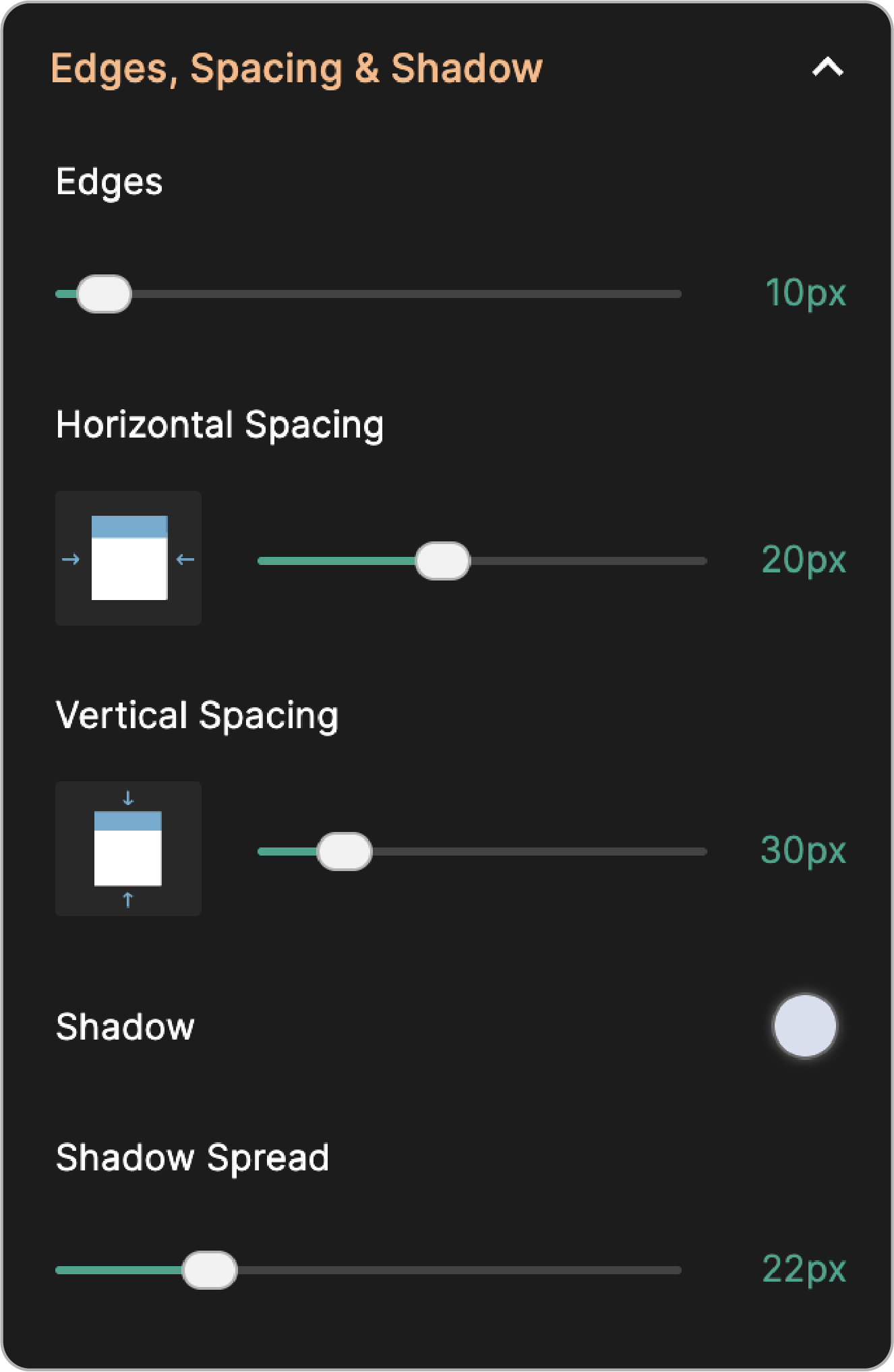
- Edges: The edges slider allows you to control the corners of your form's container.
- Horizontal Spacing: Horizontal spacing allows you to adjust the distance between the left and right edges of the form container.
- Vertical Spacing: Vertical spacing allows you to adjust the distance between the top and bottom edges of the form container.
- Shadow: This creates a shadow effect for the form container.
- Shadow Spread: Drag the slider to adjust the intensity of the shadow effect.
Form Responsiveness
Responsive View: Responsive view allows the form layout to adjust automatically to ensure optimal viewing and usability on devices of different screen size, including those smaller than 480 pixels.
Special Fields
Special Fields go beyond the basic text boxes and dropdowns of online forms. They offer a unique way to capture user input and enhance user experience. Here is the breakdown of some common special fields and how to customize them,
Grid
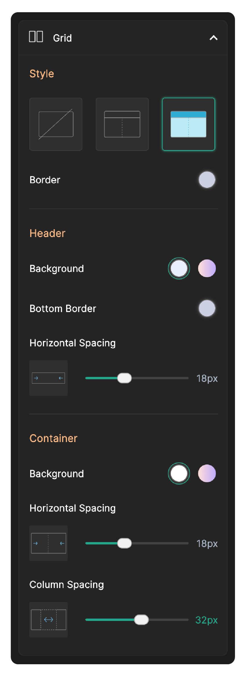
The following customizable options are available for the Grid field,
Style
- Style 1: This style applies no visible border to the grid field.
- Style 2: This style adds a visible border surrounding the entire grid container and includes a line beneath the Grid's header. Upon selecting this style, customization options are provided for the border color, and header's bottom border.
- Style 3: This style provides a background color to the Grid's header and container, in addition to the borders. Upon selecting this style, customization options are provided for the border color, header background color, header's bottom border color and container background.
Border: Allows you to customize the color of the Grid's border.
Under Header, you can customize the following
- Background: This allows you to set the background color of your header. You can select a solid color or gradient for the header background.
- Bottom Border: Allows you to set color for the Grid header's bottom border.
- Horizontal spacing: This allows you to adjust the distance between the left and right edges of the Grid header.
Under Container, you can customize the following
- Background: This allows you to set the background color of the Grid container. You can select a solid color or gradient for the container background.
- Horizontal spacing: This allows you to adjust the distance between the left and right edges of the Grid container.
- Column Spacing: This allows you to adjust the spacing between the columns.
Choice Fields
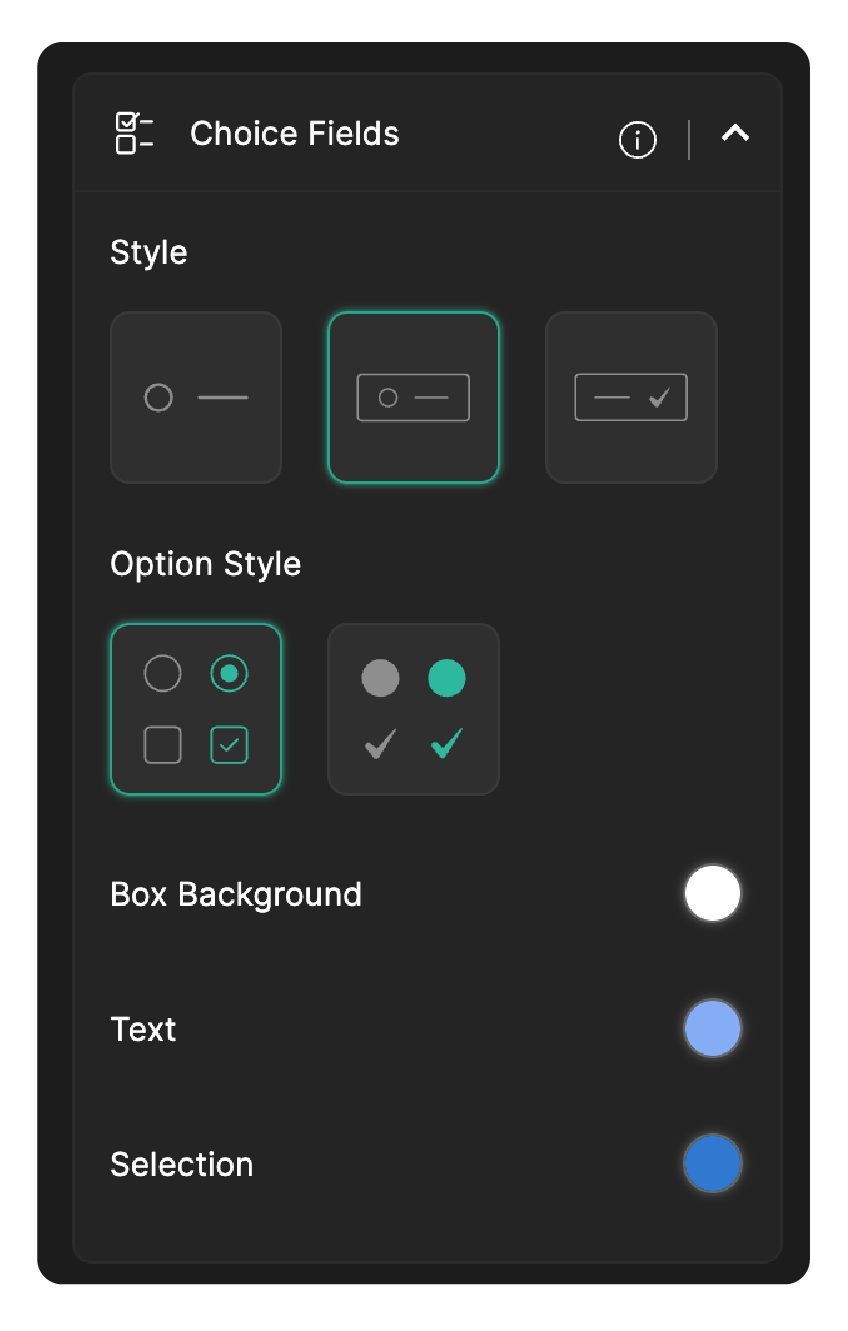
For the choice fields like Radio and Checkbox, you can customize
- Style: This enables you to choose the style of the box that contains each choice.
- Option Style: This lets you choose the style of the option field.
- Box Background: Use this to modify the background colors of Radio and Checkbox fields, enhancing their visual appeal.
- Text: Text allows you to choose the color of the text associated with choice field options, to ensure readability against the background.
- Selection: This defines the color that highlights the chosen option when a user selects them, providing a visual confirmation to the user.
This is applicable to Radio, Checkbox, Matrix Choice fields, Image Choice fields, and more.
Subforms
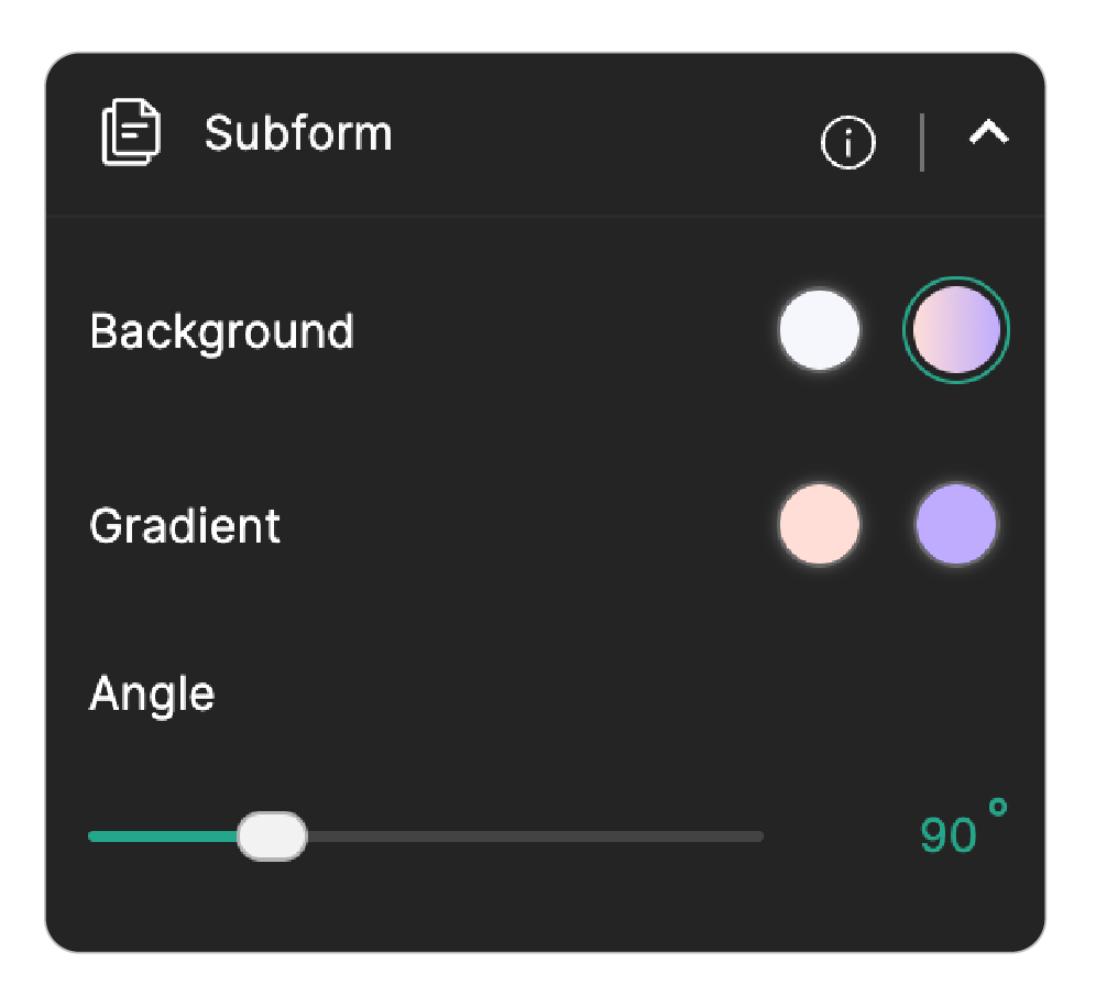
You can define a background color for Subforms to visually distinguish it from the rest of the form using the Background option. These customizations apply to Inline and Vertical Subforms, and the Add Entry card in Popup Subforms. To customize the Popup Subform container background, navigate to General > Style > Popup Background.
Slider
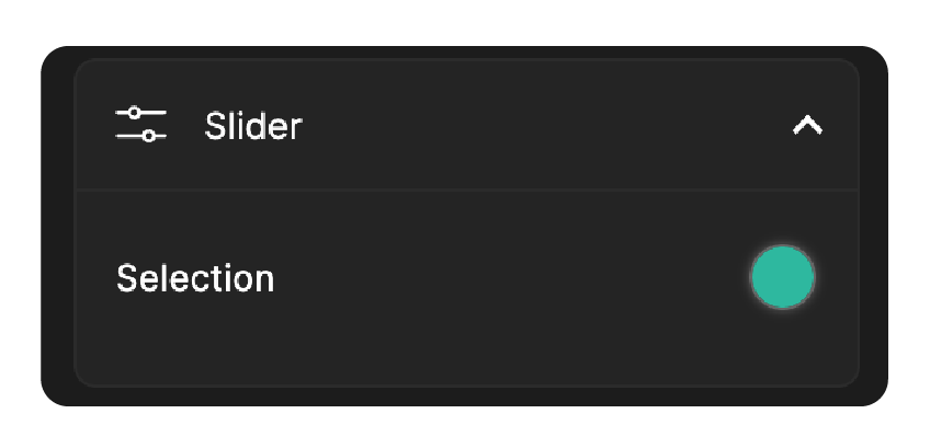
Selection: Here, you can choose the color that fills the slider bar as the user moves it, indicating their selection.
Rating
For the Rating field, you can customize:
Color Style
Use Color Style to control whether the color customization applies to each rating field individually or to all rating fields at once.
- Individual: Applies the color customization to the currently selected rating field only. Each rating field in your form can have different symbol colors.
- All: Applies the color customization to all rating fields in your form at once, making every rating field share the same symbol colors.
Note: Color Style applies only to Rating Symbols, not to Rating Numbers.Rating Symbols
This lets you customize the rating fields added with rating type as Symbols.
This lets you customize the rating fields added with rating type as Symbols.
- Border: Sets the color of the symbol's outline when it is in an unselected state.
- Fill: Sets the color that fills the symbol as the user selects a rating level, providing clear visual feedback of their selection.
Rating Numbers
This lets you customize the rating fields added with rating type as Numbers. These settings apply uniformly across all rating fields and are not affected by the Individual/All Color Style selection.
- Text and Border: Sets the text and border color of a number in its unselected state.
- Background: Sets the background color of a number in its unselected state.
- Selected Text: Sets the text color of a number when selected.
- Selected Background: Sets the background color of a number when selected.
Matrix Choice
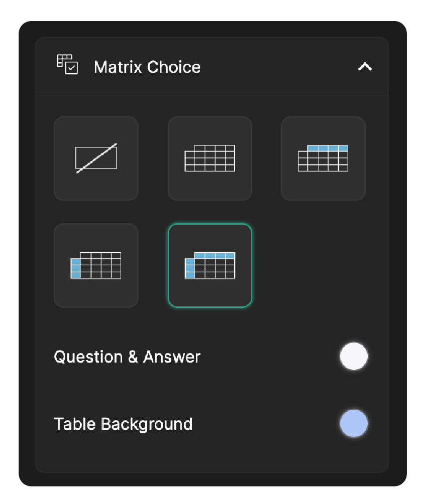
You can customize the overall appearance of the matrix choice by choosing the appropriate table style. Options to choose background colors for the Question & Answer section and the Table Background are also provided separately.
Yes/No
For the Yes/No field, you can customize:
- Label-1 Background: Sets the background color of Label-1. This applies to all three styles.
- Label-1 Text: Sets the text color of Label-1 in Default style (toggle) and icon color in Styles 2 and 3 ( like/dislike & checkmark/cross).
- Label-2 Background: Sets the background color of Label-2. This applies to all three styles.
- Label-2 Text: Sets the text color of Label-2 in Default style (toggle) and icon color in Styles 2 and 3 ( like/dislike & checkmark/cross).
- Border: Defines the border color for the Yes/No field. Applies to all styles.
Choose background and text colors that complement your form theme and offer clear contrast for readability and accessibility.
Divider
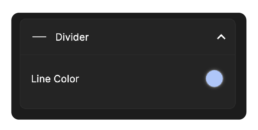
Line Color: Here, you can choose the appearance of the Divider field by modifying the line color to match your form’s overall theme.
Heading
For the Heading field, you can customize:
- Background: Sets the background color of the heading field.
- Heading Text: Sets the color of the heading text.
- Description: Sets the color of the description text shown below the heading.
- Edges: The edges slider allows you to control the corners of your heading field.
- Outer Spacing: This allows you to adjust the spacing of your heading field from the top, left and right edges of the form.
- Inner Horizontal Spacing: This allows you to adjust the spacing of heading content from the left and right edges of the heading field.
- Inner Vertical Spacing: This allows you to adjust the top to bottom spacing of the form heading field.
FAQ
For the FAQ field, you can customize:
- Layout: Choose from the available visual layout styles.
- Icon Style: Choose from four icon styles that control the expand/collapse indicator displayed next to each question.
- Icon Alignment: Sets the icon position to Left or Right of the question.
- Border: Sets the border color of individual questions and answers within the FAQ field.
- Expanded Background: Sets the background color of each question and answer set when expanded.
- Background: Sets the background color of the FAQ field container.
- Content Background: Sets the background color of both the question and answer set, regardless of whether it is expanded or collapsed.
Note: These customization options may not be available in all layouts. Their availability depends on your selected layout and may vary slightly to suit each design style.
Buttons
Buttons section allows you to design visually appealing buttons for your online forms. Here is the breakdown of the customization options available:
Button Style
This allows you to customize the shape and width of your buttons.
Shape
This allows you to choose the shape of your buttons.
Width
Here, you can control the size of the button displayed in your form.
- Standard: Here, the button has pre-defined dimensions. If you choose standard button size, it allows you to choose the position of your button placement within the container. You can choose to keep default alignment of the buttons or make it left aligned, centered or right aligned under the Button Alignment option.
- Fit to Screen: This allows the button to expand and adjust itself according to the width of the container.
Submit Button
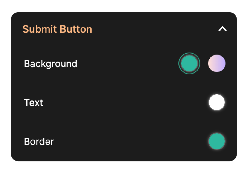
You can customize Submit button's background color, text color, and border color to make it visually distinct.
Save & Review Button
You can customize Submit button's background color, text color, and border color to make it visually distinct from other buttons.
Progress Bar
This allows you to customize the color and style of the progress bar in your form.
Progress Bar Style
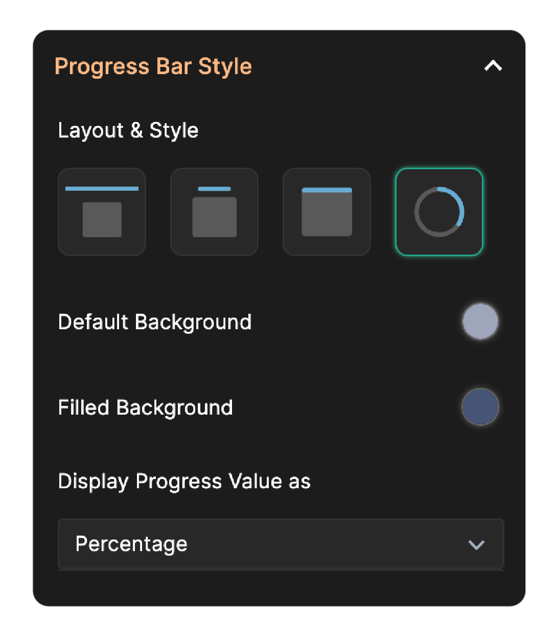
Layout & Style
- Top Fixed: The progress bar remains in the top and stays visible while scrolling.
- Floating: The bar remains detached from form header and scrolls out of view as the user moves down the page. You can customize this by showing either the completion percentage or the count of completed versus remaining questions in the live form using the Display Progress Value as option.
- Inline: The bar is positioned directly above the form header and moves along with the form as the user scrolls.
- Progress Ring: A circular indicator appears in the bottom-right corner of the form. You can choose to display the completion percentage or the number of questions completed in the live form using the Display Progress Value as option.
Default Background
Sets the background color for the unfilled portion of the progress bar. This color will be visible initially to respondents before they start filling out the form.
Filled Background
Sets the color of the completed portion of the progress bar, visually indicating how much of the form has been filled.
Display Progress Value As
Available when Floating or Progress Ring is selected as the Progress Bar style. This option lets you display the completion value as a Number or Percentage. If you prefer not to show any value, select None.