Updates to Accessibility Controls in Our Help Desk!
Hello everyone!
Accessibility controls in Zoho Desk are essential tools designed to ensure that agents of all abilities can effectively engage with our platform. These controls play a crucial role in removing barriers and providing a seamless experience for users who may have specific needs or requirements.
Recognizing the vital role that accessibility plays in ensuring everyone can effectively use our help desk, we've implemented significant improvements aimed at empowering all users to navigate our platform effortlessly. Our latest updates focus on enhancing the intuitiveness and functionality of our accessibility controls, making them more robust and user-friendly than ever before.
1. Streamlined accessibility controls
We’ve restructured the options under accessibility controls into four distinct sections:
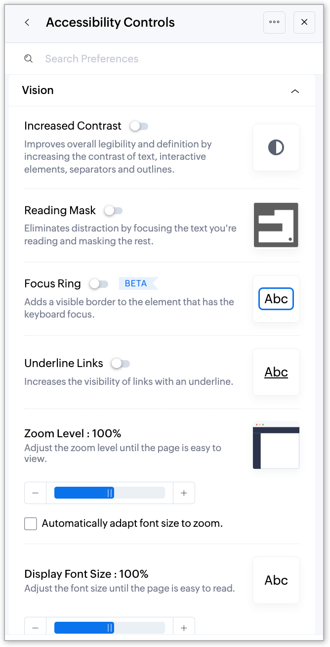
- Vision
- Hearing
- Mobility
- Learning
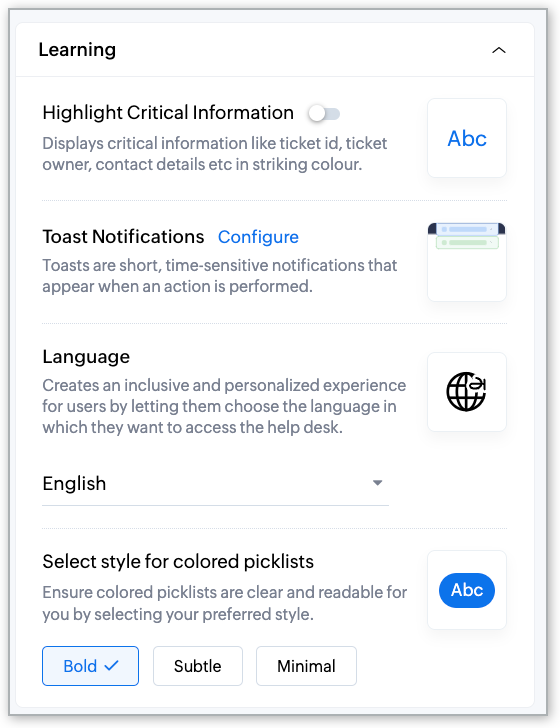
The reorganization brings in relevance and aligns the controls so that it’s easier to find the settings and adjust them according to your needs. Whether you need to increase contrast levels, use a screen reader, customize cursor behavior, or select your preferred language, everything is now neatly organized for quick access.
Suppose you want to make screen adjustments for visual impairment; you can find all of the settings under the “Vision” category. You can adjust contrast, zoom levels, or enable the reading mask for a better user experience.
2. Introducing additional elements
We've introduced three new control settings to enhance the user experience.
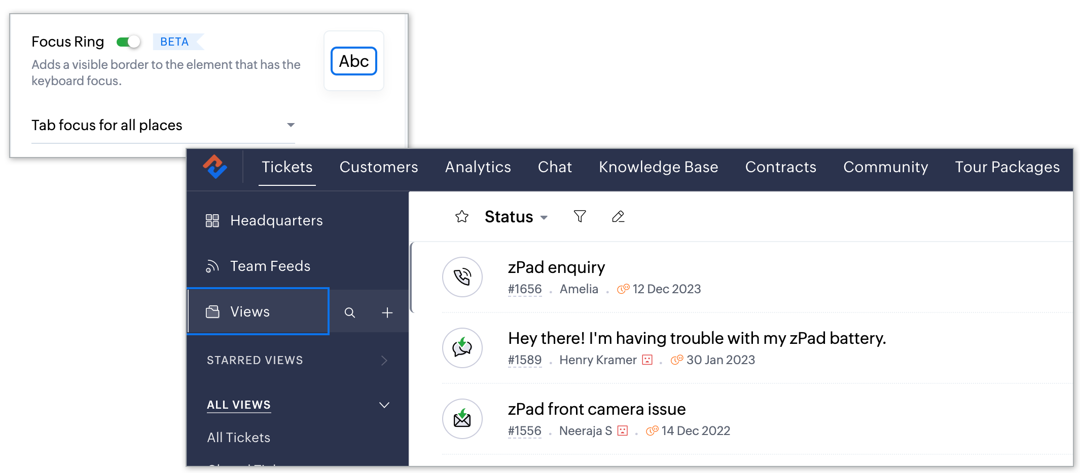
Focus Ring: Provides a visible border around the element with keyboard focus, aiding navigation and interaction.
Imagine you're navigating through the ticket interface using keyboard controls. As you tab through different elements, such as ticket details or response options, the Focus Ring highlights the selected element with a visible border around it. This makes it easier for you to track your position within the interface and enhances your ability to interact with elements efficiently.
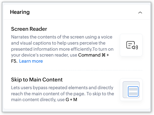
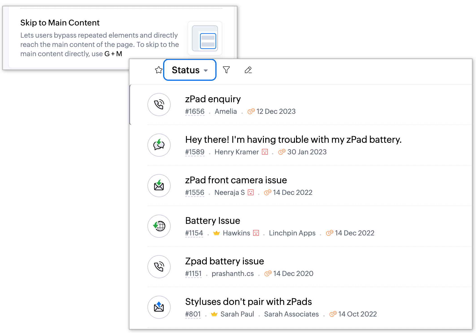
Skip to Main Content: Allows you to bypass repetitive navigation elements and skip directly to the main content of a page, saving time and removing distraction.
For example, when you enter the “Tickets” module, you're typically greeted with a navigation menu, filters, and other peripheral elements. With Skip to Main Content, instead of scrolling past these elements each time you access the tickets page, you can instantly skip over them and land directly at the primary content of your page—the list of tickets. This saves you valuable time and effort, allowing you to look straight into managing customer inquiries without unnecessary navigation hurdles.
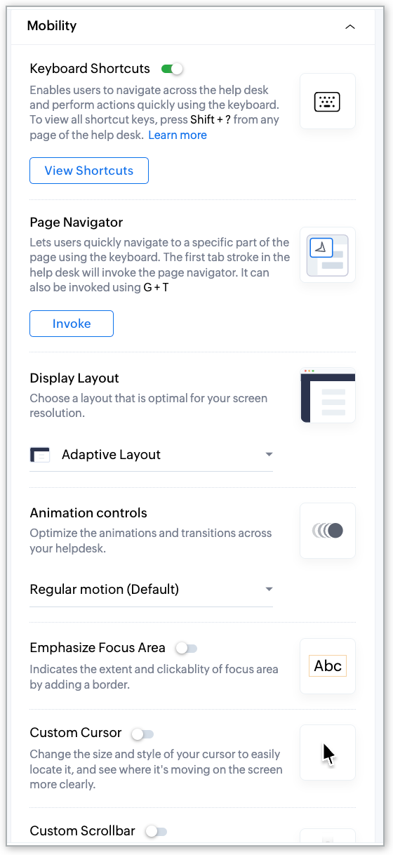
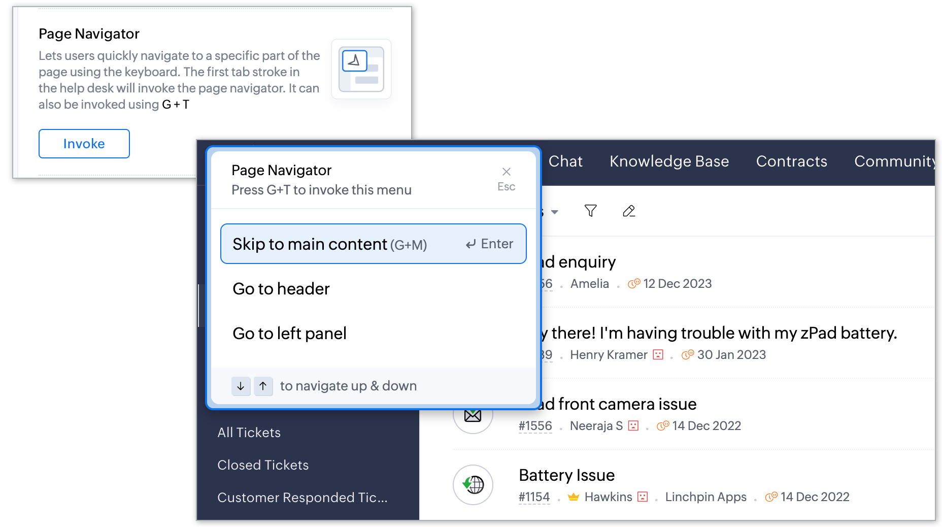
Page Navigator: Enables swift navigation to specific sections of a page using just the keyboard, enhancing efficiency for keyboard-centric users.
Let's say you're reviewing a lengthy ticket thread that spans multiple sections, such as the ticket properties, customer response, and header and footer. With Page Navigator, you can swap these sections using keyboard shortcuts, eliminating the need to scroll endlessly or use the mouse to navigate. This streamlines your workflow, especially for keyboard-centric users who prefer quick, keyboard-based navigation over manual scrolling.
For further insights on the various options available in accessibility controls, kindly refer to this help article: Using Accessibility Controls in Zoho Desk.
This feature is now available for all users across all data centers. We hope you find these improvements valuable and look forward to your feedback as we continue to refine and enhance accessibility within our platform.
Thank you, and have a great day!
Regards,
Varsha P | Zoho Desk—User Education