Visualize your data with a new set of charts: Treemap, Butterfly, Sankey, and Cluster charts in Zoho CRM
Dear customers,
When it comes to analytics, it's not just about the numbers; it's about understanding the story behind them.
With that philosophy in mind, we’re excited to introduce a line of representations to the existing array of chart types in Zoho CRM: Treemap, butterfly, sankey and cluster charts. Let's go!
Treemaps
Treemap charts are used to visually represent hierarchical datasets in a rectangular layout. It aligns its parent categories as larger tiles with their sub-categories nested within them. The size of each tile is proportional to its corresponding value, making it easy to compare different segments within the hierarchy.
This is how a treemap chart looks:

These structured data representations help you understand overall performance and contributions, as well as compare participating entities at a glance.
Unlike traditional bar charts or pie charts, treemaps can be used if your datasets are large and exhibit parent-child relationships.
Here are some examples to better understand their usage:
Comparing revenue distribution between functions
A company's revenue is distributed among its functions before it gets further disbursed to its employees. Treemap charts can be used to depict this distribution and compare it between functions. As you can see below, the hierarchy can be represented as a treemap to compare it directly with other functions:

The hierarchy at the top shows just the numbers and levels, but the treemap chart represents the numbers proportionally, allowing leaders to visualize the difference in distribution.
Interpretation: As you can easily see in the treemap, sales and marketing receive the same amount of revenue, while engineering is given significantly more than the other two.
Likewise, with treemap charts, you can:
- Compare popular lead sources with lead counts is the measure and lead source being the participating entity—a classic single-grouping configuration.
- View cost savings achieved across departments. With the departments as the grouping parameters and the cost saved as the measured amount, the chart lays out all the departments as tiles in proportion, based on money saved.
- Compare ad spends across channels, where channels are the parent grouping and ad spend is the measured unit.
Butterfly
Butterfly charts are used to compare two related datasets side-by-side, resulting in a representation that looks like a butterfly or tornado.
Now, how does it differ from bar charts?
The standard bar chart can compare two entities for a given measure. Say, you are comparing the performance of Mary and Charles. The two users' data is represented using bars, and the length will denote their performances. But, when it comes to comparing their performances over a period or their contribution across different stages, a bar chart is not sufficient.


With butterfly charts, you can:
- Compare revenue between two of your branches each month. With branches being compared for sum of sales revenue, grouped by closing date.
- Compare the performance of two reps in a given quarter. Compared between two users for average of amount of deals, grouped by closing date until today.
In addition to the user-based comparison above, butterfly charts are well-suited to visualizing other types of data comparisons, like:
- Picklist-based comparisons
- Duration-based comparisons
- Aggregate-based comparisons
Business scenario
Comparing the number of deals closed for each lead sources: Duration-based comparison
You can identify the productive lead source by comparing the number of deal closures for every lead source in your organization based on their closing week.

Analyzing effective sales methodology, inbound vs. outbound: Picklist-based comparison
Businesses use both inbound and outbound lead generation strategies, and each of these methods can reap different results based on the season and occasion. By comparing inbound versus outbound each month, you can identify which works best at what time.

Analyze the amount versus the expected revenue between accounts: Aggregate-based comparison
Expected revenue is a result of a deal's progression in the sales pipeline. Comparing the amount versus their expected revenue will not only help visualize the expected revenue of participating accounts but also indicate the accounts' stage in the sales pipeline.

Sankey
A Sankey Chart is designed to visualize the movement of data across different data groups. Unlike traditional charts—such as bar, column, pie, or donut—that mainly provide a static distribution of values, the Sankey Chart focuses on illustrating the flow between multiple segments or grouping fields. This makes it an ideal choice when you want to track how values (like lead counts, revenue, or deal statuses) move from one category to the next.

Key features
- Flow visualization: With the Sankey Chart, you can observe the movement of data between different groups.
- Multiple grouping fields: This chart works best when you have at least two grouping fields. You can go even further and add a third grouping to see an even more detailed mapping of your data flow.
- Simple configuration: The configuration for the Sankey Chart is as simple as any other chart type in Analytics.
Business scenarios:
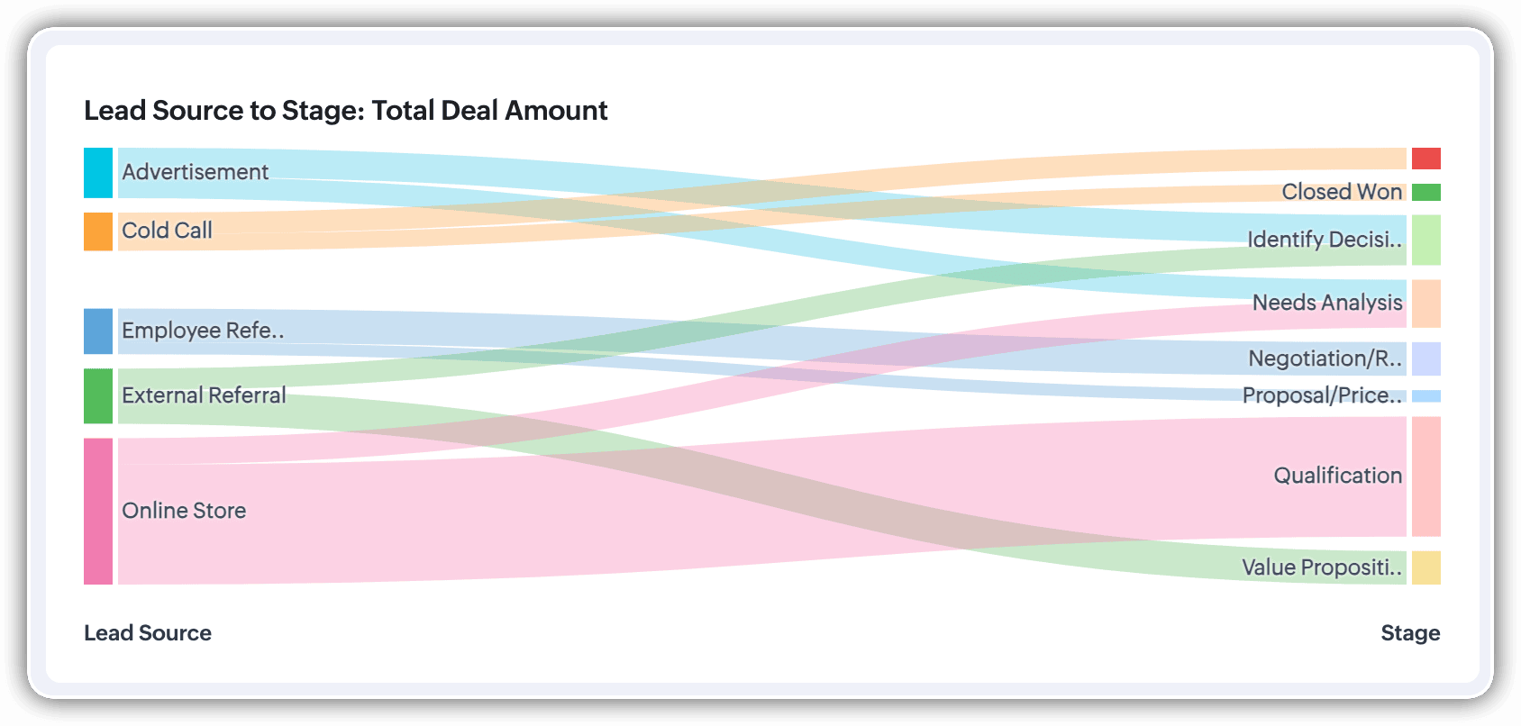
Imagine you’re a sales manager trying to get a better handle on your team’s performance and your company’s pipeline. You want to understand not just how many deals are coming in, but also which sources are contributing the most value—and how those deals are progressing through different sales stages.
Let’s say you want to understand which lead sources are driving the most deal activity and how those deals progress through the pipeline. You can create a Sankey chart that maps the count of deals from Lead Source to Stage.

After analyzing the chart, you might notice that Online Store brings in a high volume of early-stage deals, while sources like External Referral contribute fewer deals that are more likely to reach advanced stages like Proposal or Negotiation.
This insight helps you prioritize nurturing the most profitable channels.
Sankey charts can also be helpful in other operational scenarios where understanding transitions across stages or teams is essential:
- Regional revenue distribution: Visualize how revenue flows across different regions, product categories, and their corresponding annual revenue. This helps you compare which regions contribute the most to each product line and where your high-value segments lie.
- Ticket handling flow: Visualize the flow of support tickets from their origin channel to internal departments and finally to resolution statuses. This can reveal workload imbalances or common points of delay in your support process.
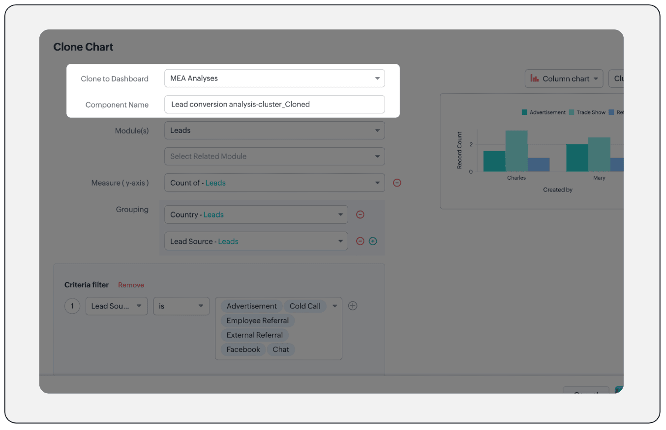
Cluster
A cluster chart is similar to stacked column charts, but instead of stacking horizontally, the data is represented as vertical bars. As you create a column chart with multiple groupings, you can change the type of column chart to a cluster chart to achieve this representation.

In the above image, you can see the stacked column chart compares the number of lead conversions based on popular sources between countries. The stacks appearing on top of existing stacks ask you to calibrate the record count (y-axis) based on the previous stacks, which can lead to inaccurate interpretations. In this case, a cluster representation will paint a clearer picture of the analyses.
Other minor enhancements:
In addition to the three charts we mentioned above, we've also made the following minor changes:
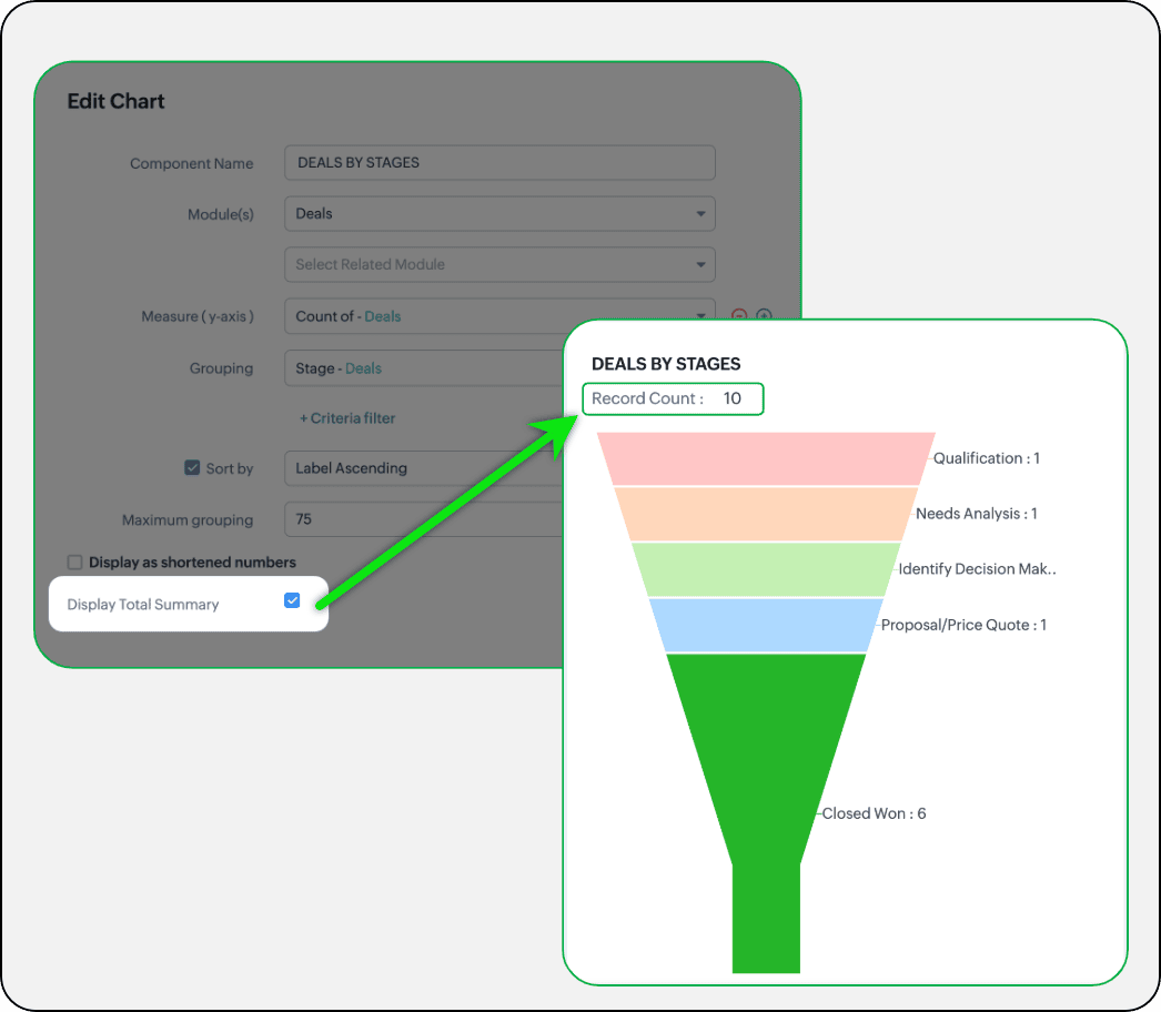
- Display total summary: Thus far, for all charts, each participating measure included labels. Now, to better understand overall contributions, a check box to display the total summary is provided under More options on the Chart Configuration page. Based on the configuration, the total revenue or the rolled-up quantities will be prominently displayed.
- Merge Y-axis: For charts that use two y-axis measurements, the intention is to view the progression of one entity against these two measures. Despite the scale, if the y-axis on the left is disproportionate to the values of the y-axis on the right, the plotted graph will result in a graphically and logically incorrect representation.
As you can see in the image below, the plot area of the sum of amount bar and the sum of expected revenue aligns close together, while, the difference between $700,000 and $40,500 is drastic, creating inaccurate interpretations.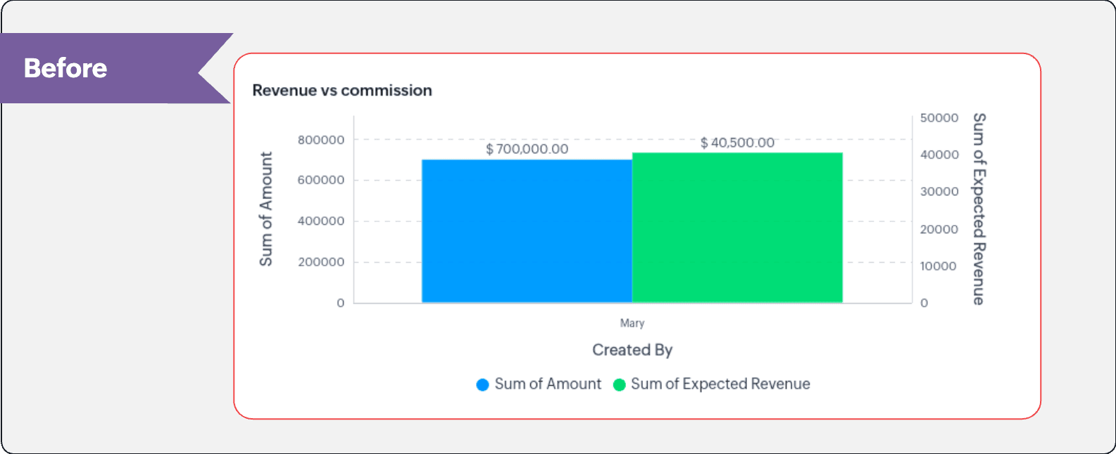
In this enhancement, we're allowing neighboring values of measures to merge so that the interpretation can be more visually accurate.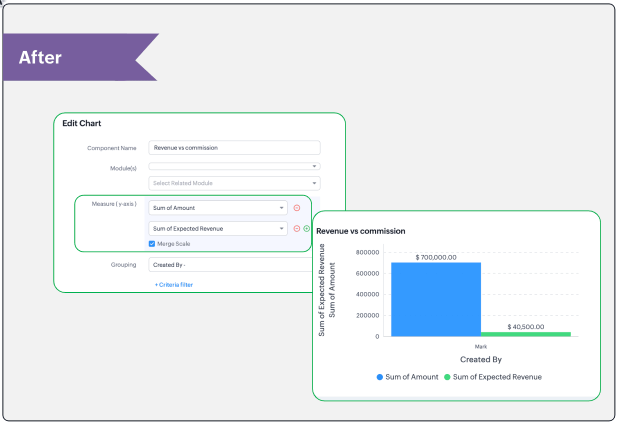
- Clone components to a different dashboard: Dashboards in Analytics serve in unique ways for various audiences—there can be separate dashboards for the sales team, marketing team, engineering team, and so on, and the chances of using the same measure for reference is common. Thus, when you clone a chart, you can now determine the target dashboard in which the cloned chart can be placed.
Resource: Help document
Thanks and have a good one!
Kind regards,
Saranya Balasubramanian
Saranya Balasubramanian
Topic Participants
Saranya Balasubramanian
Sticky Posts
Introducing Multiple Sandbox Types and Support for Module's Data Population
Register here for the upcoming Focus Group webinar on Multiple Sandbox | Help documentation to learn more about the new enhancements Hello everyone, Sandbox in CRM is a testing environment for users to create and test new configurations like workflowGood news! Calendar in Zoho CRM gets a face lift
Dear Customers, We are delighted to unveil the revamped calendar UI in Zoho CRM. With a complete visual overhaul aligned with CRM for Everyone, the calendar now offers a more intuitive and flexible scheduling experience. What’s new? Distinguish activitiesVoC in Zoho CRM is now data savvy: Explore response drilldown, summary components and participation in CRM criteria
VoC has all the goods when it comes to customer intelligence—which is why we're constantly enhancing it. We recently added the following: A customer drilldown component that shows you the list of prospects and customers behind a chart's attribute ExpandedWrapping up 2025 on a high note: CRM Release Highlights of the year
Dear Customers, 2025 was an eventful year for us at Zoho CRM. We’ve had releases of all sizes and impact, and we are excited to look back, break it down, and rediscover them with you! Before we rewind—we’d like to take a minute and sincerely thank youPresenting ABM for Zoho CRM: Expand and retain your customers with precision
Picture this scenario: You're a growing SaaS company ready to launch a powerful business suite, and are looking to gain traction and momentum. But as a business with a tight budget, you know acquiring new customers is slow, expensive, and often delivers
Recent Topics
Fail to send Email by deluge
Hi, today I gonna update some email include details in deluge, while this msg pops up and restrict me to save but my rules has run for one year. can you tell me how to use one of our admin account or super admin account to send the email? I tried to updateTransitions do not update fields until the record moves to next stage
We have a blueprint where a couple of stages have multiple transitions. If only some of the transitions are completed, but not all, Zoho does not update any of the fields impacted by the completed transitions. Is there any way Zoho can udate the fieldsZoho CRM - Kiosk Studio : Use action responses across your kiosks with sequential actions
Hello Everyone, Imagine building a kiosk that gives you full control over how actions are executed in later screens in that same kiosk. What if you could use data from a previous action later in that kiosk—with no interruptions or data gaps? This is exactlyAbility to CC on a mass email
Ability to CC someone on a mass email.Get Cliq Meetings in my O365 calendar
Hi, we are currently evaluating to replace the Teams Messaging and Meetings with Cliq. We currently still have all our email and calendars in O365. What i want to achieve is, to create a (ZOHO) meeting from Cliq and have this meeting added to my Outlook/O365Custom Button to convert a Deal to a Custom Module?
Hello Community I am in process of building out a custom CRM for my team and part of this is looking at building out a Custom Button or function of some sort where when a Deal is marked Closed Won the system will allow for a "Convert to Job" option toPower up your Kiosk Studio with Real-Time Data Capture, Client Scripts & More!
Hello Everyone, We’re thrilled to announce a powerful set of enhancements to Kiosk Studio in Zoho CRM. These new updates give you more flexibility, faster record handling, and real-time data capture, making your Kiosk flows smarter and more efficientChange eMail Template for Event-Invitations
Hello ZOHO-CRM Team How I can change the eMail Template for Event-Invitations? I work with the German Version of the Free Version. I know how I can modify eMail alerts or Signature Templates, but where I can other eMails modify you send out? Thank youWorkdrive Oauth2 Token Isn't Refreshing
I have set up oauth for a bunch of zoho apis and have never had a problem with oauth. With workdrive i am using the exact same template i usually use for the other zoho apps and it is not working. All requests will work for the first hour then stops soMigrate Your Notes from OneNote to Zoho Notebook Today
Greetings Notebook Users, We’re excited to introduce a powerful new feature that lets you migrate your notes from Microsoft OneNote to Zoho Notebook—making your transition faster and more seamless than ever. ✨ What’s New One-click migration: Easily importHow can I import OLM to Yandex Mail easily?
For migrating Mac Outlook OLM data to Yandex Mail efficiently, the Aryson OLM Converter is a reliable professional tool that ensures complete data integrity throughout the process. Unlike manual methods, which can risk inconsistent formatting or missingIntroducing Radio Buttons and Numeric Range Sliders in Zoho CRM
Release update: Currently out for CN, JP, AU and CA DCs (Free and standard editions). For other DCs, this will be released by mid-March. Hello everyone, We are pleased to share with you that Zoho CRM's Layout Editor now includes two new field formats—Is it possible to setup bin locations WITHOUT mandating batch tracking?
Hi fellow zoho users, I'm wondering if anyone else has a similar issue to me? I only have some products batch tracked (items with shelf life expiry dates) but I am trying to setup bin locations for my entire inventory so we can do stock counting easier.Implementing Inventory Process
I am just starting to create an inventory system through Zoho for a nonprofit. We receive in-kind donations of items for kids, and utilize them in 2 or 3 different programs. Then families come in and take the items. I'm thinking of this structure: OurBest way to start zoho inventory with bulk openning stock
We are already using zoho book since long time for cars trading company. Now to streamline more, would like to import the excel data of closing stock of inventory to zoho inventory and to start on. Since we need to track each VIN (unique vehicle id number)Service Reports.
Hello Team, I have a requirement to create multiple service reports for a single AP. That means, in one AP I have 5 service line items, and all line items are linked to assets. Once I complete the AP, I want to generate 5 individual service reports, oneBlueprint enhancements - Parallel and multiple transitions, and more
Last modified on Sep 4, 2023: All Zoho CRM users can now access these enhancements. Initially, these features were available only on an early access basis and by request. However, as of August 2, 2023, they have been made available to all users in allItem Bulk Edit - Allow for Reorder Level
We're implementing a process for using the Reorder Level field for Items, and I have to go through and add this value to a huge chunk of our Items. It's driving me bonkers that I have to do this individually through the UI rather than bulk updating. ItZoho CRM || Unable to Bulk Assignment of Territories for Contacts
Dear Zoho CRM Support Team, I hope this email finds you well. We recently performed a bulk upload of Contacts into Zoho CRM using the official sample Excel template downloaded from the CRM. The upload itself was completed successfully; however, we encounteredWhat's New in Zoho Inventory | August – October 2025
Hello customers, The last quarter has been incredibly productive! We've released a powerful slate of new features and enhancements in Zoho Inventory designed to give you better control, greater efficiency, and expanded functionality across your inventoryDisable Zoho Inventory Tracking / Delink Zoho Books & Inventory
We have integrated zoho inventory with zoho books? Now after a long time, we want to disable inventory tracking and delink these 2 modules. Zoho says we cant do it. Anybody else going thru the same ? Any possibility at all? Why does zoho not allow toTracking Non-Inventory Items
We have several business locations and currently use zoho inventory to track retail items (sales and purchase orders). We were hoping to use zoho inventory to track our non-inventory items as well (toilet paper, paper towels, etc). I understand that wePrice Managment
I have been in discussions with Zoho for some time and not getting what I need. Maybe someone can help explain the logic behind this for me as I fail to understand. When creating an item, you input a sales rate and purchase rate. These rates are justSet Warehouse based on Vendor
Greetings. I would like to set automaticaly the Warehouse based on the Vendor. Context: I am working on an adaptation of a Purchase Order to be used as a Quotation. I have defined that when a user has to raise a quote the Vendor will be "PROCUREMENT" I would like to set the Warehouse to a predefined value when "PROCUREMENT" is set as Vendor. I have tried to do with the Automation feature using the Field Update option, but Warehouse does not is listed as a field. Can you help? Thanks in advance.Auto tagging
Some of the articles I enter into Notebook get there when I enter them in Raindrop.io and IFTTT copies the articles in Notebook. When this happens the notes are tagged but instead of useful one word tags with topic the tag pertains to the specific articleHow do I save audio files to my PC that I record into Zoho Notebook from my phone?
I was thinking of using Zoho Notebook as a way to store composition ideas, as well as for other things if it can handle this. For this to be useful for me though, I need to be able to have an easy way to download those audio files to my PC, either individuallySearch mails in shared mailbox
Hi everyone, is there a way to search mails in shared mailbox's? Search in streams or mail doesn't return anything from mails in shared mailboxes. Thanks! RafalKaizen #186 : Client Script Support for Subforms
Hello everyone! Welcome back to another exciting Kaizen post on Client Script! In this edition, we’re taking a closer look at Client Script Support for Subforms with the help of the following scenario. " Zylker, a manufacturing company, uses the "Orders"Writing SQL Queries - After Comma Auto Suggesting Column
When writing SQL Queries, does anyone else get super annoyed that after you type a comma and try to return to a new line it is automatically suggest a new column, so hitting return just inputs this suggested column instead of going to a new line? AnyoneSync your Products Module for better context.
In customer support, context is everything. The integration between Zoho Desk and Zoho CRM helps your sales and support teams function as one, delivering better customer experiences. With the latest update to this integration, you can now sync the Product module in your Zoho CRM with your Zoho Desk portal. This feature enables products from Zoho CRM to reflect in the "product" field in Zoho Desk. This can save your support team valuable time and effort. Some things to note when syncing the two:Where is the desktop app for Zoho Projects???
As a project manager, I need a desktop app for the projects I manage. Yes, there's the web app, which is AWESOME for cross browser and platform compatibility... but I need a real desktop app for Projects that allow me to enter offline information whereCRM verify details pop-up
Was there a UI change recently that involves the Verify Details pop-up when changing the Stage of a Deal to certain things? I can't for the life of me find a workflow or function, blueprint, validation rule, layout rule ect that would randomly make itDoes Zoho Writer have Dropdowns
I want to add a drop down field in Zoho writer. Is this possible?openUrl in blueprints
My customer wants to open a URL at the end of a blueprint transition. Seems this isn't possible right now but it would be very useful. In this thread, https://help.zoho.com/portal/en/community/topic/openurl-not-working the Zoho agent said that it's logicallyDropshipping Address - Does Not Show on Invoice Correctly
When a dropshipping address is used for a customer, the correct ship-to address does not seem to show on the Invoice. It shows correctly on the Sales Order, Shipment Order, and Package, just not the Invoice. This is a problem, because the company beingPrepayment of a sales order
How does everyone handle this common (at least it is common for us!) situation? We require all our orders to be fully prepaid before shipment since we manufacture made to order, custom products. Since ZOHO does not allow a sales order to be prepaid, we are forced to create an invoice at the time an order is placed to allow the customer to pay it. Our sales category is therefore skewed, since the sale was actually booked at the time an order was placed, rather then at the time it is shipped, whichAccess to Specific Zoho Desk layout for external parties
Hi, We have a partner who handles for us sales requests from specific markets. He is not a Zoho Desk user. But we want him to b part of a specific Zoho Desk layout to handle inquiries. How to achieve it in the easiest way possible?Deposit on a Sales Order
Good day, 100% of my business is preorders, no inventory. I am trying to run away from QB for one of my businesses, but I require two options that I don't seem to find with Zoho Books. 1 - If there is a way to apply a deposit on a sales order, as withHow Does Knowledge Base Search and Article Recommendation Work?
Hello, I would like to understand how the Knowledge Base search engine works. Specifically, does it search based on: The article title only? The full article content? Both, the article and the content? Keywords? Tags? Also, how does the system determineBulk Delete Attachments
Is there a way to bulk delete attachments on the form entries? our storage is full and deleting files one by one is pain taking process.Next Page