Geo-Powered Retail Intelligence with Zoho Analytics
In today’s highly competitive retail landscape, data-driven decisions are no longer optional — they’re essential. While businesses collect vast volumes of data across regions, stores, and customer segments, the real value lies in how effectively this data is visualized and interpreted.
Geo Maps in Zoho Analytics bring location intelligence to the forefront of decision-making. With powerful spatial analytics capabilities, retail businesses can now visualize store performance, identify untapped opportunities, and track customer behavior trends with a simple glance at a map.

This solution demonstrates how Zoho Analytics' Geo Maps can be leveraged to solve real retail business problems, using a step-by-step approach grounded in a practical, ready-to-use dataset.
- Business scenario
- Dataset Overview
- Problem Description
- Why Geo Maps Become a Game-Changer
- Solution Implementation – Report Creation
- Store Performance Analysis (Map – Bubble)
- Revenue-to-Traffic Ratio with Ghost Zone Detection (Map - Filled + Scatter)
- Competitor Pressure Zones (Map – Scatter)
- Customer Gender Distribution (Map - Pie)
- Summary
Business scenario
Imagine you're a retail chain operating hundreds of stores across the United States. Each store generates data—sales, visitor footfall, customer satisfaction, marketing spend—but these numbers alone don’t explain why some stores succeed while others under-perform.
Key challenges include:
- Identifying stores that are struggling before sales drop significantly.
- Understanding whether poor performance is due to location, low visibility, or intense competition.
- Evaluating which regions offer true expansion potential—and which are over-saturated.
With no visual correlation between location and business KPIs, many decisions remain reactive instead of proactive. This is where Geo Maps make all the difference—by transforming isolated data into contextual geographic insights.
Dataset Overview
To power this solution, we’ve created a comprehensive and realistic retail dataset that mirrors how actual store data behaves across geographies.
The dataset includes:
- Store-level performance data: revenue, average purchase value, and satisfaction.
- Customer insights: foot traffic, age, gender distribution.
- Market context: competitor presence and market share, population density, and economic growth rate.
- Geospatial data: zip code, city, state, latitude, and longitude of each store location.
Problem Description
Retail chains often operate on thin margins, and even minor under-performance at store level can have significant impacts across the organization. While dashboards provide revenue and performance trends, they often miss one critical dimension—geography.
Without geographic context, businesses face several recurring challenges:
- Underperforming stores go unnoticed until major losses occur.
- Ghost zones—areas with low store presence but high potential—remain unexplored.
- Marketing budgets get wasted in regions where returns are consistently low.
- Competitor pressure is misjudged due to lack of visibility on regional saturation.
- Store closures become reactive decisions, made after performance has already declined.
In short, data without location awareness leaves decision-makers blind to spatial trends and risks. Businesses need a smarter, more intuitive way to analyze store performance with geographical clarity—before it’s too late.
Why Geo Maps Become a Game-Changer
Geo Maps in Zoho Analytics address this gap by unlocking a visual layer of intelligence that traditional charts can’t offer.

Here’s what makes them a game-changer:
- Location-first insights: Instantly identify how store performance varies across the map - by city, state, or neighborhood.
- Visual correlation of multiple KPIs: Compare revenue, satisfaction, and foot traffic geographically to detect hidden patterns.
- Clutter-free, customizable visuals: Choose the right map type - bubble, filled, pie, or scatter - to match the data you want to analyze.
Unlike static dashboards, Geo Maps enable you to see the problem, context, and opportunity—all in one frame. Whether it's spotting trends, reallocating marketing spend, or planning expansion, this spatial layer puts decision-makers back in control.
Solution Implementation – Report Creation
This section walks through the step-by-step creation of four key Geo Map reports that reveal business insights from store-level data.
1. Store Performance Analysis (Map – Bubble)
To identify how stores are performing across different regions in terms of revenue and customer satisfaction, using a clean, visual-first map representation.
This helps uncover:
- High-performing stores in key zones
- Underperforming regions needing intervention
- Patterns related to location-based store success
Why Map - Bubble?
The Map - Bubble chart is ideal for visualizing store-level metrics using geolocation.
- Size indicates magnitude (e.g., Monthly Revenue)
- Color indicates health or quality (e.g., Customer Satisfaction)
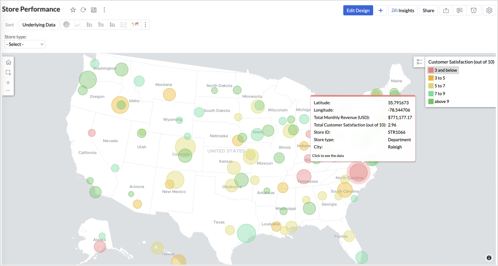
- Each store appears as a distinct bubble based on its lat/long.
Procedure
- From the dataset, click the Create icon and select Chart View.
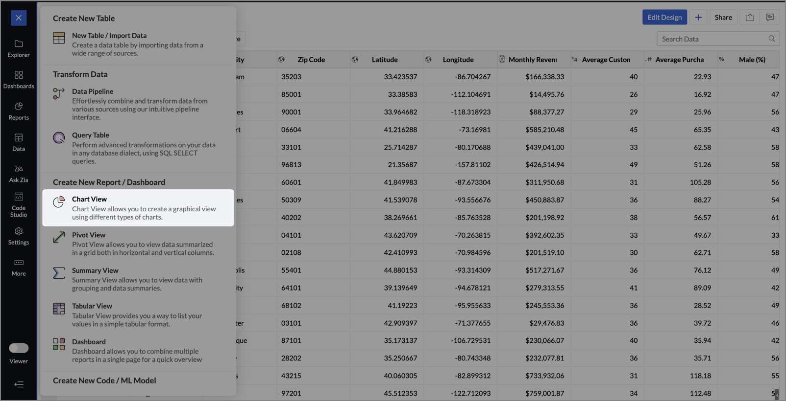
- On the designer page, drag and drop the following columns into their respective shelves:
- Latitude → X-Axis
- Longitude → Y-Axis
- Customer Satisfaction (out of 10) → Color
- Monthly Revenue (USD) → Size
- Store ID, Store Type, City → Tooltip
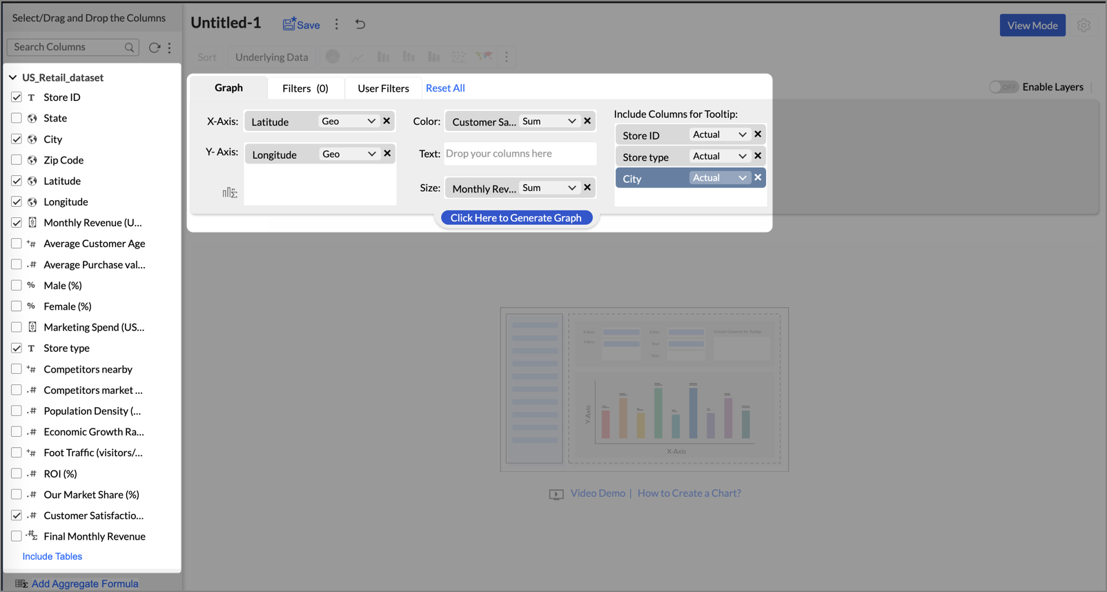
- Click Generate Graph.
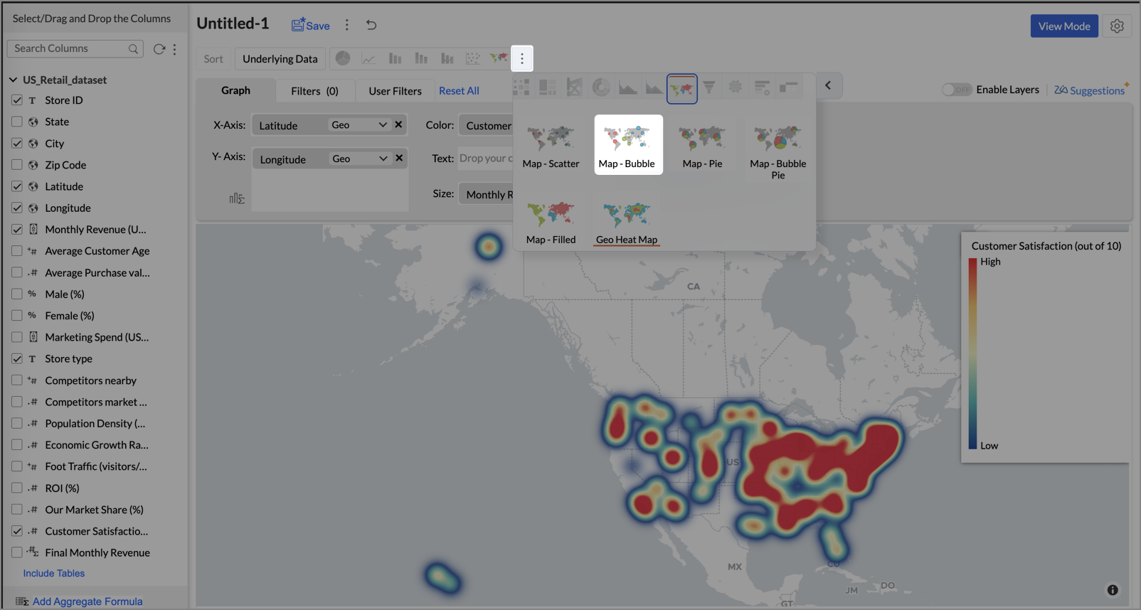
- Click on the ellipsis icon and select the chart type as Map - Bubble.
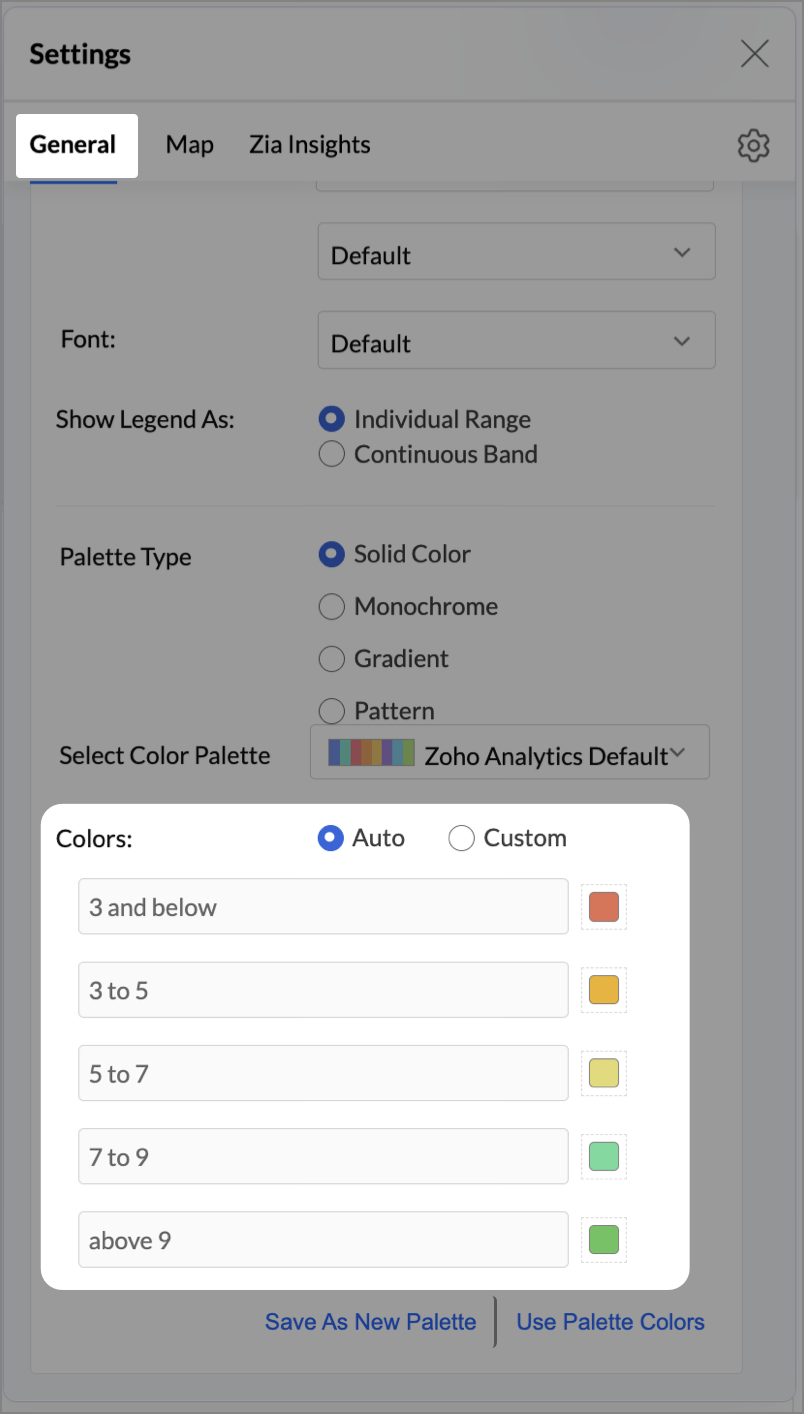
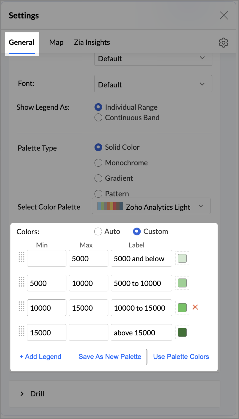
- Click the Settings icon, and under the General tab, click Legend.
- In the Colors section, customize the color scale from red to green to represent satisfaction ranges.
- Under the Map tab, click Map control and enable Display Specific Country Map.
- From the drop-down, select Albers USA Projection. This displays the USA map by placing Alaska and Hawaii below the mainland USA on a single map.
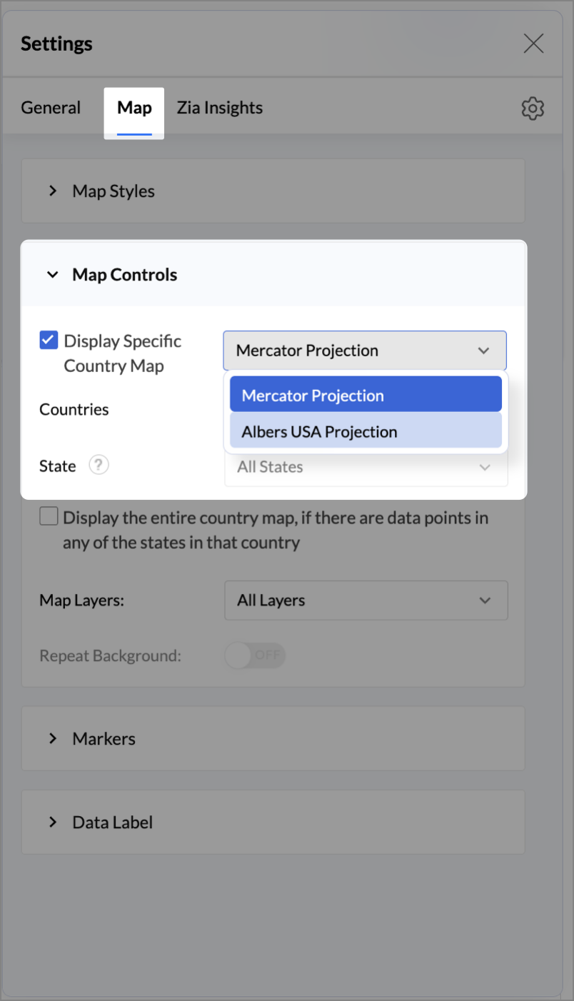
- Rename the report as Store Performance and click Save.
Tip:
Add a User filter such as Store type or State to analyze performance by segment.
This configuration creates a bubble for every store, sized by its revenue and colored by customer satisfaction — instantly showing how happy customers are in high- or low-revenue zones.
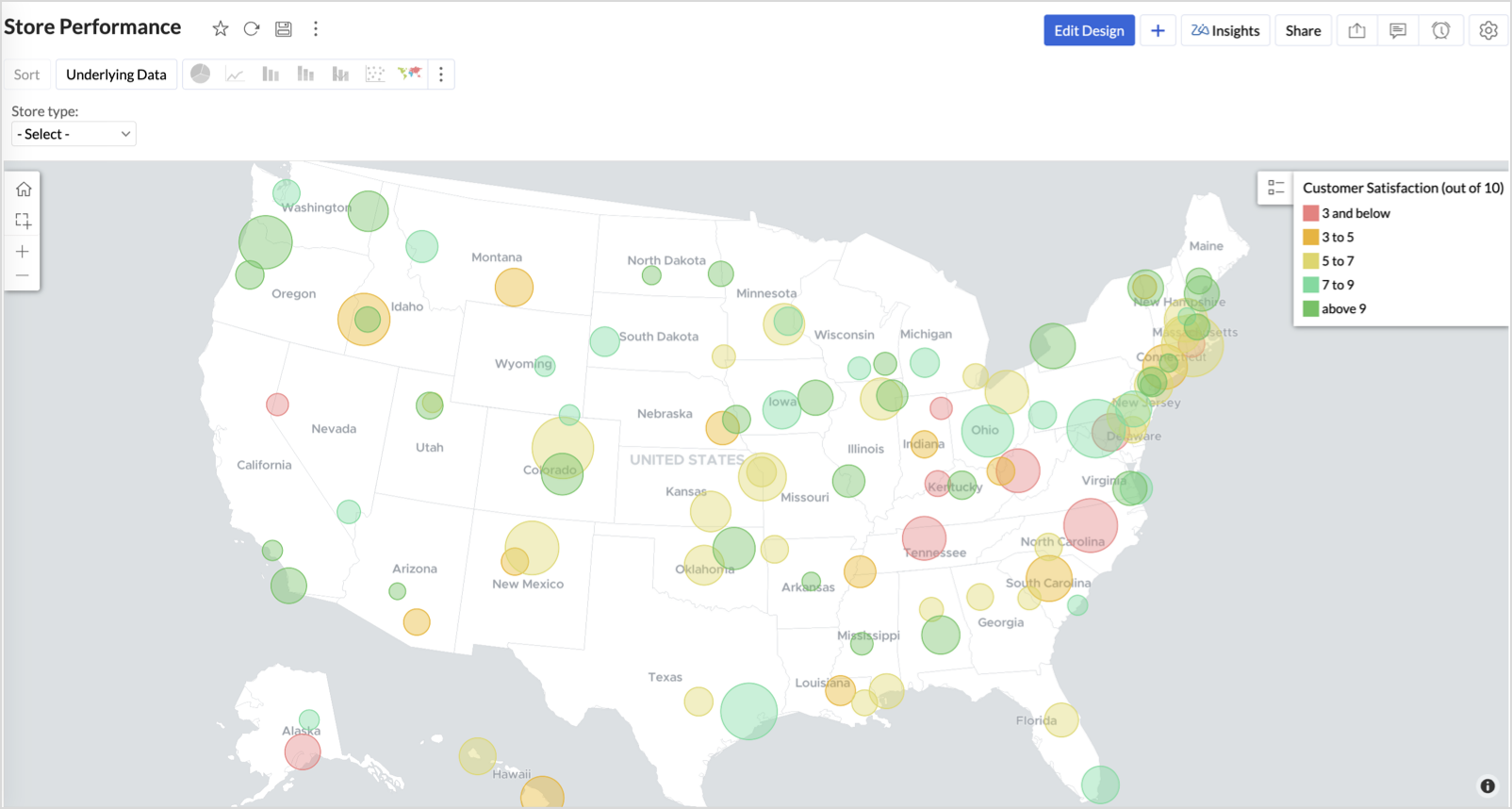
Key Insights
Large bubble + Red color - High revenue but poor satisfaction — risk of churn!
Small bubble + Green color - Low revenue but high satisfaction — possibly underserved
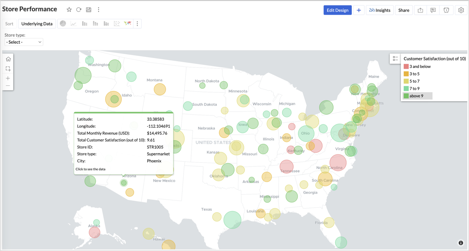
Large bubble + Green color - Healthy performers — consider replicating success
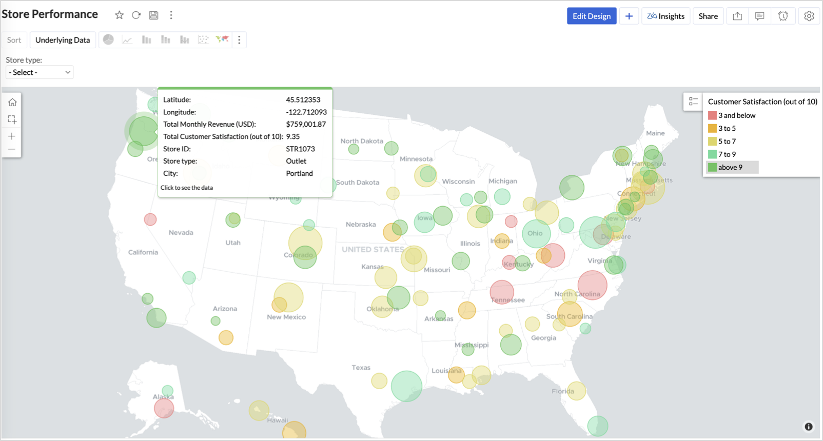
Small bubble + Red color - Low performers — review for possible closure or revamp.
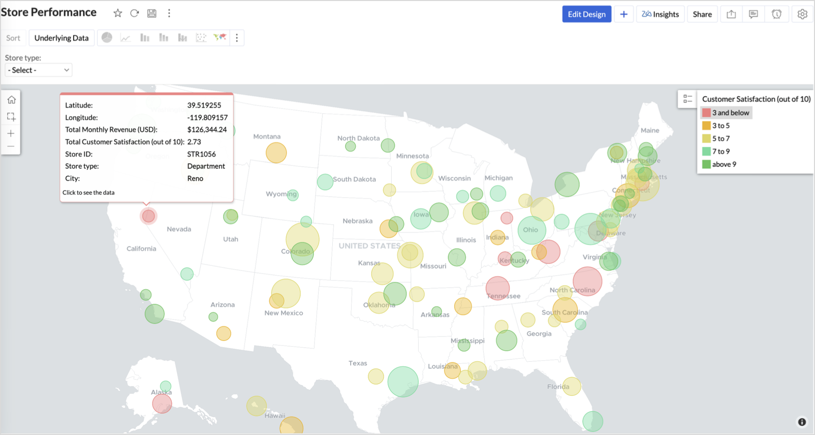
Business Interpretation
This chart acts as a live performance map for executives and analysts. Instead of scanning through tables or KPIs, stakeholders can instantly spot outliers, prioritize investments, and plan corrective actions by just glancing at the map.
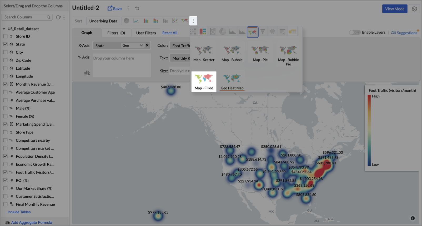
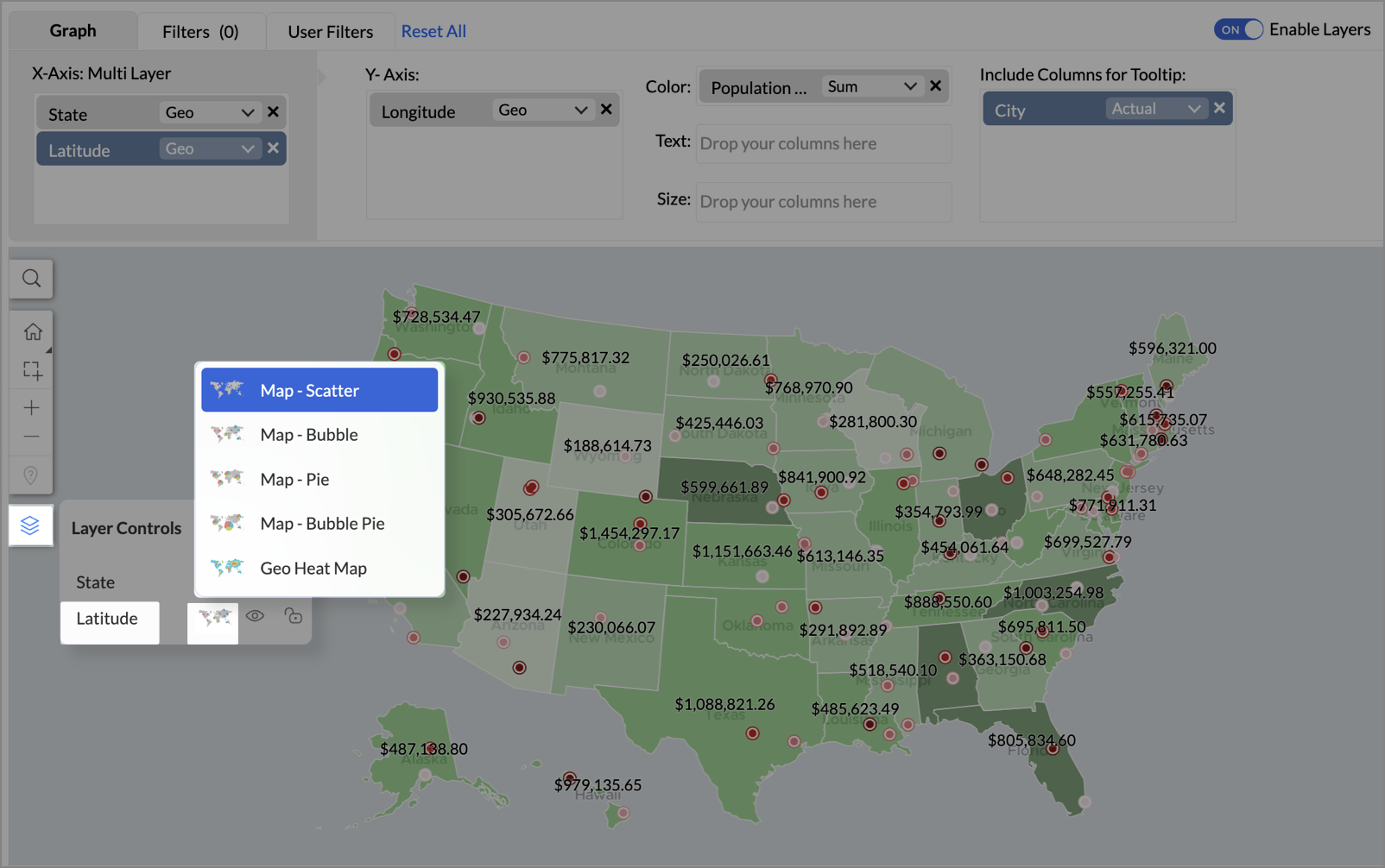
2. Revenue-to-Traffic Ratio with Ghost Zone Detection (Map - Filled + Scatter)
To evaluate how efficiently each state is converting foot traffic into store revenue — and more importantly, to identify high-footfall regions without store presence, often referred to as ghost zones.
This chart helps:
- Compare state-level foot traffic against actual revenue
- Spot underutilized or over-performing regions
- Discover untapped markets with high visitor potential but less to no physical stores
Why Map - Filled + Scatter?
- The Map - Filled chart provides a regional perspective of traffic density and revenue generation.
- The Scatter layer overlays actual store locations based on latitude and longitude.
This powerful combo allows you to measure performance where you’re active and spot opportunities where you're not.
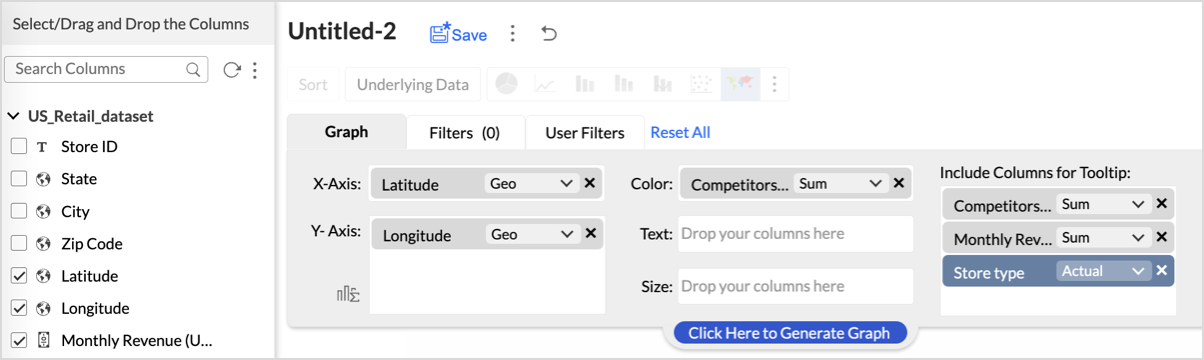
Procedure
- From the dataset, click the Create icon and select Chart View.
- On the designer page, drag and drop the following columns into their respective shelves:
- State → X-Axis
- Foot Traffic (visitors/month) → Color
- Monthly Revenue (USD) → Text
- Marketing Spend (USD), Population Density (people/sq km), ROI (%) → Tooltip
- Click Generate Graph.
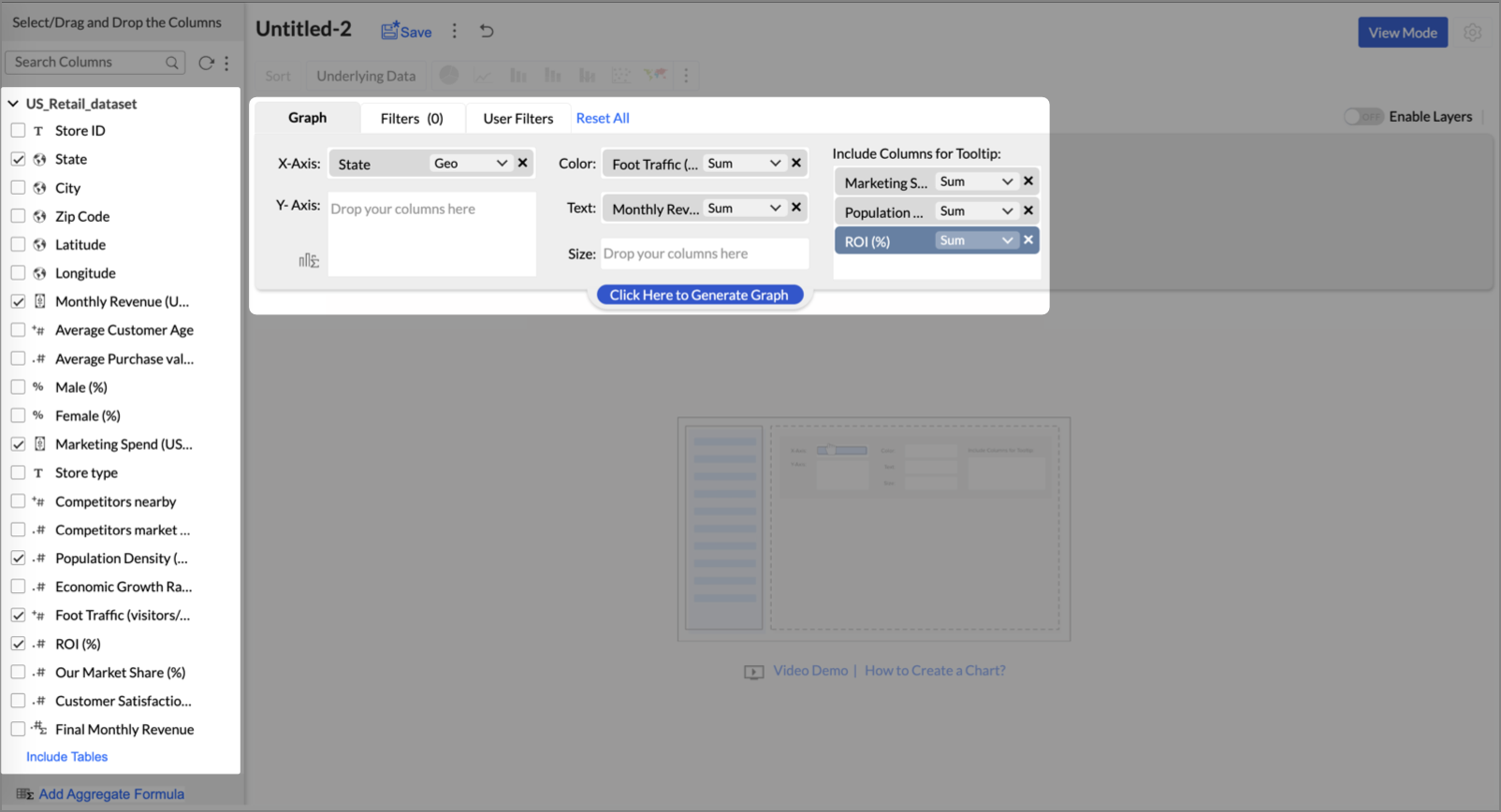
- Click on more option and select the chart type as Map-Filled.
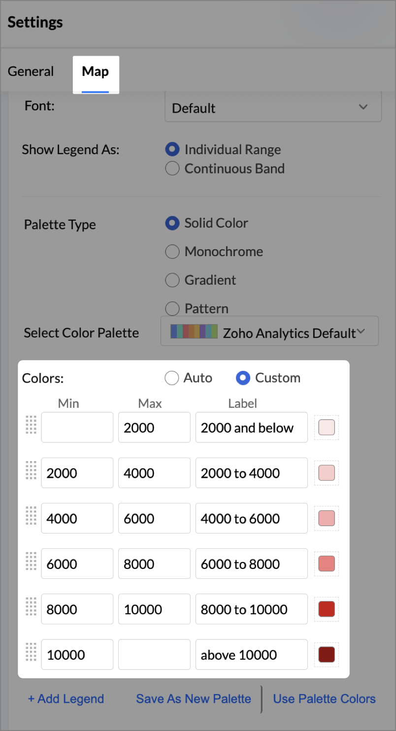
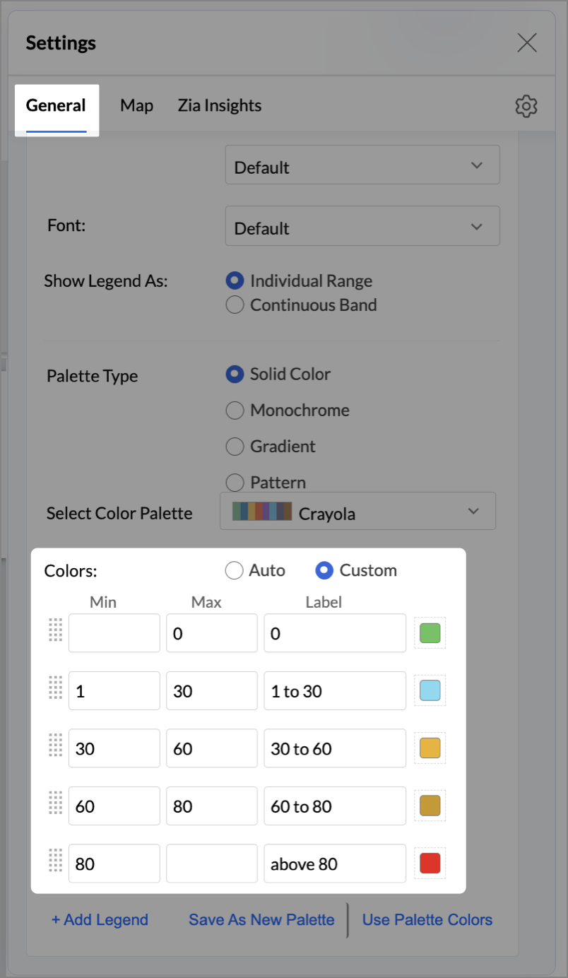
- Click the Settings icon, then click Legend.
- In the Colors section, assign from light to dark green colors for the below range of foot traffic:
- Below 5,000
- 5,000–10,000
- 10,000–15,000
- Above 15,000
- Under the Map tab, change the map to Albers USA Projection.
This filled layer highlights traffic and revenue across states.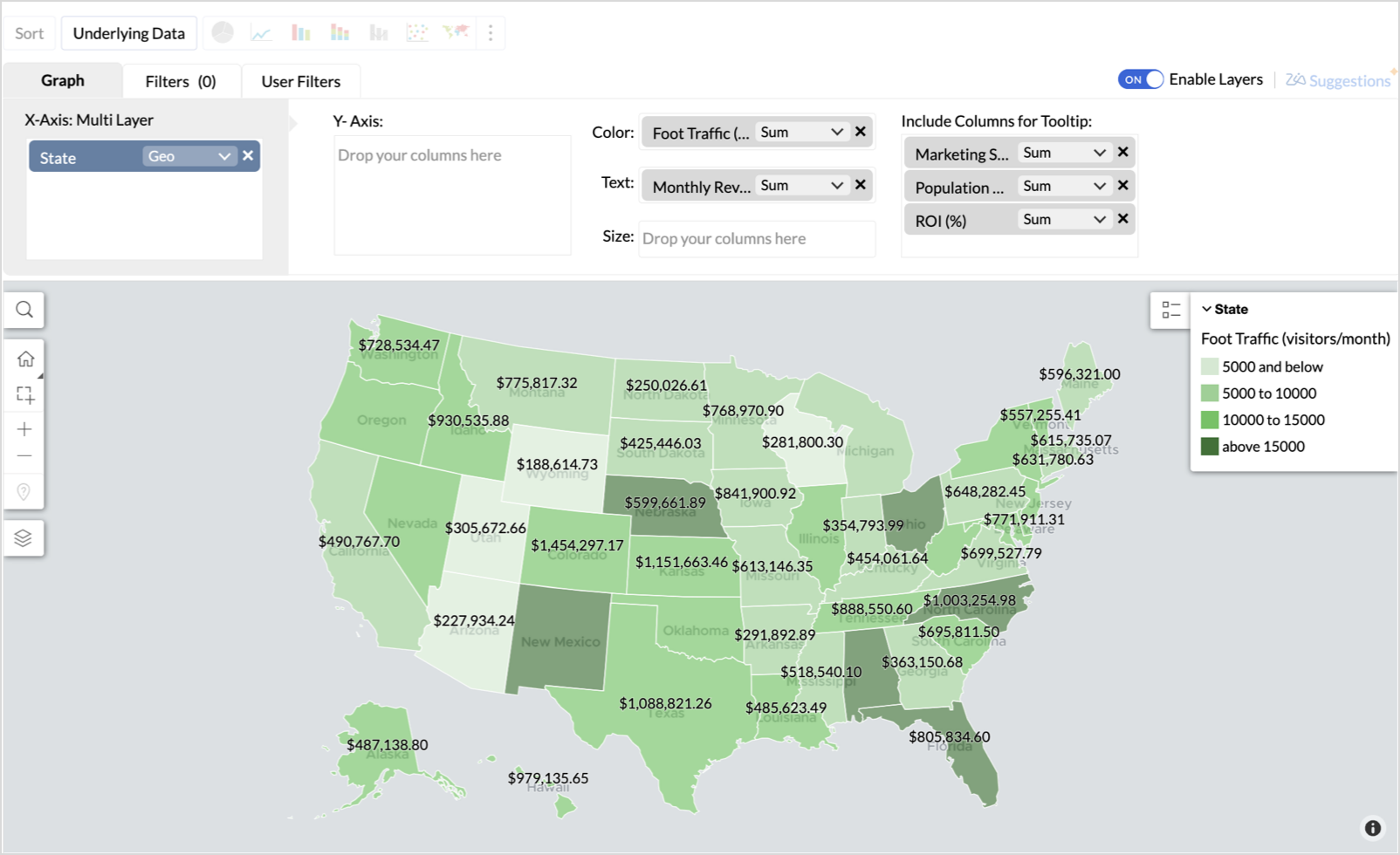
- Toggle Enable Layers to add a second layer.
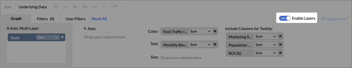
- In the new layer, drag and drop Latitude and Longitude into the X-Axis and Y-Axis respectively, Population density into the Color shelf, and click Generate Graph.
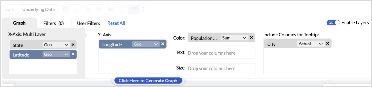
- Click Layer Controls, select Chart Chooser besides Latitude and choose the map as Map - Scatter from the list.
- To customize the second layer, go to Settings → Map → Latitude → Legend, and assign from light to dark red colors for the below range of population density:
- Below 2,000
- 2,000-4,000
- 4,000-6,000
- 6,000-8,000
- 8,000-10000
- Above 10,000
- Rename the report as Revenue-to-Traffic Ratio with Ghost Zone Detection and click Save.
This scatter layer marks the exact store locations, allowing visual correlation with high-traffic regions, revenue, and population density.

Key Insights
Dark green filled (high traffic) + Low revenue - Poor conversion - evaluate strategy or in-store experience
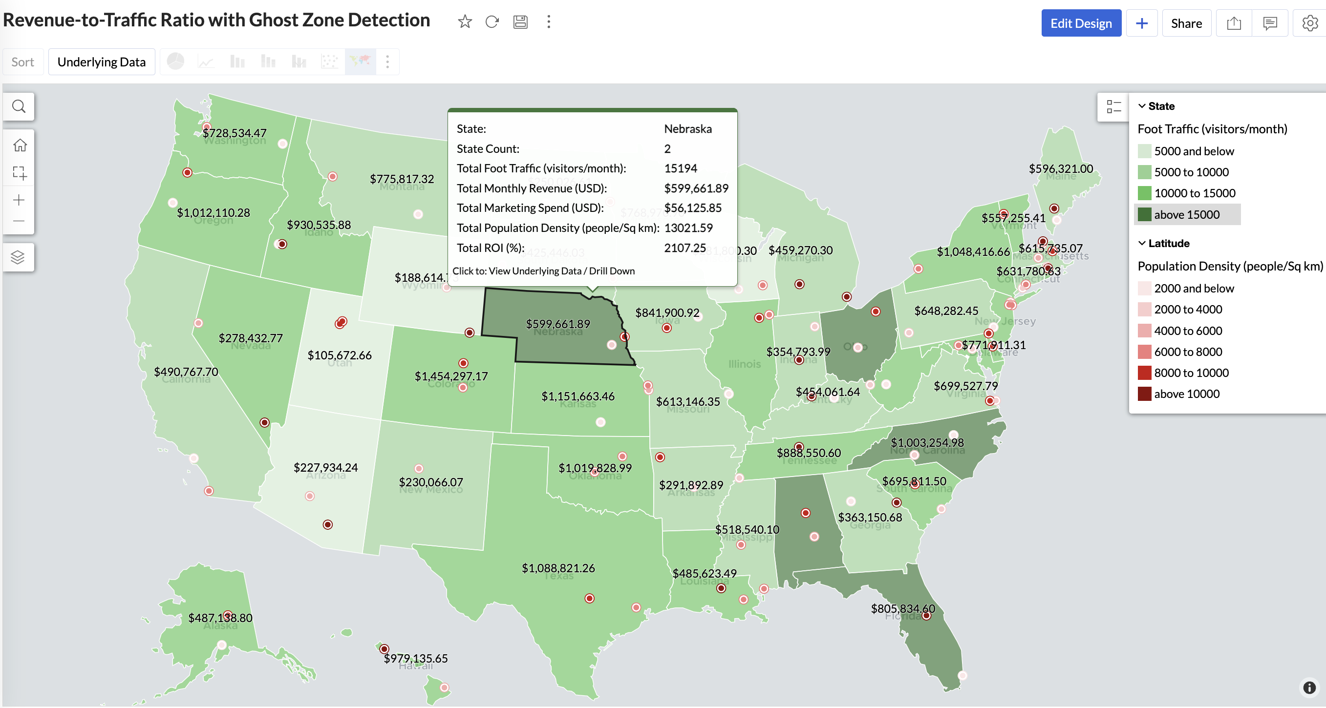
Mid to Dark green filled (high to mid traffic) + balanced revenue - Efficient zones — consider scaling efforts
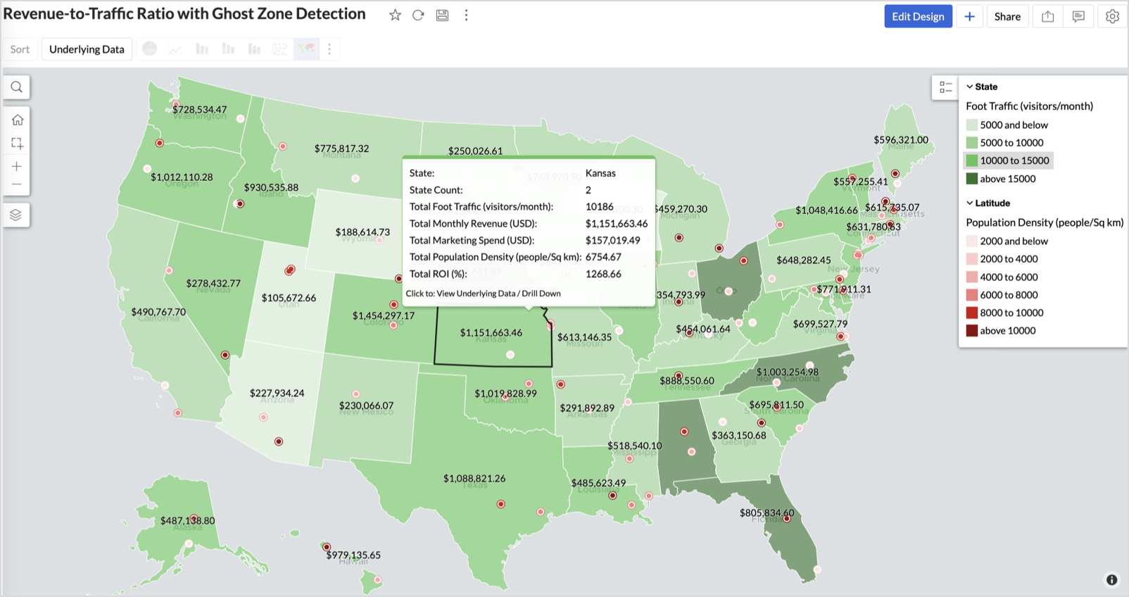
Light green filled (low traffic) + high marketing spend (from tooltip) - Budget drain — reduce spend or re-evaluate targeting
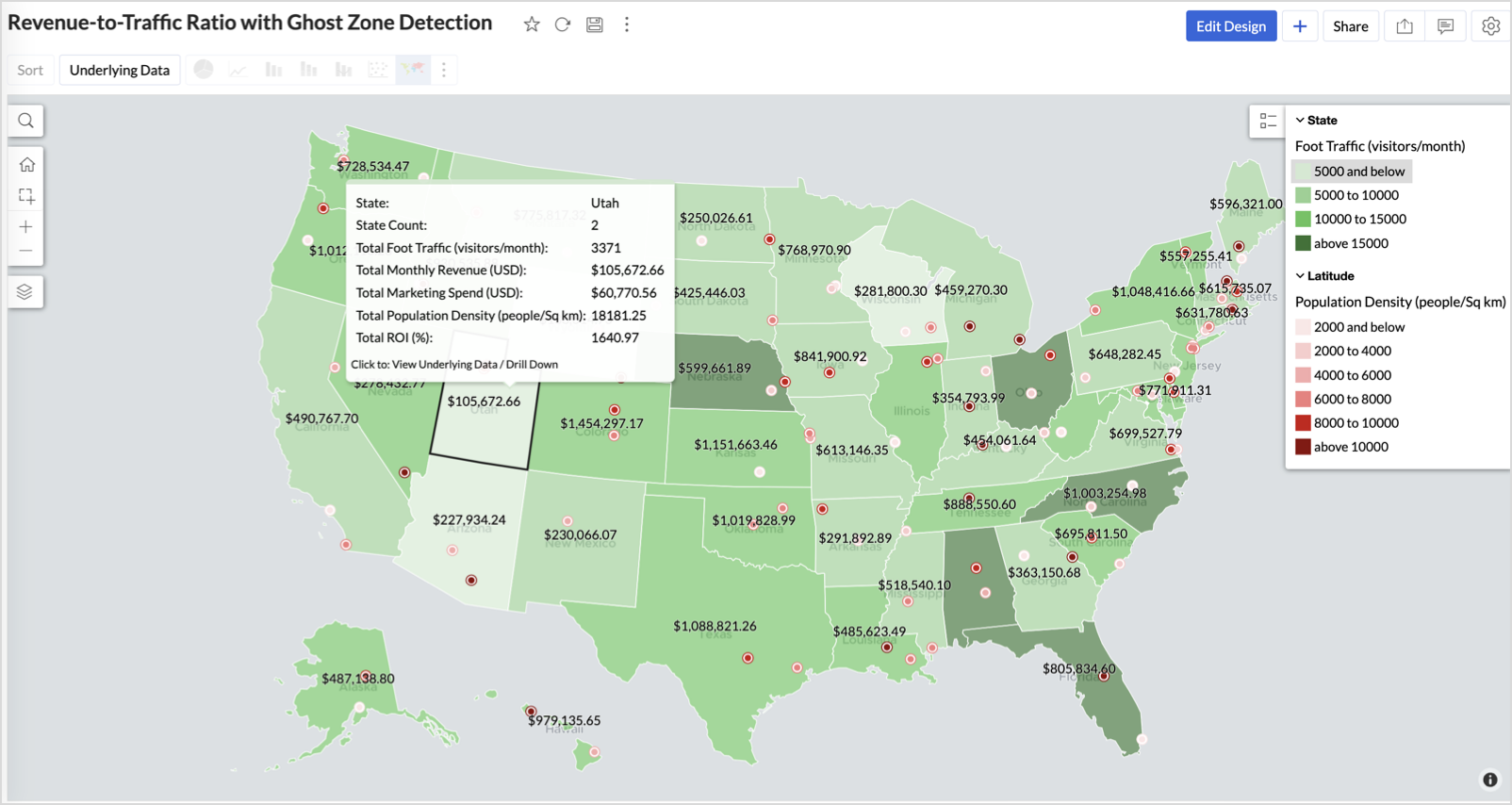
Dark red marker (high population density) + less to no store markers - Ghost Zones — high opportunity areas for expansion
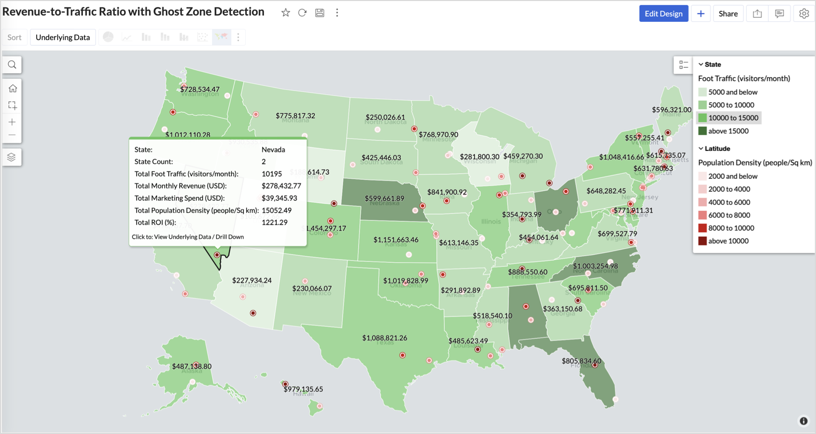
Example: In Las Vegas from Nevada, with a population density of 10,428 people/sq km and only two stores handling 10K–15K visitors/month, monthly revenue of the state remains modest at ~$278K. This indicates a high-opportunity zone for expansion, with strong footfall but untapped revenue potential.
Interpretation & Use
This map is designed for marketing and expansion teams who need to:
- Justify where to open new stores
- Optimize existing resource allocation
It visually answers the question:
Are we generating revenue where people are actually showing up?
Also, with the scatter layer:
Where are we not present — but should be?
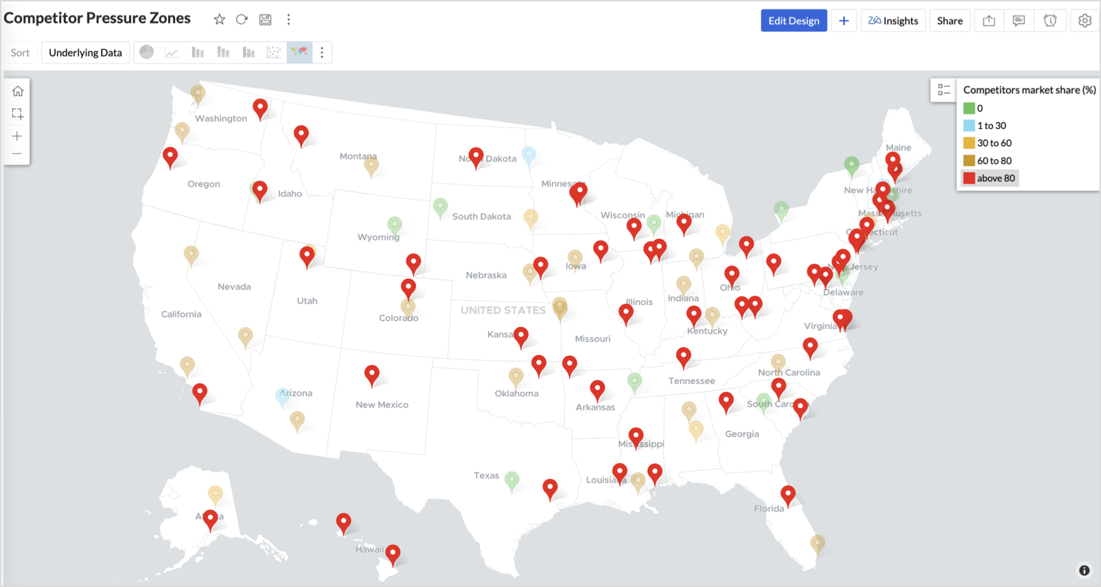
3. Competitor Pressure Zones (Map – Scatter)
To evaluate how store performance is impacted by nearby competition, using a scatter map that plots every store across the U.S. and reflects competitor market share through color intensity.
This view helps:
- Detect locations under competitive stress
- Identify high-risk zones where your market share is at risk
- Correlate competitor presence with satisfaction and store performance
Why Map - Scatter?
Map - Scatter offers a clean and lightweight visual that plots each store based on its exact coordinates. By encoding competitor market share as color and overlaying other attributes via tooltip, this chart becomes a competitive pressure radar.
Procedure
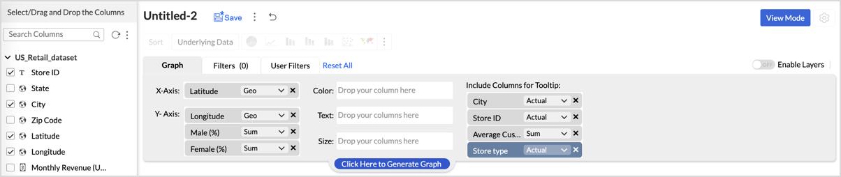
- From the dataset, click the Create icon and select Chart View.
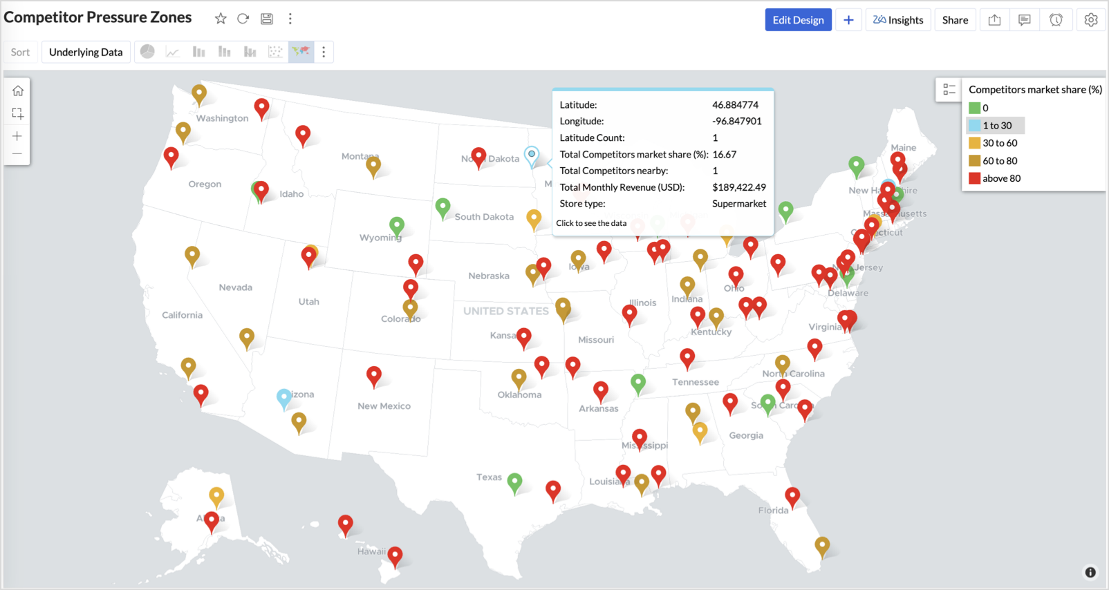
- In the chart designer, drag and drop the following columns into their respective shelves:
- Latitude → X-Axis
- Longitude → Y-Axis
- Competitors market share → Color
- Competitors nearby, Monthly Revenue, and Store Type → Tooltip
- Click Generate Graph.
- Click on the more option and select the chart type as Map-Scatter.
- In the Settings panel, adjust the color gradient to reflect pressure levels
- 0 → Green
- 1-30 → Cyan
- 30-60 → Orange
- 60-80 → Pale red
- Above 80 → Red
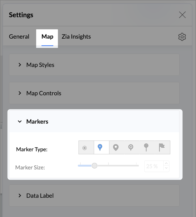
- Change the Marker type under Maps → Marker tab.
- Under the Map tab, change the map to Albers USA Projection.
- Rename the report as Competitor Pressure Zones and click Save.
The resulting chart uses color to signal competitive heat around each store, allowing you to scan pressure zones across all regions visually.
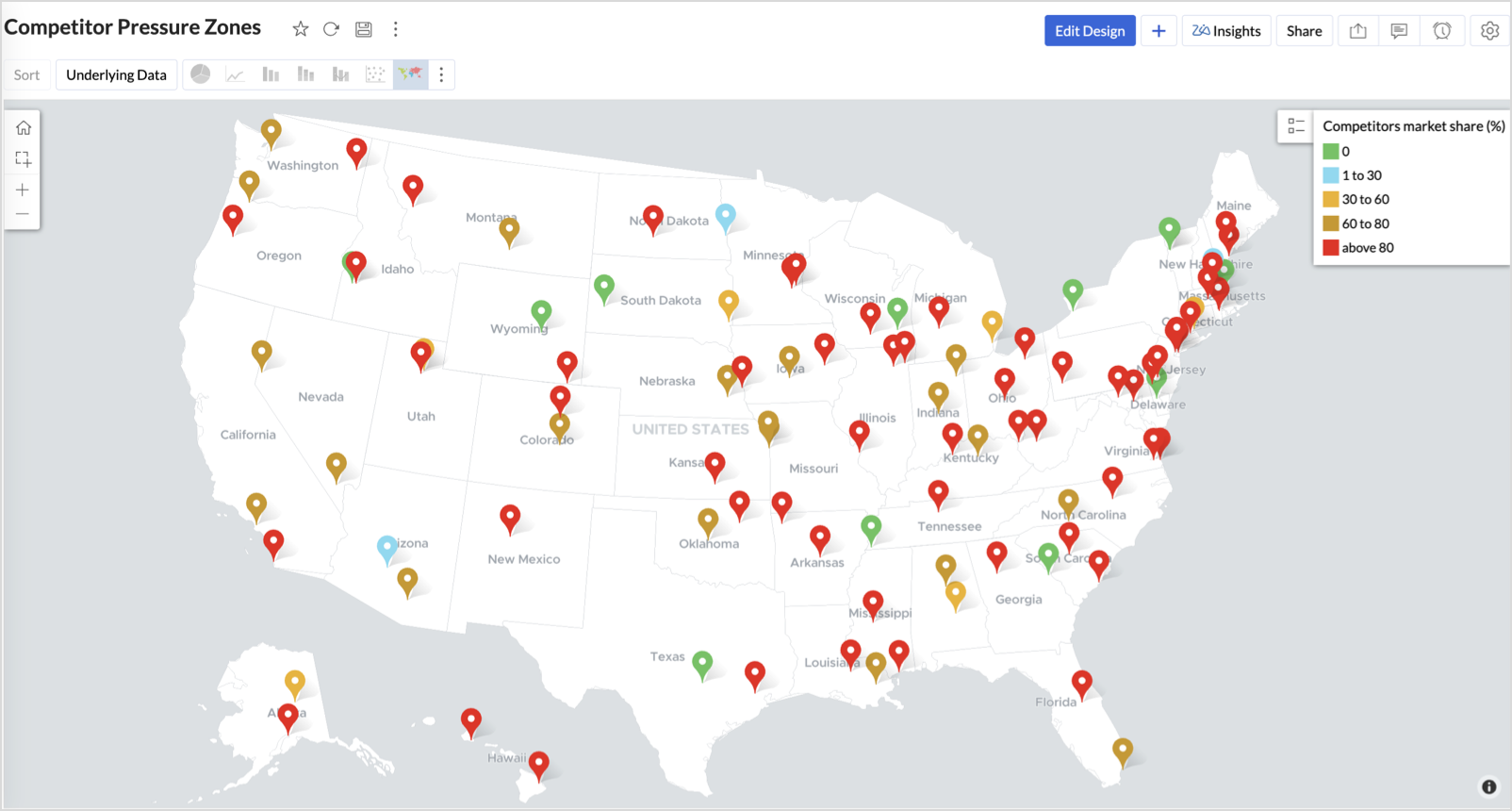
Key Insights
Red (80-100%) - High competitor dominance — urgent intervention zone
Orange (30-60%) + low revenue - Growing pressure — performance risk emerging
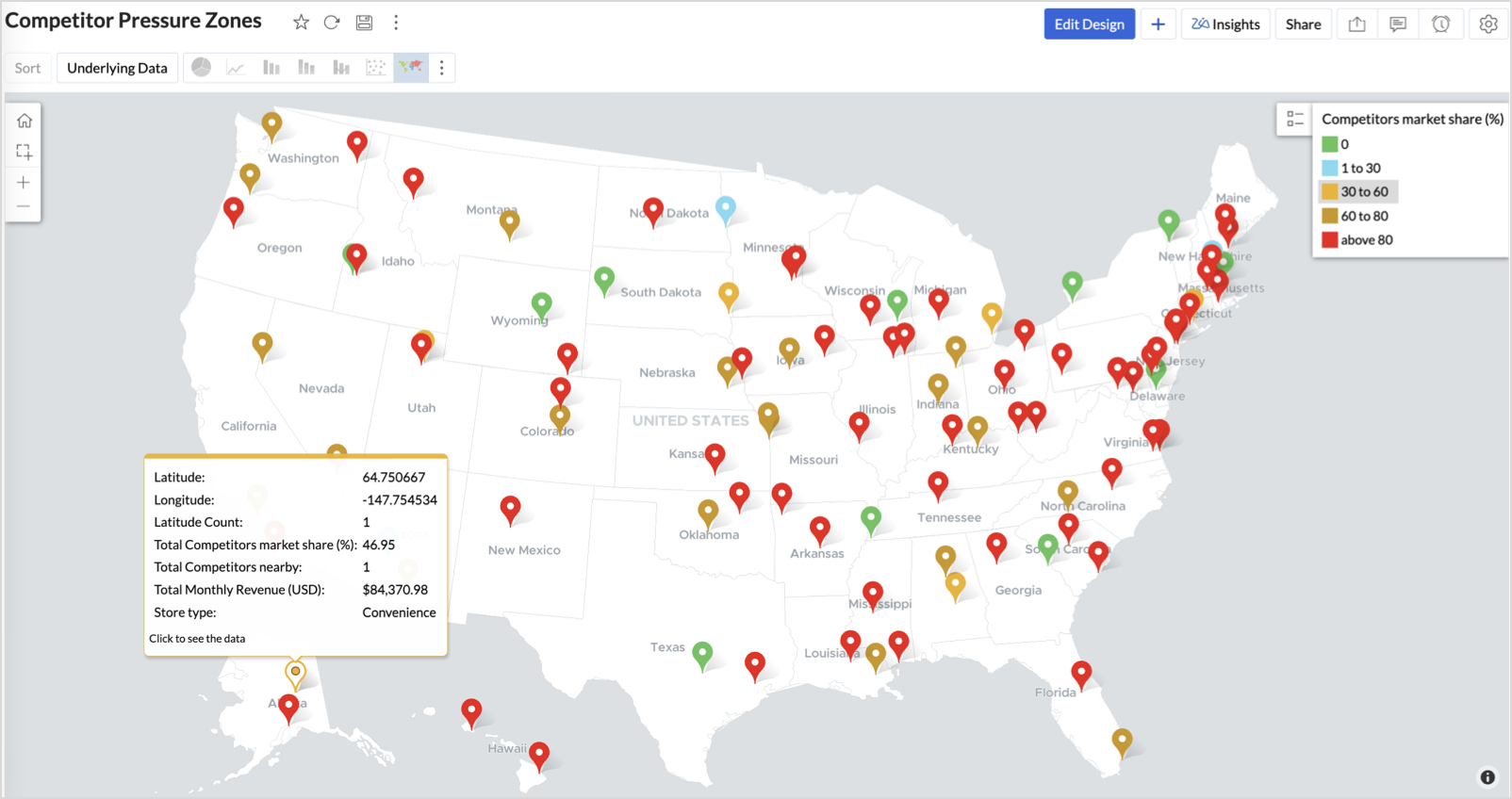
Green (0%) + strong revenue - Market leader — low competition, strong position
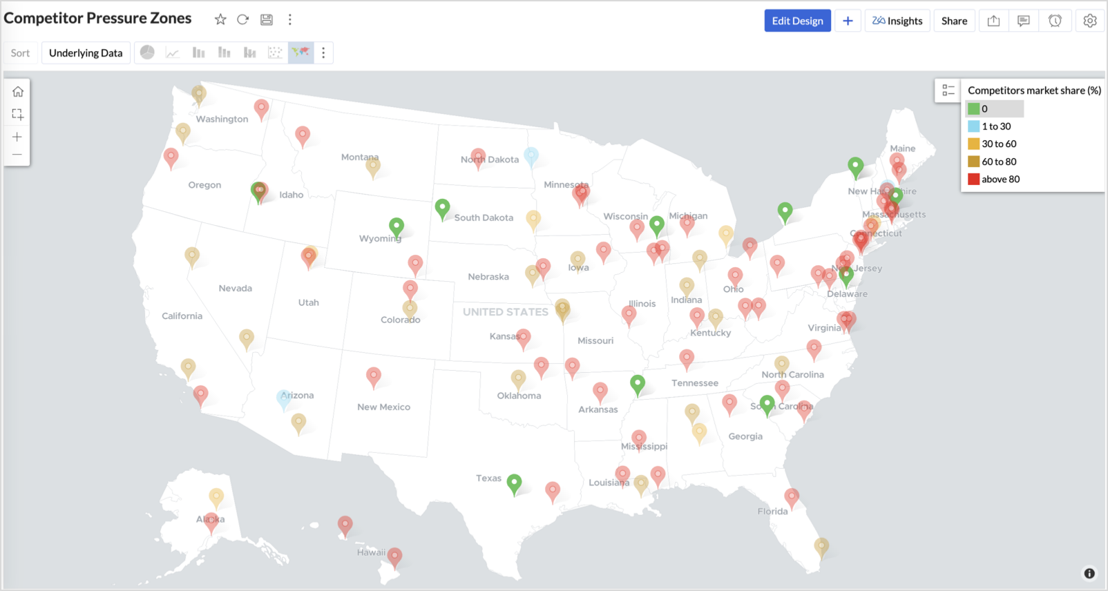
Cyan (1-30%) + moderate revenue - Mild competition — possible opportunity to scale further
Business Interpretation
This chart empowers regional and strategy teams to:
- Detect overcrowded areas where stores are losing share
- Identify safe zones where your brand leads the market
- Spot emerging competitor influence before it cuts into your margins
It acts as a competitive intelligence dashboard, mapping how your store network stands against external threats.
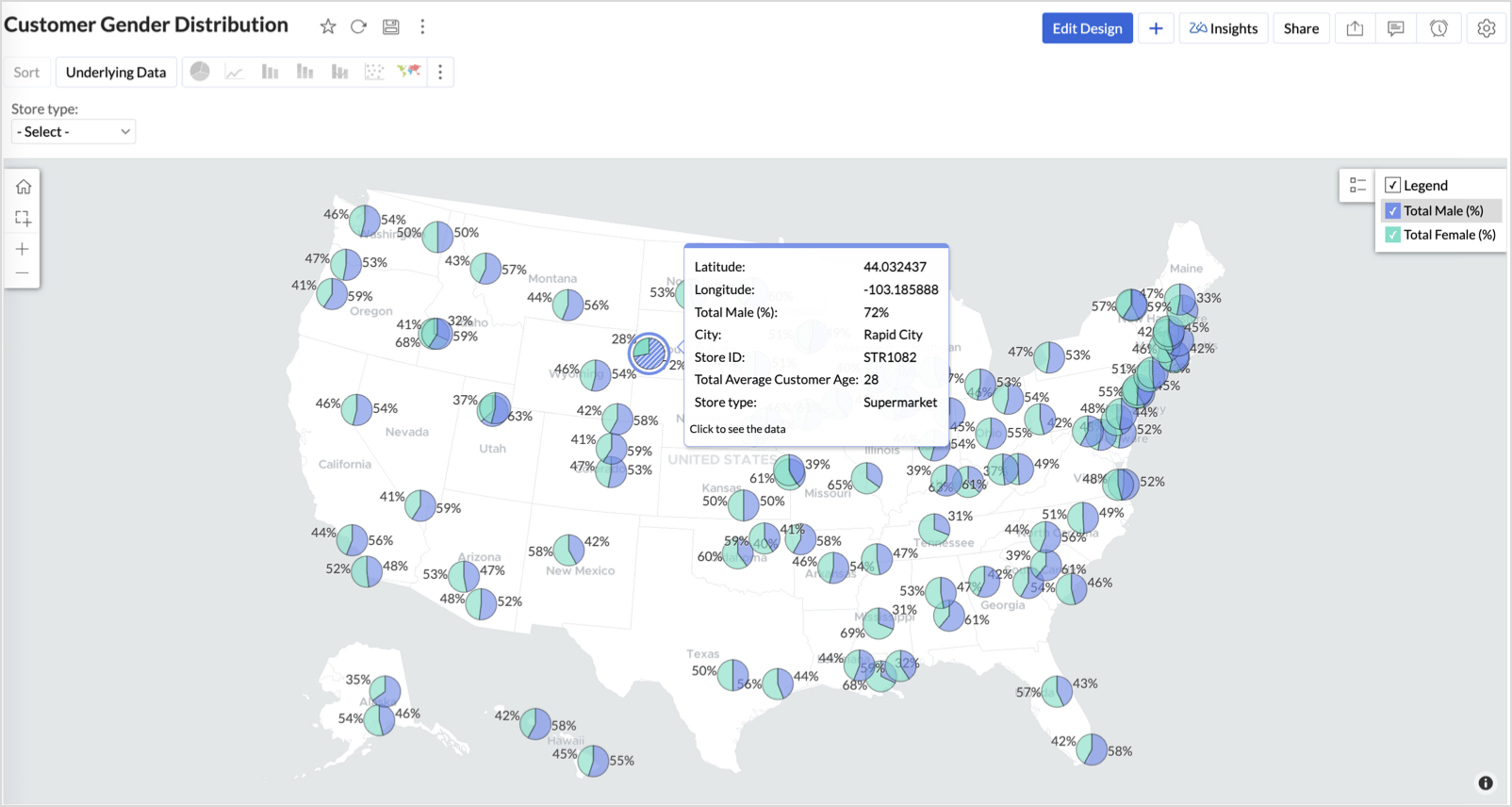
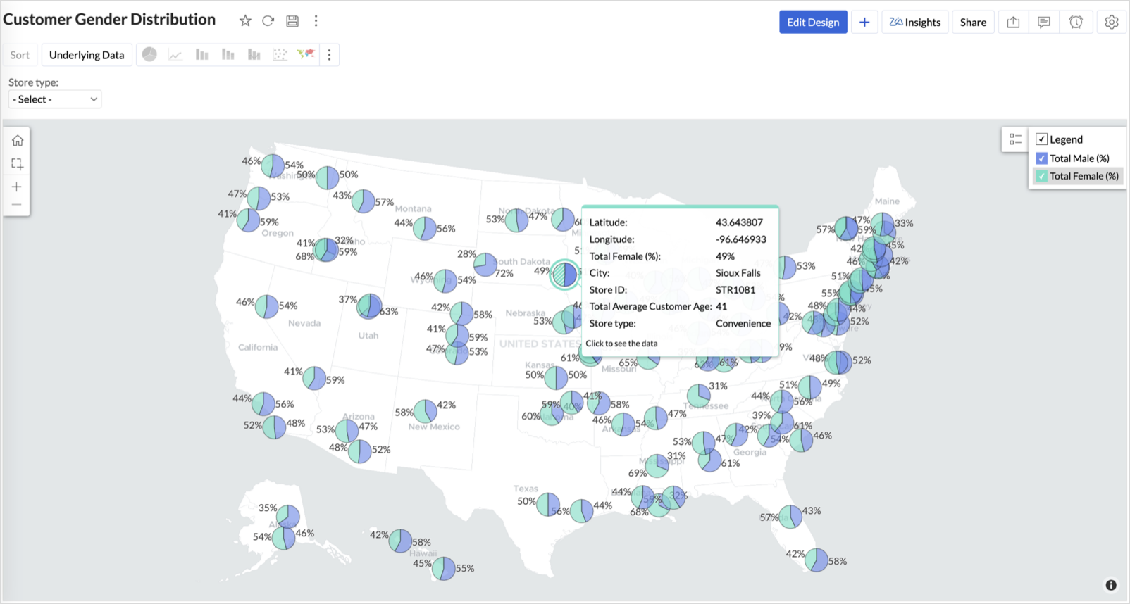
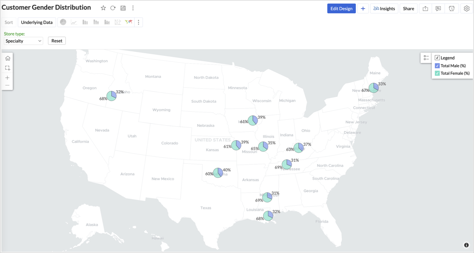
4. Customer Gender Distribution (Map - Pie)
To visualize how the gender distribution of customers varies across store locations. This helps identify stores with significant demographic skews, allowing for more personalized marketing, product selection, and in-store experience.
Why Map - Pie?
The Map - Pie chart is ideal for visualizing data composition across geographical locations.By breaking down each store’s customer base into Male (%) and Female (%) segments, this chart reveals who your customers are and where gender-targeted strategies might work best.
Procedure
- From the dataset, click the Create icon and select Chart View.
- In the chart designer, drag and drop the following columns into their respective shelves:
- Latitude → X-Axis
- Longitude, Male (%), Female (%) → Y-Axis
- City, Store ID, Average Customer Age, Store Type → Tooltip
- Click Generate Graph.
- In Settings, under the Map tab, change the map to Albers USA Projection.
- Click on Markers, adjust the Marker Size as shown.
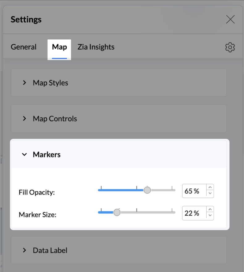
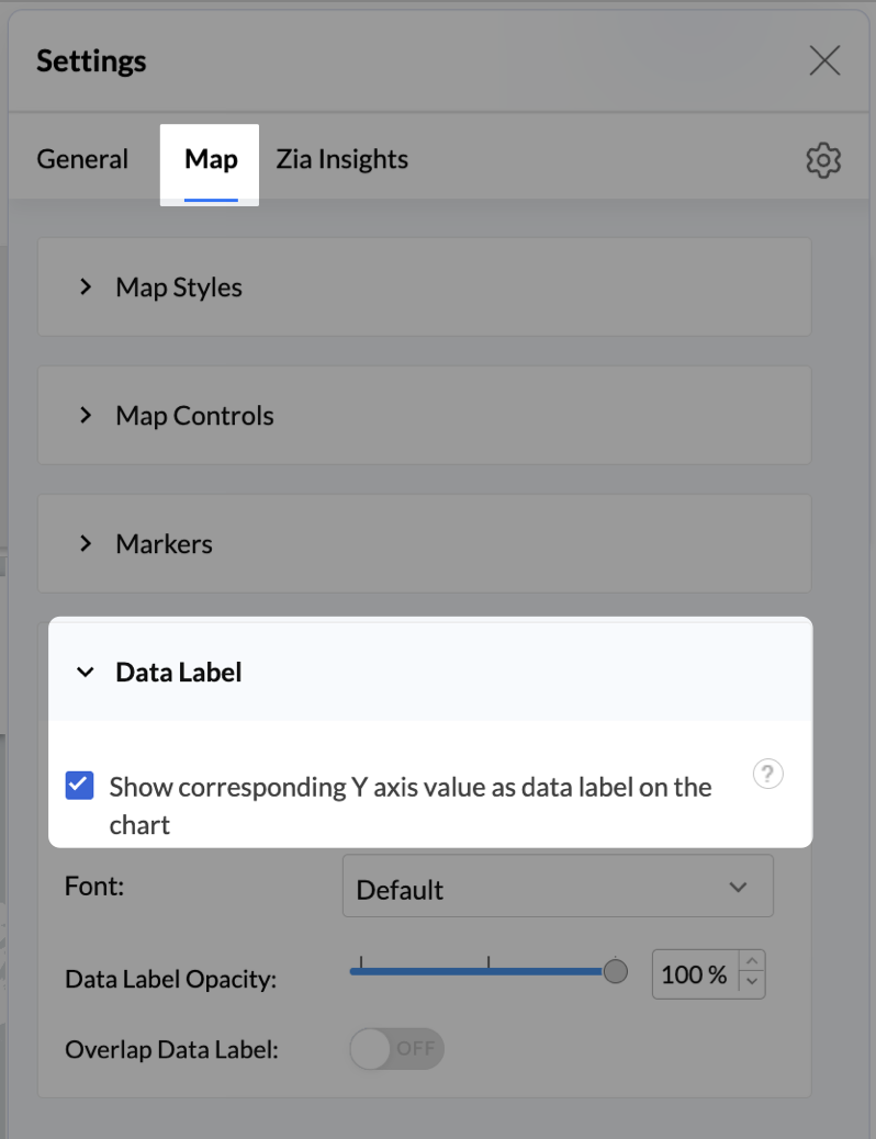
- Click on Data Label, and enable the Show corresponding Y axis value as data label on the chart to display the percentage values on the map.
- Add Store Type as User Filters to slice down store-wise gender distribution.
- Rename the report as Customer Gender Distribution and click Save.
Each store will now display a pie chart representing the gender split among its customers, directly on the map.

Key Insights
Uneven gender split (e.g., 70% Male) - Potential to tailor offerings, branding, or promotions for the dominant gender
Balanced split (≈50/50) - Opportunity to run inclusive or diversified campaigns
High female ratio + specialty store - Indicates demand for niche products — expand category offerings
Business Interpretation
This chart allows marketing and merchandising teams to:
- Understand gender-based customer clustering across regions
- Launch targeted campaigns (e.g., loyalty programs, promotions)
- Refine product assortments to suit local preferences
For example: A store with 70% female shoppers may benefit from deeper investment in lifestyle categories, while a balanced store could serve as a testing ground for unisex offerings.
Summary
In this phase, we laid the foundation for geo-powered retail intelligence using Zoho Analytics. Through a single, well-structured dataset and four powerful geo map visualizations, we transformed raw store data into real, actionable business insights.
Here’s what we achieved:
|
Report
|
Business Insights
|
|
Store Performance (Bubble)
|
Identified stores that are over performing or at churn risk based on revenue and satisfaction.
|
|
Revenue-to-Traffic Ratio (Filled + Scatter)
|
Detected ghost zones and optimized marketing ROI by comparing traffic and revenue.
|
|
Competitor Pressure Zones (Scatter)
|
Mapped out competitor dominance and spotted at-risk or saturated regions.
|
|
Customer Gender Distribution (Pie)
|
Uncovered demographic patterns to tailor product, marketing, and in-store experience.
|
Click here to access the sample workspace.
These visualizations brought spatial awareness into every performance metric — turning maps into a strategic business tool.
And this... is just the beginning.
Stay tuned for Phase 2 — where Multi-Layer Geo Maps and Network Charts come together to supercharge your business strategy with even deeper spatial insights.
Topic Participants
Pradeepkumar R
Sticky Posts
What's New in Zoho Analytics - February 2026
Hello Users! We're back with another round of updates for Zoho Analytics. This month's release focuses on giving you greater flexibility in how you visualize, manage, and act on your data - with new features like custom visualizations, remote MCP server,What's New in Zoho Analytics - January 2026
Hello Users! We are starting the year with a strong lineup of updates, marking the beginning of many improvements planned to enhance your analytics experience. Explore the latest improvements built to boost performance, simplify analysis, and help youWhat's New in Zoho Analytics - November 2025
We're thrilled to announce a significant update focused on expanding your data connectivity, enhancing visualization capabilities, and delivering a more powerful, intuitive, and performant analytics experience. Here’s a look at what’s new. Explore What'sWhat's New in Zoho Analytics - October 2025
Hello Users! We're are back with a fresh set of updates and enhancements to make data analysis faster and more insightful. Take a quick look at what’s new and see how these updates can power up your reports and dashboards. Explore What's New! ExtremeWhat’s New in Zoho Analytics – September 2025
Hello Users!! In this month’s update, we’re raising the bar across multiple touchpoints, from how you bring in data, plan and track projects to how you design and brand your dashboards. We’ve added the all-new Gantt chart for project visualization, expanded
Recent Topics
Analytics : Highlighting a single bar in a bar chart
I have a bar chart showing values across a year by week. I have a user filter to change the selected week, however the year graph will remain as showing the full year. Is there anyway to conditionally format or construct the year graph to highlight the selected week ?Agents permission per department
Hi Team, can I setup permission for each agent what they can do in each department, for example I want account department agents to only have view access to support department tickets and not allowed to assign or reply to clients. I am sure this wouldZoho CRM with Built-In MCP Support
Zoho CRM now provides built-in support for Model Context Protocol (MCP), enabling AI tools to connect and perform CRM actions using natural language. Zoho CRM MCP servers act as a bridge between AI agents and Zoho CRM, exposing CRM capabilities as callableChoose Component for User Filter
This filter in the Choose Component for User Filter would be better if had an Order or Group by function. Also, the Specify the default filter values: is very confusing and limiting.Inviting client to setup brand and more
Hello, There are two most critical functions which must be added in Zoho Social for Agency. Invite user/client to setup brand and link social media. As a agency we tell our clients, we don't want your social media credentials to manage your account. ThenDisable - order online at zoho store
I'm running cafe with Zoho POS. Doing good, however this enablement (Disable online order only on zakyastore.in) would enhance the business. Support asked to close -> "We can close the store from more options in the Mobile store > Overview > Store detailsMass email from Report output
Hi, I'd like to send a mass email based on a report output. The report is pulling multiple information from linked modules. Each line of the report ends up with a contact name, email and multiple field values pulled from the linked modules (some are customSchedule from AI with Zoho Bookings MCP Server
Greetings from the Zoho Bookings team! We’re excited to introduce the Zoho Bookings MCP (Model Context Protocol) Server integration, a powerful new way to bring AI-driven automation into your scheduling workflows. With MCP, you can connect Zoho BookingsIssue with attaching files to a task through the API
Hello! I've implemented a function that creates a task for every new bill that is created but I haven't been able to attach to the task the files which are attached to the bill. I have encountered multiple errors but the most common one is error 33003:Create your own Zoho CRM homepage using Canvas - Home View!
Hello everyone We are excited to share a new enhancement to Canvas in Zoho CRM that gives users more control over how their homepage looks and works. Introducing Canvas Home View! What is Canvas Home View? You can now create and design a custom homepageHow to make separate ledgers for GST (different types). Based in India
Hello Everyone, I am trying to configure GST for a small business and I am not able to create separate ledgers for the different types of GST. In the reports all of it is mentioned under one heading which is not allowed. How do I make sure that the differentZoho mail admin panel not opening
Setting default From address when replying to request
At the moment, if I want to reply to a request, the From field has three options, company@zohosupport.com, support@company.zohosupport.com, and support@company.com. The first two are really internal address that should never be seen by the customer andIntroducing SlyteUI : From Idea to a Working Interface in Minutes
Hello everyone! Are you spending hours building basic UIs? Does even the smallest customization feel like a major task? CRM customization should feel intuitive and straightforward, not time consuming or exhausting. SlyteUI makes this possible by simplifyingZia Agents in Zoho CRM: a better way to set up digital employees
Hello everyone, If you've been using Zia Agents in Zoho CRM, so far using Connections was the only deployment method you're familiar with. You create an agent in Zia Agents (define its objective, write instructions, use tools, add knowledge base) andCanadian Banks ?
Can you advise which Canadian Banks can be used to fully sync credit cards and bank accounts? ThanksCombined Tasks and Issues View (Jira-Style Unified Workload)
Hello Zoho Projects Team, We hope you are doing well. We would like to submit a feature request regarding task and issue visibility in Zoho Projects. Current Behavior: At the moment, Zoho Projects separates Tasks and Issues into different modules, eachScale up your support with Zia actions
Hi there, Have you explored how Zia can help automate repetitive tasks? In customer support, every detail matters when delivering the right solutions to customers, and Zia is here to support you. This edition highlights how Zia can simplify and streamlineDisable Zoho Contacts
We don't want to use this app... How can we disable it?Allow Zia Agents using Zoho One Account
When I went to try Zia Agents, it forced the creation of a new, separate account. This seems counter-intuitive to me. I don't want to manage a separate account. Plus, aren't Zoho One users the ones most likely to adopt Zia Agents most quickly? It seemsMy Zoho mail stopped receiving or sending emails about 3 hours ago
Its a pop 3 account. The emails get into the actual mailbox on the server and I can send emails directly from the server, but they are no longer in Zoho, in neither of my Zoho accounts. All green ticks under Mail Accounts under SettingsPOP mailbox limits
If I am accessing a remote POP mail server using Zoho Mail is there a mailbox quota for the account or is it all related to my mail account storage limits?SPF: HELO does not publish an SPF Record
I am using Zoho mail. Completed all of the required prerequisites from the dashboard to avoid any issues with mail delivery. But when checking on mail-tester.com getting the following error. Can anyone help me solve this?Check out in Meetings
Why there is no check out in Meetings of Zoho CRM, very difficult to trackAbility to Attach Images When Reporting Issues to Zoho Projects from Zoho Desk
Hi Zoho Desk Team, Hope you’re doing well. We’re using the Zoho Desk–Zoho Projects integration to report bugs directly from support tickets into the Zoho Projects issue tracker. This integration is extremely useful and helps us maintain smooth coordinationZoho Show Keeps Crashing and Goes Down with the Data
Today, I am experiencing something unusual: Zoho Show keeps crashing and goes down with the data. When you try to reopen the same deck, you get that lovely "Presentation not found" error. This has happened today rather frequently with multiple decks.Outgoing Mail Blocked – Suspicious Login Activity (Need Clarification and Solution)
Hello, I’m currently facing an issue where my Zoho Mail account has been blocked due to “suspicious login activity,” and outgoing emails are restricted. Here are the details shown: Block type: Outgoing mail blocked Reason: Suspicious login activity AEscalate the tickets to the escalation team through email
Hi Zoho Team, I would like to ask if it is possible to escalate the tickets when the status changed to "Escalated" by sending an email to them. I have attached the snapshot from my Zoho desk where I want it to email to a certain group(escalation team).Mailbox storage showing incorrect usage
My mailbox shows 4.99 GB used out of 5 GB. However, actual mailbox usage is only around 394 MB. Trash and Spam are already empty. IMAP/POP is not enabled. WorkDrive is not in use. This appears to be a storage calculation issue. Please help to recalculateGoogle Fonts Integration in Pagesense Popup Editor
Hello Zoho Pagesense Team, We hope you're doing well. We’d like to submit a feature request to enhance Zoho Pagesense’s popup editor with Google Fonts support. Current Limitation: Currently, Pagesense offers a limited set of default fonts. Google FontsHave to ask: WHY is Zoho Purposefully blocking Apple Reminders?
I just have to ask: Why is zoho purposefully blocking Apple reminders (CalDav). This is just strange... I just can't see a reason why this is done both within the Zoho calendar and mail calendar? These are both paid services. Why? This little simple feature is forcing me to leave Zoho. Our workflow depends on Reminders and after talking with an Apple engineer, they noticed theat Zoho is purposefully blocking this caldav port call. I just don't understand why. Thanks!I am not able to check in and checkout in zoho people even location access allowed
This issue i am facing in mackbook air m1, I allowed location in chrome browser and i also tried in safari but getting similar issue. Please have a look ASAP.Printing receipts with 80mm thermal printer and Zoho Creator
I have a sales form in my Zoho Creator app and I would like to print receipts for customers. Question 1: From what I've read on this forum there's no way to submit and have the receipt print automatically, you'd have to go through the printer dialog,Integrate with WooCommerce using Wordpress Plugin
We’re thrilled to announce a powerful update to the Zoho Marketing Automation WordPress plugin with WooCommerce integration! This enhancement enables new possibilities for businesses running online stores using WooCommerce, empowering them to merge seamlessRemoving To or CC Addresses from Desk Ticket
I was hoping i could find a way to remove unnecessary email addresses from tickets submitted via email. For example, a customer may email the support address AND others who are in the helpdesk notification group, in either the TO or CC address. This resultsWhen I schedule calendar appointments in zoho and invite external emails, they do not receive invites
Hello, We have recently transitioned to zoho and are having a problem with the calendar feature. When we schedule new calendar appointments in zoho the invite emails aren't being sent to the external users that we list in participants. However, this worksSync desktop folders instantly with WorkDrive TrueSync (Beta)
Keeping your important files backed up and accessible has never been easier! With WorkDrive desktop app (TrueSync), you can now automatically sync specific desktop folders to WorkDrive Web, ensuring seamless, real-time updates across devices. Important:Unable to send
Hello, I am unble to send any single email during the whole time due to the Zoho IP 136.143.188.16 being bloked by SpamCop.net Please help can somebody help me?Errorcode 554
Hello, I am unble to send any single email during the whole time due to the Zoho IP 136.143.188.16 being blocked by SpamCop. Please can somebody help me?Spamcop
Have been trying to email several of our clients and many of our emails keep getting bounced back with an error that states: ERROR CODE :550 - "JunkMail rejected - sender4-op-o16.zoho.com [136.143.188.16]:17694 is in an RBL: Blocked - see spamcop.net/bl.shtml?136.143.188.16"Next Page