Geo-Powered Retail Intelligence with Zoho Analytics
In today’s highly competitive retail landscape, data-driven decisions are no longer optional — they’re essential. While businesses collect vast volumes of data across regions, stores, and customer segments, the real value lies in how effectively this data is visualized and interpreted.
Geo Maps in Zoho Analytics bring location intelligence to the forefront of decision-making. With powerful spatial analytics capabilities, retail businesses can now visualize store performance, identify untapped opportunities, and track customer behavior trends with a simple glance at a map.

This solution demonstrates how Zoho Analytics' Geo Maps can be leveraged to solve real retail business problems, using a step-by-step approach grounded in a practical, ready-to-use dataset.
- Business scenario
- Dataset Overview
- Problem Description
- Why Geo Maps Become a Game-Changer
- Solution Implementation – Report Creation
- Store Performance Analysis (Map – Bubble)
- Revenue-to-Traffic Ratio with Ghost Zone Detection (Map - Filled + Scatter)
- Competitor Pressure Zones (Map – Scatter)
- Customer Gender Distribution (Map - Pie)
- Summary
Business scenario
Imagine you're a retail chain operating hundreds of stores across the United States. Each store generates data—sales, visitor footfall, customer satisfaction, marketing spend—but these numbers alone don’t explain why some stores succeed while others under-perform.
Key challenges include:
- Identifying stores that are struggling before sales drop significantly.
- Understanding whether poor performance is due to location, low visibility, or intense competition.
- Evaluating which regions offer true expansion potential—and which are over-saturated.
With no visual correlation between location and business KPIs, many decisions remain reactive instead of proactive. This is where Geo Maps make all the difference—by transforming isolated data into contextual geographic insights.
Dataset Overview
To power this solution, we’ve created a comprehensive and realistic retail dataset that mirrors how actual store data behaves across geographies.
The dataset includes:
- Store-level performance data: revenue, average purchase value, and satisfaction.
- Customer insights: foot traffic, age, gender distribution.
- Market context: competitor presence and market share, population density, and economic growth rate.
- Geospatial data: zip code, city, state, latitude, and longitude of each store location.
Problem Description
Retail chains often operate on thin margins, and even minor under-performance at store level can have significant impacts across the organization. While dashboards provide revenue and performance trends, they often miss one critical dimension—geography.
Without geographic context, businesses face several recurring challenges:
- Underperforming stores go unnoticed until major losses occur.
- Ghost zones—areas with low store presence but high potential—remain unexplored.
- Marketing budgets get wasted in regions where returns are consistently low.
- Competitor pressure is misjudged due to lack of visibility on regional saturation.
- Store closures become reactive decisions, made after performance has already declined.
In short, data without location awareness leaves decision-makers blind to spatial trends and risks. Businesses need a smarter, more intuitive way to analyze store performance with geographical clarity—before it’s too late.
Why Geo Maps Become a Game-Changer
Geo Maps in Zoho Analytics address this gap by unlocking a visual layer of intelligence that traditional charts can’t offer.

Here’s what makes them a game-changer:
- Location-first insights: Instantly identify how store performance varies across the map - by city, state, or neighborhood.
- Visual correlation of multiple KPIs: Compare revenue, satisfaction, and foot traffic geographically to detect hidden patterns.
- Clutter-free, customizable visuals: Choose the right map type - bubble, filled, pie, or scatter - to match the data you want to analyze.
Unlike static dashboards, Geo Maps enable you to see the problem, context, and opportunity—all in one frame. Whether it's spotting trends, reallocating marketing spend, or planning expansion, this spatial layer puts decision-makers back in control.
Solution Implementation – Report Creation
This section walks through the step-by-step creation of four key Geo Map reports that reveal business insights from store-level data.
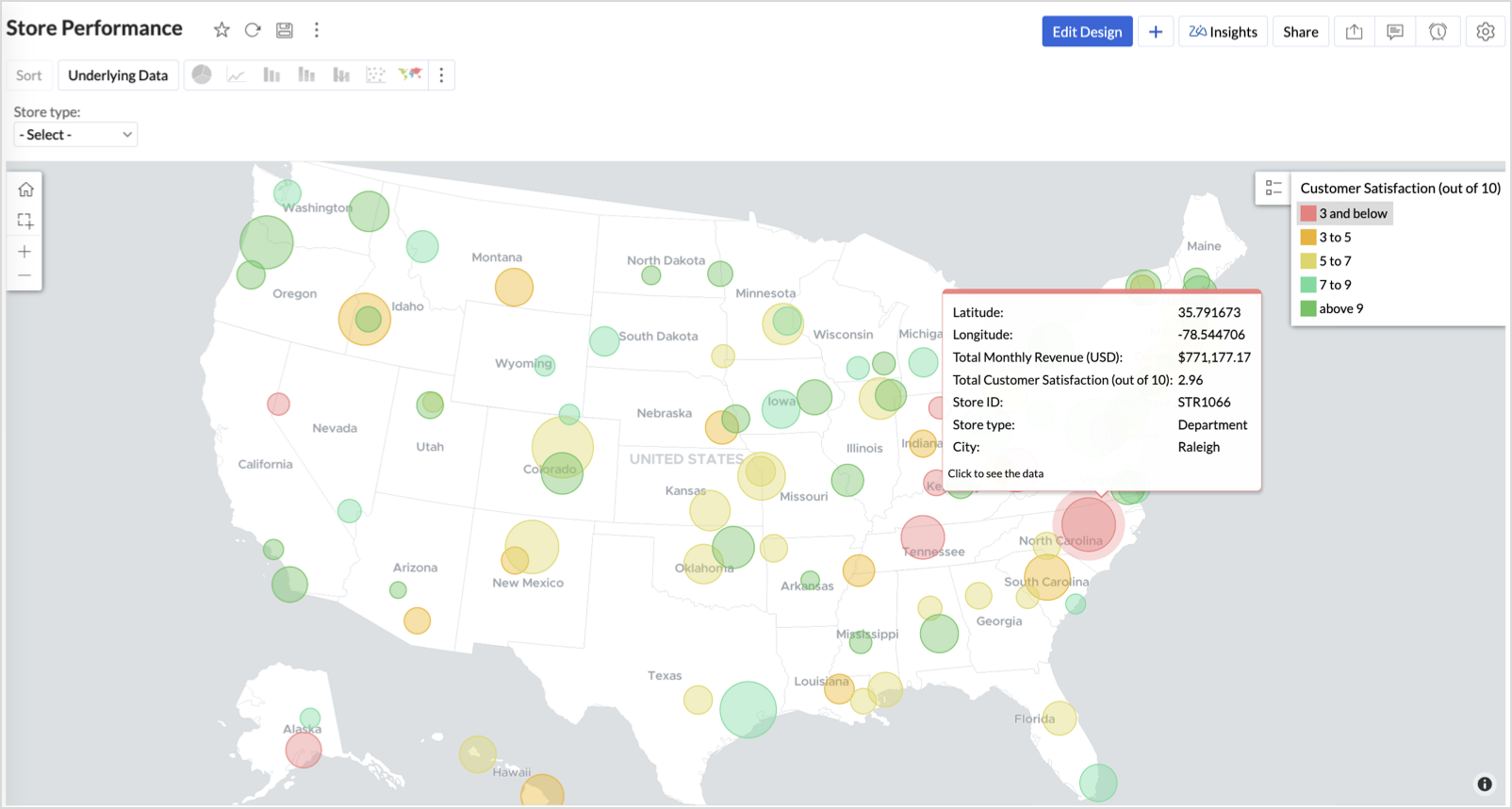
1. Store Performance Analysis (Map – Bubble)
To identify how stores are performing across different regions in terms of revenue and customer satisfaction, using a clean, visual-first map representation.
This helps uncover:
- High-performing stores in key zones
- Underperforming regions needing intervention
- Patterns related to location-based store success
Why Map - Bubble?
The Map - Bubble chart is ideal for visualizing store-level metrics using geolocation.
- Size indicates magnitude (e.g., Monthly Revenue)
- Color indicates health or quality (e.g., Customer Satisfaction)
- Each store appears as a distinct bubble based on its lat/long.
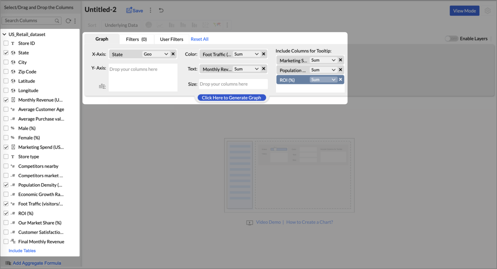
Procedure
- From the dataset, click the Create icon and select Chart View.
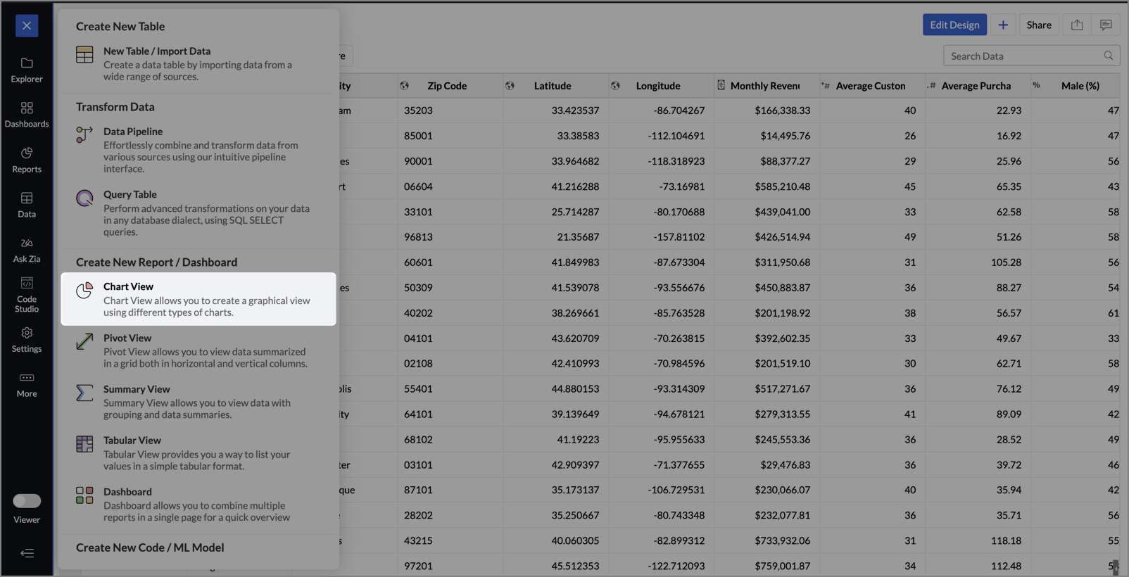
- On the designer page, drag and drop the following columns into their respective shelves:
- Latitude → X-Axis
- Longitude → Y-Axis
- Customer Satisfaction (out of 10) → Color
- Monthly Revenue (USD) → Size
- Store ID, Store Type, City → Tooltip
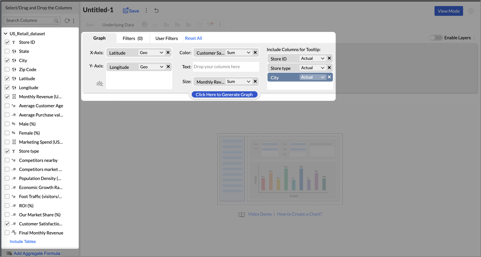
- Click Generate Graph.
- Click on the ellipsis icon and select the chart type as Map - Bubble.
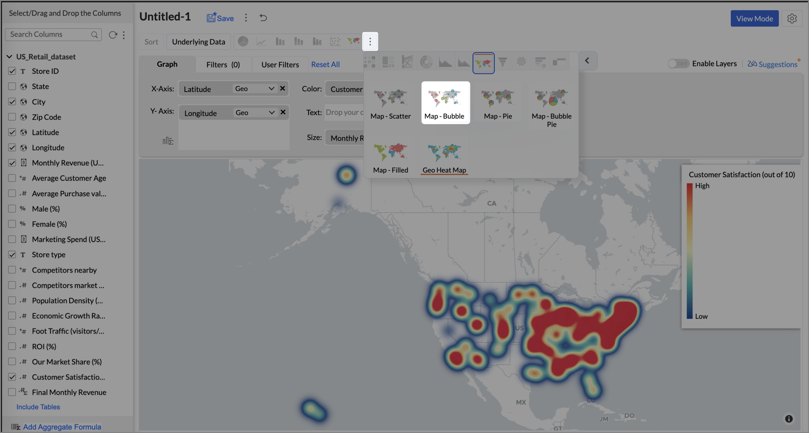
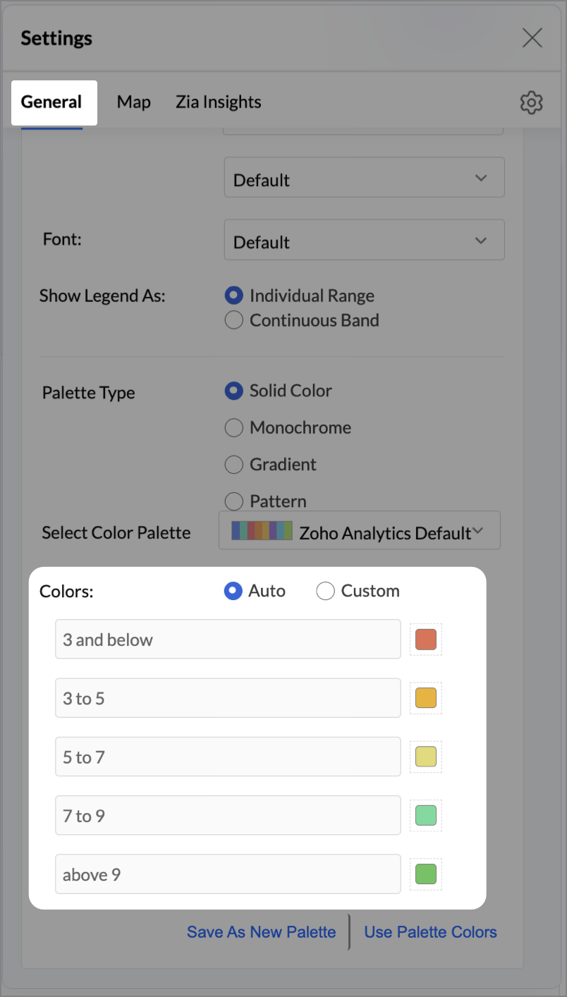
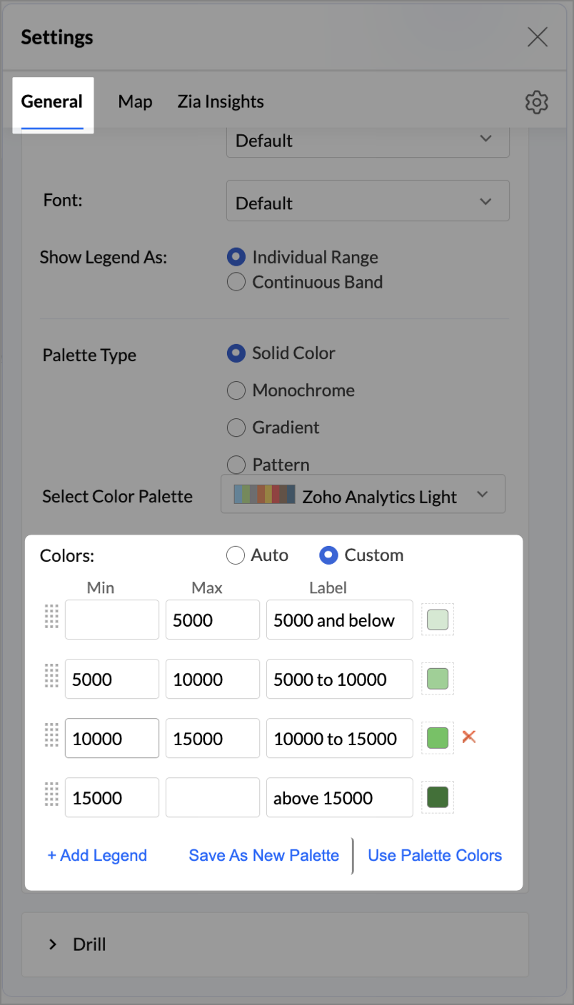
- Click the Settings icon, and under the General tab, click Legend.
- In the Colors section, customize the color scale from red to green to represent satisfaction ranges.
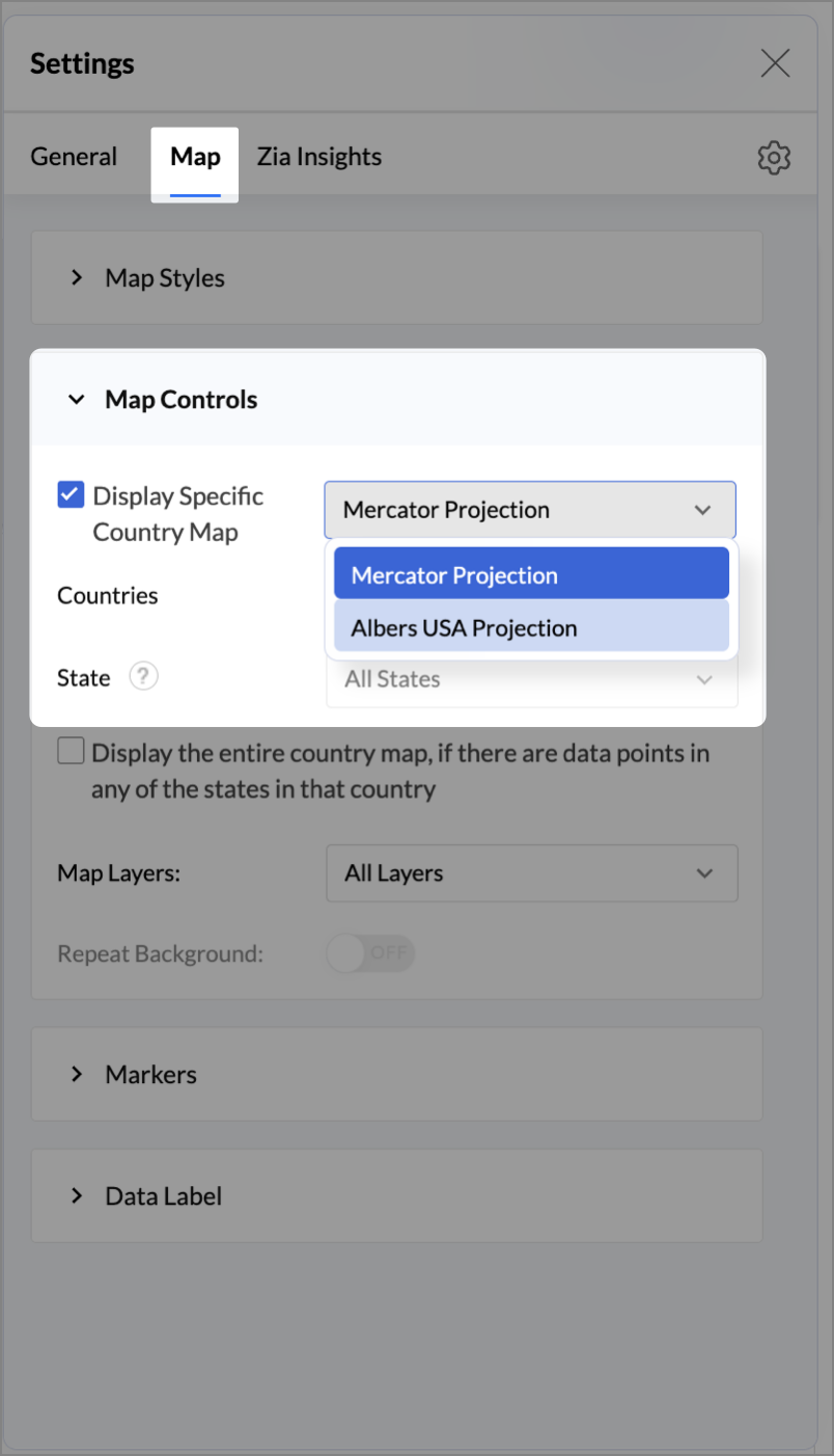
- Under the Map tab, click Map control and enable Display Specific Country Map.
- From the drop-down, select Albers USA Projection. This displays the USA map by placing Alaska and Hawaii below the mainland USA on a single map.
- Rename the report as Store Performance and click Save.
Tip:
Add a User filter such as Store type or State to analyze performance by segment.
This configuration creates a bubble for every store, sized by its revenue and colored by customer satisfaction — instantly showing how happy customers are in high- or low-revenue zones.
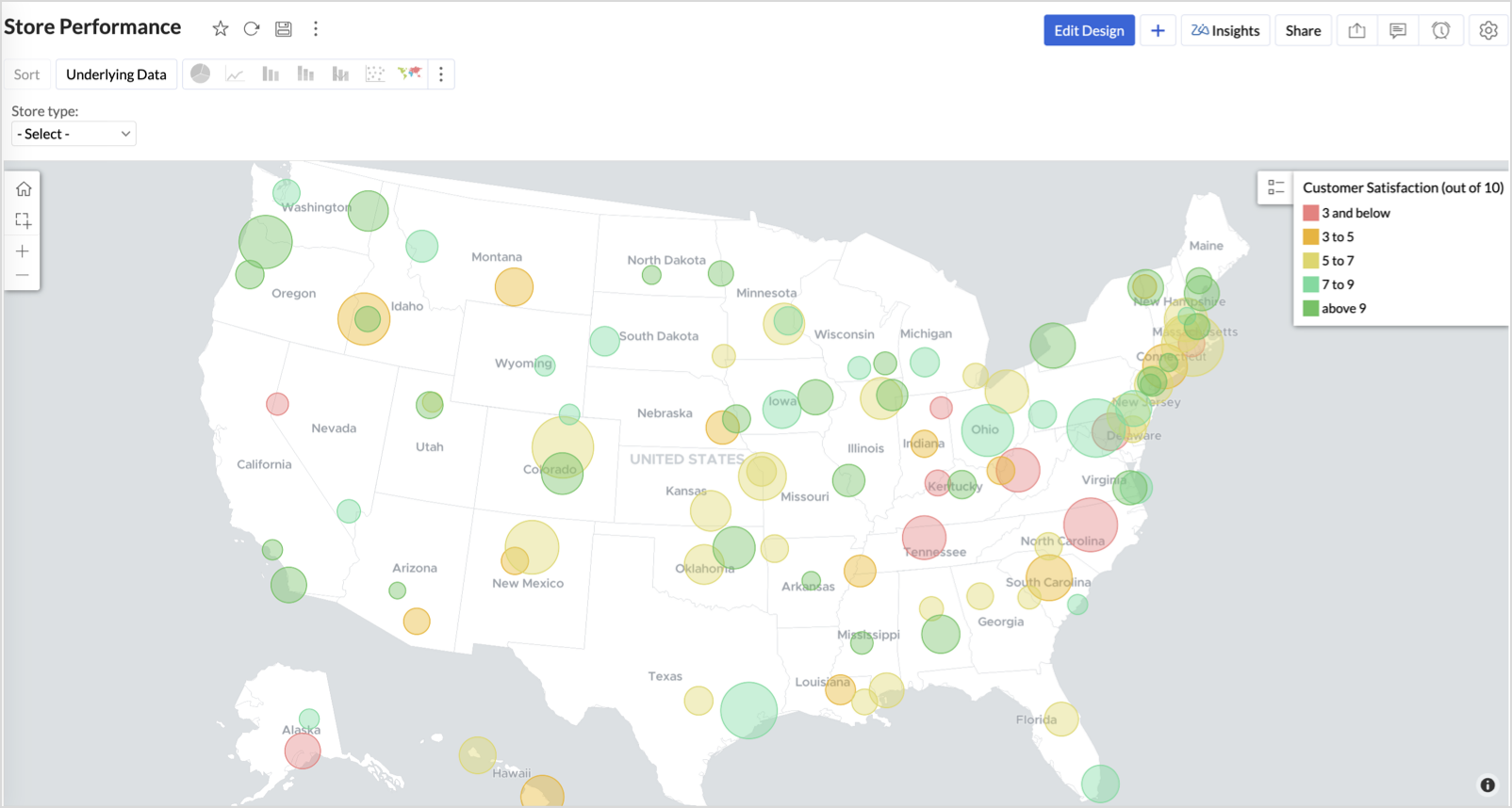
Key Insights
Large bubble + Red color - High revenue but poor satisfaction — risk of churn!
Small bubble + Green color - Low revenue but high satisfaction — possibly underserved
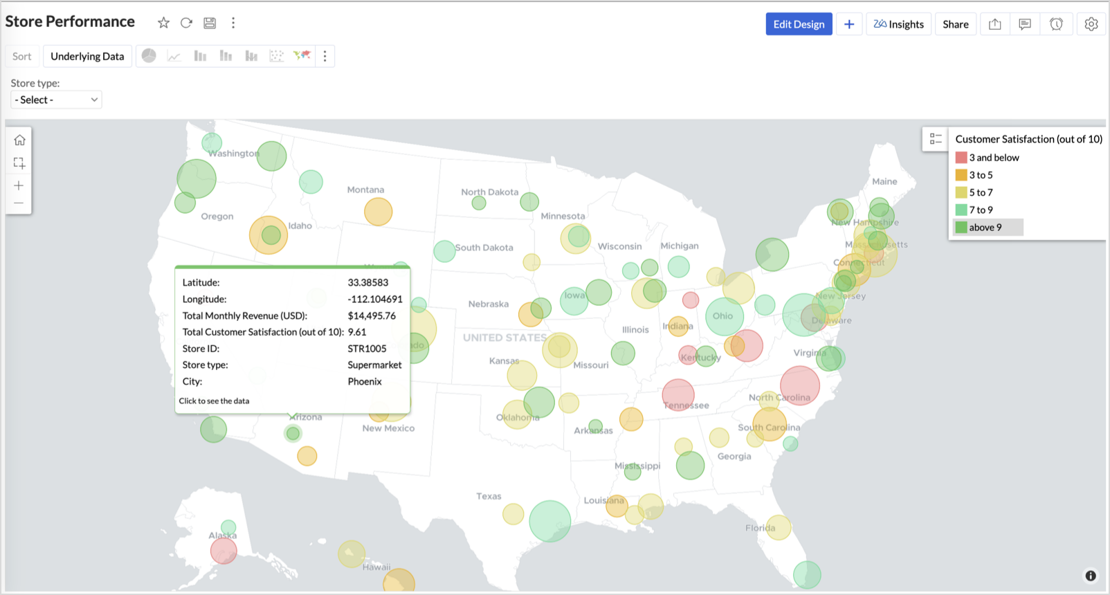
Large bubble + Green color - Healthy performers — consider replicating success
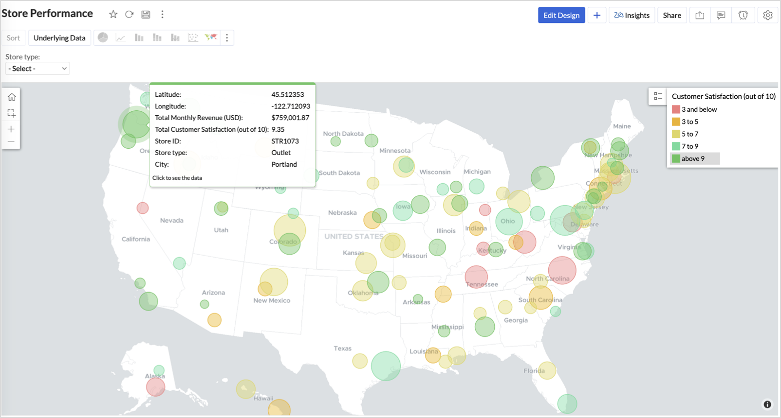
Small bubble + Red color - Low performers — review for possible closure or revamp.
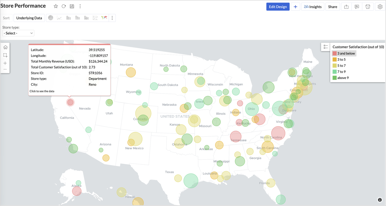
Business Interpretation
This chart acts as a live performance map for executives and analysts. Instead of scanning through tables or KPIs, stakeholders can instantly spot outliers, prioritize investments, and plan corrective actions by just glancing at the map.
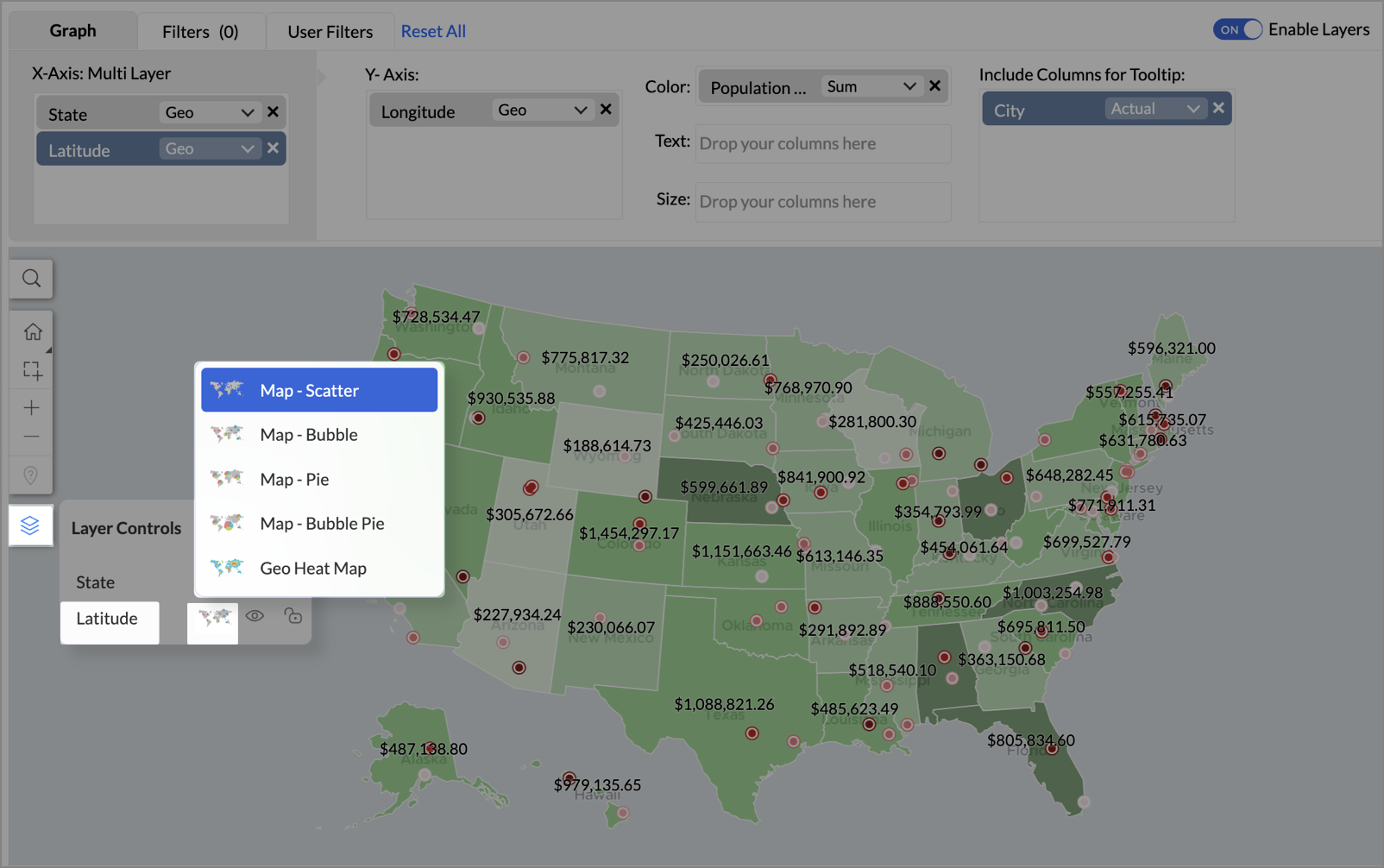
2. Revenue-to-Traffic Ratio with Ghost Zone Detection (Map - Filled + Scatter)
To evaluate how efficiently each state is converting foot traffic into store revenue — and more importantly, to identify high-footfall regions without store presence, often referred to as ghost zones.
This chart helps:
- Compare state-level foot traffic against actual revenue
- Spot underutilized or over-performing regions
- Discover untapped markets with high visitor potential but less to no physical stores
Why Map - Filled + Scatter?
- The Map - Filled chart provides a regional perspective of traffic density and revenue generation.
- The Scatter layer overlays actual store locations based on latitude and longitude.
This powerful combo allows you to measure performance where you’re active and spot opportunities where you're not.
Procedure
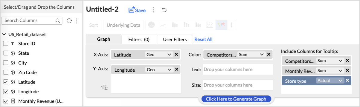
- From the dataset, click the Create icon and select Chart View.
- On the designer page, drag and drop the following columns into their respective shelves:
- State → X-Axis
- Foot Traffic (visitors/month) → Color
- Monthly Revenue (USD) → Text
- Marketing Spend (USD), Population Density (people/sq km), ROI (%) → Tooltip
- Click Generate Graph.
- Click on more option and select the chart type as Map-Filled.
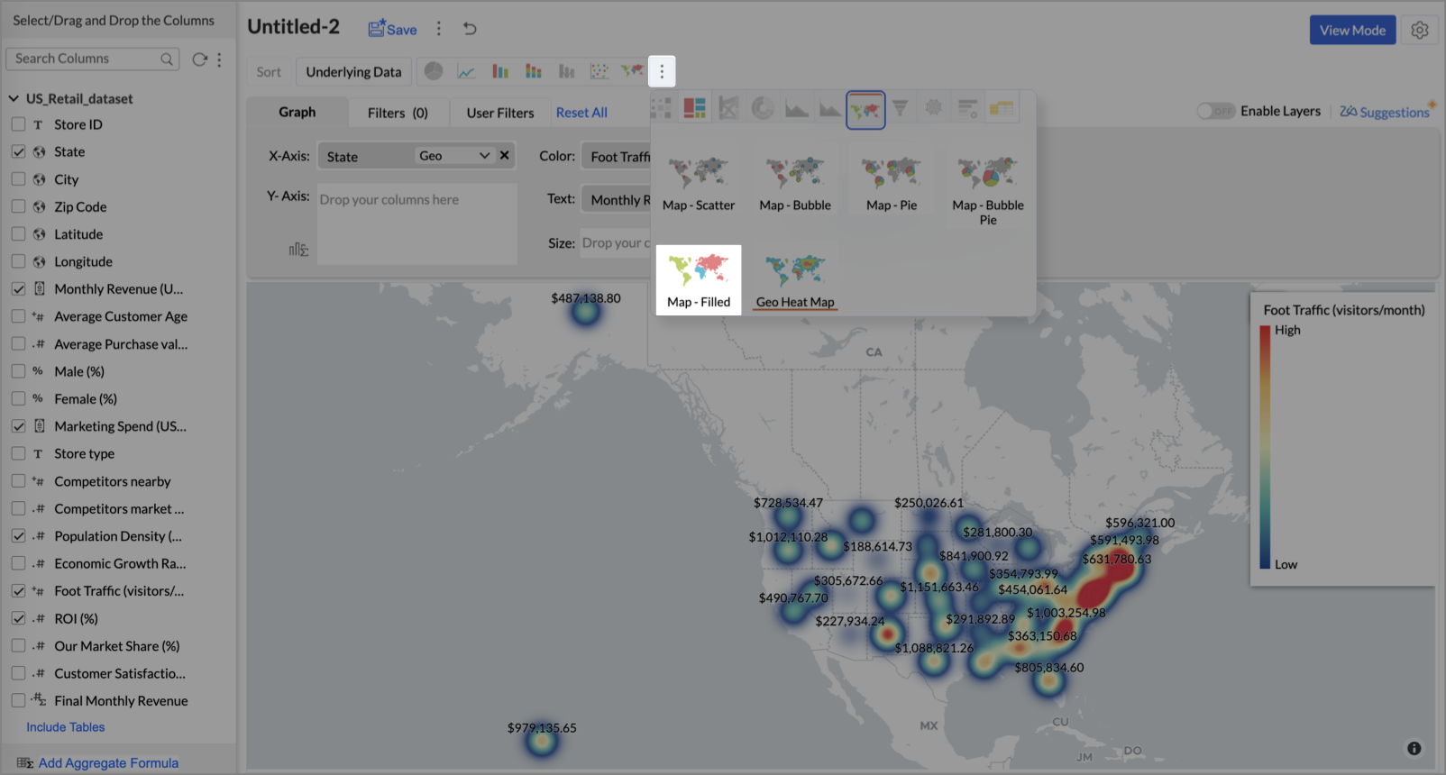
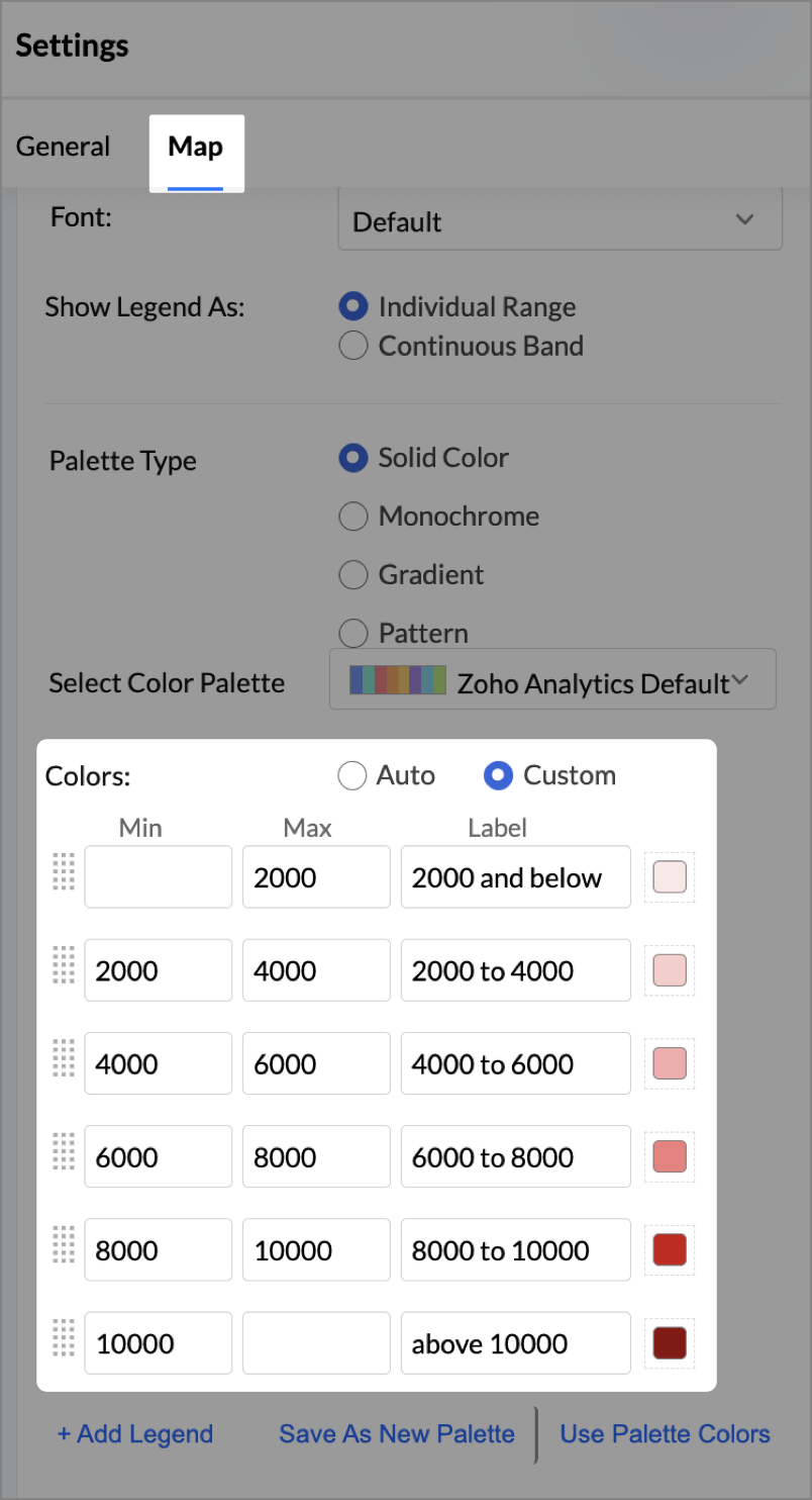
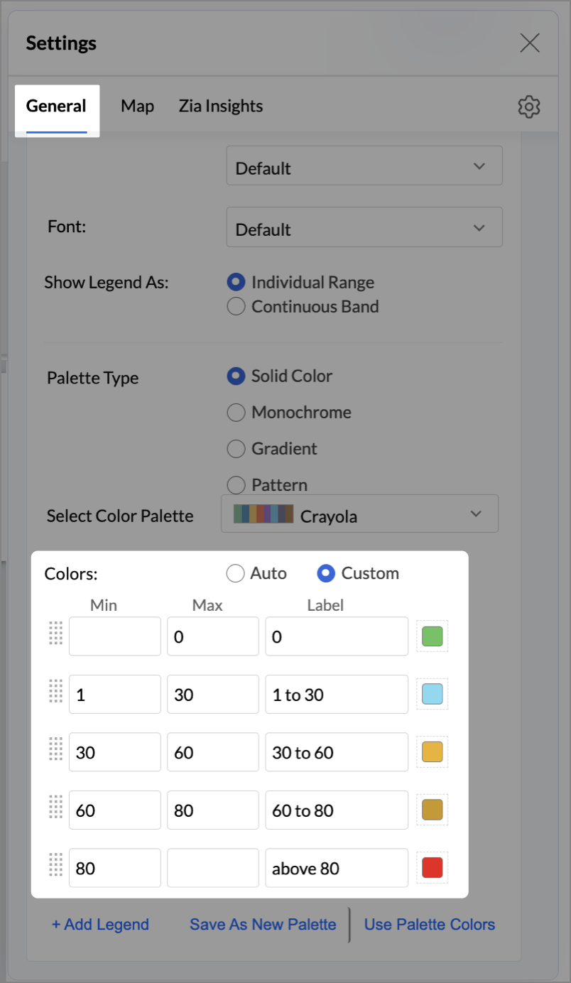
- Click the Settings icon, then click Legend.
- In the Colors section, assign from light to dark green colors for the below range of foot traffic:
- Below 5,000
- 5,000–10,000
- 10,000–15,000
- Above 15,000
- Under the Map tab, change the map to Albers USA Projection.
This filled layer highlights traffic and revenue across states.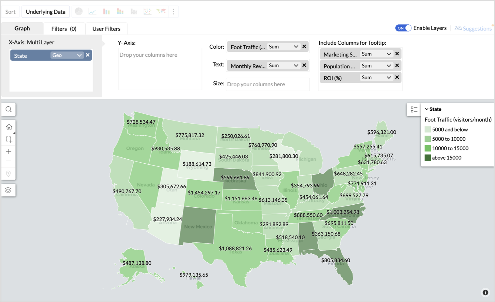
- Toggle Enable Layers to add a second layer.
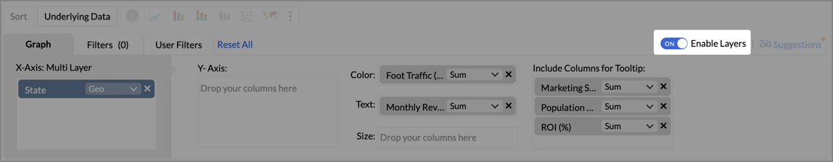
- In the new layer, drag and drop Latitude and Longitude into the X-Axis and Y-Axis respectively, Population density into the Color shelf, and click Generate Graph.
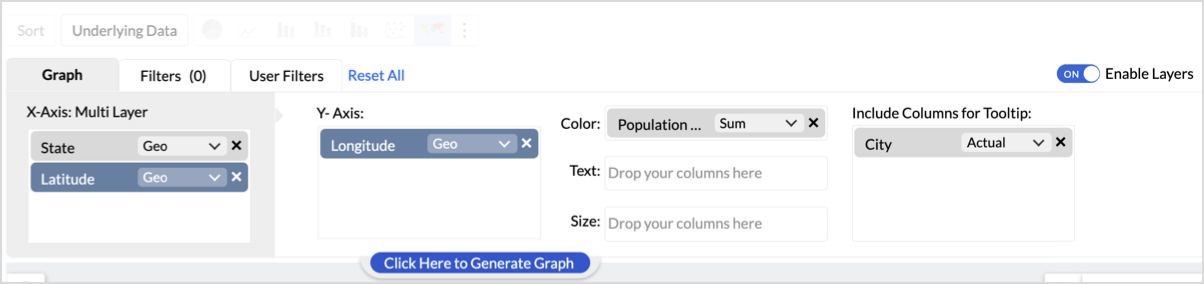
- Click Layer Controls, select Chart Chooser besides Latitude and choose the map as Map - Scatter from the list.
- To customize the second layer, go to Settings → Map → Latitude → Legend, and assign from light to dark red colors for the below range of population density:
- Below 2,000
- 2,000-4,000
- 4,000-6,000
- 6,000-8,000
- 8,000-10000
- Above 10,000
- Rename the report as Revenue-to-Traffic Ratio with Ghost Zone Detection and click Save.
This scatter layer marks the exact store locations, allowing visual correlation with high-traffic regions, revenue, and population density.

Key Insights
Dark green filled (high traffic) + Low revenue - Poor conversion - evaluate strategy or in-store experience
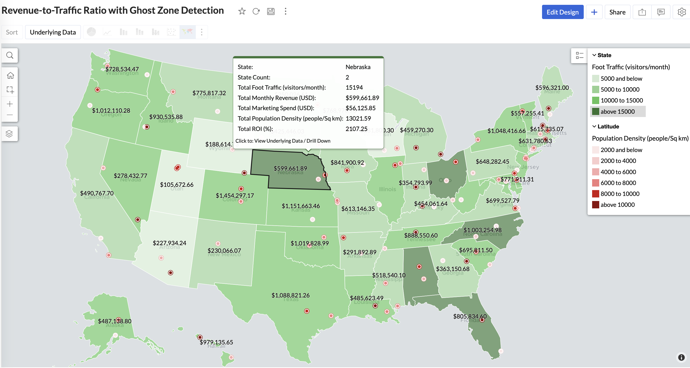
Mid to Dark green filled (high to mid traffic) + balanced revenue - Efficient zones — consider scaling efforts
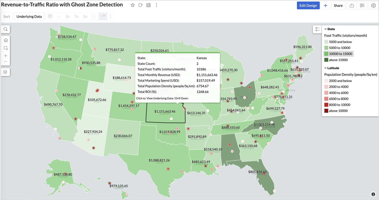
Light green filled (low traffic) + high marketing spend (from tooltip) - Budget drain — reduce spend or re-evaluate targeting
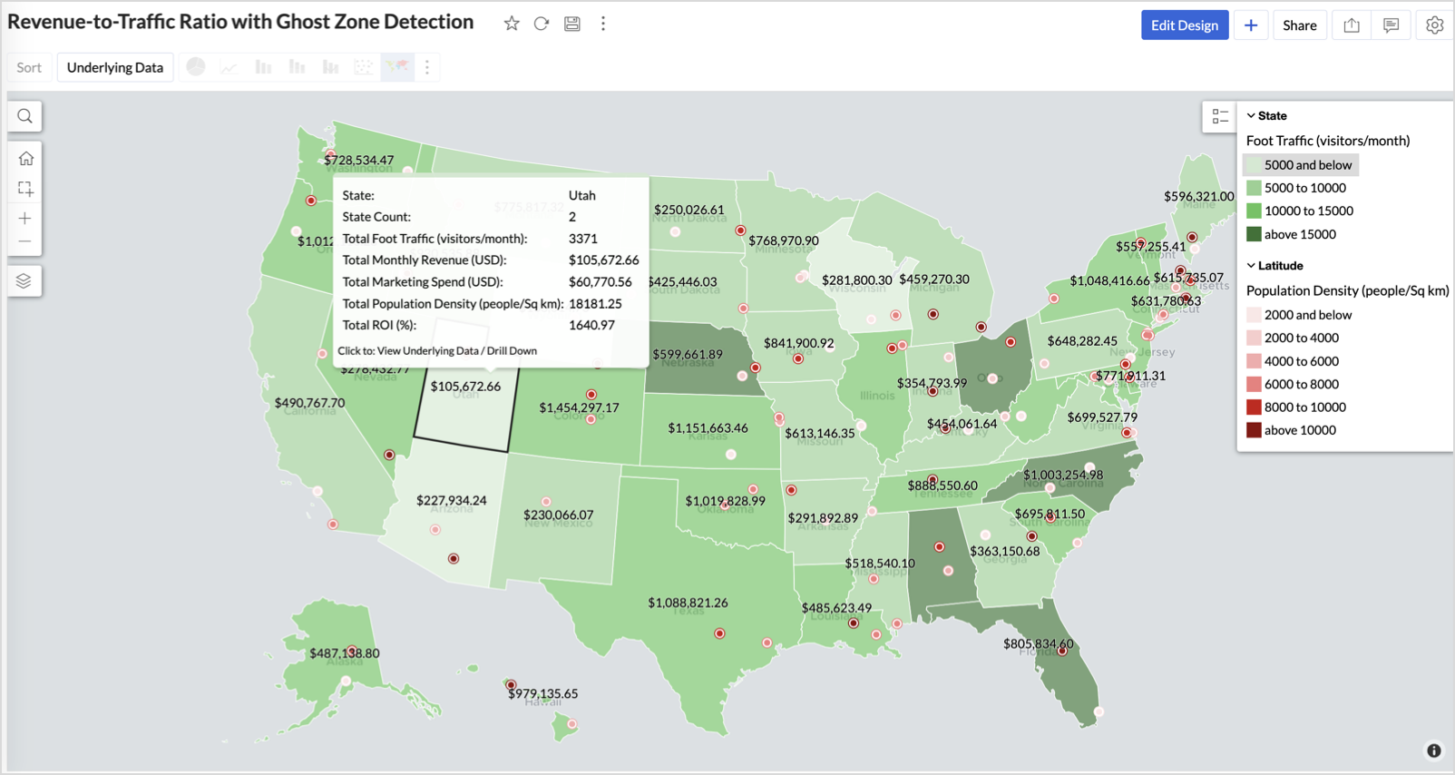
Dark red marker (high population density) + less to no store markers - Ghost Zones — high opportunity areas for expansion
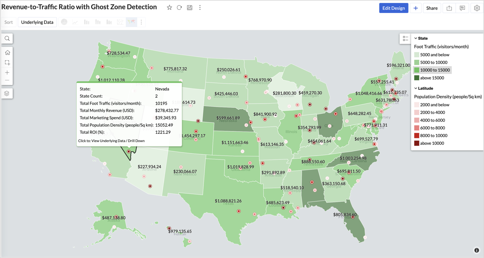
Example: In Las Vegas from Nevada, with a population density of 10,428 people/sq km and only two stores handling 10K–15K visitors/month, monthly revenue of the state remains modest at ~$278K. This indicates a high-opportunity zone for expansion, with strong footfall but untapped revenue potential.
Interpretation & Use
This map is designed for marketing and expansion teams who need to:
- Justify where to open new stores
- Optimize existing resource allocation
It visually answers the question:
Are we generating revenue where people are actually showing up?
Also, with the scatter layer:
Where are we not present — but should be?
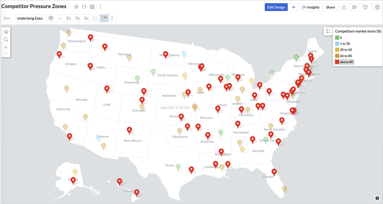
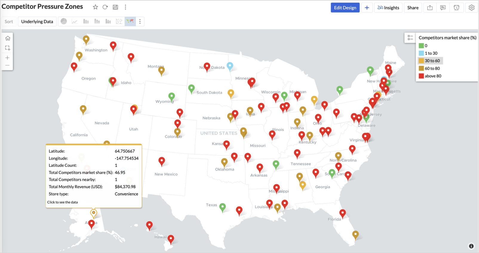
3. Competitor Pressure Zones (Map – Scatter)
To evaluate how store performance is impacted by nearby competition, using a scatter map that plots every store across the U.S. and reflects competitor market share through color intensity.
This view helps:
- Detect locations under competitive stress
- Identify high-risk zones where your market share is at risk
- Correlate competitor presence with satisfaction and store performance
Why Map - Scatter?
Map - Scatter offers a clean and lightweight visual that plots each store based on its exact coordinates. By encoding competitor market share as color and overlaying other attributes via tooltip, this chart becomes a competitive pressure radar.
Procedure
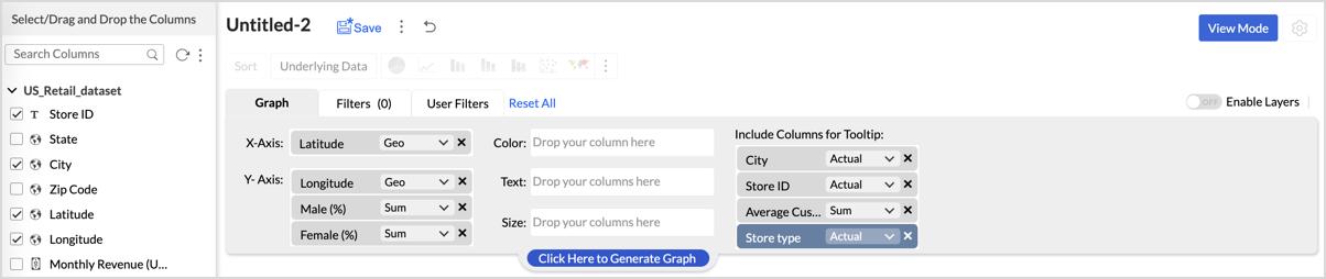
- From the dataset, click the Create icon and select Chart View.
- In the chart designer, drag and drop the following columns into their respective shelves:
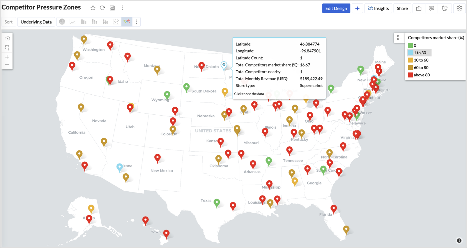
- Latitude → X-Axis
- Longitude → Y-Axis
- Competitors market share → Color
- Competitors nearby, Monthly Revenue, and Store Type → Tooltip
- Click Generate Graph.
- Click on the more option and select the chart type as Map-Scatter.
- In the Settings panel, adjust the color gradient to reflect pressure levels
- 0 → Green
- 1-30 → Cyan
- 30-60 → Orange
- 60-80 → Pale red
- Above 80 → Red
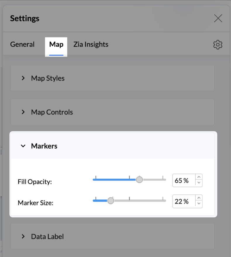
- Change the Marker type under Maps → Marker tab.
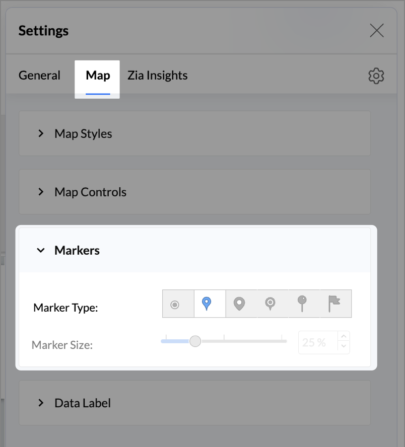
- Under the Map tab, change the map to Albers USA Projection.
- Rename the report as Competitor Pressure Zones and click Save.
The resulting chart uses color to signal competitive heat around each store, allowing you to scan pressure zones across all regions visually.
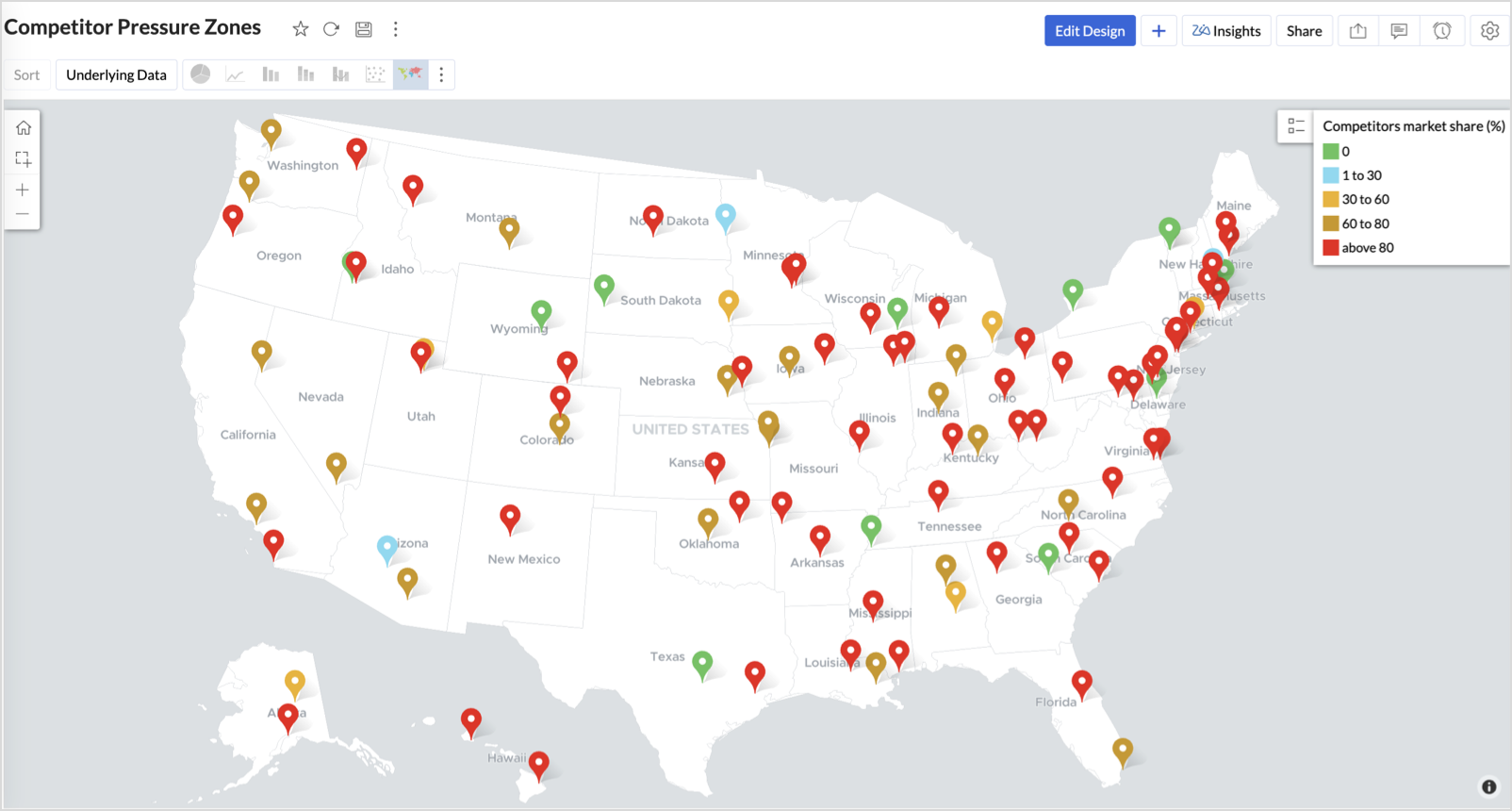
Key Insights
Red (80-100%) - High competitor dominance — urgent intervention zone
Orange (30-60%) + low revenue - Growing pressure — performance risk emerging
Green (0%) + strong revenue - Market leader — low competition, strong position
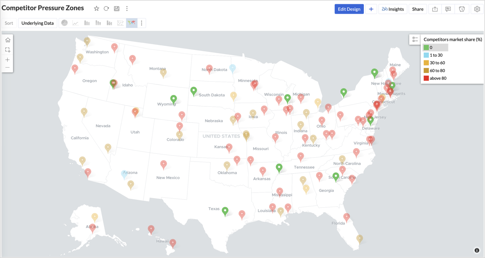
Cyan (1-30%) + moderate revenue - Mild competition — possible opportunity to scale further
Business Interpretation
This chart empowers regional and strategy teams to:
- Detect overcrowded areas where stores are losing share
- Identify safe zones where your brand leads the market
- Spot emerging competitor influence before it cuts into your margins
It acts as a competitive intelligence dashboard, mapping how your store network stands against external threats.
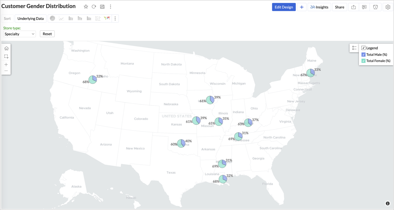
4. Customer Gender Distribution (Map - Pie)
To visualize how the gender distribution of customers varies across store locations. This helps identify stores with significant demographic skews, allowing for more personalized marketing, product selection, and in-store experience.
Why Map - Pie?
The Map - Pie chart is ideal for visualizing data composition across geographical locations.By breaking down each store’s customer base into Male (%) and Female (%) segments, this chart reveals who your customers are and where gender-targeted strategies might work best.
Procedure
- From the dataset, click the Create icon and select Chart View.
- In the chart designer, drag and drop the following columns into their respective shelves:
- Latitude → X-Axis
- Longitude, Male (%), Female (%) → Y-Axis
- City, Store ID, Average Customer Age, Store Type → Tooltip
- Click Generate Graph.
- In Settings, under the Map tab, change the map to Albers USA Projection.
- Click on Markers, adjust the Marker Size as shown.
- Click on Data Label, and enable the Show corresponding Y axis value as data label on the chart to display the percentage values on the map.
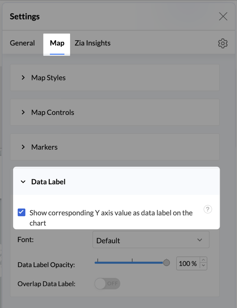
- Add Store Type as User Filters to slice down store-wise gender distribution.
- Rename the report as Customer Gender Distribution and click Save.
Each store will now display a pie chart representing the gender split among its customers, directly on the map.

Key Insights
Uneven gender split (e.g., 70% Male) - Potential to tailor offerings, branding, or promotions for the dominant gender
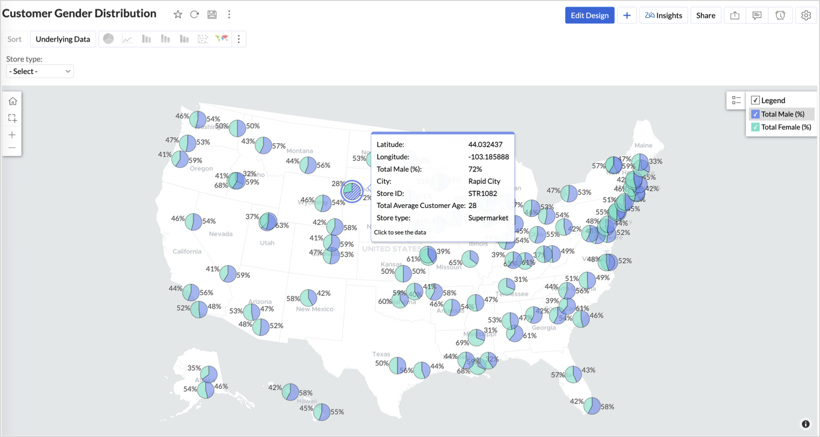
Balanced split (≈50/50) - Opportunity to run inclusive or diversified campaigns
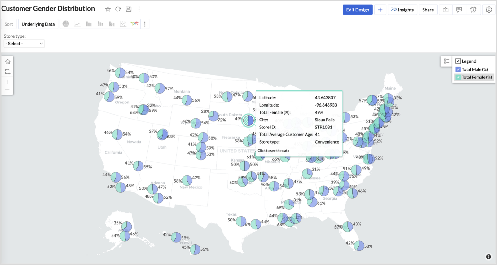
High female ratio + specialty store - Indicates demand for niche products — expand category offerings
Business Interpretation
This chart allows marketing and merchandising teams to:
- Understand gender-based customer clustering across regions
- Launch targeted campaigns (e.g., loyalty programs, promotions)
- Refine product assortments to suit local preferences
For example: A store with 70% female shoppers may benefit from deeper investment in lifestyle categories, while a balanced store could serve as a testing ground for unisex offerings.
Summary
In this phase, we laid the foundation for geo-powered retail intelligence using Zoho Analytics. Through a single, well-structured dataset and four powerful geo map visualizations, we transformed raw store data into real, actionable business insights.
Here’s what we achieved:
|
Report
|
Business Insights
|
|
Store Performance (Bubble)
|
Identified stores that are over performing or at churn risk based on revenue and satisfaction.
|
|
Revenue-to-Traffic Ratio (Filled + Scatter)
|
Detected ghost zones and optimized marketing ROI by comparing traffic and revenue.
|
|
Competitor Pressure Zones (Scatter)
|
Mapped out competitor dominance and spotted at-risk or saturated regions.
|
|
Customer Gender Distribution (Pie)
|
Uncovered demographic patterns to tailor product, marketing, and in-store experience.
|
Click here to access the sample workspace.
These visualizations brought spatial awareness into every performance metric — turning maps into a strategic business tool.
And this... is just the beginning.
Stay tuned for Phase 2 — where Multi-Layer Geo Maps and Network Charts come together to supercharge your business strategy with even deeper spatial insights.
Topic Participants
Pradeepkumar R
Sticky Posts
What's New in Zoho Analytics - February 2026
Hello Users! We're back with another round of updates for Zoho Analytics. This month's release focuses on giving you greater flexibility in how you visualize, manage, and act on your data - with new features like custom visualizations, remote MCP server,What's New in Zoho Analytics - January 2026
Hello Users! We are starting the year with a strong lineup of updates, marking the beginning of many improvements planned to enhance your analytics experience. Explore the latest improvements built to boost performance, simplify analysis, and help youWhat's New in Zoho Analytics - November 2025
We're thrilled to announce a significant update focused on expanding your data connectivity, enhancing visualization capabilities, and delivering a more powerful, intuitive, and performant analytics experience. Here’s a look at what’s new. Explore What'sWhat's New in Zoho Analytics - October 2025
Hello Users! We're are back with a fresh set of updates and enhancements to make data analysis faster and more insightful. Take a quick look at what’s new and see how these updates can power up your reports and dashboards. Explore What's New! ExtremeWhat’s New in Zoho Analytics – September 2025
Hello Users!! In this month’s update, we’re raising the bar across multiple touchpoints, from how you bring in data, plan and track projects to how you design and brand your dashboards. We’ve added the all-new Gantt chart for project visualization, expanded
Nederlandse Hulpbronnen

Recent Topics
Deluge error on updating datetime field
Hi, while updating date-time field , i am getting this error {"code":"INVALID_DATA","details":{"expected_data_type":"datetime","api_name":"Date_Time_1"},"message":"invalid data","status":"error"} Here is the code , i have tried leads = zoho.crm.getRecordById("Leads",No option for pick up in Zoho Books / Inventory but yes on commerce
Is it planned to release soon on books/inventory?Update to CRM Custom Buttons: Collect Users' Location
Hello everyone! Buttons in Zoho CRM allow you to extend the default CRM capabilities for your bespoke business needs. It provides the flexibility to connect to any third-party application to perform necessary actions. Wouldn't it be better, if those buttonsSpeed (again!)
Same old story again: impossible to work at this "speed". Category NOTES!Client Script | Update - Client Script Support For Custom Buttons
Hello everyone! We are excited to announce one of the most requested features - Client Script support for Custom Buttons. This enhancement lets you run custom logic on button actions, giving you greater flexibility and control over your user interactions.Cloning Module Customizations in Zoho FSM
Hello Latha, I have two Zoho FSM accounts, each in a different data center. I would like to know if it is possible to clone the module customizations I have already completed in one account to my new account in the UAE from the backend. In other words,sending email with another account
Hello there, i write there for an our costumer request. They want to send email from CRM with a different email (confirmed and added to zoho profile). For example they use account@zilium.com but with this account they want to send (not only with emailMarketing Tip #27: Add a favicon and social preview image for your online store
Small branding details can make a big difference in how professional your store looks online. A favicon (the tiny icon shown in browser tabs) helps customers recognize your store instantly, especially when they have multiple tabs open. A social preview商談の特定ステージ選択時に、集計項目の入力を必須化したい
こんにちは。Zoho CRMの商談管理で以下を実現したいです。レイアウトルールでは、集計項目を条件に選択できず実現できておりません。よい方法があればご教示いただけると嬉しいです。 ■やりたいこと 商談で特定のステージに変更する場合に、特定の集計項目(同じ商談データ内の項目。以降、集計項目Aとする)を入力必須化したい。 ■概要、状況 ・集計項目Aは、別のオブジェクトで、商談に関連する月ごとの売上を集計している数値項目 ・見積を顧客に提示した際に、集計項目Aに見積金額と一致するようにデータ登録する運用をしているKnowledge base: The nitty-gritty of SEO tags
A well-optimized knowledge base with great SEO can benefit your company by allowing customers to find help articles and support resources using search engines. This enables customers to quickly and efficiently find the information they need without directZoho Social API for generating draft posts from a third-party app ?
Hello everyone, I hope you are all well. I have a question regarding Zoho Social. I am developing an application that generates social media posts, and I would like to be able to incorporate a feature that allows saving these posts as drafts in Zoho Social.How to list WorkDrive folder contents using API
I'm trying to read folder contents using a Deluge script. The code below returns {"errors":[{"id":"F6016","title":"URL Rule is not configured"}]}". I've tried using the search API and seen similar errors. I have proved that the connection works by creatingBest practice to handle 50+ invokeurl calls in a loop without hitting the 30-second timeout?
Hi everyone, I am working on a custom Deluge function where I have a Map containing around 50+ key-value pairs. I need to iterate through this Map using a for each loop and make a GET API call (invokeurl) for each item. The Problem: Because of the 50+filter on sheets mobile (iOS, iPadOS) does not work
re-posting this as a question because reporting as a problem netted zero responses... I have this issue on every spreadsheet, whether imported or created natively in Zoho Sheets. I can use on desktop without issue: but on iOS the filter dropdowns areSolving the bug in Zoho Writer API for styling
So... the Zoho Writer APIs for programatically creating a document do not respect a template's style. The result is that any document you generate via API needs to be manually, paragraph by paragraph, reformatted. That bug alone is sufficient to renderZoho Books' 2025 Wrapped
Before we turn the page to a new year, it’s time to revisit the updates that made financial management simpler and more intuitive. This annual roundup brings together the most impactful features and enhancements we delivered in 2025, offering a clearNeed to set workflow or journey wait time (time delay) in minutes, not hours
Minimum wait time for both Campaigns workflows and Marketing Automation journeys is one hour. I need one or the other to be set to several minutes (fraction of the hour). I tried to solve this by entering a fraction but the wait time data type is an integerAll new Address Field in Zoho CRM: maintain structured and accurate address inputs
Availability Update: 29 September 2025: It's currently available for all new sign-ups and for existing Zoho CRM orgs which are in the Professional edition exclusively for IN DC users. 2 March 2026: Available to users in all DCs except US and EU DC. 24Comments aren't visible in shared spreadsheet
I would like to send a spreadsheet to people who can use it to help solve a problem as a one off use unique to them. They will have to enter data in the sheet. I have comments attached to some of the cells to explain the purpose of the data being collected.Custom button for list page
Why is my 'List Page - Bulk Action Menu' button in the Packages module not autopopulating the List argument with selected record IDs?Ask the Experts - Live Q&A webinar
Hello Community, We’re excited to host our very first Ask the Experts session! Join us on 7 April 2026 from 11 a.m. to 12 p.m. (IST) for this live webinar Q&A session, where you will have an opportunity to connect directly with our product experts, gainDesigning Multi-Step Workflow System in Zoho Creator + Deluge (Startup Build – Exploring Advanced Architecture + Partnerships)
Hi everyone, I’m currently building a Zoho-based system as part of an early-stage startup, and I’m looking to connect with others who have experience designing more advanced workflows in Creator + Deluge. This started as a standard application, but it’sBin Tracking with eBay integration
When trying to setup bin tracking on items that are linked to eBay listings using the built-in Zoho eBay integration, I keep getting this error: "Storage Tracking cannot be enabled for items that are manually fulfiled or for serial/batch items trackedRemoving To or CC Addresses from Desk Ticket
I was hoping i could find a way to remove unnecessary email addresses from tickets submitted via email. For example, a customer may email the support address AND others who are in the helpdesk notification group, in either the TO or CC address. This resultsIs it possible to make tags "required"
We would like to be able to make the tag field a requirement for agents before they can close a ticket. This would help with monthly reporting, where a lot of tickets end up with no tag, causing manual work to go back and add the correct tag for eachPrevent Automatic Milestone Inheritance for Newly Created Task Lists
Hello Zoho Projects Team, We hope you are doing well. We would like to request an enhancement regarding how new task lists inherit Milestone association in Zoho Projects. Current Behavior: At the moment, when a new task list is created below an existingI would like to know wich person viewed the file
I have a franchise and my Operative Manual is in WorkdriveI, the user can´t download but despite I know How many views the file had, I would like to know wich person viewed the file Is it possible? thank youCan I write a check in Zoho Books with no associated bill?
This currently does not seem possible, and I have a client that desperately needs this function if I am able to convert them with Quickbooks. Thank you in advance for your reply.Ordering of Teams
Hi there, Currently, we cannot order Teams in Zoho Desk. Teams are ordered as they were created. It would be really helpful if we could customise the order of Teams. For example: We have the following Teams: Shipping Customer Service Sales ComplianceEstimate Module - Contact Field.
Hello Latha and Team, Is it possible to make the Contact field optional in the Estimate module? Best regards, Chethiya.Item with name in different languate
Hello, is there a way to have an item with its name in different languages? For example: I sell an item in different markets and I'd like to have a Proposal and the Invoice with the Item Name in a specific language. Rino Bertolotto Zoho Specialist, STESA srlWhat is a realistic turnaround time for account review for ZeptoMail?
On signing up it said 2-3 business days. I am on business-day 6 and have had zero contact of any kind. No follow-up questions, no approval or decline. Attempts to "leave a message" or use the "Contact Us" form have just vanished without a trace. It stillHow to keep track of bags, cans, drums of inventory?
We buy and sell products that are packaged in bags 🛍️, cans🥫, drums🛢️, etc. with batch numbers. When we get a shipment of one of the products, how do we track we received (say) 10 cans each of 5L of a product and maybe we received 10 cans of anotherThis version of app doesn't support this notecard type Error
So this problem is happening for any notes created within the last week, as well as any note recently edited on Android. I can open them on my phone fine, but they don't open on the website version. They DO work on the desktop app version. It's just webPDF's Give Unsupported Type Error Message
Many of the pdf files I add to Notebook work fine but in some cases when I try to open them on the Android App I get a message saying "Unsupported Type. Psst! You are using an older version of the app which does not support this note format. Please updateCliq iOS can't see shared screen
Hello, I had this morning a video call with a colleague. She is using Cliq Desktop MacOS and wanted to share her screen with me. I'm on iPad. I noticed, while she shared her screen, I could only see her video, but not the shared screen... Does Cliq iOS is able to display shared screen, or is it somewhere else to be found ? RegardsI am not able to check in and checkout in zoho people even location access allowed
This issue i am facing in mackbook air m1, I allowed location in chrome browser and i also tried in safari but getting similar issue. Please have a look ASAP.Is multiple invoice e-mailing possible?
I wonder if following is possible: When you are in the invoice view, assume you have five invoices to five different customers that are pending (you have just created them, but not sent them away yet by email.) To the left of every invoice in the overviewMultiple packages in one shipment
Guys we have been asking for this for years. we want to be able to ship multiple packages for one customer in the same shipment, so as to avoid entering shipping info repeatedly, and avoid customer getting multiple tracking emails. When does this arise?I can't add a new customer in Zoho invoice? Anyone had this issue before?
Ive been using Zoho invoice for over 6 years. Today I wanted to add a new customer to send an invoice to but it doesn't save when I try to access it from the pulldown menu when you go to send a new invoice.Next Page