 Note: Instance-specific data based charts can be configured in time-grouped charts enabling dashboards to present more focused and relevant information based on individual instances. Refer to Configuring Instance Data in Charts Widgets section in this document more details.
Understanding Chart Widgets
Charts play a vital role in displaying live and historical data from devices and assets for data visualization and data analysis purposes. Zoho IOT provides a wide range of chart type widgets to showcase these data in colorful and appealing formats for easy interpretation. They are segregated into Realtime and Historical charts.
You can construct charts ranging from simple live data plotting charts to intelligent comparison charts. The drill down view in charts provides you more insight into the data that constitutes the chart value.
Image: Different type of charts
Realtime charts styles for live monitoring are :
Historical charts styles for analysis purposes are :
- Column Chart
- Bar Chart
- Area Chart
- Line Chart
- Combined Chart
- Stacked Chart
- Donut Chart
- Pie Chart
- Sankey Chart
- Heatmap Chart
You can use the Advanced Option in cards and charts to perform detailed comparative analysis. The available options are KPI Bar, Ranking/Sorting, Threshold Line, and Axis Settings.
Note: Instance-specific data based charts can be configured in time-grouped charts enabling dashboards to present more focused and relevant information based on individual instances. Refer to Configuring Instance Data in Charts Widgets section in this document more details.More details on the advanced options in widgets is available in the Understanding Widgets document.
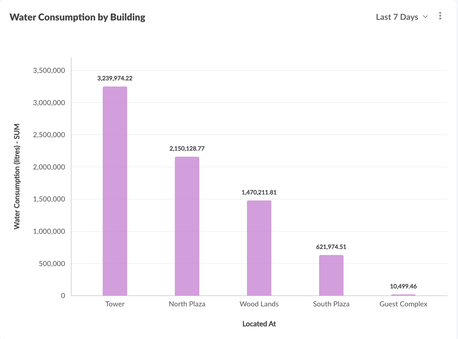
Column Chart
This style is used to display data as vertical bars, grouped based on time periods or instance property for comparative study purposes. The vertical height of the graph can represent values which can be a count of a module/model or an aggregate value of a datapoint, such as AVG, SUM, MIN value, etc.
Image: Day-wise current consumption column chart

Tip: You can use the Advanced Options > Threshold Line option to include a Line across the vertical bars to set a boundary.
Image: Alerts column chart highlighting counts below/above a threshold.
Usecase : Create a Column Chart to display the weekly fuel consumption for the last two months.
1. Access the End Application.
2. In the dashboard view, click Actions > Add Widget to invoke the New Widget addition screen.
3. Click on Charts in the Select Widget Type section.
4. Select Historical or Realtime option on top.
- Historical to display collected stored data
- Realtime to display live data of a datapoint.
5. Select Column Chart in the right slide window.
6. Click Create to display the Add Widget screen.
7. Select the Grouping Type.
- Timeseries Grouping to group the information displayed on the charts by time.
- Instance Property Grouping to group the information displayed on the charts by module properties.
For Timeseries grouped charts:1. Select the Show the actual data as received without any aggregation against the received timeline option if you want to display the data as such without any grouping.2. Provide the title for your widget.3. Select the module (i.e. Module, ME Module, Custom Module, Asset Module, or Device Module).4. Select the datapoint for the selected module or model.5. Select the time frame, unit, and aggregate based on which you want to display the data.6. Click on the + icon to add more datapoints of the selected module to the chart.7. Click Add Module Metric link to add a different module's datapoint.8. Provide the Time Grouping values based on which the X axis is constructed for the chart.9. Configure the time period and grouping using the Set Time Duration and Select Grouping options.10. Select Add KPI Bar to add the KPI comparison bar for the selected metric with its previous time period.11. Select Add Threshold Line to set a limit to the value for the Y-axis.
For Instance Property grouped charts:1. Provide the title for your widget.2. Select the Primary Module (i.e. Module, ME Module, Custom Module, Asset Module, or Device Module) which will form the Y-axis component of the graph.3. Select the measure which can be the field, datapoint, or count etc.4. Click on the + icon to add more measures to the chart.5. Click Add Module Metric link to add a different module's datapoint.6. Provide the Grouping values based on which the X-axis is constructed for the chart.7. Select Ranking/Sorting to rank or sort your data by the selected metrics.8. Select Add Threshold Line to set a limit to the value for the Y-axis.
8. Click Create.
Bar Chart
This style is used to display data as horizontal bars, grouped based on time periods or instance property for comparative study purposes. The horizontal length of the graph represents the value which can be a count of a module/model or an aggregate value, of a datapoint, such as AVG, SUM, MIN value, etc.
Image: Energy consumption bar chart

Tip: You can use the Advanced Options > Threshold Line option to include a Line across the horizontal bars to set a boundary.
To create a Bar Chart style widget:
Usecase : Create a Bar Chart based on a use case. For example, daily temperature reading for the month.
1. Access the End Application.
2. In the dashboard view, click Actions > Add Widget to invoke the New Widget addition screen.
3. Click on Charts in the Select Widget Type section.
4. Select Historical or Realtime option on top.
- Historical to display collected stored data
- Realtime to display live data of a datapoint.
5. Select Bar Chart in the right slide window.
6. Click Create to display the Add Widget screen.
7. Select the Grouping Type.
- Timeseries Grouping to group the information displayed on the charts by time.
- Instance Property Grouping to group the information displayed on the charts by module properties.
For Timeseries grouped charts:1. Select the Show the actual data as received without any aggregation against the received timeline option if you want to display the data as such without any grouping.2. Provide the title for your widget.3. Select the module (i.e. Module, ME Module, Custom Module, Asset Module, or Device Module).4. Select the datapoint for the selected module or model.5. Select the time frame, unit, and aggregate based on which you want to display the data.6. Click on the + icon to add more datapoints of the selected module to the chart.8. Provide the Time Grouping values based on which the X axis is constructed for the chart.9. Configure the time period and grouping using the Set Time Duration and Select Grouping options.10. Click Advanced Options link to configure KPI bar, Threshold line, or Axis setting.11. Select Add KPI Bar to add the KPI comparison bar for the selected metric with its previous time period.12. Select Add Threshold Line to set a limit to the value for the Y-axis.For Instance Property grouped charts:1. Provide the title for your widget.2. Select the Primary Module (i.e. Module, ME Module, Custom Module, Asset Module, or Device Module) which will form the Y-axis component of the graph.3. Select the measure which can be the count etc.4. Click on the + icon to add more measures to the chart.5. Add Module Metric to add related module.6. Provide the Grouping values based on which the X-axis is constructed for the chart.7. Click Advanced Options link to configure Rank/Sort, Threshold line, or Axis setting.8. Select Ranking/Sorting to rank or sort your data by the selected metrics.9. Select Add Threshold Line to set a limit to the value for the Y-axis.
8. Click Create.
Stacked Chart
The Stacked Chart is used to display values in multiple stacked blocks. Each block represents a value, and this can be easily compared with the whole value grouped on module properties. You can easily analyze the change pattern for different properties in the data with the vertical stacked blocks.
Image: Month-wise fuel consumption stacked chart by vehicles
To create a Stacked Chart style widget:
1. In the dashboard view, click Actions > Edit to invoke the dashboard builder.
2. Click Charts in the Add Widget Components section in the left frame.

Note: Only historic data can be displayed in Stacked Chart, and Realtime data cannot be displayed here.
3. Select Stacked Chart in the right slide window.
4. Click Proceed to display the Add Widget screen.
5. Select the Grouping Type.
- Instance Property Grouping to group the information displayed on the charts by module properties.
- Cross-section Grouping to group the information displayed by instance property and by received time.
For Instance Property grouped charts:1. Provide the title for your widget.2. Select the Primary Module (i.e. Module, ME Module, Custom Module, Asset Module, or Device Module) which will form the Y-axis component of the graph.3. Select the Measure i.e. count, field, or datapoint for the selected module or model.4. Configure the Grouping criteria X1, X2 etc., based on which the stacks (or slices) will be grouped in the chart along the X-axis.
For Cross-section grouped charts:1. Provide the title for your widget.2. Select the Primary Module (i.e. Module, ME Module, Custom Module, Asset Module, or Device Module) which will form the Y-axis component of the graph.3. Select the Measure i.e. count, field, or datapoint for the selected module or model.4. Select the time period of the data for grouping.5. Configure the Grouping criteria X1, X2, etc., based on which the stacks (or slices) will be grouped in the chart along the X-axis.
6. Click Create.
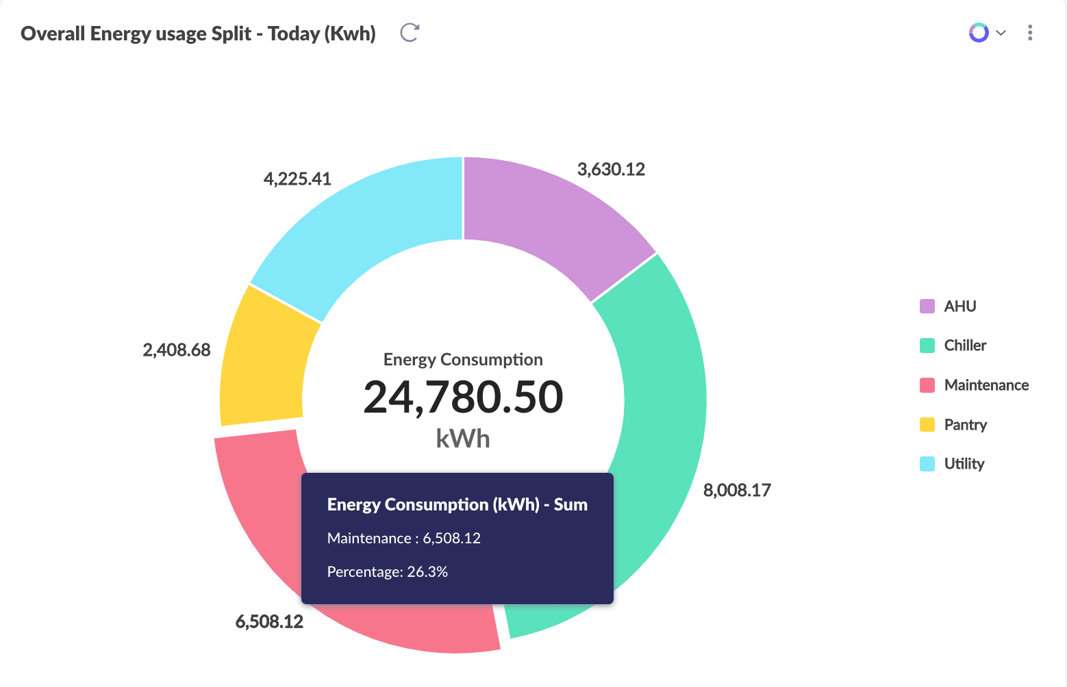
Donut Chart
The Donut Chart is used to display values as a contribution to an overall total. The pieces that form the donut represent a percentage of the whole ring. The pieces are grouped on different module properties. You can easily analyze the proportions of each grouped data by viewing the size of each piece.
To create a Donut Chart style widget:
1. Access the End Application.
2. In the dashboard view, click Actions > Add Widget to invoke the New Widget addition screen.
3. Click on Charts in the Select Widget Type section.
Note: Only historic data can be displayed in Donut Chart, and Realtime data cannot be displayed here.
4. Select Donut Chart in the right slide window.
5. Click Create to display the Add Widget screen with Instance Property Grouping selected. The chart information will be grouped on selected module properties.
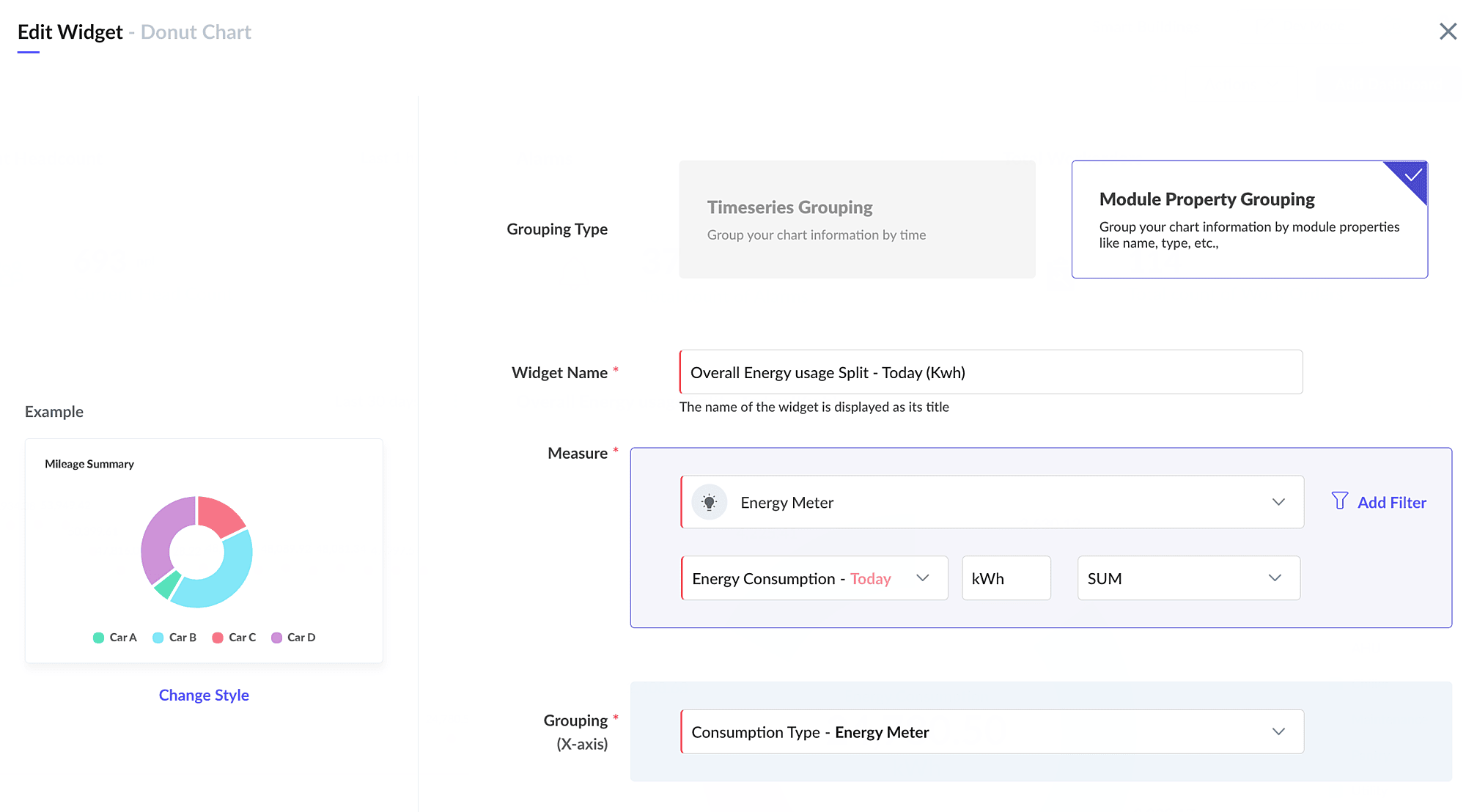
6. Provide the title for your widget.
7. Select the Module (i.e. Asset, Device, Locations, System Modules, or Custom Modules) which will represent the Y-axis.
8. Select the Measure i.e. count, field, or datapoint for the selected module or model.
9. Configure the Grouping criteria based on which the values will be grouped.
10. Click Create.
Pie Chart
The Pie Chart is used to display values as contribution to an overall total, similar to the donut chart. The solid pieces that form the pie represent a percentage of the circle. The pieces are grouped on different module properties. You can easily analyze the proportions of each grouped data by viewing the size of each piece.
Image: Pie Chart displaying alarm count by severity
To create a Pie Chart style widget:
1. Access the End Application.
2. In the dashboard view, click Actions > Add Widget to invoke the New Widget addition screen.
3. Click on Charts in the Select Widget Type section.
Note: Only historic data can be displayed in Pie Chart, and Realtime data cannot be displayed here.
Note: Only historic data can be displayed in Pie Chart, and Realtime data cannot be displayed here.
4. Select Pie Chart in the right slide window.
5. Click Create to display the Add Widget screen with the Instance Property Grouping selected. The chart information will be grouped on selected module properties.
6. Provide the title for your widget.
7. Select the Module (i.e. Asset, Device, Locations, System Modules, or Custom Modules) which will represent the Y-axis.
8. Select the Measure i.e. count, field, or datapoint for the selected module or model.
9. Configure the Grouping criteria based on which the values will be grouped in the chart along the X-axis.
10. Click Create.
Area Chart
The Area Chart is used to display values as shaded portions below marked lines that represent the data value. You can easily compare the different property values with other plotted areas on the chart.
Image: Area chart displaying energy consumption
To create a Area Chart style widget:
1. Access the End Application.
2. In the dashboard view, click Actions > Add Widget to invoke the New Widget addition screen.
3. Click on Charts in the Select Widget Type section.
4. Select Historical or Realtime option on top.
- Historical to display collected stored data
- Realtime to display live data of a datapoint.
5. Select Area Chart in the right slide window.
6. Click Create to display the Add Widget screen.
7. Select the Grouping Type. You can select Timeseries Grouping to group the information displayed on the charts by time. Or Instance Property Grouping to group the information displayed on the charts by module properties.
For Timeseries grouped charts:1. Select the Show the actual data as received without any aggregation against the received timeline option if you want to display the data as such without any grouping.2. Provide the title for your widget.3. Select the module (i.e. Asset, Device, Locations, System Modules, or Custom Modules).4. Select the count, field, or datapoint for the selected module or model.5. Select the time frame, unit, and aggregate based on which you want to display the data.6. Click on the + icon to add more datapoints to the chart. You can add a maximum of 3 layers on the area chart.7. Click Add Module Metric to add more module metrics.8. Provide the Time Grouping values based on which the X-axis is constructed for the chart.9. Configure the time period and grouping using the Set Time Duration and Select Grouping options.10. Click Advanced Options link to configure KPI bar, Threshold line, or Axis setting.11. Select Add KPI Bar option to add the KPI comparison bar for the selected metric with its previous time period.12. Select Add Threshold Line to set a limit to the value for the Y-axis.13. Select Axis Setting to manage axis setting for the selected metrics.For Instance Property grouped charts:Note: This option is not available for Realtime Area charts.1. Provide the title for your widget.2. Select the Primary Module (i.e. Asset, Device, Locations, System Modules, or Custom Modules) which will form the Y-axis component of the graph.3. Select the count, field, or datapoint for the selected module or model.4. Click on the + icon to add more measures to the chart.5. Add Module Metric to add related module.6. Provide the Grouping values based on which the X-axis is constructed for the chart.7. Click Advanced Options link to configure KPI bar, Threshold line, or Axis setting.8. Select Ranking/Sorting to rank or sort your data by the selected metrics.9. Select Add Threshold Line to set a limit to the value for the Y-axis.10. Select Axis Setting to manage axis setting for the selected metrics.
8. Click Create.
Line Chart
The Line Chart is used to display values in line format across time periods for an instance property. The lines join plotted values which can be a count of a module/model or an aggregate value of a datapoint such as AVG, SUM, MIN value etc. You can easily compare the different property values with other plotted pointers on the chart.
Image: Line chart displaying temperature and RPM readings for a year.
To create a Line Chart style widget:
1. Access the End Application.
2. In the dashboard view, click Actions > Add Widget to invoke the New Widget addition screen.
3. Click on Charts in the Select Widget Type section.
4. Select Historical or Realtime option on top.
- Historical to display collected stored data
- Realtime to display live data of a datapoint.
5. Click Create to display the Add Widget screen.
6. Select the Grouping Type. You can select Timeseries Grouping to group the information displayed on the charts by time.
For Timeseries grouped charts:1. Select the Show the actual data as received without any aggregation against the received timeline option if you want to display the data as such without any grouping.2. Provide the title for your widget.3. Select the module (i.e. Asset, Device, Locations, System Modules, or Custom Modules).4. Select the count, field, or datapoint for the selected module or model.5. Select the time frame, unit, and aggregate based on which you want to display the data.6. Click on the + icon to add more datapoints to the chart. You can add a maximum of 3 line representations on the lines chart.7. Add Module Metric to add more modules.8. Provide the Time Grouping values based on which the X-axis is constructed for the chart.9. Configure the time period and grouping using the Set Time Duration and Select Grouping options.10. Click Advanced Options link to configure KPI bar, Threshold line, or Axis setting.11. Select Add KPI Bar option to add the KPI comparison bar for the selected metric with its previous time period.12. Select Add Threshold Line to set a limit to the value for the Y-axis.13. Select Axis Setting to manage axis setting for the selected metrics.For Instance Property grouped charts:Note: This option is not available for Realtime Line charts.1. Provide the title for your widget.2. Select the Primary Module (i.e. Module, ME Module, Custom Module, Asset Module, or Device Module) which will form the Y-axis component of the graph.3. Select the count, field, or datapoint for the selected module or model.4. Click on the + icon to add more measures to the chart.5. Add Module Metric to add more module metrics.6. Provide the Grouping values based on which the X-axis is constructed for the chart.7. Select Ranking/Sorting to rank or sort your data by the selected metrics.8. Select Add Threshold Line to set a limit to the value for the Y-axis.9. Select Axis Setting to manage axis setting for the selected metrics.
7. Click Create.
Combined Chart
The Combined Chart is used to display values in a combination of line, column, and area chart. The bar in the column chart usually represents the value, and the line connecting the points on the bar may represent the minimum or a threshold value.
Image: Combined chart displaying temperature and humidity for a month
To create a Line Chart style widget:
1. Access the End Application.
2. In the dashboard view, click Actions > Add Widget to invoke the New Widget addition screen.
3. Click on Charts in the Select Widget Type section.
4. Select Historical or Realtime option on top.
- Historical to display collected stored data
- Realtime to display live data of a datapoint.
5. Select Combined Chart in the right slide window.
6. Click Create to display the Add Widget screen.
7. Select the Grouping Type. You can select Timeseries Grouping to group the information displayed on the charts by time. Or Instance Property Grouping to group the information displayed on the charts by module properties.
For Timeseries grouped charts:1. Select the Show the actual data as received without any aggregation against the received timeline option if you want to display the data as such without any grouping.2. Provide the title for your widget.3. Select the module (i.e. Asset, Device, Locations, System Modules, or Custom Modules).4. Select the count, field, or datapoint for the selected module or model.5. Select the time frame, unit, and aggregate based on which you want to display the data.6. Click on the + icon to add more datapoints to the chart. You can add a maximum of 3 line representations on the lines chart.7. Add Module Metric.8. Provide the Time Grouping values based on which the X-axis is constructed for the chart.9. Configure the time period and grouping using the Set Time Duration and Select Grouping options.10. Click Advanced Options link to configure KPI bar, Threshold line, or Axis setting.11. Select Add KPI Bar option to add the KPI comparison bar for the selected metric with its previous time period.12. Select Add Threshold Line to set a limit to the value for the Y-axis.13. Select Axis Setting to manage axis setting for the selected metrics.For Instance Property grouped charts:
Note: This option is not available for Realtime Combined charts.1. Provide the title for your widget.2. Select the Primary Module (i.e. Asset, Device, Locations, System Modules, or Custom Modules) which will form the Y-axis component of the graph.3. Select the measure which can be the count etc.4. Click on the + icon to add more measures to the chart.5. Add Module Metric.6. Provide the Grouping values based on which the X-axis is constructed for the chart.7. Click Advanced Options link to configure Ranking/Sorting, Threshold line, or Axis setting.8. Select Ranking/Sorting to rank or sort your data by the selected metrics.9. Select Add Threshold Line to set a limit to the value for the Y-axis.10. Select Axis Setting to manage axis setting for the selected metrics.
8. Click Create.
Sankey Chart
The Sankey Chart is used to display comparative or flow of values. Each link in the chart denotes a property's values from one node to another.
To create a Sankey Chart style widget:
1. Access the End Application.
2. In the dashboard view, click Actions > Add Widget to invoke the New Widget addition screen.
3. Click on Charts in the Select Widget Type section.
4. Select Historic option on top. You can select Historic to display collected stored data.
Note: Only historic data can be displayed in Sankey Chart, and Realtime data cannot be displayed here.
5. Select Sankey Chart in the right slide window.
6. Click Create to display the Add Widget screen.
Image: Sankey widget
Select the Grouping Type. Select Instance Property Grouping to group the information displayed on the charts by module properties.
Note: Time series grouping is not available for Sankey charts.
Note: Time series grouping is not available for Sankey charts.
For Instance Property grouped charts:1. Provide the title for your widget.2. Select the Primary Module (i.e. Asset, Device, Locations, System Modules, or Custom Modules) which will form the Y-axis component of the graph.3. Select the measure which can be the count, field, or datapoint.4. Provide the Grouping values for the nodes Node 1 and Node 2 in the chart.5. Click Create.
Heatmap Chart
The Heatmap Chart is used to display values in the chart in a colored pattern based on the value range. This helps to view the values of multiple complex patterns easily and understand the performance or trend.
To create a Headmap Chart style widget:
1. Access the End Application.
2. In the dashboard view, click Actions > Add Widget to invoke the New Widget addition screen.
3. Click on Charts in the Select Widget Type section.
4. Select the Historic option on top. You can select Historic to display collected stored data.
Note: Only historic data can be displayed in Heatmap Chart, and Realtime data cannot be displayed here.
Note: Only historic data can be displayed in Heatmap Chart, and Realtime data cannot be displayed here.
5. Select Heatmap Chart in the right slide window.
6. Click Create to display the Add Widget screen.
Image: Sample heat map chart
Image: Sample heat map chart with metric details view
Note: Heatmap chart provides drill-down capabilities. You can click on a segment on the Heatmap to view detailed subviews or entity-specific data.Image: Sample heat map chart with metric drill down view
Select the Grouping Type. You can select Timeseries Grouping to group the information displayed on the charts by time.
Note: The Instance Property Grouping option to group the information displayed on the charts by module properties is not available for heatmap.
Note: The Instance Property Grouping option to group the information displayed on the charts by module properties is not available for heatmap.
For Timeseries grouped charts:1. Select the Show the actual data as received without any aggregation against the received timeline option if you want to display the data as such without any grouping.2. Provide the title for your widget.3. Select the module (i.e. Asset, Device, Locations, System Modules, or Custom Modules).4. Select the datapoint for the selected module or model.5. Select the unit, and aggregate based on which you want to display the data.6. Configure the Time Grouping values based on which the X-axis is constructed for the chart. Select for Vertical and Horizontal grouping.7. Configure Scaling Settings. Select Custom to provide your own Min and Max range of values.8. Configure the Color Settings. Click on any point on the color setting bar to set any color for a specific range of values.Note: You can set different colors for various value ranges in the heatmap by double-clicking on the color settings bar.For Instance Property grouped charts:1. Provide the title for your widget.2. Select the Primary Module (i.e. Asset, Device, Locations, System Modules, or Custom Modules) which will form the Y-axis component of the graph.3. Select the measure which can be the count etc.4. Provide the Grouping values on which the X-axis is constructed for the chart. Select for Vertical and Horizontal grouping.5. Configure Scaling Settings. Select Custom to provide your own Min and Max range of values.6. Configure the Color Settings. Click on any point on the color setting bar to set any color for a specific range of values.For Cross Section grouped charts:1. Provide the title for your widget.2. Select the Primary Module (i.e. Asset, Device, Locations, System Modules, or Custom Modules) which will form the Y-axis component of the graph.3. Select the measure which can be the count etc.4. Provide the Grouping values on which the X-axis is constructed for the chart. Select for Vertical and Horizontal grouping.5. Configure Scaling Settings. Select Custom to provide your own Min and Max range of values.6. Configure the Color Settings. Click on any point on the color setting bar to set any color for a specific range of values.Note: You can set different colors for various value ranges in the heatmap by double-clicking on the color settings bar.
7. Click Create.
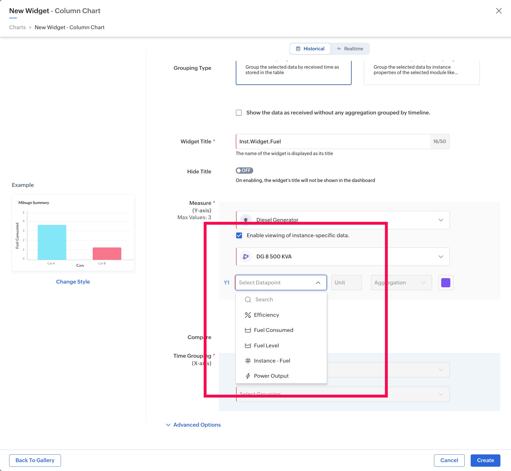
Configuring Instance Data in Chart Widgets
Time-grouped visualizations such as Line, Bar, Area, and Column charts support viewing instance-specific data. This allows dashboards to display more targeted and relevant information by filtering data based on individual instances enabling better monitoring, analysis, and decision-making at the asset or device level.
Note: This feature is currently not supported in Pie Chart, Donut Chart, and Sankey Chart widgets.