Yes/No field
Greetings, form architects!
Normally, you add a Radio field.
Type Yes. Type No.
Until now.
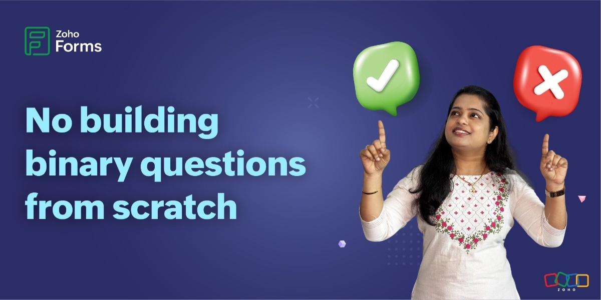
The new Yes/No field is purpose-built for binary decisions. It is preconfigured, visually consistent, and designed to get you a clear answer, fast.
Three visual languages, one purpose
What makes this field genuinely innovative is not that it offers yes/no options.
Not all yes/no questions are the same.
We have recognized binary decisions exist in different emotional and contextual registers and the UI should reflect that.
Some yes/no questions are formal and serious. Others are quick, instinctive, even emotional. So, instead of building one generic yes/no solution, we built three visual styles for meaningful flexibility within purposeful constraints.
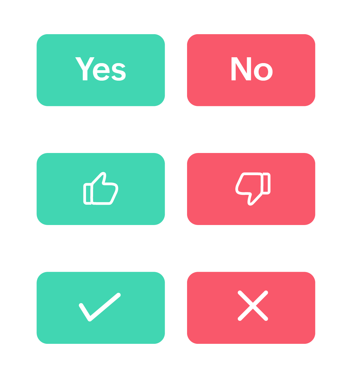
Classic toggle
Text-based, unambiguous, universally understood. When you need respondents to carefully read and consciously commit to a decision, this style delivers.
It's perfect for terms of service agreements or formal approvals.
Like/Dislike icons
Here's where we leaned into something pretty much every social platform has already proven. People respond to visual feedback. The thumbs-up/thumbs-down iconography transcends language barriers and taps into emotional response patterns. When you ask "Was this article helpful?" and show someone a thumbs-up or thumbs-down, you are inviting a feeling-based response, not a manufactured one. It works because it mirrors human gesture.
For forms where you are measuring gut reactions rather than deliberated choices, this visual language outperforms text every time.
Check mark/Cross icons
Check marks and crosses carry decades of conditioning. From grade school papers to quality control checklists, they communicate approval/rejection with zero ambiguity.
These symbols trigger decision-making mode rather than reflection mode. They are action-oriented, which is why they excel in operational and process-driven contexts.
No matter the style you choose, you can rename the labels to anything you want; the meaning remains unchanged. For example, change "Yes/No" to "Approve/Reject," and that meaning carries through whether you are showing text toggles or check mark icons.
Want minimalist, icon-only buttons? You can turn text labels on or off independently.
Beyond surface-level styling
Let's talk about the theme customization capabilities; this is where a field truly shows its sophistication.
You will find granular control over:
- Separate background colors for labels
- Independent text/icon colors for each option
- Border color across all styles
Why does this matter? Because color carries meaning.
For example, the question "How are you feeling today?" can have:
- Soft green for positive responses (calming, associated with growth)
- Muted orange for negative responses (attention-drawing without being alarming)
Pro tip: Maintain WCAG-compliant color contrast ratios (at least 4.5:1 for normal text) to ensure accessibility; beautiful and accessible are not mutually exclusive.
Why obsess over something this small?
Let’s zoom out for a moment and talk about why a "simple" yes/no field deserves this much attention.
In product development, there is a constant tension between building flashy new features and perfecting foundational ones.
Here's what we have learned after years of building form tools.
Great experiences are built from tiny, excellent interactions stacked together.
Nobody fills out a form thinking, "Wow, I love how well-designed this binary question is." But they do notice when forms feel unnecessarily complicated.
The Yes/No field is our attempt to handle one small interaction, binary choice, with the care and thoughtfulness it deserves.
Now we want to hear from you.
What additional features would make this field indispensable for your workflows?
Drop your thoughts, use cases, and creative implementations in the comments. The best ideas often come from the community pushing features in directions we never imagined.
Cheers,
Samhita