A/B Testing Idea #1: Place irresistible and clear CTA buttons
Are you wasting much of your time and effort A/B testing every single idea that pops into your head, yet you're not generating sufficient traffic to your website? Don't worry—we've got you.
We'd like to introduce you to the A/B Testing Ideas learning series, a collection of easy-to-use design tips to A/B test your website pages. This series will include techniques to effectively optimize various elements on your website and boost conversion rates in a short time. These ideas can also give you a strong framework to start your conversion rate optimization and discover what design changes work best for your website. Do Follow the page and post your comments about the content shared in the comment box below.
So, here is our first post in the series: Place irresistible and clear CTA buttons

As we know, the basic intention of any website is to make somebody do something—for example, getting visitors to fill in a form, download a PDF, or purchase an item. And, of course, the best way to make visitors perform these actions is through the simple CTA (call-to-action) buttons placed on your web page, such as "Buy now", "Learn more", or "Sign up" links.
However, at times you might notice that your website is getting a good traffic but the conversions obtained on your CTA are poor. This is exactly when you need to A/B test your CTA buttons. In today’s post, we'll learn a few simple, yet powerful, CTA testing ideas to maximize conversions and recover those lost leads on your site.
So how do you create and test a persuasive CTA?
There are three parts to look at: the text, the position, and the graphical presentation of the CTA on your web page.
Testing the CTA words
Good CTA copy is more than just text. In general, CTA copy that speaks directly to your visitor outperforms generalized CTA copy. Here are a few points to consider while crafting your CTA copy:
Good CTA copy is more than just text. In general, CTA copy that speaks directly to your visitor outperforms generalized CTA copy. Here are a few points to consider while crafting your CTA copy:
- Decide what action you want your audience to take and describe what will happen next—for example, use text like “Subscribe to our blog " or "Request a product demo" and not "Subscribe" or "Register here." This will tell visitors what to expect by clicking on the CTA.
- Start with action-oriented words in your CTA like "read," "download," "call," and more. This can make your button stand out from the rest of the page content and convince visitors to click it instantly.
- Create a sense of urgency with words like “today,” “now,” or “in the next 24 hours” in your CTAs to garner those extra clicks with less effort.
Focusing on the above tips can help you kindle your audience’s emotion towards your products/services, build a sense of trust in your business, and eventually achieve your website goal.
A few examples of good CTA copy you can test out include:
A few examples of good CTA copy you can test out include:
- Using a "Grab my ebook" CTA on the web page instead of a CTA that just instructs visitors to “Download.” This will create a more personal touch and draw interest towards the button.

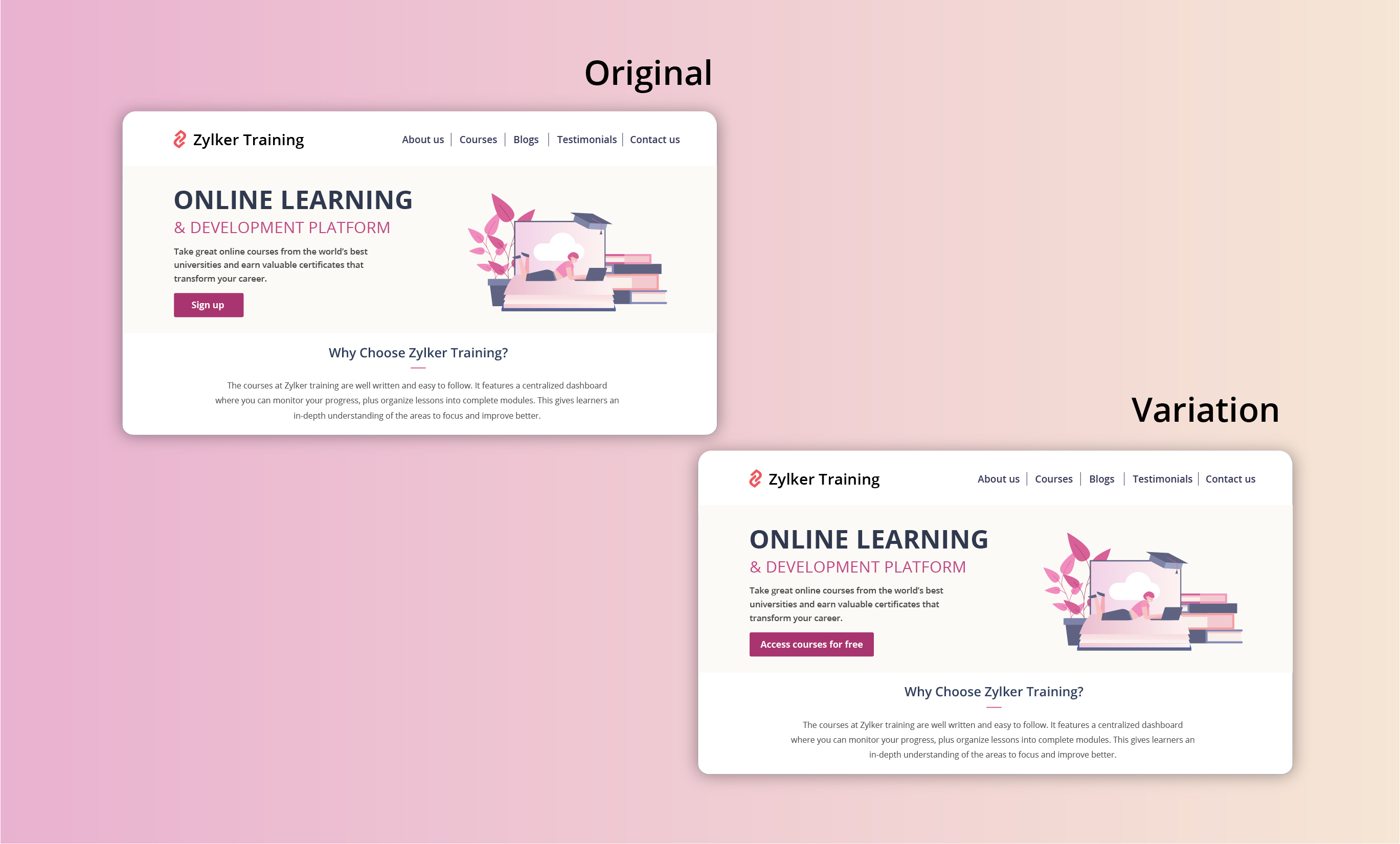
- Using a "Access courses for free" CTA instead of an overused "Sign up" button to build connections and boost sign ups on your newly developed elearning website.
Extra tip: Your CTA buttons should always have a healthy chunk of white space surrounding them. White space helps instantly grab your visitors' attention and adds focus to your button.
Testing the CTA position
Strive to achieve CTA placement that is noticeable but not disruptive to your audience. If you place your CTA button in a spot where your users don’t naturally look, you’re going to lose conversions. There are generally two points to look at while testing CTA position:
- Identify and utilize smart button placement based on your visitors' natural reading flow (top to bottom and left to right or right to left) and behavior on your website. This includes the path users follow on your website to complete a process, the design elements they click on, and the barriers that prevent them from achieving their goal.
Tip: You can use Session Recordings in PageSense to see how and why users are interacting with your CTAs the way they are. - Place the CTA button above or below the average fold of your page depending on the length and complexity of the content. This could also be determined by how far down the page your visitors scroll on an average. However, adding your CTA above the fold is the most common placement choice used on homepage/landing page designs.
Tip: You can set up heatmaps, scroll maps, and attention maps in PageSense to determine whether people are responding to—or even seeing—your CTAs.
A few examples of good CTA placement you can test out include:
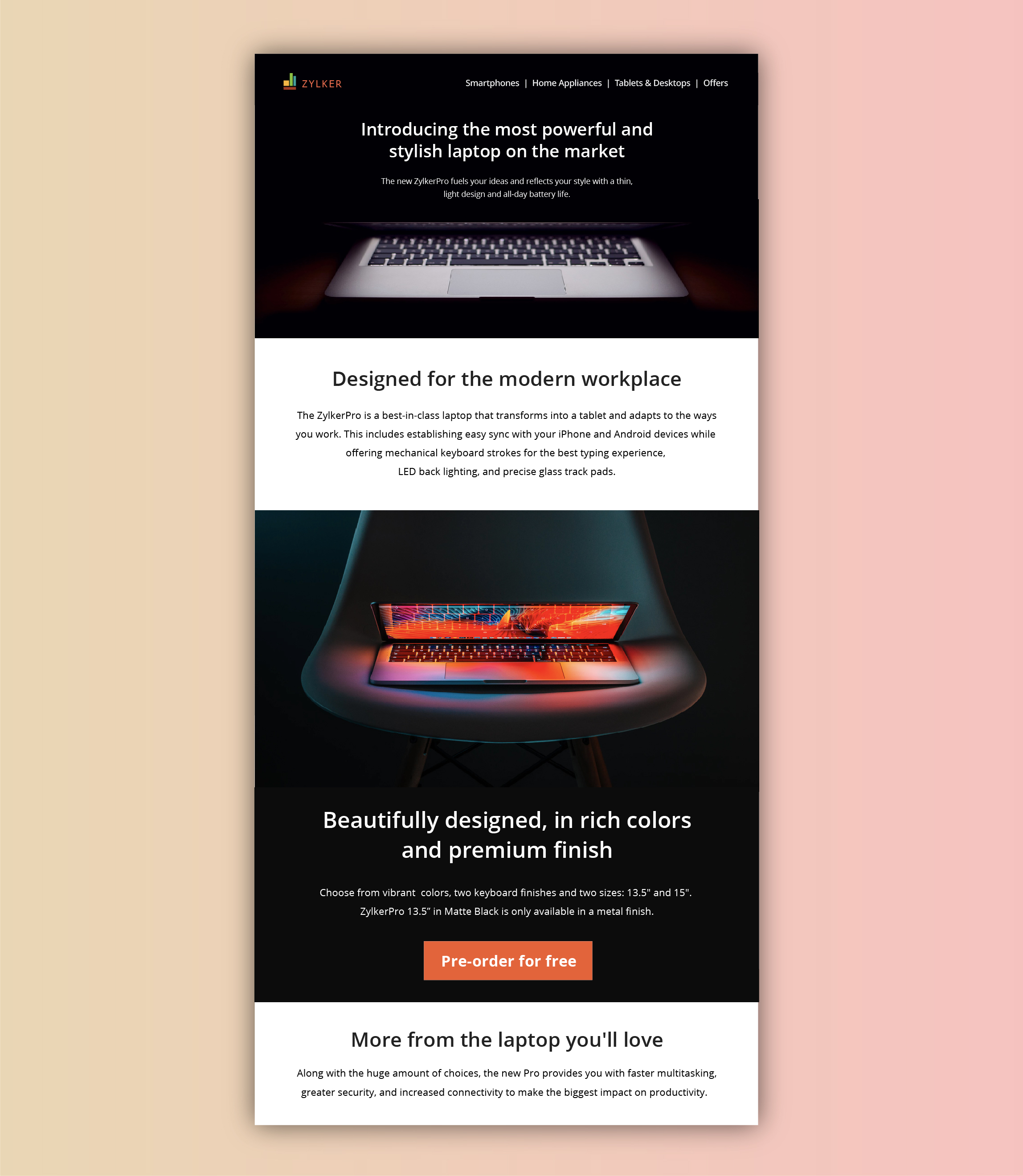
- Showing a glimpse of soon-to-be-released products with feature highlights, and then at the end placing "Pre-order for free" CTA on your digital store. This uses the below-the-fold area of your web page to catch the attention of the visitors first, even before redirecting visitors to the preferred page(s).
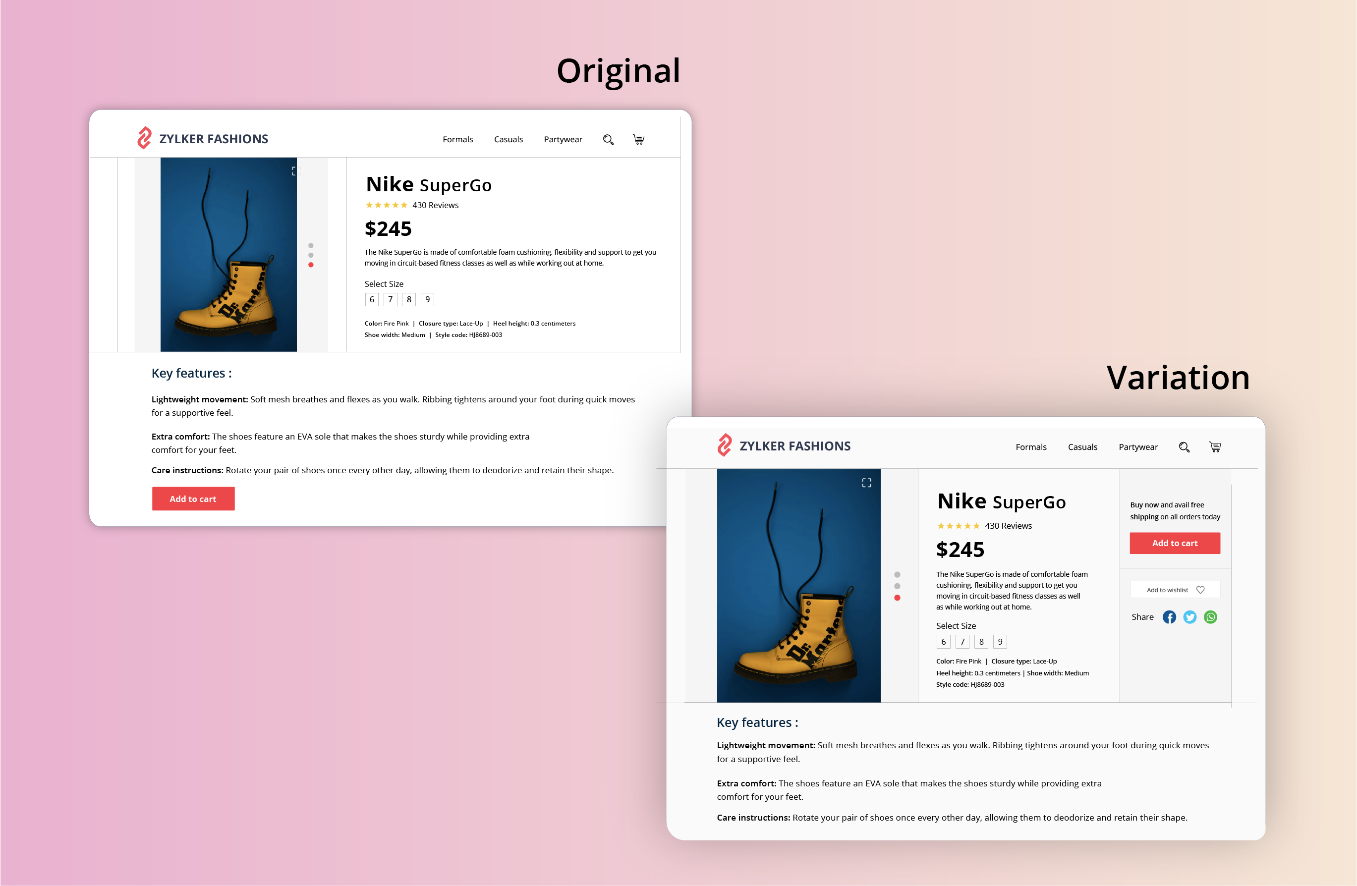
- Adding a “Buy Now” or "Add to Cart" button at the top-right section of the product page where a user would immediately click to buy after viewing your product offers page on the ecommerce site. This type of CTA placement adds visitors to your sales pipeline quickly by canceling extra steps like add to cart and check out.
Testing the CTA appearance
The color and appearance of your CTA button are the most important aspects while testing and optimizing your website. As humans, we always have a greater tendency to stick to information that looks bigger and brighter. Below are some practical tips on designing and testing an appealing CTA button:
- Add a bold, bright, and contrasting background color to CTAs. Give more important CTA buttons a brighter color and the less important functions a lighter color or simple text links.
- Have your CTA appear more clickable. This could be done by adding some visual effects such as a slight gradient or a small shadow to create that real push-button effect. However, if you think none of the effects will suit the chosen style of your website, add emphasis by applying rounded edges to the button.
- Size of the button is another crucial factor in designing an effective CTA button. Larger CTAs have a higher chance of being noticed and clicked by readers. It’s also common to arrange UI components according to their importance.
A few examples of good CTA appearance you can test out include:
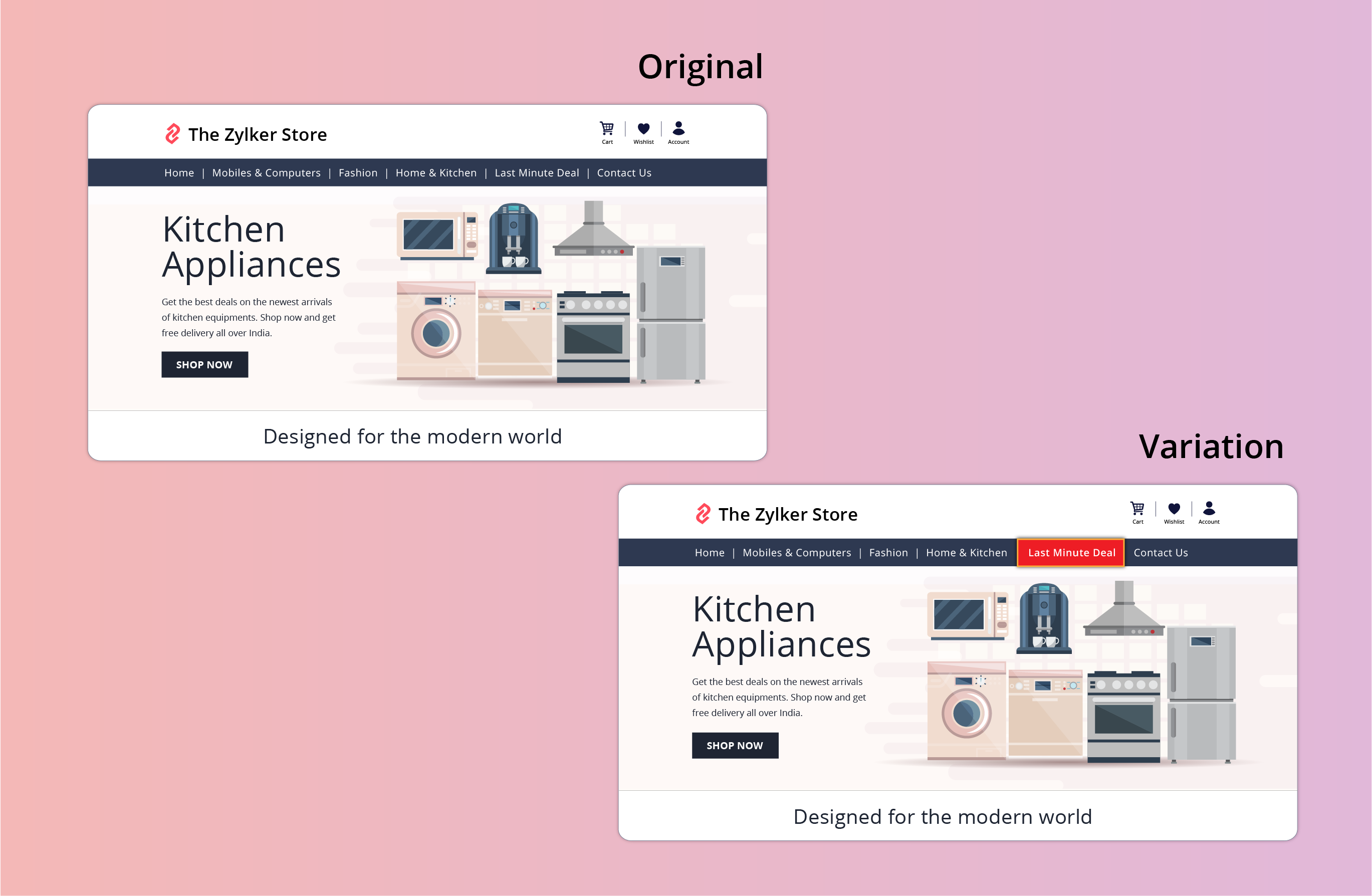
- Adding an attractive 3D or shadow effect to the "last minute deal" CTA button on your ecommerce site. This effect can spotlight the CTA, making it bright and prominent in comparison to other features like wish lists, view cart, or check out buttons.
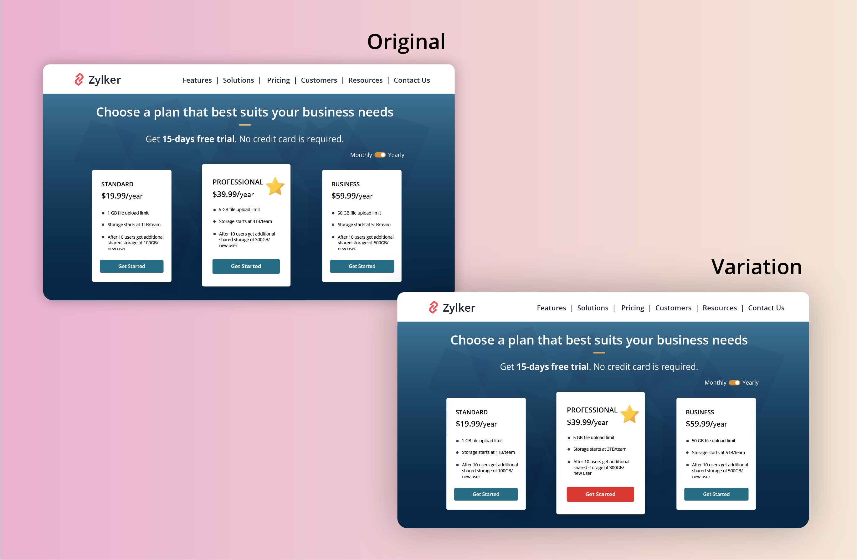
- Applying a bright color to the most recommended plan on your pricing page that you think will be a good fit for the majority of visitors. This might help highlight the best features in your product and avoid confusing buyers.
Found this useful? We would love to know what you think about this post. And, do you have any favorite A/B testing tricks or preferred approaches that you experiment on your website CTAs? Let us know in the comments below!
Happy testing. Happy converting!
Happy testing. Happy converting!