Resource Utilisation is now Workload Report
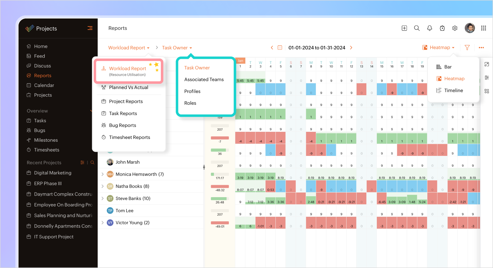
On behalf of the team, I am thrilled to share a significant transformation in one of our pivotal features – the current 'Resource Utilisation' chart is now reborn as the more versatile and insightful 'Workload Report'!
It is not about just the name change. A few enhancements are packaged in.
Task Grouping Evolution
Enjoy the enhanced ability to group tasks by 'Task Owner', 'Associated Teams', 'Profile', and 'Roles', providing a more tailored and detailed view of your project(s) workload.

Diverse Task Expansion Styles
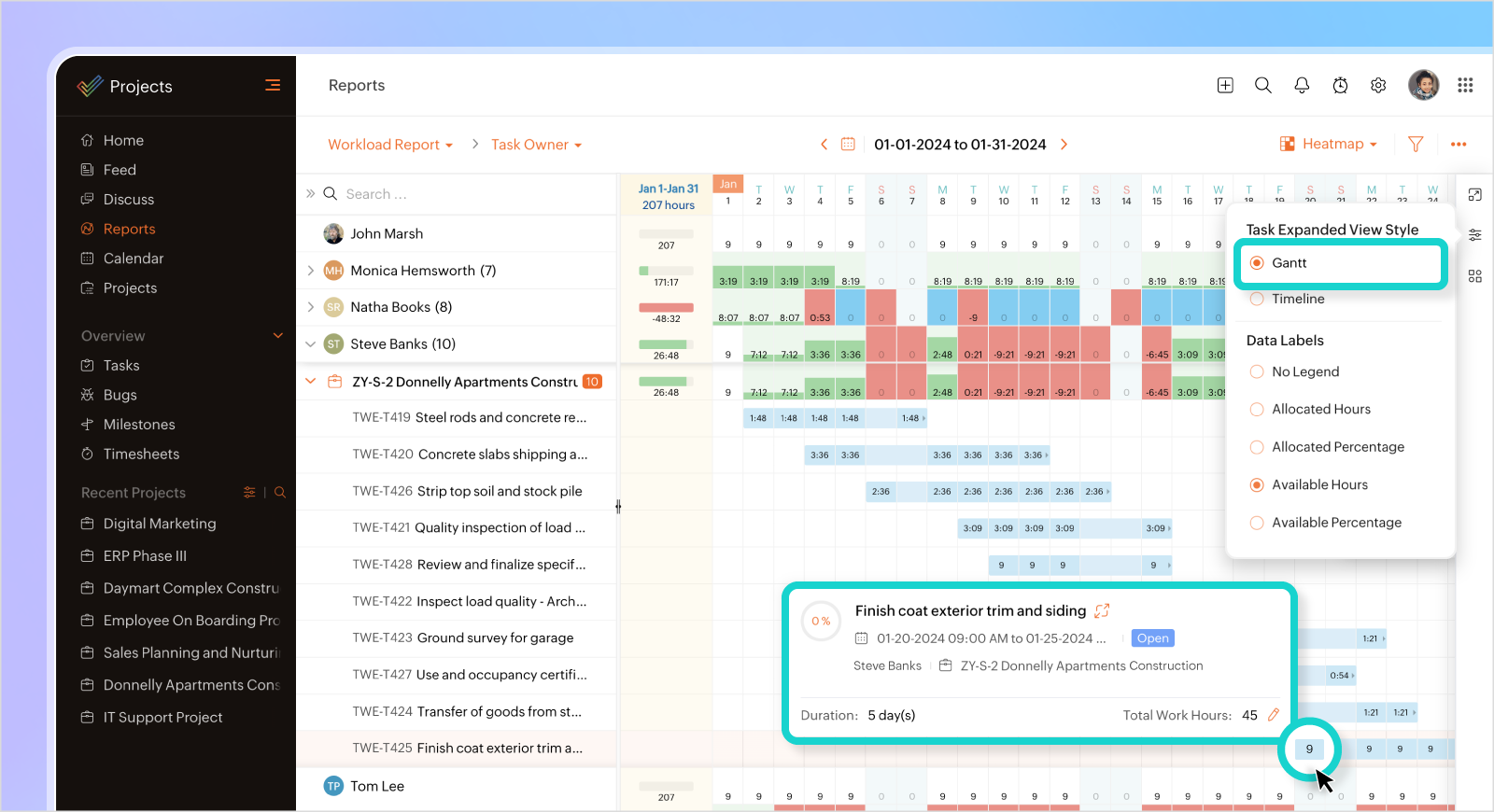
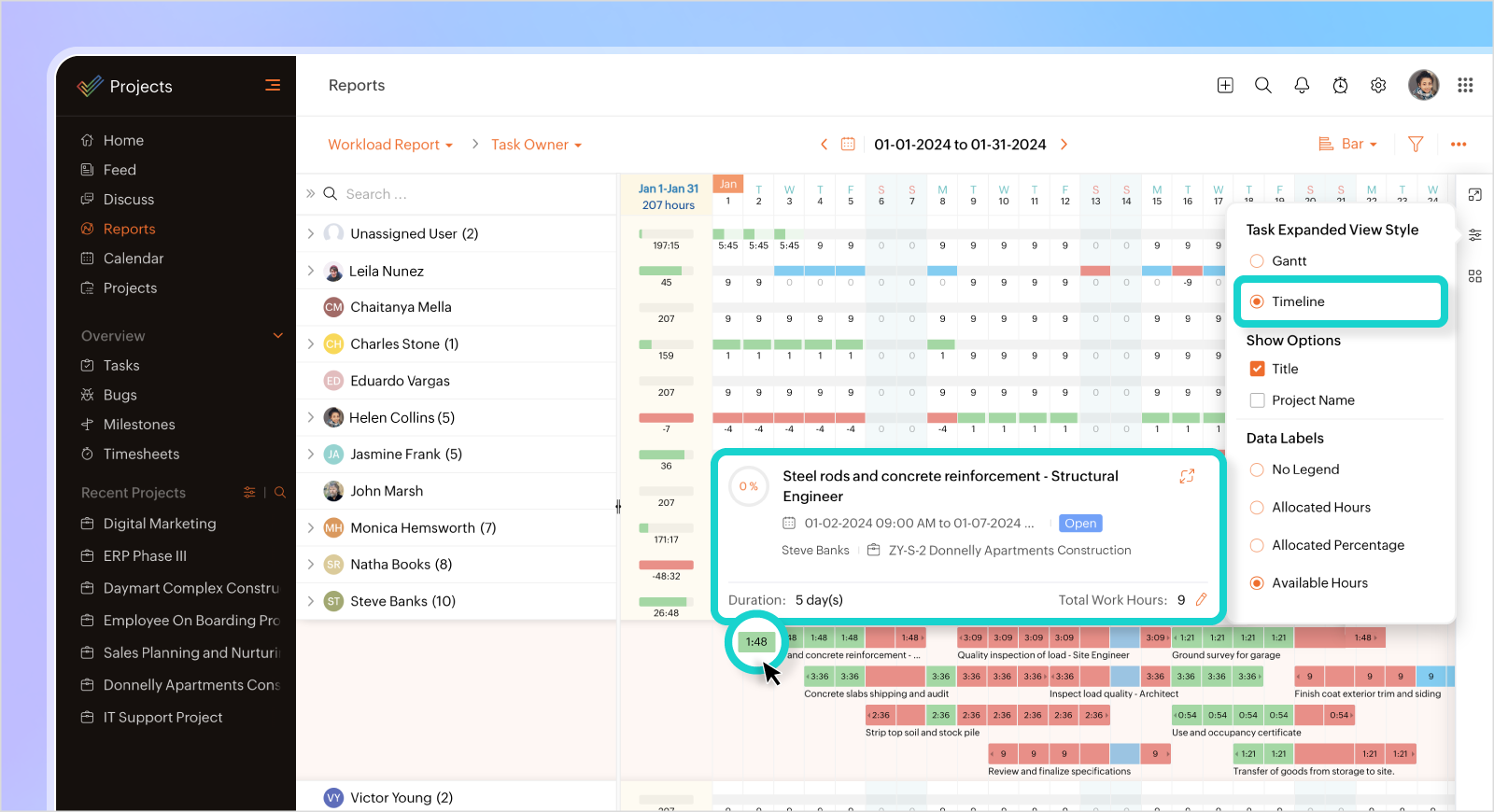
Tailor your task-viewing experience by expanding and exploring tasks in different styles. Choose between the classic Gantt or the new Timeline style to suit your preferences.


Dynamic Timeline View
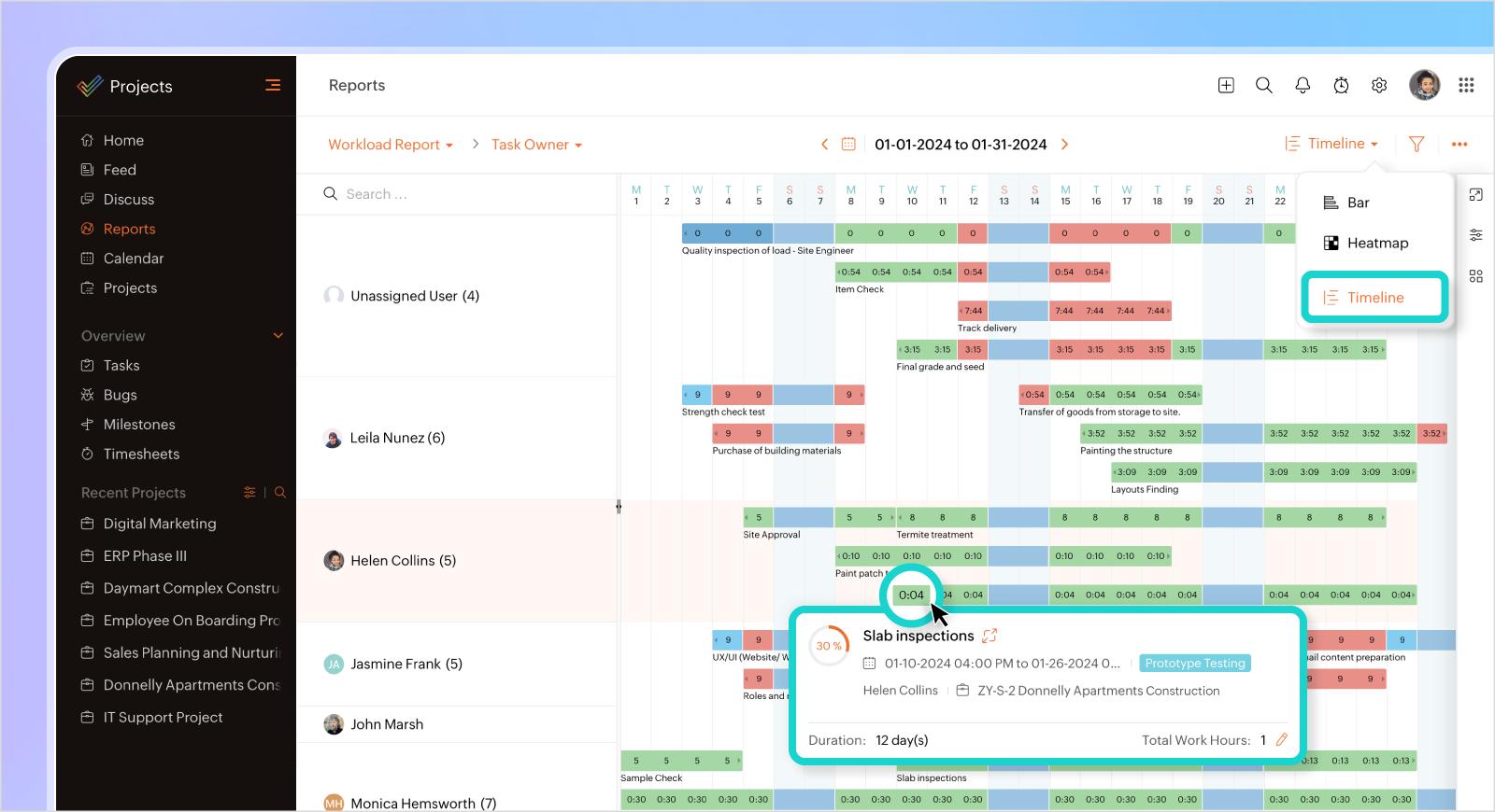
Experience the power of our newly introduced 'Timeline' view, designed to provide a holistic overview of timelines for better planning and coordination. This is in addition to the existing 'Bar' and 'Heatmap' view.

Why embrace the change?
The shift from 'Resource Utilisation' to 'Workload Report' signifies our commitment to providing a more encompassing and user-friendly tool. It's not just about resources; it's about optimizing and understanding the entire workload.
The changes mentioned above are expected to go live on or before Monday (18 March 2024). I will keep you all updated once the changes are live. Stay tuned!