Geo-Powered Retail Intelligence with Zoho Analytics
In today’s highly competitive retail landscape, data-driven decisions are no longer optional — they’re essential. While businesses collect vast volumes of data across regions, stores, and customer segments, the real value lies in how effectively this data is visualized and interpreted.
Geo Maps in Zoho Analytics bring location intelligence to the forefront of decision-making. With powerful spatial analytics capabilities, retail businesses can now visualize store performance, identify untapped opportunities, and track customer behavior trends with a simple glance at a map.

This solution demonstrates how Zoho Analytics' Geo Maps can be leveraged to solve real retail business problems, using a step-by-step approach grounded in a practical, ready-to-use dataset.
- Business scenario
- Dataset Overview
- Problem Description
- Why Geo Maps Become a Game-Changer
- Solution Implementation – Report Creation
- Store Performance Analysis (Map – Bubble)
- Revenue-to-Traffic Ratio with Ghost Zone Detection (Map - Filled + Scatter)
- Competitor Pressure Zones (Map – Scatter)
- Customer Gender Distribution (Map - Pie)
- Summary
Business scenario
Imagine you're a retail chain operating hundreds of stores across the United States. Each store generates data—sales, visitor footfall, customer satisfaction, marketing spend—but these numbers alone don’t explain why some stores succeed while others under-perform.
Key challenges include:
- Identifying stores that are struggling before sales drop significantly.
- Understanding whether poor performance is due to location, low visibility, or intense competition.
- Evaluating which regions offer true expansion potential—and which are over-saturated.
With no visual correlation between location and business KPIs, many decisions remain reactive instead of proactive. This is where Geo Maps make all the difference—by transforming isolated data into contextual geographic insights.
Dataset Overview
To power this solution, we’ve created a comprehensive and realistic retail dataset that mirrors how actual store data behaves across geographies.
The dataset includes:
- Store-level performance data: revenue, average purchase value, and satisfaction.
- Customer insights: foot traffic, age, gender distribution.
- Market context: competitor presence and market share, population density, and economic growth rate.
- Geospatial data: zip code, city, state, latitude, and longitude of each store location.
Problem Description
Retail chains often operate on thin margins, and even minor under-performance at store level can have significant impacts across the organization. While dashboards provide revenue and performance trends, they often miss one critical dimension—geography.
Without geographic context, businesses face several recurring challenges:
- Underperforming stores go unnoticed until major losses occur.
- Ghost zones—areas with low store presence but high potential—remain unexplored.
- Marketing budgets get wasted in regions where returns are consistently low.
- Competitor pressure is misjudged due to lack of visibility on regional saturation.
- Store closures become reactive decisions, made after performance has already declined.
In short, data without location awareness leaves decision-makers blind to spatial trends and risks. Businesses need a smarter, more intuitive way to analyze store performance with geographical clarity—before it’s too late.
Why Geo Maps Become a Game-Changer
Geo Maps in Zoho Analytics address this gap by unlocking a visual layer of intelligence that traditional charts can’t offer.

Here’s what makes them a game-changer:
- Location-first insights: Instantly identify how store performance varies across the map - by city, state, or neighborhood.
- Visual correlation of multiple KPIs: Compare revenue, satisfaction, and foot traffic geographically to detect hidden patterns.
- Clutter-free, customizable visuals: Choose the right map type - bubble, filled, pie, or scatter - to match the data you want to analyze.
Unlike static dashboards, Geo Maps enable you to see the problem, context, and opportunity—all in one frame. Whether it's spotting trends, reallocating marketing spend, or planning expansion, this spatial layer puts decision-makers back in control.
Solution Implementation – Report Creation
This section walks through the step-by-step creation of four key Geo Map reports that reveal business insights from store-level data.
1. Store Performance Analysis (Map – Bubble)
To identify how stores are performing across different regions in terms of revenue and customer satisfaction, using a clean, visual-first map representation.
This helps uncover:
- High-performing stores in key zones
- Underperforming regions needing intervention
- Patterns related to location-based store success
Why Map - Bubble?
The Map - Bubble chart is ideal for visualizing store-level metrics using geolocation.
- Size indicates magnitude (e.g., Monthly Revenue)
- Color indicates health or quality (e.g., Customer Satisfaction)
- Each store appears as a distinct bubble based on its lat/long.
Procedure
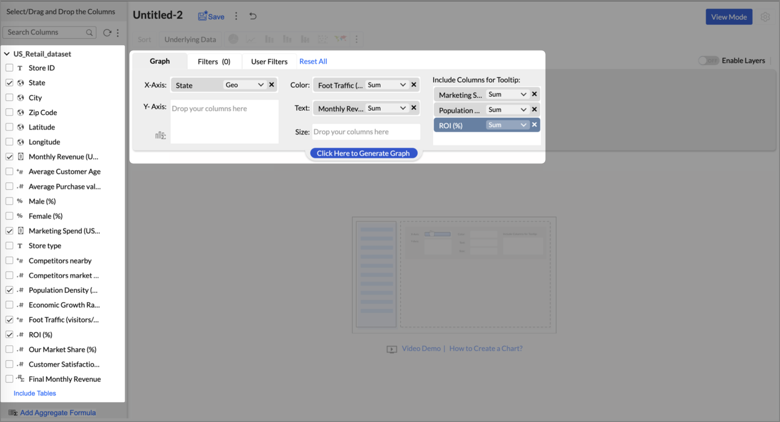
- From the dataset, click the Create icon and select Chart View.
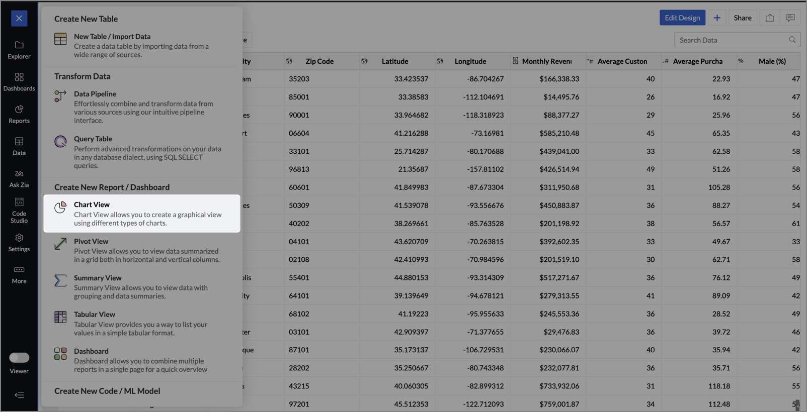
- On the designer page, drag and drop the following columns into their respective shelves:
- Latitude → X-Axis
- Longitude → Y-Axis
- Customer Satisfaction (out of 10) → Color
- Monthly Revenue (USD) → Size
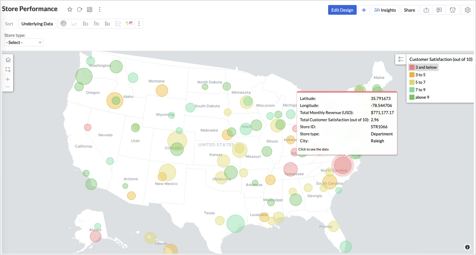
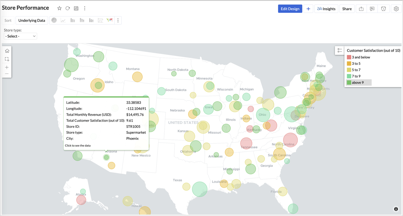
- Store ID, Store Type, City → Tooltip
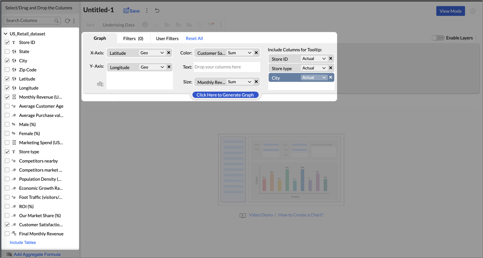
- Click Generate Graph.
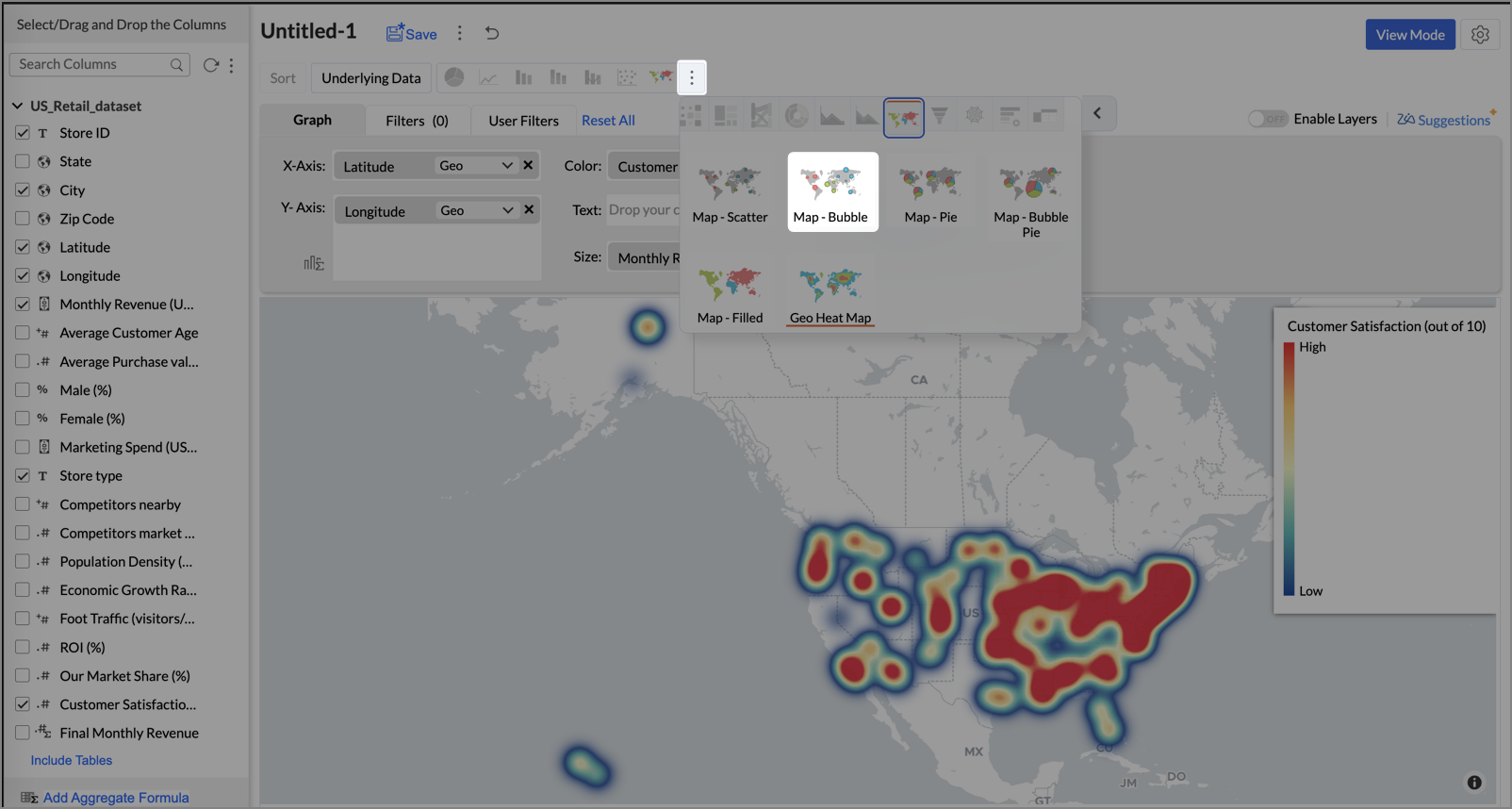
- Click on the ellipsis icon and select the chart type as Map - Bubble.
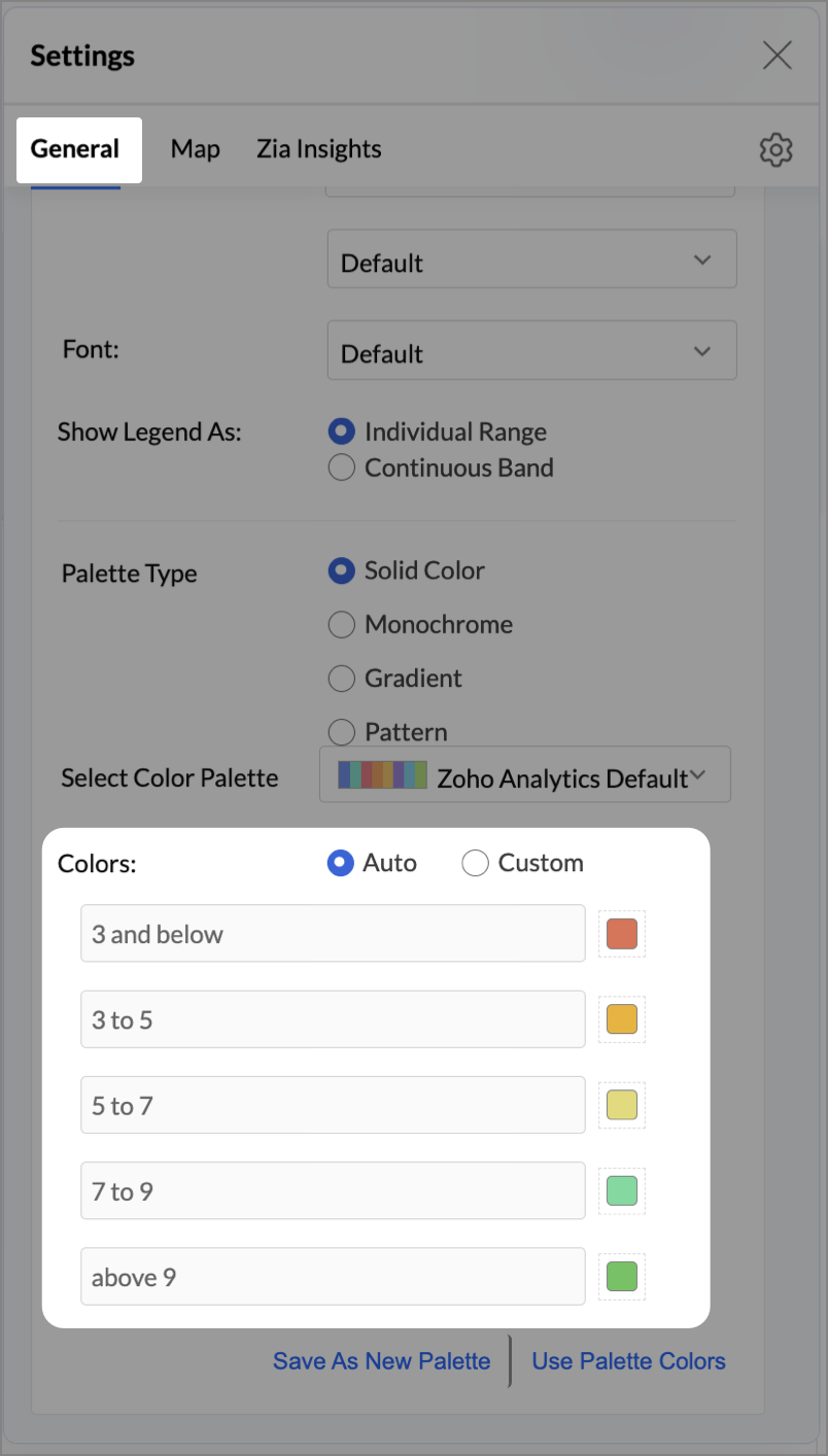
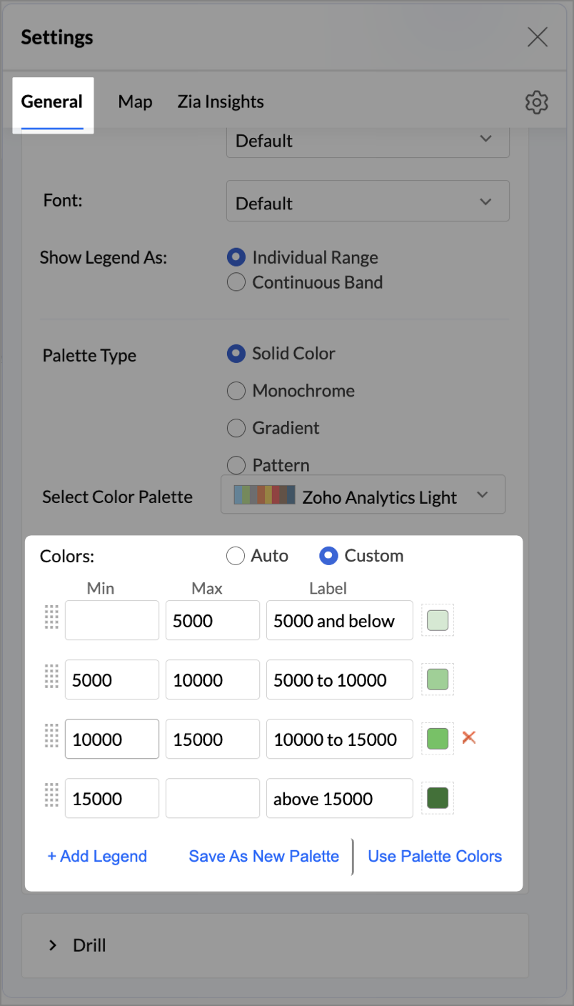
- Click the Settings icon, and under the General tab, click Legend.
- In the Colors section, customize the color scale from red to green to represent satisfaction ranges.
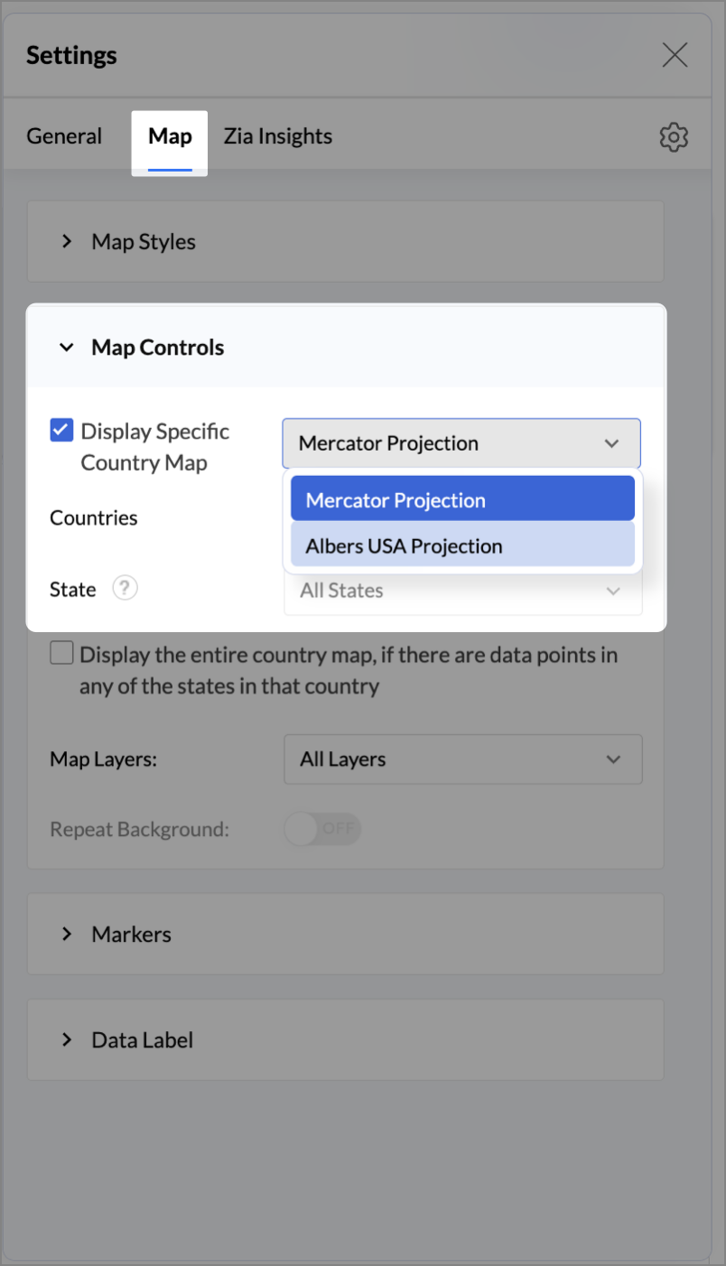
- Under the Map tab, click Map control and enable Display Specific Country Map.
- From the drop-down, select Albers USA Projection. This displays the USA map by placing Alaska and Hawaii below the mainland USA on a single map.
- Rename the report as Store Performance and click Save.
Tip:
Add a User filter such as Store type or State to analyze performance by segment.
This configuration creates a bubble for every store, sized by its revenue and colored by customer satisfaction — instantly showing how happy customers are in high- or low-revenue zones.
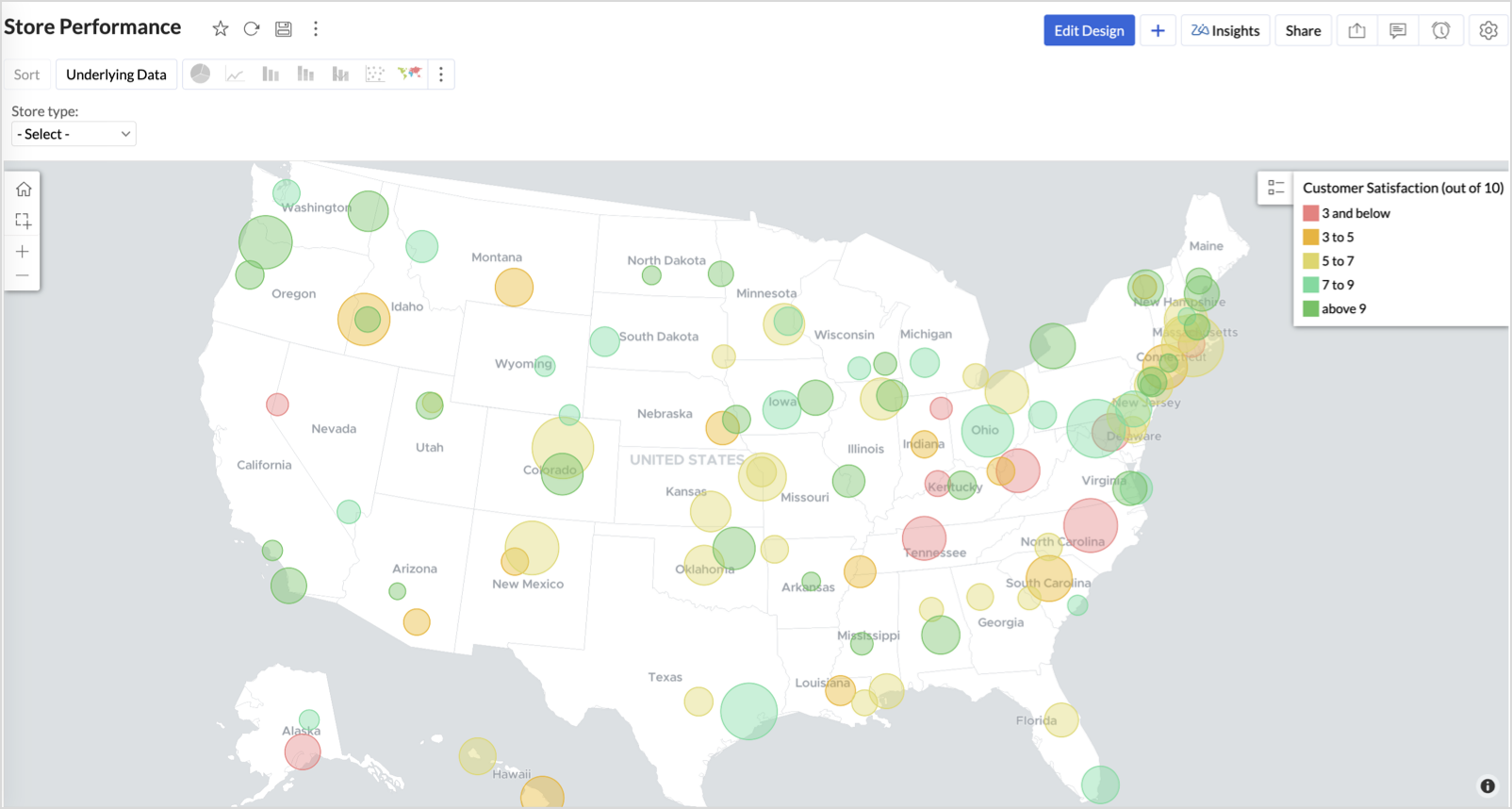
Key Insights
Large bubble + Red color - High revenue but poor satisfaction — risk of churn!
Small bubble + Green color - Low revenue but high satisfaction — possibly underserved
Large bubble + Green color - Healthy performers — consider replicating success
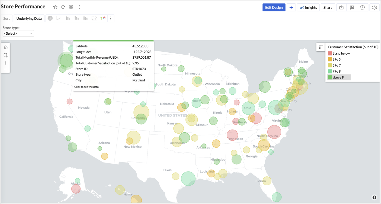
Small bubble + Red color - Low performers — review for possible closure or revamp.
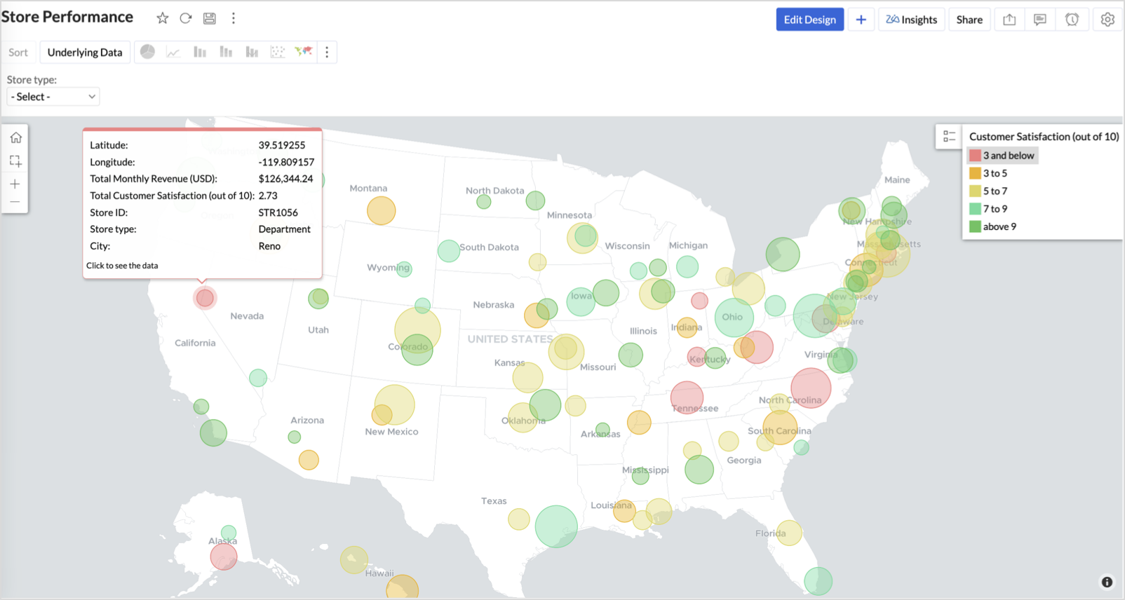
Business Interpretation
This chart acts as a live performance map for executives and analysts. Instead of scanning through tables or KPIs, stakeholders can instantly spot outliers, prioritize investments, and plan corrective actions by just glancing at the map.
2. Revenue-to-Traffic Ratio with Ghost Zone Detection (Map - Filled + Scatter)
To evaluate how efficiently each state is converting foot traffic into store revenue — and more importantly, to identify high-footfall regions without store presence, often referred to as ghost zones.
This chart helps:
- Compare state-level foot traffic against actual revenue
- Spot underutilized or over-performing regions
- Discover untapped markets with high visitor potential but less to no physical stores
Why Map - Filled + Scatter?
- The Map - Filled chart provides a regional perspective of traffic density and revenue generation.
- The Scatter layer overlays actual store locations based on latitude and longitude.
This powerful combo allows you to measure performance where you’re active and spot opportunities where you're not.
Procedure
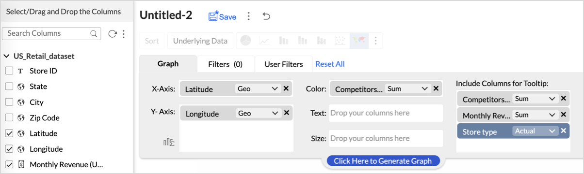
- From the dataset, click the Create icon and select Chart View.
- On the designer page, drag and drop the following columns into their respective shelves:
- State → X-Axis
- Foot Traffic (visitors/month) → Color
- Monthly Revenue (USD) → Text
- Marketing Spend (USD), Population Density (people/sq km), ROI (%) → Tooltip
- Click Generate Graph.
- Click on more option and select the chart type as Map-Filled.
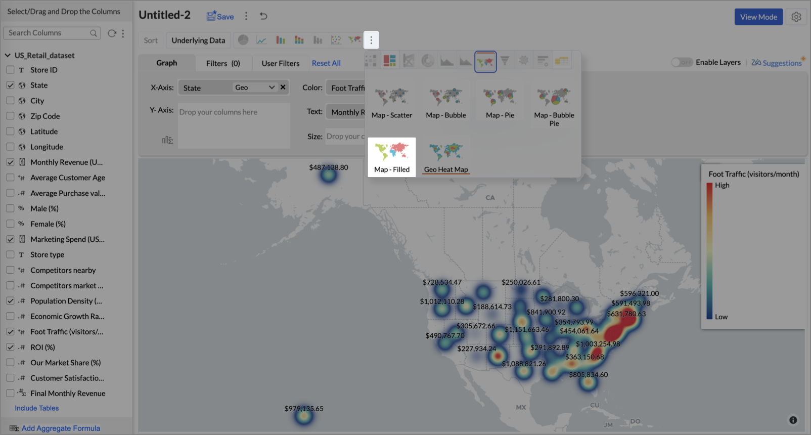
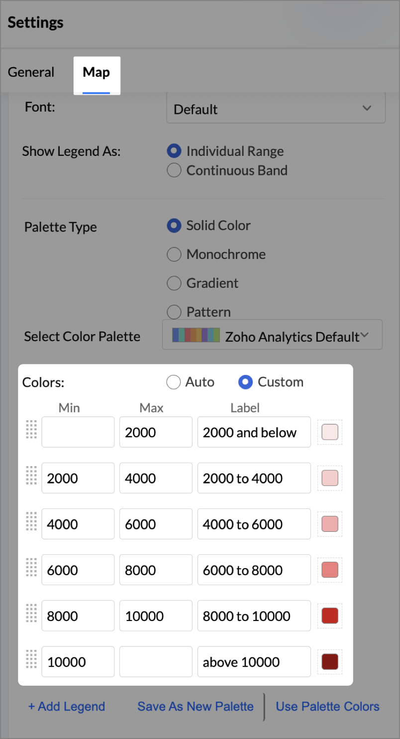
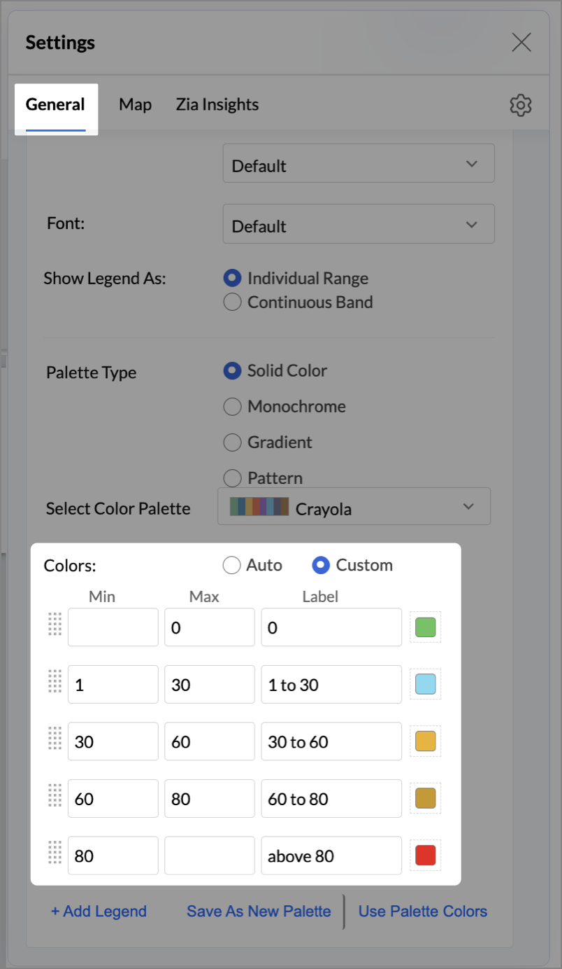
- Click the Settings icon, then click Legend.
- In the Colors section, assign from light to dark green colors for the below range of foot traffic:
- Below 5,000
- 5,000–10,000
- 10,000–15,000
- Above 15,000
- Under the Map tab, change the map to Albers USA Projection.
This filled layer highlights traffic and revenue across states.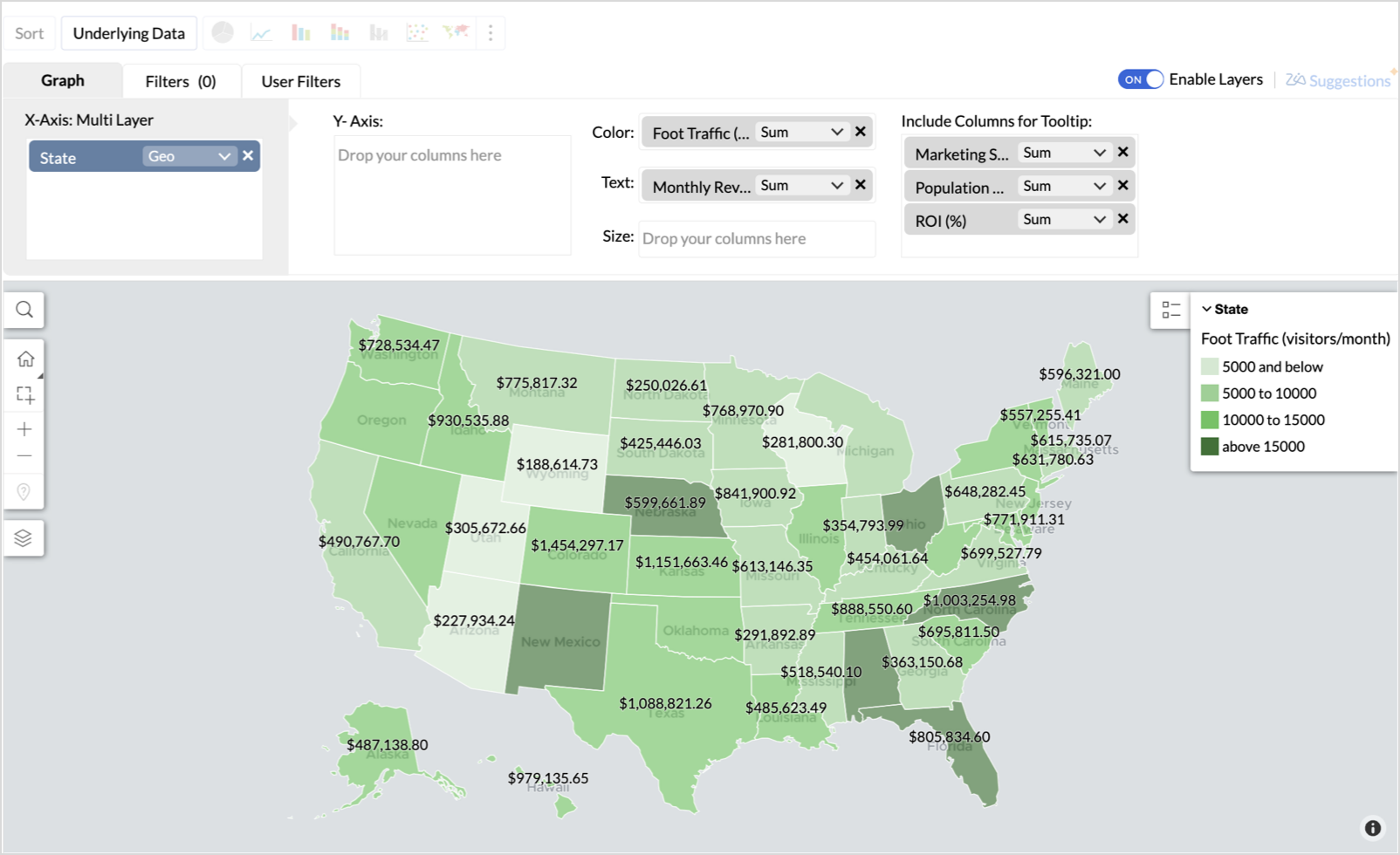
- Toggle Enable Layers to add a second layer.
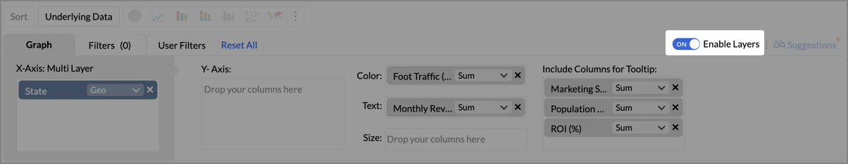
- In the new layer, drag and drop Latitude and Longitude into the X-Axis and Y-Axis respectively, Population density into the Color shelf, and click Generate Graph.
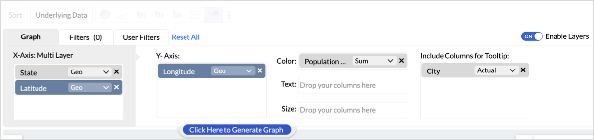
- Click Layer Controls, select Chart Chooser besides Latitude and choose the map as Map - Scatter from the list.
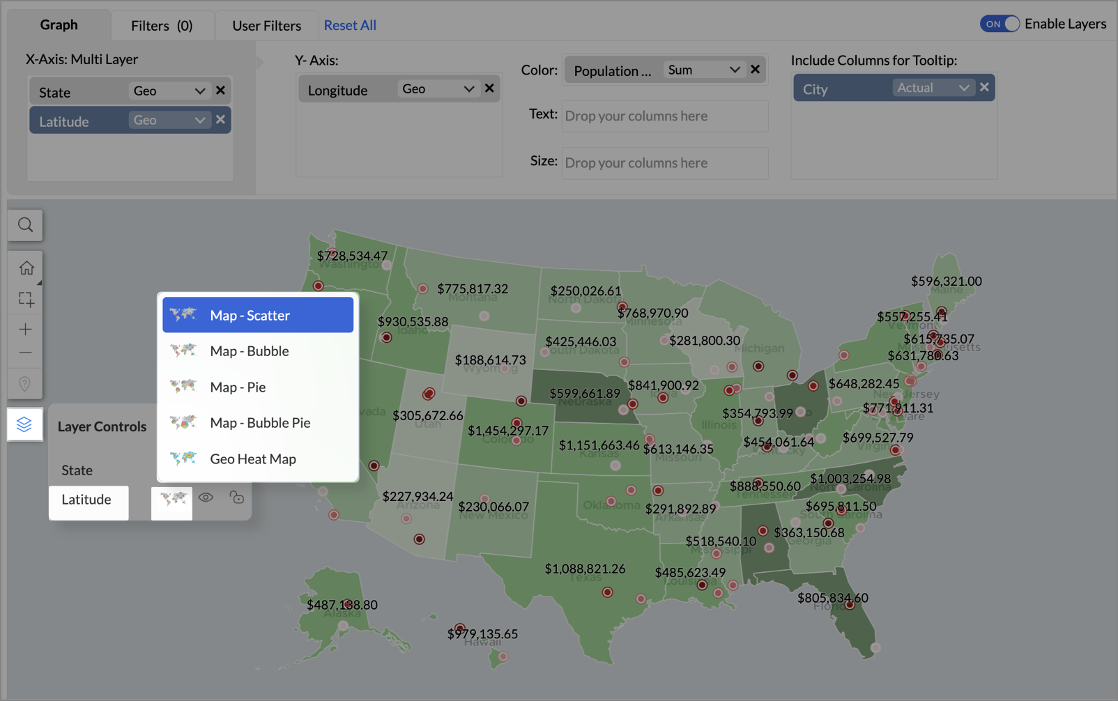
- To customize the second layer, go to Settings → Map → Latitude → Legend, and assign from light to dark red colors for the below range of population density:
- Below 2,000
- 2,000-4,000
- 4,000-6,000
- 6,000-8,000
- 8,000-10000
- Above 10,000
- Rename the report as Revenue-to-Traffic Ratio with Ghost Zone Detection and click Save.
This scatter layer marks the exact store locations, allowing visual correlation with high-traffic regions, revenue, and population density.

Key Insights
Dark green filled (high traffic) + Low revenue - Poor conversion - evaluate strategy or in-store experience
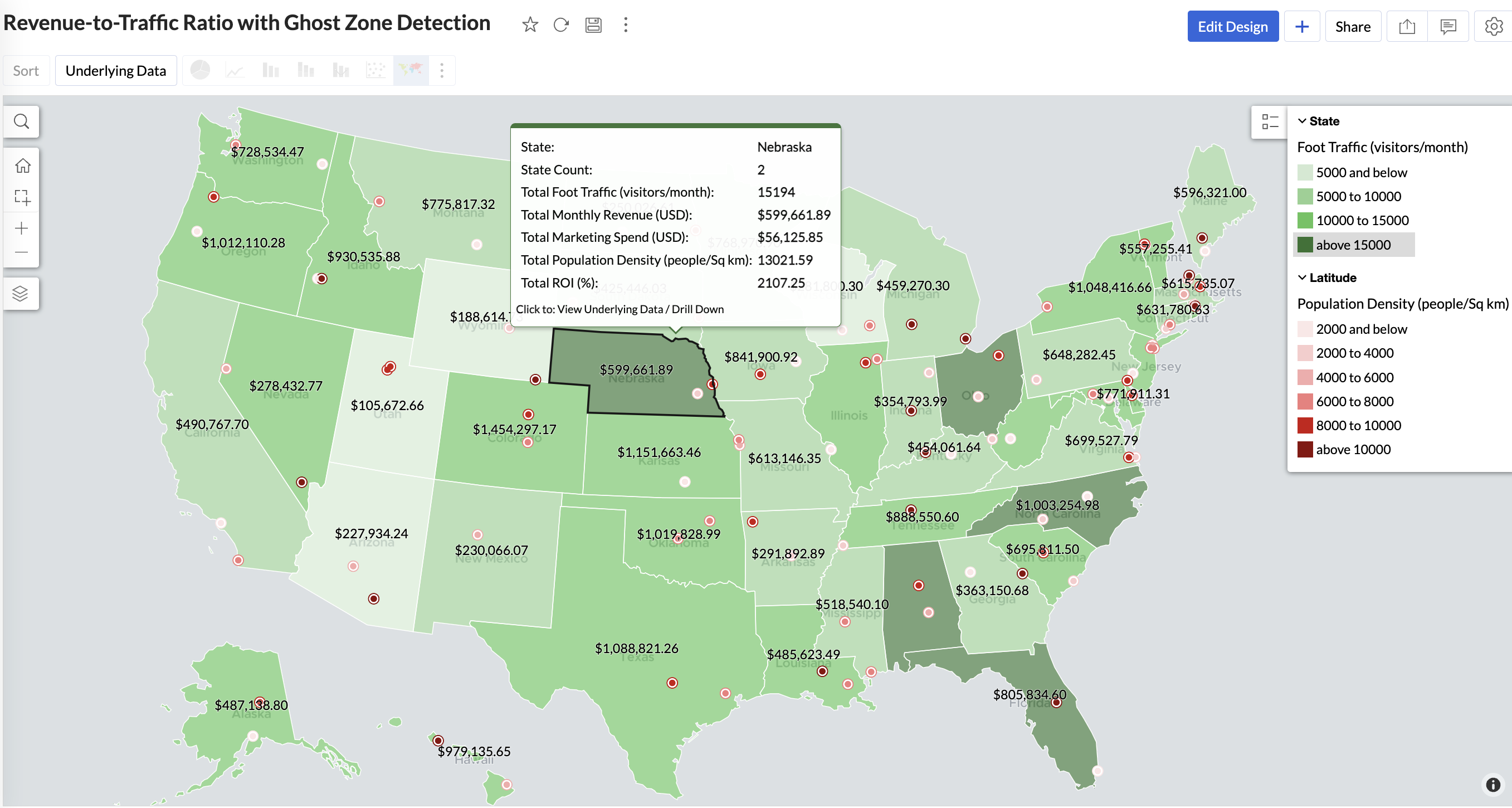
Mid to Dark green filled (high to mid traffic) + balanced revenue - Efficient zones — consider scaling efforts
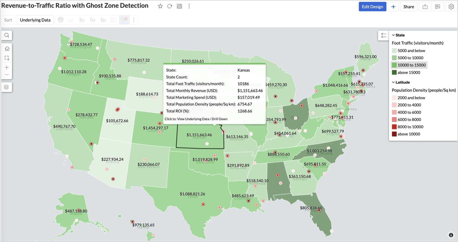
Light green filled (low traffic) + high marketing spend (from tooltip) - Budget drain — reduce spend or re-evaluate targeting
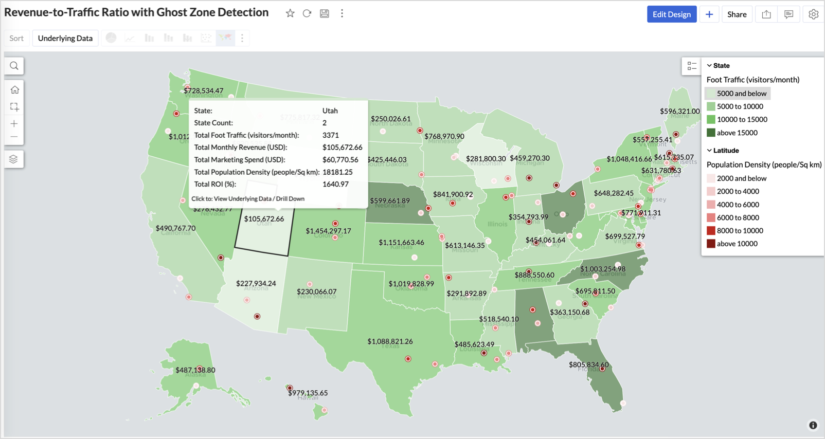
Dark red marker (high population density) + less to no store markers - Ghost Zones — high opportunity areas for expansion
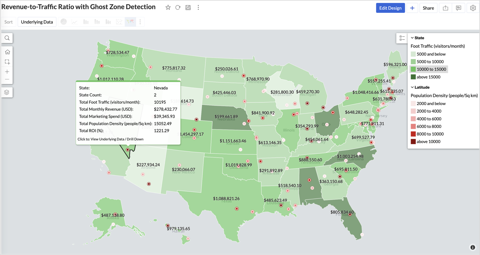
Example: In Las Vegas from Nevada, with a population density of 10,428 people/sq km and only two stores handling 10K–15K visitors/month, monthly revenue of the state remains modest at ~$278K. This indicates a high-opportunity zone for expansion, with strong footfall but untapped revenue potential.
Interpretation & Use
This map is designed for marketing and expansion teams who need to:
- Justify where to open new stores
- Optimize existing resource allocation
It visually answers the question:
Are we generating revenue where people are actually showing up?
Also, with the scatter layer:
Where are we not present — but should be?
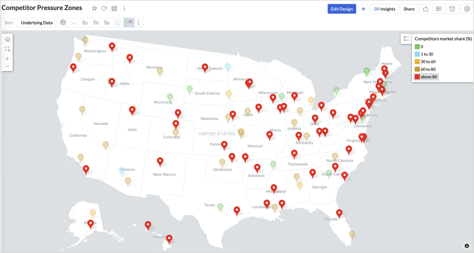
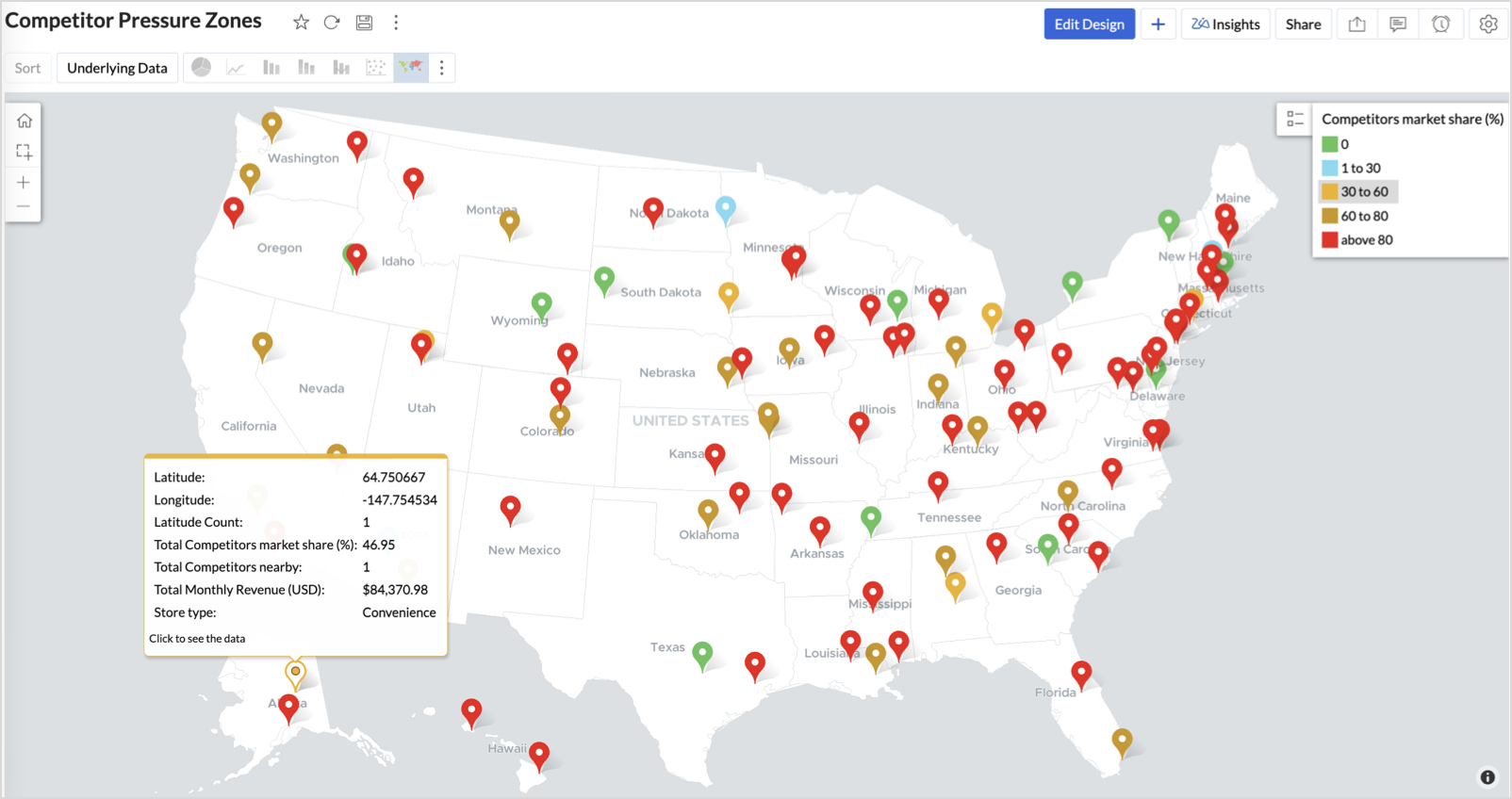
3. Competitor Pressure Zones (Map – Scatter)
To evaluate how store performance is impacted by nearby competition, using a scatter map that plots every store across the U.S. and reflects competitor market share through color intensity.
This view helps:
- Detect locations under competitive stress
- Identify high-risk zones where your market share is at risk
- Correlate competitor presence with satisfaction and store performance
Why Map - Scatter?
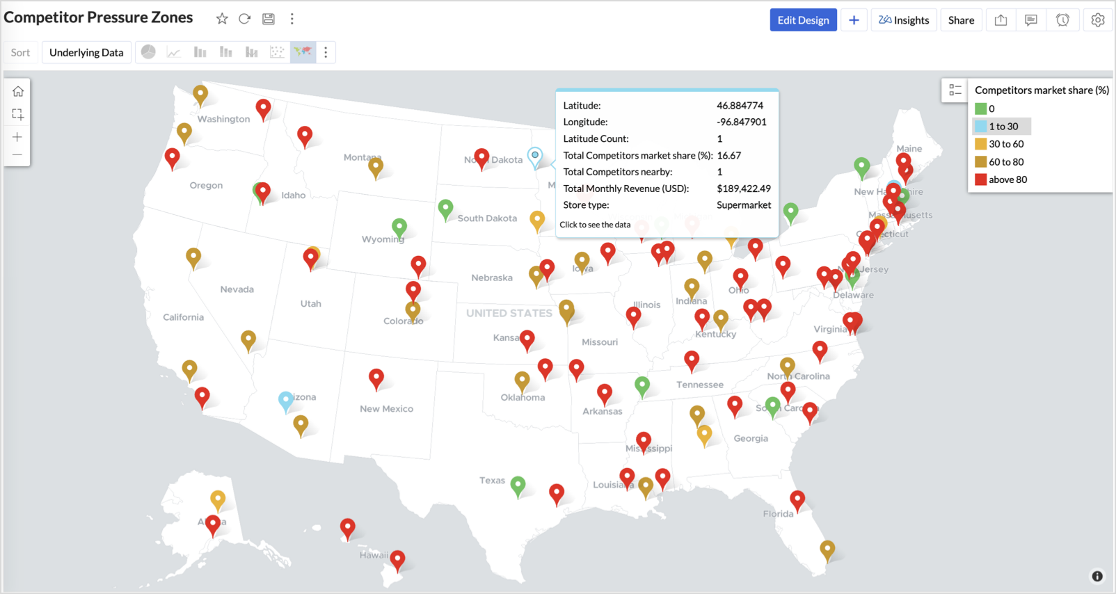
Map - Scatter offers a clean and lightweight visual that plots each store based on its exact coordinates. By encoding competitor market share as color and overlaying other attributes via tooltip, this chart becomes a competitive pressure radar.
Procedure
- From the dataset, click the Create icon and select Chart View.
- In the chart designer, drag and drop the following columns into their respective shelves:
- Latitude → X-Axis
- Longitude → Y-Axis
- Competitors market share → Color
- Competitors nearby, Monthly Revenue, and Store Type → Tooltip
- Click Generate Graph.
- Click on the more option and select the chart type as Map-Scatter.
- In the Settings panel, adjust the color gradient to reflect pressure levels
- 0 → Green
- 1-30 → Cyan
- 30-60 → Orange
- 60-80 → Pale red
- Above 80 → Red
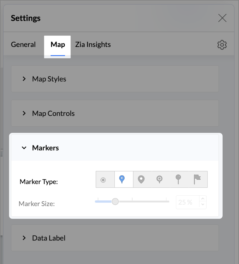
- Change the Marker type under Maps → Marker tab.
- Under the Map tab, change the map to Albers USA Projection.
- Rename the report as Competitor Pressure Zones and click Save.
The resulting chart uses color to signal competitive heat around each store, allowing you to scan pressure zones across all regions visually.
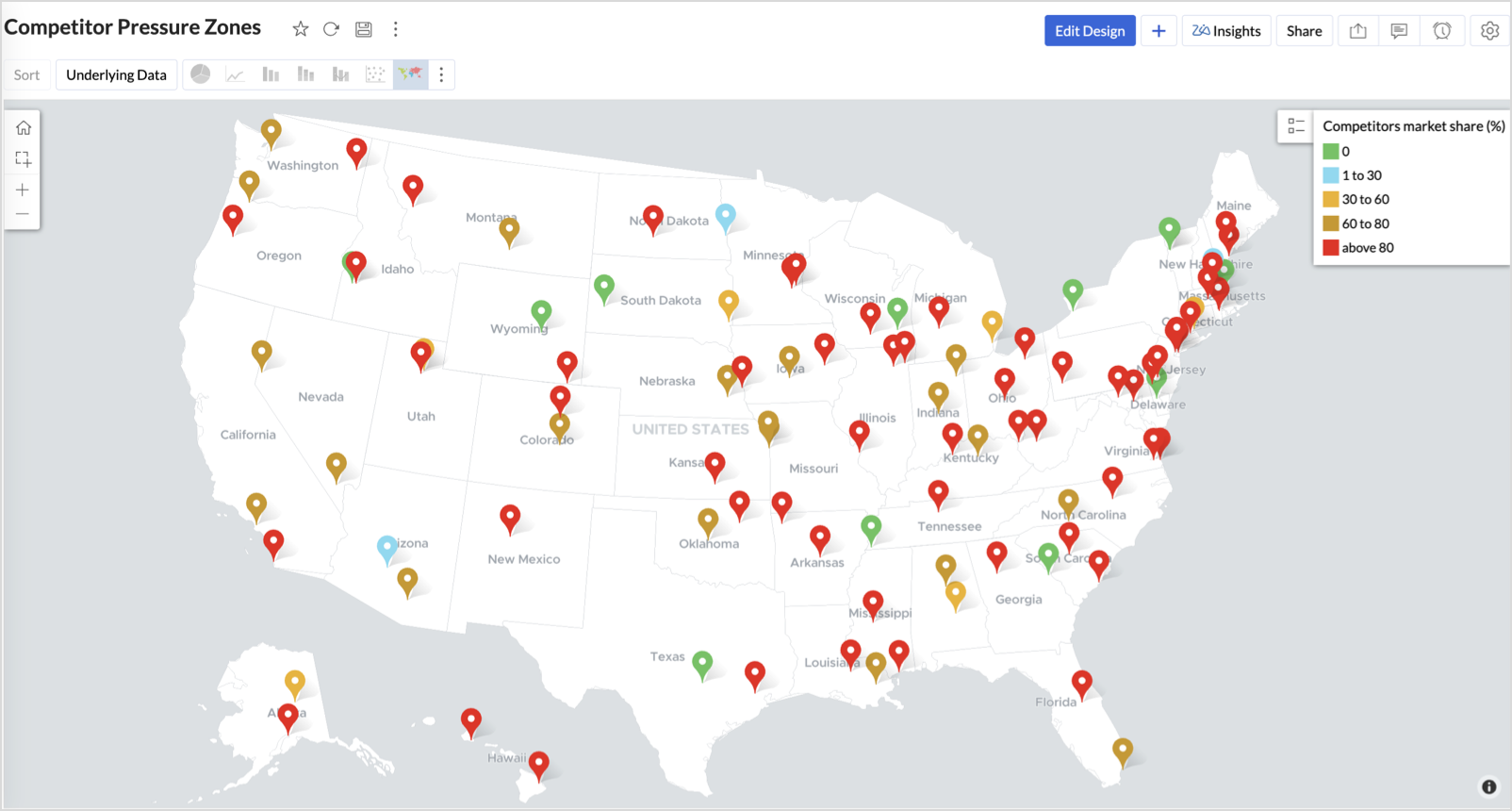
Key Insights
Red (80-100%) - High competitor dominance — urgent intervention zone
Orange (30-60%) + low revenue - Growing pressure — performance risk emerging
Green (0%) + strong revenue - Market leader — low competition, strong position
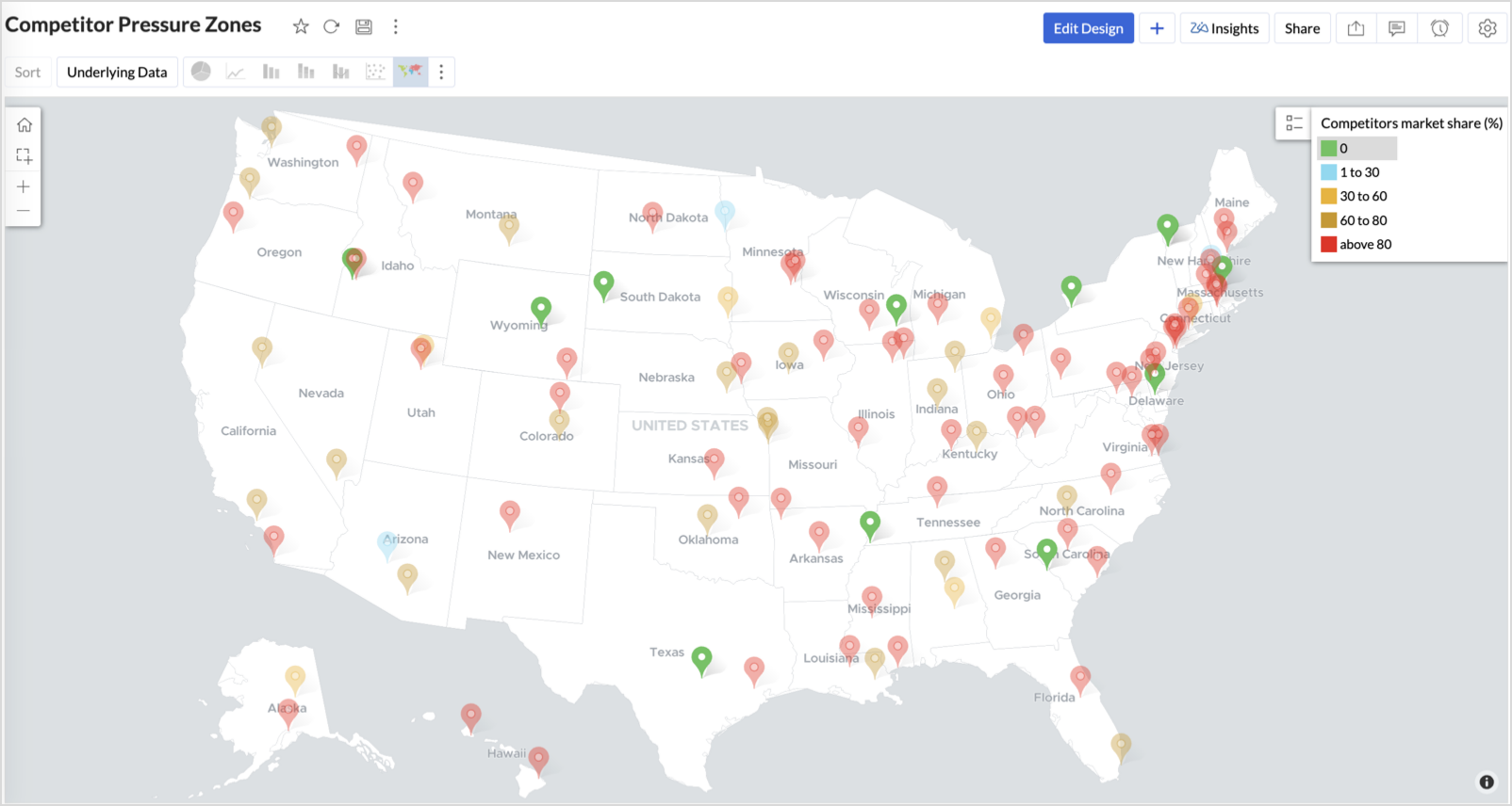
Cyan (1-30%) + moderate revenue - Mild competition — possible opportunity to scale further
Business Interpretation
This chart empowers regional and strategy teams to:
- Detect overcrowded areas where stores are losing share
- Identify safe zones where your brand leads the market
- Spot emerging competitor influence before it cuts into your margins
It acts as a competitive intelligence dashboard, mapping how your store network stands against external threats.
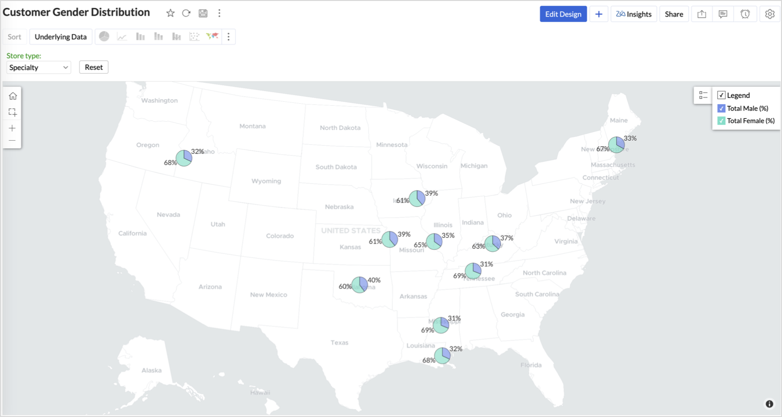
4. Customer Gender Distribution (Map - Pie)
To visualize how the gender distribution of customers varies across store locations. This helps identify stores with significant demographic skews, allowing for more personalized marketing, product selection, and in-store experience.
Why Map - Pie?
The Map - Pie chart is ideal for visualizing data composition across geographical locations.By breaking down each store’s customer base into Male (%) and Female (%) segments, this chart reveals who your customers are and where gender-targeted strategies might work best.
Procedure
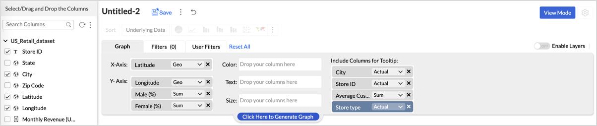
- From the dataset, click the Create icon and select Chart View.
- In the chart designer, drag and drop the following columns into their respective shelves:
- Latitude → X-Axis
- Longitude, Male (%), Female (%) → Y-Axis
- City, Store ID, Average Customer Age, Store Type → Tooltip
- Click Generate Graph.
- In Settings, under the Map tab, change the map to Albers USA Projection.
- Click on Markers, adjust the Marker Size as shown.
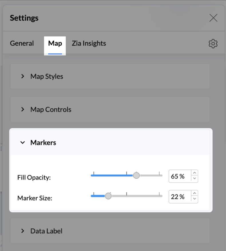
- Click on Data Label, and enable the Show corresponding Y axis value as data label on the chart to display the percentage values on the map.
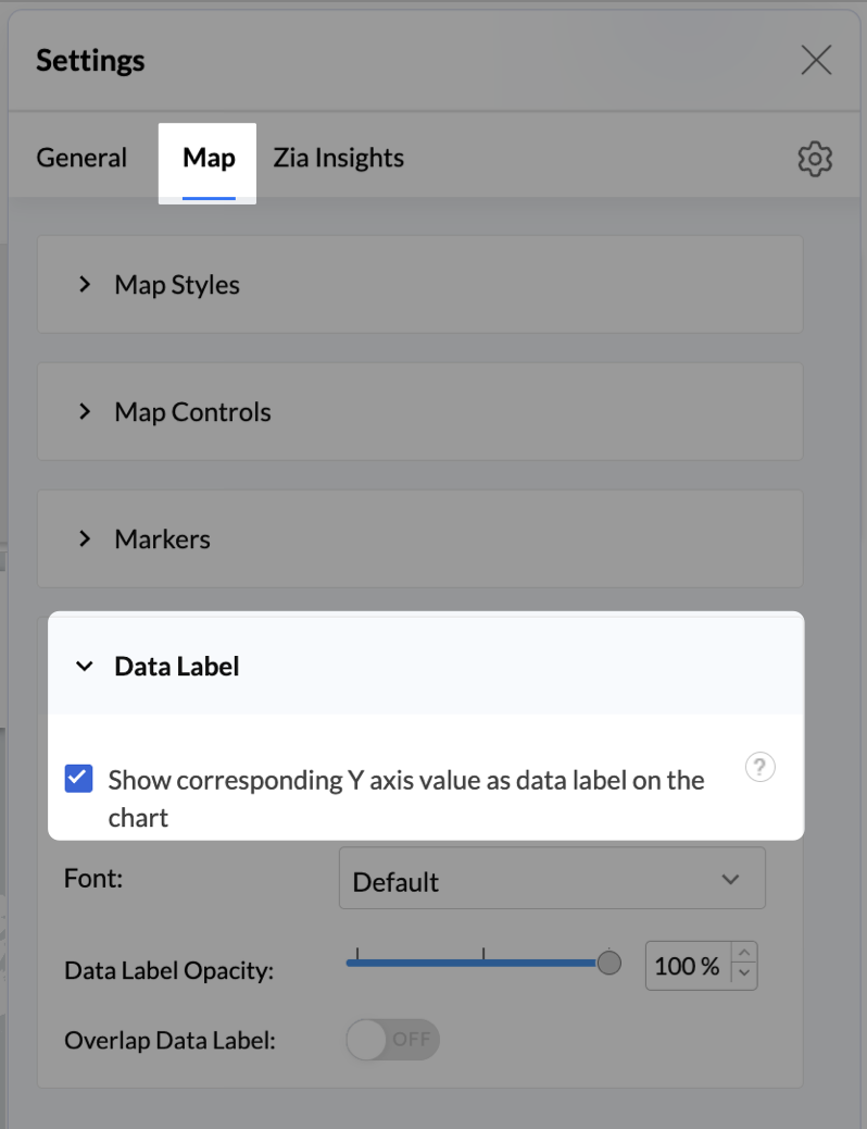
- Add Store Type as User Filters to slice down store-wise gender distribution.
- Rename the report as Customer Gender Distribution and click Save.
Each store will now display a pie chart representing the gender split among its customers, directly on the map.

Key Insights
Uneven gender split (e.g., 70% Male) - Potential to tailor offerings, branding, or promotions for the dominant gender
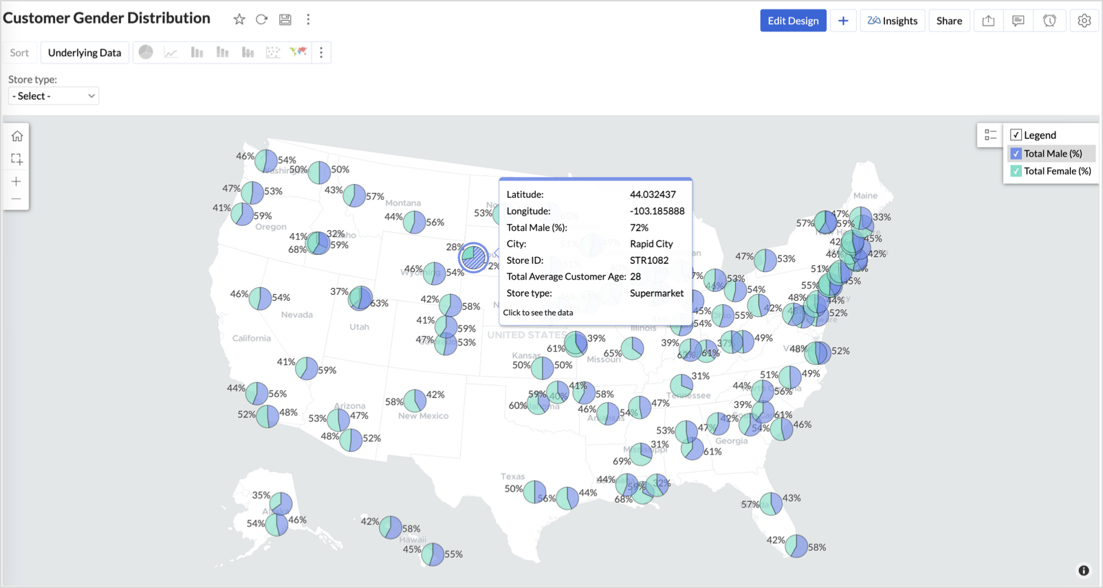
Balanced split (≈50/50) - Opportunity to run inclusive or diversified campaigns
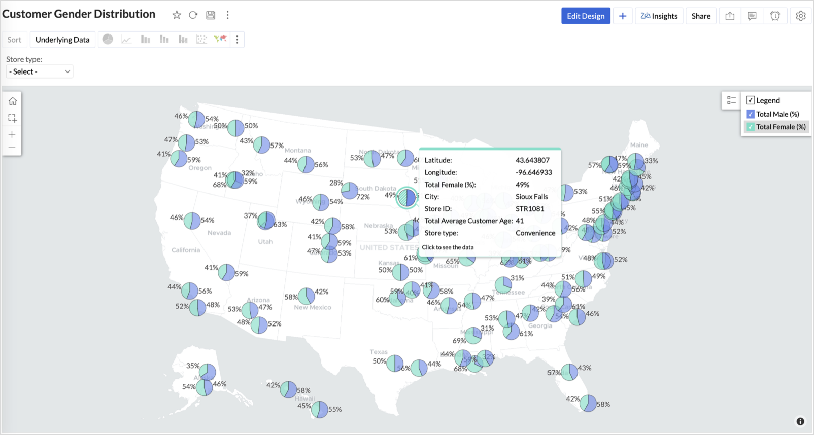
High female ratio + specialty store - Indicates demand for niche products — expand category offerings
Business Interpretation
This chart allows marketing and merchandising teams to:
- Understand gender-based customer clustering across regions
- Launch targeted campaigns (e.g., loyalty programs, promotions)
- Refine product assortments to suit local preferences
For example: A store with 70% female shoppers may benefit from deeper investment in lifestyle categories, while a balanced store could serve as a testing ground for unisex offerings.
Summary
In this phase, we laid the foundation for geo-powered retail intelligence using Zoho Analytics. Through a single, well-structured dataset and four powerful geo map visualizations, we transformed raw store data into real, actionable business insights.
Here’s what we achieved:
|
Report
|
Business Insights
|
|
Store Performance (Bubble)
|
Identified stores that are over performing or at churn risk based on revenue and satisfaction.
|
|
Revenue-to-Traffic Ratio (Filled + Scatter)
|
Detected ghost zones and optimized marketing ROI by comparing traffic and revenue.
|
|
Competitor Pressure Zones (Scatter)
|
Mapped out competitor dominance and spotted at-risk or saturated regions.
|
|
Customer Gender Distribution (Pie)
|
Uncovered demographic patterns to tailor product, marketing, and in-store experience.
|
Click here to access the sample workspace.
These visualizations brought spatial awareness into every performance metric — turning maps into a strategic business tool.
And this... is just the beginning.
Stay tuned for Phase 2 — where Multi-Layer Geo Maps and Network Charts come together to supercharge your business strategy with even deeper spatial insights.
Topic Participants
Pradeepkumar R
Sticky Posts
What's New in Zoho Analytics - November 2025
We're thrilled to announce a significant update focused on expanding your data connectivity, enhancing visualization capabilities, and delivering a more powerful, intuitive, and performant analytics experience. Here’s a look at what’s new. Explore What'sWhat's New in Zoho Analytics - October 2025
Hello Users! We're are back with a fresh set of updates and enhancements to make data analysis faster and more insightful. Take a quick look at what’s new and see how these updates can power up your reports and dashboards. Explore What's New! ExtremeWhat’s New in Zoho Analytics – September 2025
Hello Users!! In this month’s update, we’re raising the bar across multiple touchpoints, from how you bring in data, plan and track projects to how you design and brand your dashboards. We’ve added the all-new Gantt chart for project visualization, expandedAnnouncing Agentic AI - Ask Zia!
We are delighted to roll out the new agentic AI capabilities in Ask Zia, where every stage of the BI workflow is assisted by AI. With a human-in-the-loop approach, Ask Zia ensures that you’re in command of the decision, while AI handles the complexity.Invitation-Based User Access in Zoho Analytics
Hello everyone, We’re rolling out an important update on how users are added to your Zoho Analytics Organization and Workspaces. Previously, when admins added users, they were automatically added to the organization. Moving forward, to improve security
Recent Topics
Different languages for users
Hello, Do you plan to enable individual users to select their languages for interface? Currently language can be changed for everyone - it looks like a settings for a whole portal, which is not good when you are working internationally. Best regards,Kaizen #222 - Client Script Support for Notes Related List
Hello everyone! Welcome to another week of Kaizen. The final Kaizen post of the year 2025 is here! With the new Client Script support for the Notes Related List, you can validate, enrich, and manage notes across modules. In this post, we’ll explore how2025年 Zoho コミュニティ 活動の振り返り 🎉
ユーザーの皆さん、こんにちは!コミュニティチームの中野です。 2025年も多くの学びと出会いがあったZoho コミュニティ。 本記事では今年の活動を振り返りながら、フォーラムの投稿・参加者の皆さん・イベントのハイライトをご紹介していきます。 目次 フォーラム:注目の投稿 フォーラム:多くの貢献をしてくださった方々 ユーザー交流会振り返り ワークアウト振り返り その他のトピックス 1. フォーラム:注目の投稿 本フォーラムでは様々な議論と知識の共有が行われました。 ユーザーの皆さんが日々の業務で直面する課題を投稿し、経験豊富なユーザーさん達が実践的な解決策を提供してくださいました。Customer Management: #3 Giving Customers Control & Privilege
Rio, the founder of RenoTech Solutions, a fast-growing digital service company, found itself juggling a dozen different services for its clients. They handled one-time setup fees, recurring monthly invoices, and custom milestone-based billing for projects.Can I use a Standalone CRM Function as the Callback URL For Async Export Data API?
I am creating an export job using this API https://www.zoho.com/analytics/api/v2/bulk-api/export-data-async/create-export/view-id.html There is a "callbackUrl" key in the CONFIG object. I tried copying the URL for a standalone function in CRM which canBooks Api: listing expenses created after certain dates
Is there any parameter I can add to the List Expenses endpoint that will let me look up expenses by when they were created?Add RTL (Right-to-Left) Text Direction Support Across All Zoho Learn Editing Interfaces
Hi Zoho Learn Team, Hope you're doing well. We would like to request an important enhancement to Zoho Learn regarding support for right-to-left (RTL) languages such as Hebrew and Arabic. 🔹 Current Issue While the Knowledge Base Article editor providesAdd Hebrew Support for Meeting Transcripts Provided by ZIA in Zoho Cliq
Hi Zoho Cliq Team, Hope you're doing well. We would like to request the addition of Hebrew language support for the Meeting Transcript and Summary feature in Zoho Cliq. Currently the transcript and summary feature is available for recorded meetings andRemote Control Functionality During Screen Sharing in Zoho Cliq
Hello Zoho Cliq Team, We would like to request the addition of remote control functionality during screen sharing sessions in Zoho Cliq. Currently, while screen sharing in Cliq is very useful, it lacks the ability for another participant to take controlReal-Time Screen Annotation During Zoho Cliq Screen Sharing
Hi Zoho Support Team, Hope you're doing well. We’d like to request the addition of real-time screen annotation tools during screen sharing sessions in Zoho Cliq video calls. 🔍 What We're Looking For: The ability for the presenter—and optionally, otherCentralized Organization Information Management in Zoho One
Dear Zoho One Support, I'm writing to propose a feature that would significantly improve the user experience and streamline data management within Zoho One. Current Challenge: Currently, managing organization information across various Zoho One apps requiresEnhance Zoho One Conditional Assignment to Fully Reassign App Settings When Changing Departments
Hi Zoho Team, We’d like to submit a feature request regarding the current behavior of Zoho One’s conditional assignment logic when moving a user between departments. 🔧 Current Limitation As it stands, Zoho One’s conditional assignment does not removeAbility to Filter Alias Mailboxes in Zoho Recruit
Dear Zoho Recruit Team, I hope you are doing well. We would like to request a feature enhancement regarding the handling of alias mailboxes in Zoho Recruit. Currently, when we connect an alias mailbox (e.g., jobs@domain.com) from our Zoho One accountAutomatic Department and Employee Sync Between Zoho One and Zoho People
Dear Zoho Support, I'm writing to propose a valuable feature request that would streamline data management and improve user experience within the Zoho ecosystem: automatic synchronization between departments and employees in Zoho One and Zoho People.Add Attachment Support to Zoho Flow Mailhook / Email Trigger Module
Dear Zoho Support Team, We hope you are well. We would like to kindly request a feature enhancement for the Mailhook module in Zoho Flow. Currently, the email trigger in Zoho Flow provides access to the message body, subject, from address, and to address,Prefered Bin Missing in android APP
Andoroid app dosent show preferred bin in the picklist. The workaround support reccomend is to use the computre to create the picklist. it shuld be information to be shown aas basic for the pciker.Open Sans Font in Zoho Books is not Open Sans.
Font choice in customising PDF Templates is very limited, we cannot upload custom fonts, and to make things worse, the font names are not accurate. I selected Open Sans, and thought the system was bugging, but no, Open Sans is not Open Sans. The realFunction #1: Convert an accepted Estimate to Sales Order automatically in Zoho Books
As you’re aware, Zoho Books provides a default option to have the estimates automatically converted to invoices once your customer accepts them. Many of you wanted a similar option for sales orders, so here’s a workflow that converts accepted estimatesWrite-Off multiple invoices and tax calculation
Good evening, I have many invoices which are long overdue and I do not expect them to be paid. I believe I should write them off. I did some tests and I have some questions: - I cannot find a way to write off several invoices together. How can I do that,Reusable Jira Connection for Multiple Zoho Projects Imports
Hello Zoho Projects Team, We would like to raise a concern and submit a feature request regarding the Jira → Zoho Projects migration process, specifically around how Jira connections are handled. Current Behavior: When setting up a Jira connection forZoho invoice doesn't support Arabic language
I added a clause in the terms & conditions section in Arabic but it doesn't appear when I sent or print it.Recurring Invoice Placeholder Not Updating Billing Period
Hi, I’m using Zoho Invoice Free and want the billing period to update automatically in recurring invoices. In Item Description I tried: Billing Period: %(m-6)% %(y)% to %(m-1)% %(y)% but even if the invoice date is in 2026, it still shows the period basedRelated list Mobile Device
Hello, We use an the Zoho creator application to make reports linked to Accounts. On the computer: it's easy to go the Account and see all the created reports in the related list below On iPad/Phone ZOHO CRM APP: we cannot see the reports on those accountsCan't update the company address in zoho invoice
Dear Sir/Madam, I want to update the company address in Zoho Invoice but failed. It popped out a sentence "Invalid value passed for Website". Please advice how to solve this problem. Thank you.Is there a plan to allow for the hierarchical organization of Customers / Companies in Zoho Billing?
We have a few customers who have organizational structures that we haven't quite found a way to deal with in Zoho Billing. In CRM, these sub-companies (or subsidiaries or whatever you want to call them) all have another CRM account as the parent account.【Zoho CRM】作業リスト機能リリースのお知らせ
ユーザーの皆さま、こんにちは。コミュニティチームの藤澤です。 今回は「Zoho CRM アップデート情報」の中から、作業リスト機能リリースのお知らせ情報をご紹介します。 目次 作業リスト機能 概要 機能① 自分の未完了の活動 機能② 処理待ち 機能③ 自分の作業リスト 作業リスト機能 概要 営業チームでは、CRM内に業務やデータが分散しているため、管理が煩雑になりがちです。この断片化は、機会の見逃しや生産性の低下につながります。 作業リスト機能は、タブを横断する業務項目をひとつのカスタマイズ可能なダッシュボードに集約し、業務を効率的に管理できるようにします。SalesIQとPageSenseの利用について
初めての投稿で場違いだったらすいません。 弊社ではSalesIQを運用しているのですが、追加でPageSenseの導入もしたいと現場からの声があります。 両サービスともクッキー同意バナーが必要なサービスなのですが 弊社では同意無しに情報はとりませんという方針なので 2つ入れると2つバナーを出す必要がでてきます・・・ 両サービスを運用されてる方があれば運用状況とか教えてほしいです。 PageSenseについては詳細まで機能を理解してないなかでの質問です。Zohomail - The "All Messages" vs "In Box"
Why do some new email message appear under the all messages view but not in my inbox? That's really annoying but to be fair I've experienced the same with gmail.Parent-Child Tickets using API or Deluge
Hi Everyone, We are looking at the parent-child ticketing features in Zoho Desk. We want to be able to create a parent ticket at customer level and nest child tickets underneath. The issue we are facing is to be able to automate this. I'm checking theCustomer ticket creation via Microsoft Teams
Hi all, I'm looking to see if someone could point me in the right direction. I'd love to make it so my customers/ end users can make tickets, see responses and respond within microsoft teams. As Admin and an Agent i've installed the zoho assist app withinClosing connected ticket after closing WA conversation
Hi, At the moment, once someone sends a message to our WA number, a corresponding ticket is automatically created. After the question is answered, our support department closes the chat/conversation. However, after that, the connected ticket is stillNote sync turn off
Hi, Is it possible to turn off notes sync between task notes and the parent module? (Account/Deal)Basic Plan Active but Survey Creation Still Limited to 3 Surveys
I have an active Basic (Monthly) subscription (valid period: Dec 24, 2025 – Jan 24, 2026), but the system still limits survey creation to only 3 surveys, which matches Free plan behavior. The subscription appears active in Portal Information, howeverManage control over Microsoft Office 365 integrations with profile-based sync permissions
Greetings all, Previously, all users in Zoho CRM had access to enable Microsoft integrations (Calendar, Contacts, and Tasks) in their accounts, regardless of their profile type. Users with administrator profiles can now manage profile-based permissions2025 in Review: Powering Field Services Forward—One Feature at a Time
As 2025 draws to a close, it’s time to pause and reflect on a year of meaningful progress at Zoho FSM. This year was all about listening closely to our customers and partners, building with purpose, and continuously improving the way field service teamsSyncing with Google calendar, Tasks and Events
Is it possible to sync Zoho CRM calendar, task and events with Google Calendar's tasks and events. With the increasing adoption by many major tool suppliers to sync seamlessly with Google's offerings (for instance I use the excellent Any.do task planningCRM x WorkDrive: We're rolling out the WorkDrive-powered file storage experience for existing users
Release plan: Gradual rollout to customers without file storage add-ons, in this order: 1. Standalone CRM 2. CRM Plus and Zoho One DCs: All | Editions: All Available now for: - Standalone CRM accounts in Free and Standard editions without file storageHow do I associate pricebooks to a customer?
I setup a few pricebooks, that worked fine. But now the only thing I can do with it, when I enter a quote or sales order, I can select which pricebook to use, but I have to do this product by product every time I add one. Is there a way to connect a pricebookFOLDER DISAPPEARED
Hello Zoho Community. I recently found a problem with no explanation: a folder in Zoho Analytics just disappeared, but the tables and SQL sentences still existed, the folder was not deleted. The solution for me in this case was to create a new folder,Zoho Tracking Image location
So we've been having an issue with tracking email opens. Specifically in Gmail. Our emails are not that long either, maybe 4 sections of image/250 characters of text/button per section. But all my test accounts I used via Gmail we're showing opens. But then come to find out the tracking image is at the very bottom of the email. So If the message is clipped (It always just clips our social icons on the bottom) and the user doesn't click the show more button it never tracks the open. Looking at otherNext Page