A/B Testing Idea #2: Make your headlines sound super cool.
Hello everyone,
We're back with our second post in the CRO testing idea series. If you missed the first post, please check it out here: "Place irresistible and clear CTAs." In today's post, we'll look at how to effectively A/B test your headline content.


Some people say "you only get one chance to make a first impression" while others contend that it only takes seven seconds to make an impression about someone or something. Well, the same concept applies to your website.
A good first impression on your website is crucial for making visitors trust in your products/services and keeping them tied to your business forever. Creating this first impression depends on many factors like structure, colors, spacing, symmetry, amount of text, and fonts. But, of everything else, a good headline plays a major role in the success of your website.
Your headline is the first thing that readers see as soon as they land on your site; it holds the power to make or break a deal at first visit. Even if your content is truly unique and innovative, a weak headline can ruin its chances of being super successful in terms of conversions. So how do you create a strong headline that drives more traffic and clicks on your website?
Here are a few aspects to consider as you A/B test your site's headline content:
Communicate your brand's purpose
Often we just assume that the visitors fully understand everything about our website and its product offerings. However, that’s not always the case, especially for new visitors. With hundreds of websites selling products/services online, it's important to make sure that the primary headline on your homepage tells visitors what your website has to offer and how it aligns with their expectations—all in a few short seconds. Tweaking and testing headline copy that clearly communicates your brand's purpose and differentiates yourself from the competitors can encourage your visitors to take the desired action without another thought.
Example:
Say you own a website testing and analytics software solution that offers a set of tools to grow an online business. Take a look below at the old and new versions of the same headline message. Notice that while the first tells people what the product is, the second tells people what the product will actually help them do.
Say you own a website testing and analytics software solution that offers a set of tools to grow an online business. Take a look below at the old and new versions of the same headline message. Notice that while the first tells people what the product is, the second tells people what the product will actually help them do.

Extra tip: The easiest way to determine if your brand message is clear to your visitors is by assuming your audience knows nothing about the business you're running.
Try different headlines for different set of target audiences
Each website caters to a specific type of audience. So understanding which audience group you cater to, where they come from, what their interests are, and what information they are hoping to find on your site is another major parameter to consider before starting to test your headline content. Testing and optimizing your headline copy based on a particular set of audience segments like demographics (such as location, gender, age, etc), personal interests, and past engagements with your site can help you deliver personalized content for each category of visitors, which is more likely to generate conversions.
Example:
Say you run an ecommerce business and want to A/B test your headline copy with enticing offers for returning visitors to see which one convinces them to fulfill your conversion goals.
Say you run an ecommerce business and want to A/B test your headline copy with enticing offers for returning visitors to see which one convinces them to fulfill your conversion goals.
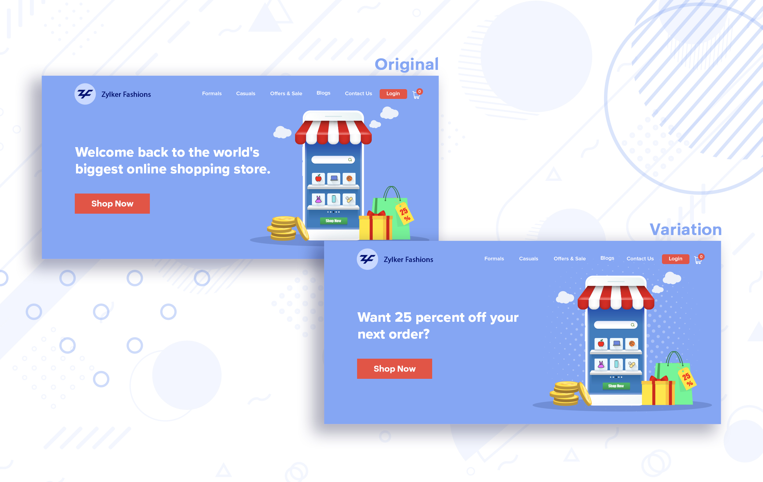
Extra tip:
- You can target your A/B test in PageSense using a variety of audience segments such as visitor type, device used, JS variable, day of the week, and more to learn which version grabs your audience's attention immediately and performs best for each segment.
- To know your target audience better, you can set up polls on your website using PageSense and learn your visitor’s business (or personal) needs and how your product can help achieve them. Later, you can use this feedback to test and optimize your website content.
Match your headline with your ad copy
When a visitor clicks on an ad, it's of the utmost importance to match the message on that ad to the headline content on your post-click landing page. If your headline doesn't match the offers and features that you promised in your ad copy, you're wasting all your marketing investment and conversion opportunities. A/B testing your headline by incorporating relevant keywords that resonate with your ad copy can help you reassure people that they've come to the right place. It can also later persuade them to take the desired action on your site more quickly. Further, this type of testing is more likely to generate increased clickthrough rates, conversions, and revenue for your website.
When a visitor clicks on an ad, it's of the utmost importance to match the message on that ad to the headline content on your post-click landing page. If your headline doesn't match the offers and features that you promised in your ad copy, you're wasting all your marketing investment and conversion opportunities. A/B testing your headline by incorporating relevant keywords that resonate with your ad copy can help you reassure people that they've come to the right place. It can also later persuade them to take the desired action on your site more quickly. Further, this type of testing is more likely to generate increased clickthrough rates, conversions, and revenue for your website.
Example:
Say you're running a Facebook Ad for older travelers, and the post-click landing page shows the most relevant tourist packages, flights, and hotel stays based on their interests. Now compare the old and new headline messages below to see which version of the message sounds better.
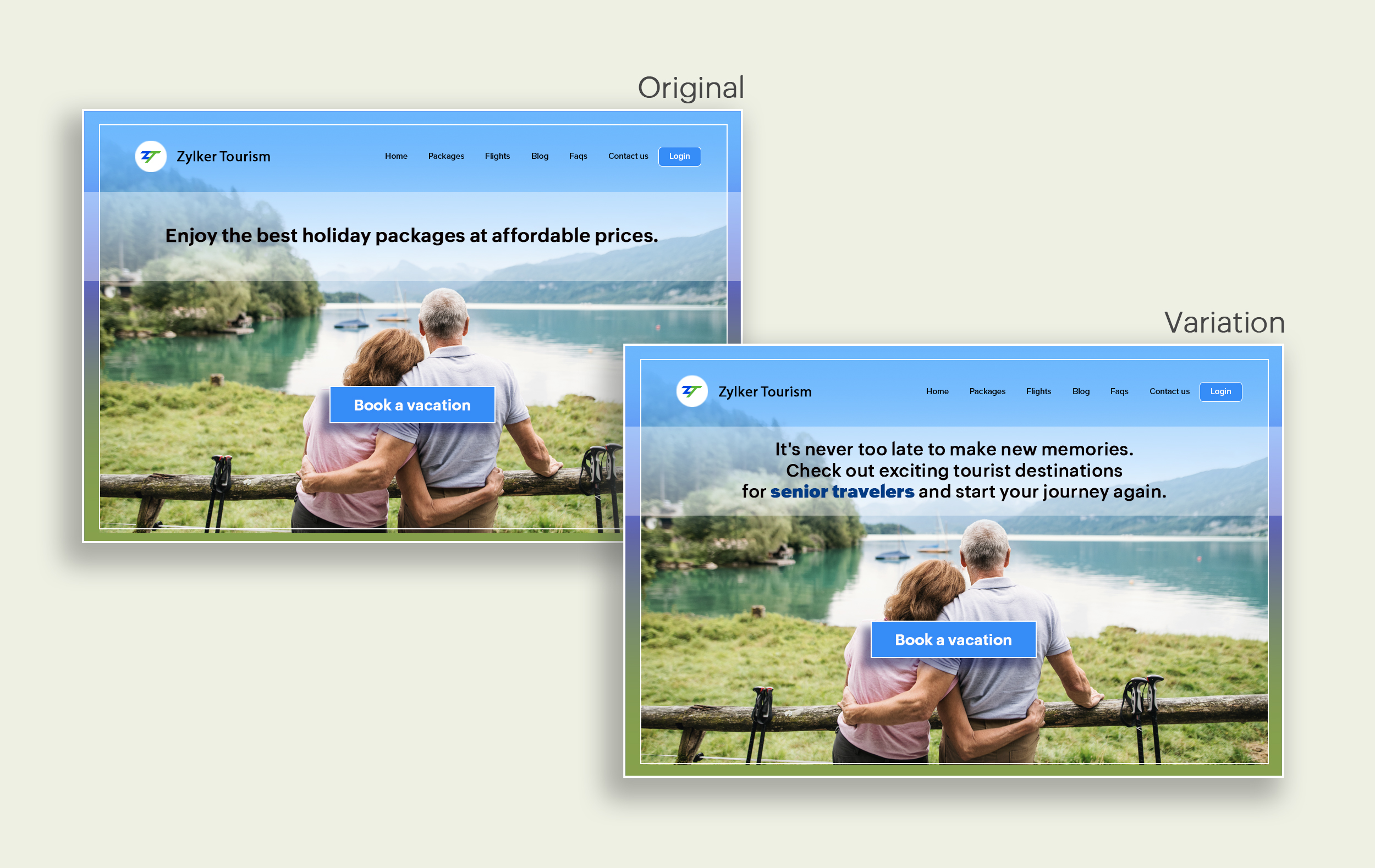
Say you're running a Facebook Ad for older travelers, and the post-click landing page shows the most relevant tourist packages, flights, and hotel stays based on their interests. Now compare the old and new headline messages below to see which version of the message sounds better.

Include stats and numbers
Numbers in your headlines are a great way to grab attention by spontaneously triggering curiosity in your targeted audience. When you use symbols like %, $, or digits instead of words to express percentages, dollars, or numbers in your headlines, it creates specificity around the duration, size, value, etc. of what you're offering customers, which is more attractive than a generic offering. This is a powerful psychological tactic that spotlights your headlines and immediately hooks the reader's interest, which results in more traffic.
Example:
Consider the pricing page of your website and see how adding a number to the headline can increase reader engagement.

Follow the problem-solving methodology
Solving your customers' problem is the easiest and fastest way to reach their heart. Crafting a headline that addresses an issue and provides a cutting-edge solution to solve the problem can make optimizing your website easier. Intriguing your readers like this can make them look for more information on the rest of your site. Further, when done well, it can build a solid emotional bond between you and your customer for a longer term.
Example:
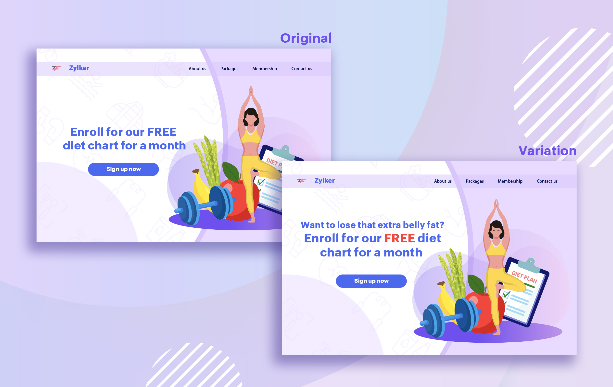
Take a look at the image below to see how implementing the problem and solution technique in your fitness website can make your headline sound more interesting.
Test with power words and sentiments
Sometimes the right audience is just one word away. Using forceful positive or negative power words in your headlines has the potential to kindle your customers' emotions and inspire action on your website in no time. Also, these words can guarantee more clicks and make your headlines stand out from the rest. You can test your headlines depending on two groups of power words:
Sometimes the right audience is just one word away. Using forceful positive or negative power words in your headlines has the potential to kindle your customers' emotions and inspire action on your website in no time. Also, these words can guarantee more clicks and make your headlines stand out from the rest. You can test your headlines depending on two groups of power words:
- Negative headlines: This type of headline tends to intrigue your customers by setting a stage to avoid a miserable situation. It includes words like never, stop, worst, avoid, or do not.
- Positive headlines: This type of headline tries to build a relationship with feel good emotions. It includes words like best, always, fastest, easiest, most, greatest, largest, funniest, hottest, strongest, biggest, and ever.
Example:
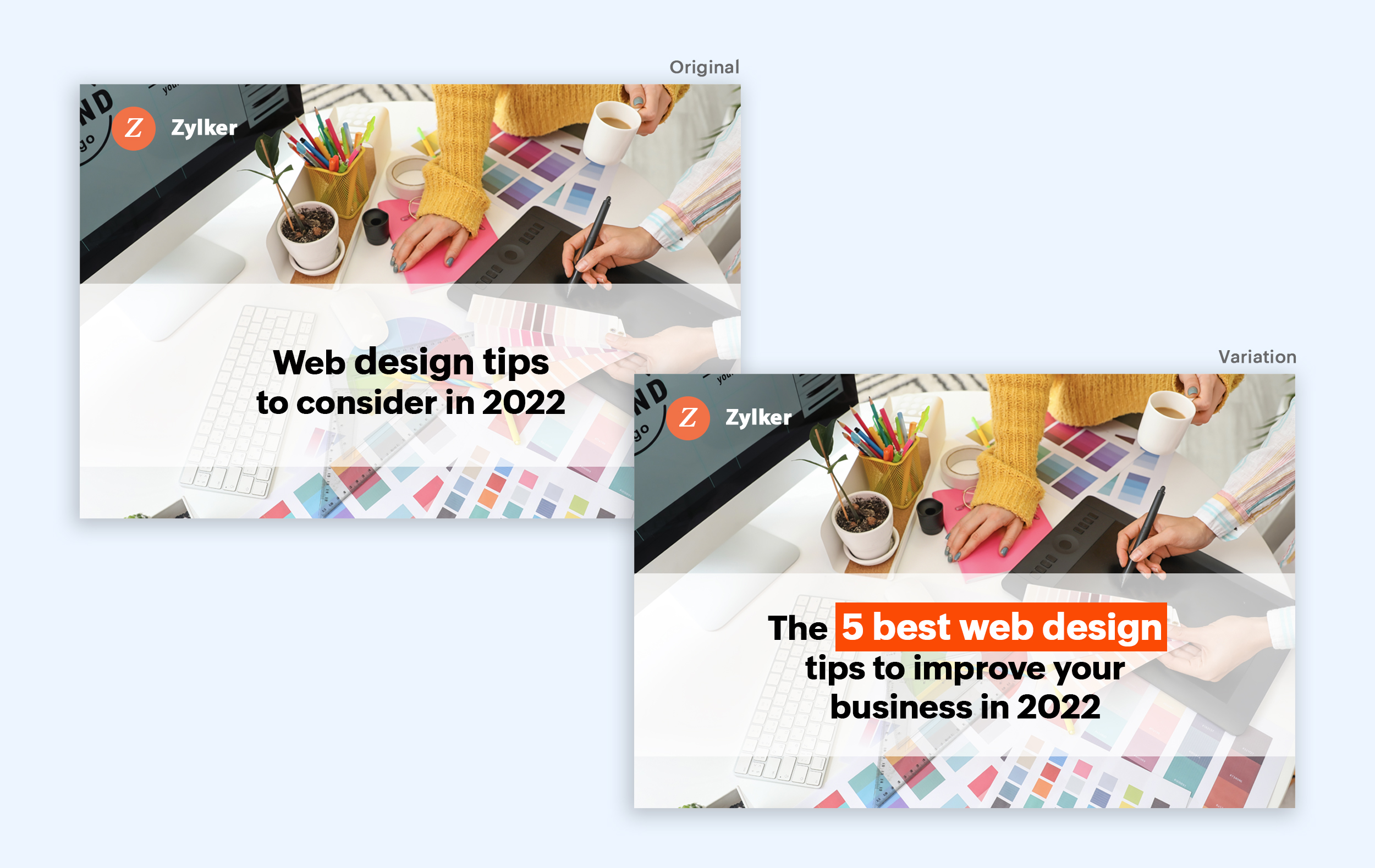
Take a look at the image below to see how the choice of words can invoke a positive feeling as you read the headline.

Test the font and appearance of your headline
The presentation (color, fonts, and layout) of your headline copy has a huge impact on the performance of your site. Below are a few points to consider while testing the appearance of your headline:
- Use title case. Avoid writing your headlines in all caps as it can reduce the readability of your text.
- Choose a font style and size that matches your website's personality. The most popular font style is sans-serif and font size is 20 - 36 pixels.
- Apply colors that contrast (while complimenting) your website's background well and focus on the legibility of your content.
- Align your headline perfectly with your body content for a bigger impact. Centered headlines are most powerful visually, while left-centered are more conservative and formal.
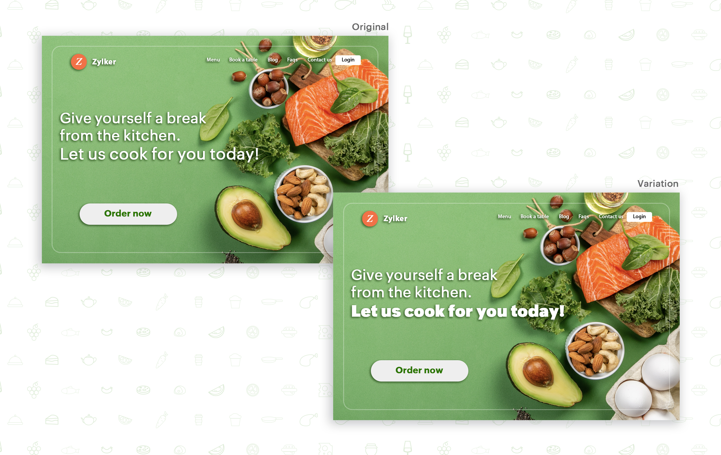
Example:
Say you own an online food delivery website, and you want to test the color and font of your homepage headline for better clickthrough rates. Take a look at the before and after images of the headline below. Which one you think will attract more eyeballs?

Try out the two-part strategy
Don't forget your supporting cast! Successful headlines act in two parts. Including a persuasive subheadline copy below your headline can be another winning strategy to pull your customers deeper into your website. You can test different versions of your subheadings to see which best suits your visitors, such as explaining a bit more about your product or services, emphasizing your product benefits, or encouraging visitors to click the CTA button placed on your site.
Example:
Take a look at the main headline and the subheading of a customer support software website as shown below. In this case, your subheadline re-affirms how your software helps your customers and adds emphasis about different product features.

Test the headline length and SEO compatibility
Test your headline for the right length, SEO keywords, and sentiments. Keeping a headline no longer than six words will help readers easily process your text and attain the goal of your website. Using free headline analyzer tools such as Coschedule or Sharethrough can help you effortlessly understand your website's performance. They analyze important factors (like searchable keywords, word balance, and sentiments) and assign a percentage score based on how good your headline is. They'll help you identify the factors you need to improve for more productive headlines.
Test your headline for the right length, SEO keywords, and sentiments. Keeping a headline no longer than six words will help readers easily process your text and attain the goal of your website. Using free headline analyzer tools such as Coschedule or Sharethrough can help you effortlessly understand your website's performance. They analyze important factors (like searchable keywords, word balance, and sentiments) and assign a percentage score based on how good your headline is. They'll help you identify the factors you need to improve for more productive headlines.
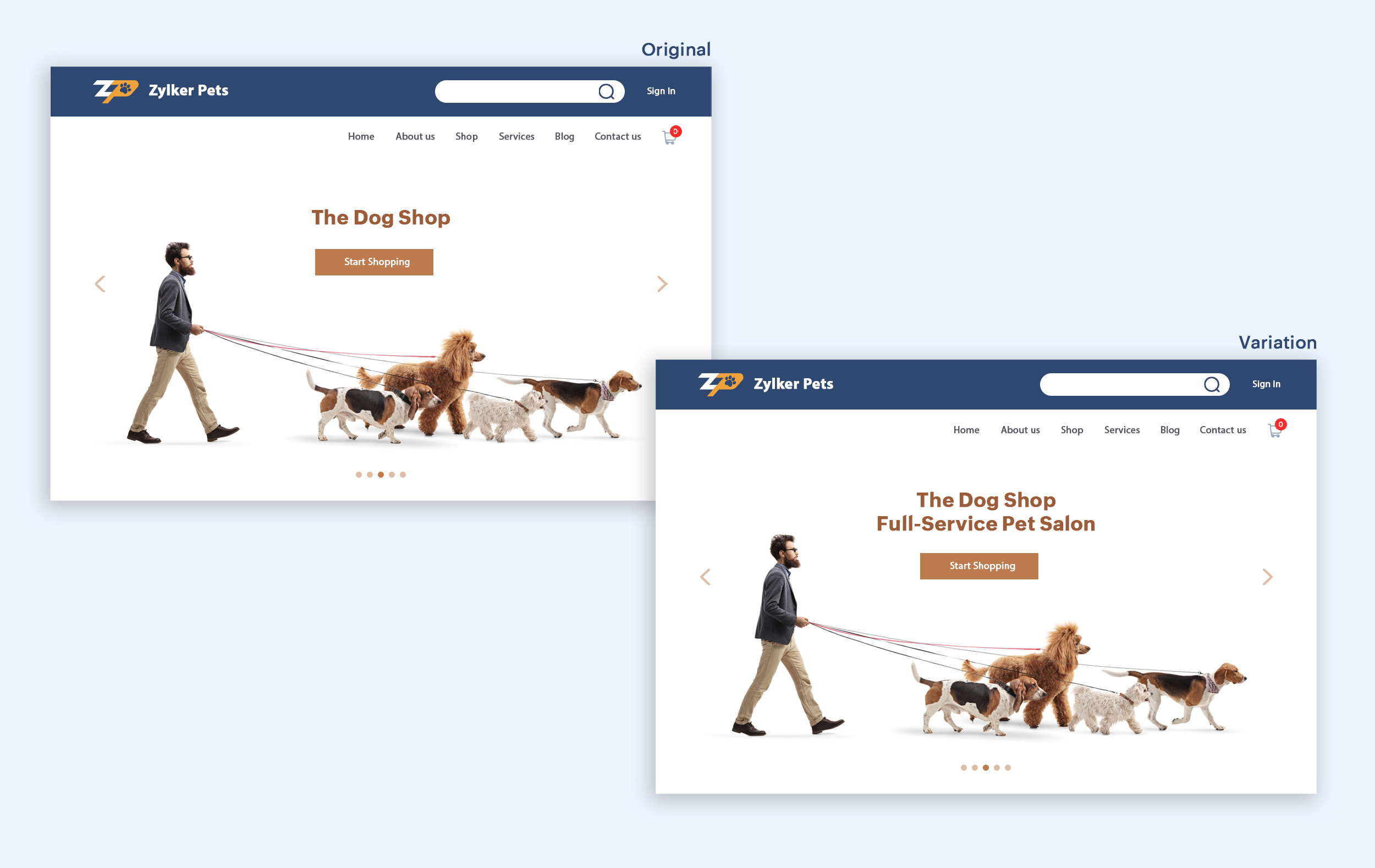
Example:
Let's say you own an online pet supply store and you want to test the headline of your homepage to attract more visitor traffic. The screenshots below show the performance of both the old and new versions of the headline in terms of length.
Bonus tips:
- Create a sense of urgency in your headline with words like "today," "now," and "last-minute offer."
- Use comparison phrases like "versus" to reinforce the benefits and features of your products/services.
- Research your competitor's headlines to add more value and optimize your headlines better.
We hope you found this article useful. What is your favorite headline tester? Have you had any success with headline A/B testing? Do share with us in the comments box below.
Happy testing. Happy converting!
Thank you.