Visualize hierarchical datasets using treemap charts
Treemap charts are visual representations of datasets that have hierarchical structures—for example, functions and their departments, brands and their models, industries and businesses, territories and demographics, and campaigns and conversions are all datasets with parent-child, root-node, or superset-subset classifications.
Also, if you have a large volume of data or want to compare proportions and contributions between the participating hierarchies, treemap charts are the type you need.
Understanding the structure of a treemap chart
Tiles and proportions:
Treemap charts have a rectangular layout built with tiles of various sizes and colors. These tiles represent different entities, their sizes represent those entities' values or contributions, and their colors distinguish the entities one from another.
For example: Below is a treemap chart that represents a list of lead sources and compares them all at once. This is a single-grouping treemap, meaning it only uses one level of data for analysis.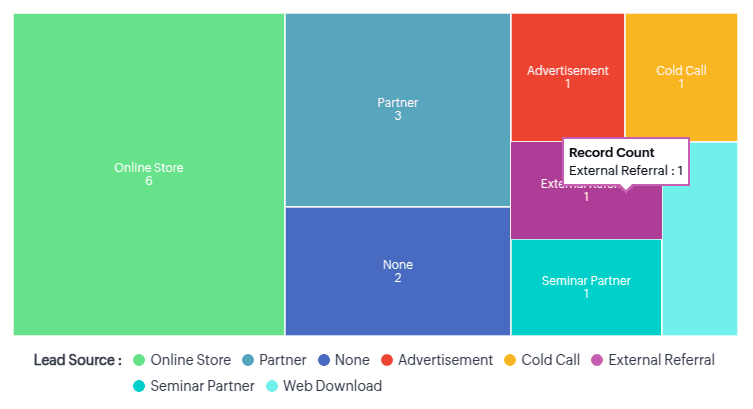
Similarly, to understand and compare the agents' involvement in each of these sources would require second-level data, for which each larger entity in the treemap will have further nested tiles representing the agents, whose contributions are again represented by the tiles' proportions. However, the nested tiles will be of the same color.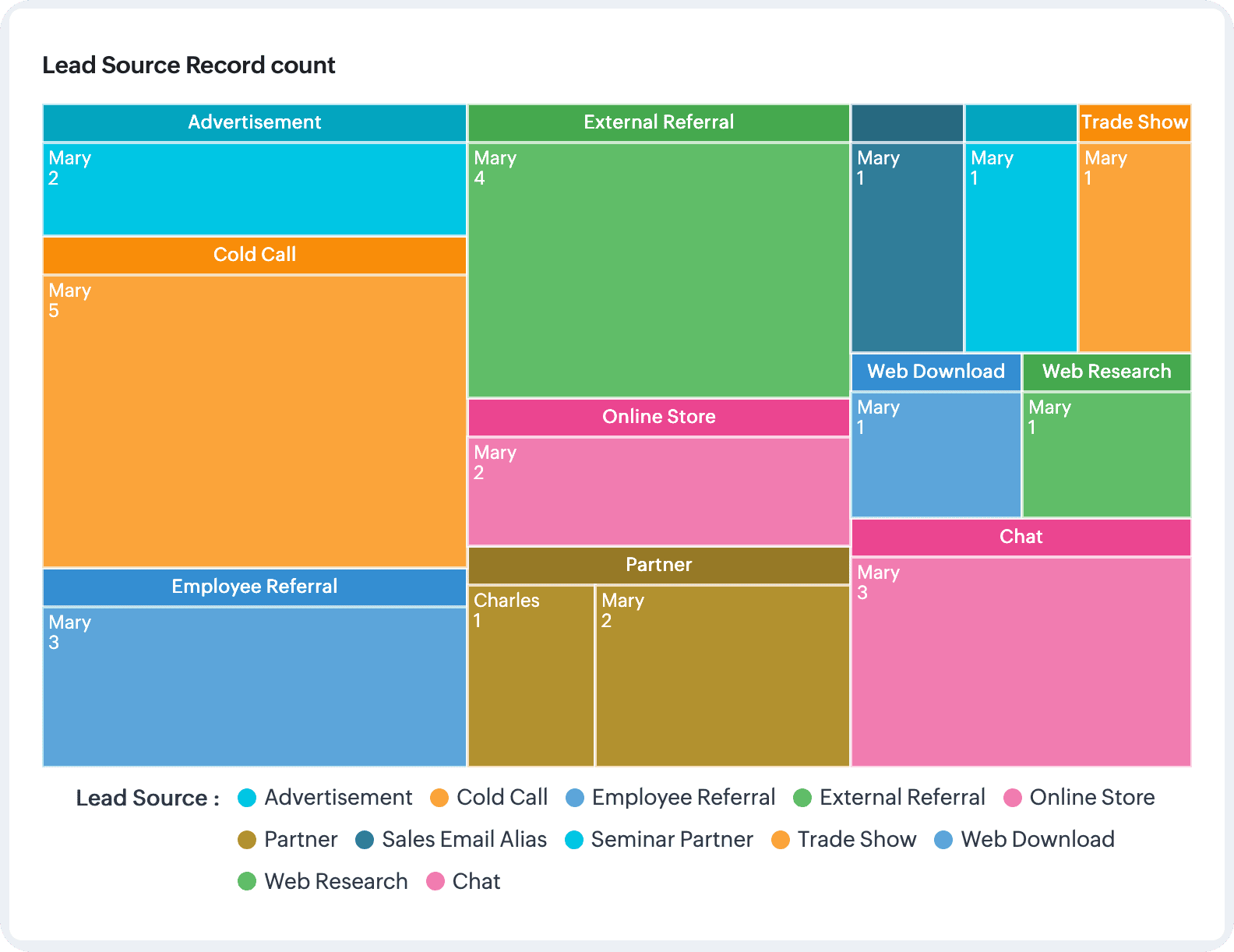

Note: You can use data with up to two groupings to build treemap charts in Zoho CRM.
Applications of a treemap charts: business scenarios
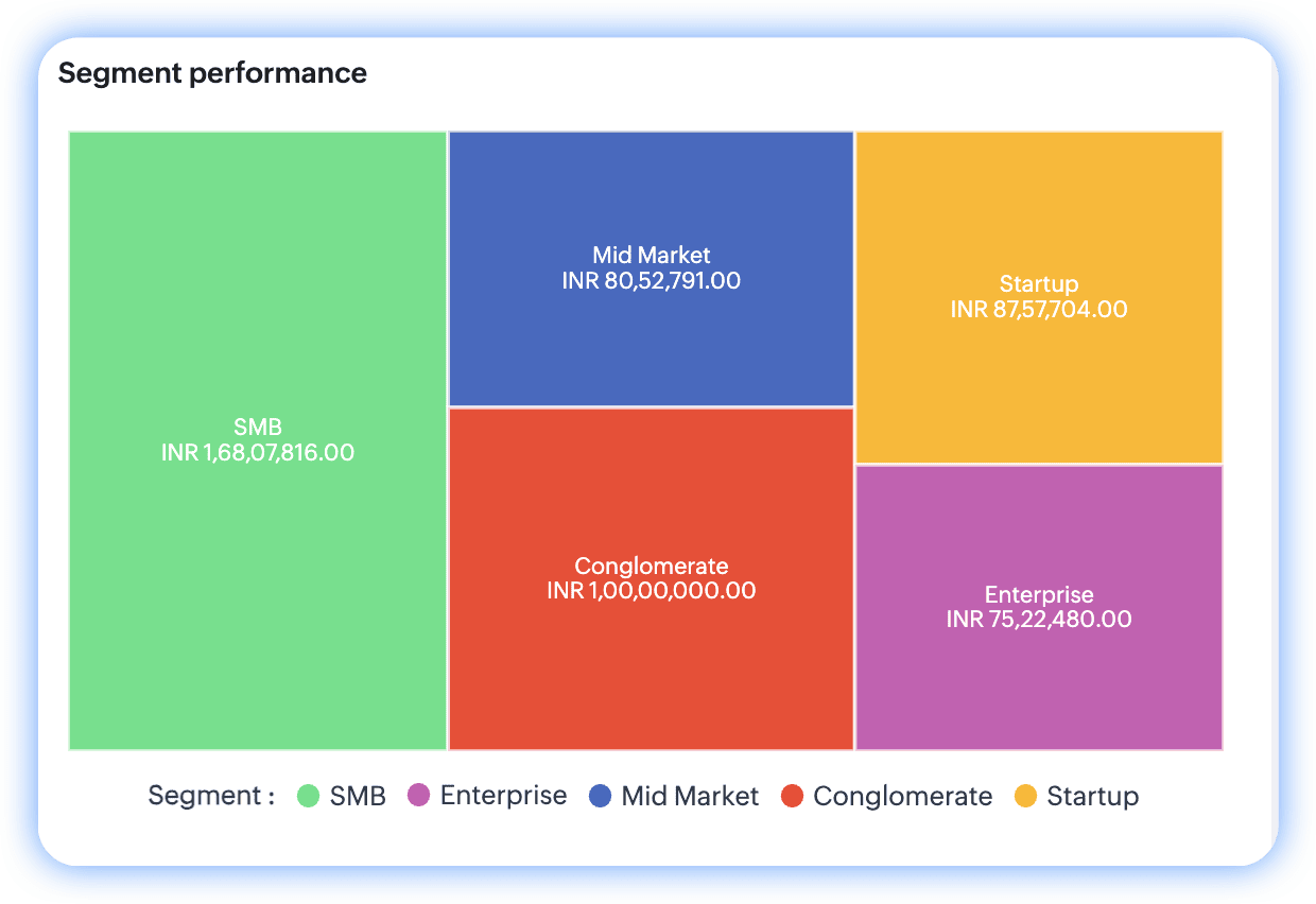
Analyzing profitable segment performances: Single-grouping treemap chart
A segment's performance is primarily related to its revenue; the more revenue, the greater its performance. That said, when businesses have more segments, those segments can be compared to identify the top contributor.
Parameters at play: Segments and their revenue
Configuration:
- The objective is to compare and analyze the performance of different segments based on their profit—so the measure here is revenue.
- To break this revenue up based on segments, the grouping value is the Segments field.
Chart
Comparing sales volume across product categories and channels: double-grouping treemap charts
Businesses often compare different products and their sales channels to gauge their relative performances.
Parameters at play: Sales volume, product categories, and channels
Configuration:
- The objective of this analysis is to compare the sales volumes of different products—so the "count of deals" is the key measure.
- To explore the products that contributed to these participating deals, the Products field serves as the first grouping.
- This analysis also functions to identify profitable channels for each product, so "channels" defines the second grouping.
Chart
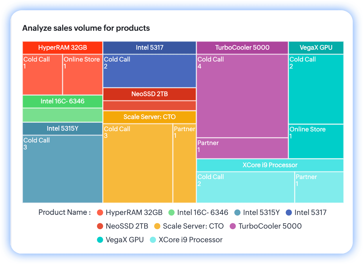
Per the chart, TurboCooler 5000 leads by volume and cold calls seem to be its most profitable channel.
To configure a treemap chart
- Go to the Analytics module in Zoho CRM.
- Select a dashboard you want to create the treemap chart in and click Add Component at the top-right.
- From the list of available dashboard components, select Chart.
- In the Add Chart screen, select Quick chart if you would like to create a chart based on data available in the module.
- In the configuration page, do the following:
- Provide a name for your component.
- Select the module for computation.
- Upon selecting the module, the available chart types will be displayed. To your right, above the chart preview, click on the dropdown.
- The default chart name is always "column". Click on the dropdown and select Treemap chart from the list.
- Select Related module.
- Specify the Measure (Y-axis). In the case of treemap charts, the measure represents the proportional value.
- Select your grouping preferences based on dates or dimensions. You can provide up to two groupings.
- Provide filter criteria for more precise results.
- Select the Combine related grouping values into categories checkbox if your grouping parameters have similar attributes.
- Under More options, if you'd like to have a filter in your chart, select up to two fields to display as component filters.
- Click Save. Your chart will be created after computation.
- If you'd like to use a report to create a treemap chart, click Reports in the Add Chart screen from step 3.
- Provide a name for your component.
- Select the report. Based on your report type and its exhibited relationship structure, the chart type above the preview will be enabled.
- Provide the rest of the field values detailed in the Quick Chart's directions.
- Click Save.
Actions you can perform on treemap charts
Like all chart components in Analytics, you can clone components to the same dashboard or a different dashboard, as well as edit, delete, and print them, add them to your home page, embed a URL, move them to another dashboard, download them, and add them as favorites. Go to the chart and click on the vertical ellipses button to view these options.
If you've enabled component filters, those filters will be added to the chart near its name.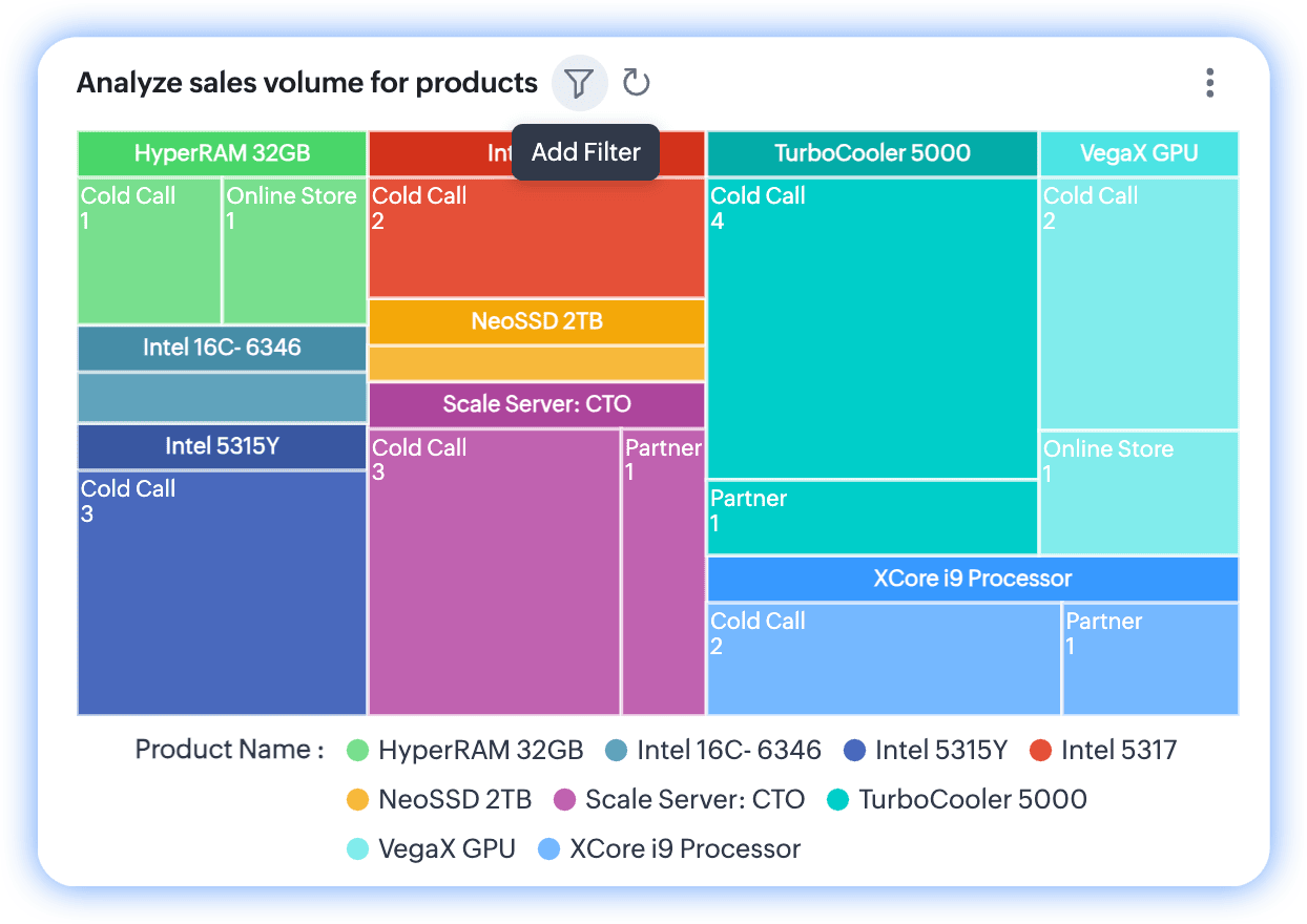
Note: You can select up to two filter parameters in the configuration. If you've applied any parameters, only the qualified data will be displayed in the chart, and the filter will hint its application by displaying a notification dot over the funnel.
 See also: