Compare and contrast competing datasets using butterfly charts
Butterfly charts serve to compare a single metric across datasets with similar attributes, and are so-named because they appear visually similar to butterflies. They're also popularly known as tornado charts.
Imagine you need to assess one of the following scenarios:
- The demand versus stock of each product
- The deal volumes of two sales teams over a quarter
- The ongoing progress and performance of two territories based on their forecast stages
- The revenue contribution of two branches over a period
- The most popular lead sources for two campaigns
Each of these scenarios involves the comparison of two active forces across a set of variables for a given metric. Butterfly charts can help you perform these contextual analyses of your business's performance.
Components of butterfly charts
Butterfly charts have the same layout as bar or column charts:
- The x-axis represents the measure
- The y-axis represents the variables
- Bars represent the participating data and their distributions
But how do butterfly charts differ from standard bar charts, aside from the obvious orientation? The answer: their context.
Let's say you use a stacked bar chart to compare the performance of two users, and accordingly, have two bars for two users. To compare them against a set of variables, the bar chart adds more stacks at varying sizes to the same bar. The bigger the stack, the higher the contribution.
But for the purposes of studying these analyses, the comparison is accurate only when the two users are compared in the context of their distribution for each variable. Butterfly charts are useful for this contextual need.
Here's an illustration to help you understand butterfly charts more clearly: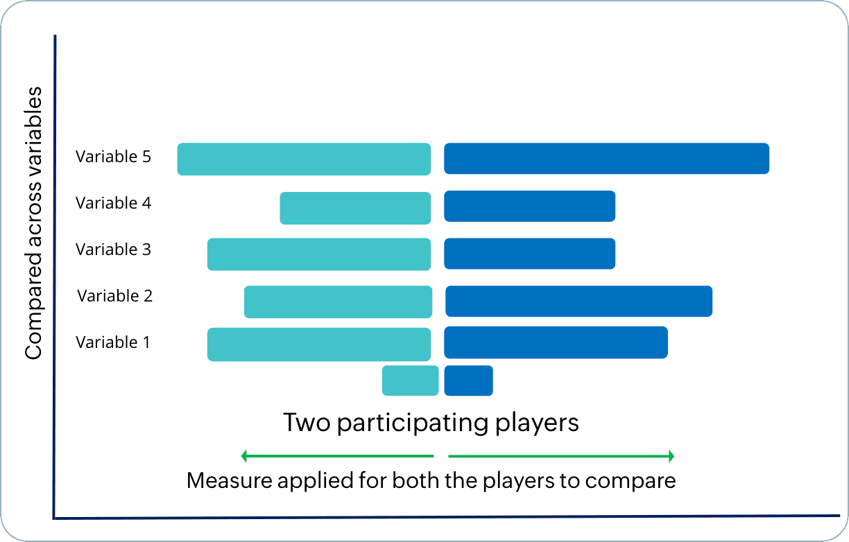
Here's a look at the builder: builder:
With Zoho CRM's butterfly chart builder, you can:
- Determine the data from the primary and its related module.
- Draw comparisons between two picklist values, stages, users, or timelines. You can also compare two aggregates like counts, averages, sums, maximums, minimums, and more.
Applications of butterfly charts
Studying product demand vs. product supply
To study the demand and stock of all products in your portfolio simultaneously, a butterfly chart would be the best choice. Here's how you can configure it:
Comparing the efficacy of two sales approaches: Product-led vs. sales-led
To assess the efficacy of various sales approaches and the profit they've generated over a quarter, you can draw user-based comparisons between two sales managers.
Likewise, you can build butterfly charts to compare between picklist values, users, durations, and aggregates of values.
To create a butterfly chart
- Go to the Analytics module in Zoho CRM.
- Select a dashboard you want to create a butterfly chart in and click Add Component in the top-right.
- From the list of available dashboard components, select Chart.
- In the Add Chart screen, select Quick chart if you would like to create a chart based on data available in the module.
- In the configuration page, do the following:
- Provide a name for your component.
- Select the module to be analyzed.
- Select a related module from which data will be used to compare to data in the module chosen in the previous step.
- Upon selecting the module, you can select a chart type by clicking on the dropdown to the right, above the chart preview.
- The default chart type is always "column." Click on the dropdown and select Butterfly chart from the list.
- From the Compare among field, choose between picklist, users, time, and aggregates.
- In the subsequent fields, choose the desired attributes to compare. For example, the sum of quantity ordered or the sum of quantity in stock.
- Choose the grouping.
- Provide filter criteria for more precise results.
- Select the Combine related grouping values into categories checkbox if your grouping parameters have similar attributes.
- Under More options, if you'd like to have a filter in your chart, select up to two fields to display as component filters.
- Click Save. Your chart will be created after computation.
- If you'd like to use a report to create a butterfly chart, click Reports in the Add Chart screen from step 3.
- Provide a name for your component.
- Select the report. Based on your report type and its exhibited relationship structure, the chart type above the preview will be enabled.
- Provide the rest of the field values detailed in the Quick Chart's direction.
- Click Save.
Actions you can perform on a butterfly chart
Like all chart components in the Analytics module, you can clone or move a component to the same dashboard or a different one, as well as edit, delete, print, add to home, embed a URL, download, and add as favorite. All you have to do is go to the chart and click on the vertical ellipses button to view these options. You can also drill down into each distribution by clicking on it.
If you've enabled a component filter, it will be added to the chart and a label will be displayed near its name.