Dashboard Components
The Dashboard is a visual representation of the business data that allow managers and decision makers to get a real-time snapshot of important metrics that save time. A quick overview of all overdue tickets, comparison of ticket load against the previous quarter, compare the actual tasks created vs. the incomplete tasks, unassigned open calls, contacts with cancelled subscription, and more.
In addition to the standard components that are available by default in each dashboard, users can add more components depending on the metric they want to view.
Dashboard components are of the following types:
- Reports
- Gallery
- KPI
- Custom Views
- Embeds (reports from Zoho Analytics)
Reports
A variety of built-in summary and matrix reports from modules such as Tickets, Knowledge Base, Accounts and Contacts, Activity, and Product can be added as components. Important metrics like number of overdue tickets, status of the tickets, total call counts, products for which support has reached termination and more can be viewed at a glance in the dashboard.
Global reports can also be added to the dashboard. Note that global reports will only be displayed in the all department view.
Gallery
The data can be viewed in visual form with the help of charts and graphs, or in a tabular form. Businesses can view how each metric is faring over a certain period by selecting a time of their choice, such as tasks due in 7 days.
Chart Type | Description |
Bar | Displays two or more kinds of data that can be used to compare values across categories. |
Pie | Displays data that is divided into triangular areas proportional to the percentages of the whole and to illustrate the relationship of parts to the whole. |
Line | Displays a trend over a period with the variations in the multiple values in a single chart. |
Funnel Chart | Shows the convergence of data from the entry level to the exit level. It is typically used to show the ticket flow at any point in time. |
Table | Shows the sum of the values in each category of the data. |
In the gallery, you can select data from the following categories:
Tickets
You can choose bar graph to view tickets by status, pie chart to know number of tickets created from each channels or stacked bar chart to find the number of tickets for which SLA has been violated and more.
Tasks
Bar, stacked bar or pie charts display the tasks according to their status, owner, priority, and due date.
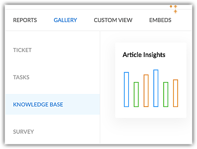
Knowledge base
You can view the number of likes received for different articles over a certain period, such as, the last 7 days or last month. The insights can help businesses find how popular their knowledge base articles are among their customers. Articles can be replaced with better and latest content based on number of likes or dislikes.
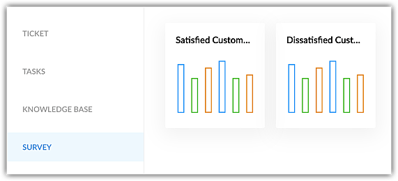
Survey
You can view the top ten customers who gave positive or negative ratings over a period and prioritize solving their problems. For marketing purposes, businesses can contact the satisfied customers for testimonials.
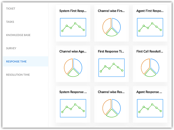
Response time
You can view the number of tickets that were responded first across different channels, first response time of agents, total number of responses at the end of each day and more using line graph and pie charts.
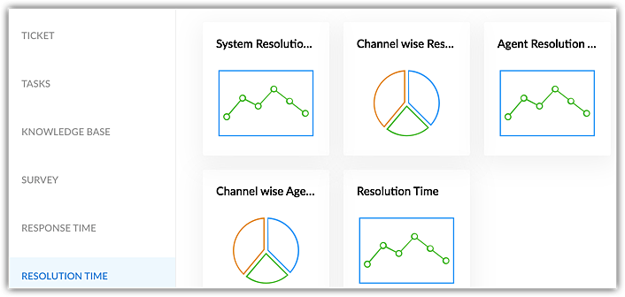
Resolution time
The line graphs and pie charts show the ticket resolution time by each agent, across different channels and more.
Configuring KPI Cards
Configuring KPIs involves the following steps:
 Note: You can create KPI cards for all the modules. But the modules must have the respective fields created prior to creating a KPI card.
- Component Name - Enter the name of the component. For example, Support team tickets. The name you provide here will be added to the widget.
- Module - Select any standard module (For example, tickets) that you want to create the KPI card for.
- Related Module - Except for the module selected in the Module field, all other modules will be listed in the Related Module field. For example, if you select Ticket as the primary module, you can select Activities as the related module. This will give a metric for the number of calls, tasks, or events closed by the agent or the team. Note: Custom modules cannot be validated.
- Column - Columns are the fields created in each module, such as the Agent Responded time, Channel, Classification, Ticket Age, or Status. For example, if you select Ticket as the module, then one of the fields in the ticket layout is Status. Select the required column. The column's data will be used to validate and will be displayed on the widget.
- Aggregation - An aggregate value that is the minimum, maximum, sum, average, and count of the selected column will be displayed. For example, ticket count, average resolution time, average due date, and so on.
- Filter based on column - The filter based on column is time based, and the values are auto-populated based on the column selected. For example, if you selected Status as High priority, then the values in the drop-down are auto-populated. Select an option to create the metric card for the specific time.
- Filter based on duration - Select the time duration (for example, today, previous year, etc.) to validate the data.
Note
- The aggregation, filter based on column, and filter based on duration will be updated based on the column you selected.
- Users must click the refresh individual card to reload the data.
Custom View
The predefined views and custom list views created in the Tickets, Contacts, Accounts, and Tasks modules can be added to the dashboards for a quick reference. For eg., Unassigned tickets, Contacts created in the last 30 days, Overdue tasks, Articles with least number of views, etc.
Key Performance Indicators
A KPI card is a simple, visual summary of a various metrics that indicate an individual's or team's or activity's performance. It shows important data clearly, allowing businesses to quickly assess if they are meeting the goals. Measuring business metrics helps with:
- Resource management - Monitoring agent productivity can help managers understand the bandwidth of the agents and allocate tickets and tasks more effectively.
- Performance tracking - Measuring First Response Time and Time to Resolution can help identify the underlying reason for delay and take necessary actions to improve resolution time.
- Goal Alignment - By measuring FRT or resolution time, businesses can align support activities to bigger goals such as quicker ticket closure, improved customer satisfaction, and decrease in tickets.
Businesses can measure their performance using the following four type of KPI cards:
Metric Cards
Metric card is a quantitative assessment of an individual's, team's, or an activity's performance. It displays an aggregate value that indicates growth or decline of the measurable values that allow businesses to take decision-based actions.
Assume a team has an SLA to respond within 24 hours of raising a ticket. The manager can track the First Response time to verify if the SLA is met. The First Response Time field can be selected in the Advanced Filter option, and the metric card can be created.
Managers can track the number of reopened tickets for the past three months by adding a metric card. This will help them analyze why the ticket was reopened and to assess if the original resolution provided was effective.
Comparison Index
The comparison index is used to validate and compare metrics to identify progress, slowness, or any change in pattern that can eventually help find the areas of improvement.
For example, if a department received 20 tickets last month and only 10 tickets this month, the comparison index card can be used to compare the percentage difference of the incoming tickets in these two months. Businesses can further investigate to infer whether the measures taken to reduce the ticket inflow are successful, agents can resolve tickets faster, more customers are relying on self-service platforms, and so on to make informed decisions.
Understanding percentage metrics in a comparison index:
- If the percentage between the primary and secondary value is more, then the percentage is displayed in green.
- If the percentage between the primary and secondary value is less, then the percentage is displayed in red.
- If the percentage is zero or no change, then the percentage is displayed in green.
Note
- Data can be compared in the duration, such as today, the current week, current month, this fiscal quarter, and current year.
- The fiscal year starts from January. If you select this fiscal quarter as July- September, then it will be compared with the previous fiscal quarter, April -June.
- Based on the column selected (for example, Child Ticket Count, On- Hold Tickets, or Resolved Tickets), the aggregation values are auto-populated in the drop-down.
- The comparison is always drawn between the current and previous timeline. For example, the current month vs last month. The last month is auto-populated, and it cannot be edited.
The bullet and dial chart is used to provide a visual representation of the data by comparing the actual value to a target.
If a target is set for the number of tickets each agent must close in a quarter, then it can be compared against the current closure pattern to identify the progress. The manager can monitor the number of tickets closed, if the target is achieved, how many tickets are pending, and more. The bullet chart or a dial chart will provide a visual representation of the target vs. the actual metric.
There are two target types:
- Constant Value - Users can manually enter a value in the Target field. For example, if you want the agent to close 300 tickets, then the target value should be 300.
- Previous period value - The comparison will be done with the previous timeline. For example, if the duration is set as this month, then the value will be compared against last month (number of ticket closed this month vs. last month).
Embeds
Tables, reports, or dashboards created in Zoho Analytics can be embedded in the dashboards to get real-time updates.
Note: The Desk account must be integrated with Zoho Analytics in order to add the respective components. Standard dashboards cannot be deleted or edited. Also, new components cannot be added to them. Users can create custom dashboards and add components based on their business preference and usage. A maximum of 10 components can be added to a custom dashboard.
To create dashboards and add components
- Go to the Analytics module.
- In the Analytics Overview page, click the Dashboards tab from the left menu.
- In the Dashboards List page, click Add Dashboard.
- In the Add Dashboard page, do the following:
- Enter the Dashboard Name.
- Select Dashboard Folder from the drop-down list.
- Enter the Description.
- Click Add Component.
You can add more components later. - Select components from Reports, Gallery, KPI cards, Custom view, or Embeds.
Global reports will be only displayed in the All Department view. - If you select a Report, do the following:
- Enter the Component Name.
- Select the Chart type from the drop-down list.
- Select X and Y-axis data from the drop-down list.
- Click Add.
- If you select a Gallery, do the following:
- Select a Component.
- Enter the Component Name.
- Select Agents from the drop-down list.
- Choose a time.
- Click Add.
- If you select a KPI, do the following:
- Select the KPI card - Metric Card, Comparison Index, Bullet Chart, or Dial Chart.
- Enter the Component name.
- In the Basic Information, select a Module and Related Module from the drop-down. Select the Column to be added, as well as its Aggregation.
- For bullet and dial chart, select the Target Type and Target.
- In the Standard Filters section, select the column and the duration you want the data for.
- In the Advanced Filters section, click + Add Criteria to only use selected field values.
- Click Add.
- If you select a Custom view, do the following:
- Select a Component.
- Enter the Component Name.
- Select a custom view from the drop-down list.
- Select a total number of rows to view on a page.
A maximum of 50 rows can be viewed. - Click Add.
- If you select Embeds, select a Zoho Analytics component and click Add.
- Click Save, to save the dashboard.
Creating dashboard folders
Dashboards can be stored in publicly accessible folders that can be viewed by all agents or private folders that can be accessed only by a selected agent.
Note
- Administrators and agents who create the dashboard folder will be able to access the folders by default.
- Other users can access the dashboard folders only if the owner of the folder provides access.
To create dashboard folders
- Click the Analytics module.
- In the Analytics Overview page, click the Dashboards tab from the left menu.
- In the Dashboards List page, click Add Dashboard Folder.
Alternately, click the arrow on Add Dashboard and select Add Dashboard Folder. - In the Add Dashboard Folder page,
- Enter the Folder Name.
- In the Visible To section, select from the available options.
- Click Save.
Actions that can be performed in Dashboards and Components
Users can perform the following actions in a dashboard:
- Export a dashboard as excel or CSV
- Print a dashboard or component
- Set dashboard as default for the entire org - Some commonly used metrics, such as overdue tasks or list of premium contacts, that are relevant and useful for all agents across departments can be set as default for reference and easy access.
- Edit or delete dashboards and their components - Custom dashboards and their components can be modified or deleted by admins or agents who have created them.
- Refresh components - Dashboard components can be refreshed manually (
) to view the recent data or edits made to the component.
- Zoom or resize components - Users can also use the zoom icon to view the charts and bar graphs in full screen for better visibility. You can hover on the component to refresh or zoom. Components can be arranged within a dashboard by maximizing or minimizing them using the
icon. Users can drag the icon to resize the components.
Starred dashboards
Dashboards help organize large amounts of data into a clear, understandable format. Organizations may have multiple dashboards based on their requirements, and it can be challenging to find the right one when it’s needed the most.
For example, the IT team manager regularly monitors the SLA dashboard to ensure that all the customer requests are being addressed within the SLA time. But with multiple dashboards with different metrics available, finding the SLA dashboard quickly is crucial for the team's performance and to identify SLA breach before hand.
To avoid this hassle, users can star or mark the frequently accessed dashboard as favorite to identify them quickly.
Note: Users in Standard edition and above can star a maximum of 15 dashboards per department.
To star a dashboard
- Navigate to Analytics > Dashboards.
- Click the
icon of the dashboard to be starred.
- Click Star.
The favorite report will be listed in the Starred Dashboards folder.
Note
- The Popular Dashboards, Telephony Dashboards, Time Based Dashboards, and Zia Dashboards cannot be starred.
- Starred folder will not be listed in the parent folder search drop-down.