How to create charts
Charts let you visualize your data and highlight patterns at a glance. Charts in Zoho Sheet come with a three-tab interface—Data, Design, and Format—that helps you create, design, format, and manage your charts.
To create a chart
- Select the cell range for which you wish to create a chart.
- Navigate to Insert > Chart.
- You can either select the chart from the AI-powered recommendations tab or select any preferred chart type based on your use case.
How to add multiple data ranges
Navigate to the charts side pane and click the Data tab. Click (+ icon) in the data range field and add the preferred data ranges.
Zoho Sheet supports the following data ranges:
- Static: Allows you to specify any range of cells. Example: Sheet1.A1:C10
- Named range: Allows you to add any named ranges in your sheet. Example: SalesData
- Named Expression: Allows you to add a named expression. A named expression is a saved formula with a user-defined label. Example: Matric1 or Matric2
- Formulas: Allows you to add formulas directly. Example: SORT(FILTER(D3:E62;C3:C62=I2);2;-1)
- Table: Allows you to reference any tables in your sheet using the table name. Example: SalesTable
- Basic array: Allows you to add arrays. Simply a set of values arranged in a single or multiple rows and columns. Example: {val1; val2; val3,...valn}
How to aggregate values in a chart
From the Data tab in the charts side pane, click Aggregation.
- Operation: Allows you to select the type of aggregation—sum, average, count, max, min, etc.
- Values: Allows you to select the column on which aggregation should be performed.
- Axis: This is the first level of grouping and allows you to select the column for which you need to group unique values. The unique values are displayed along the axis.
- Legend: This is the second level of grouping and allows you to select the column for which you need to group unique values. The unique values will appear in the legend.
How to filter values in a chart
From the Data tab in the charts side pane, click Top/Bottom N.
- Top/Bottom: Allows you to select Top or Bottom, based on how you want the values to be filtered.
- N: Allows you to select the count of values need to be filtered.
- Selection: Allows you to select the series for which you want to apply this filter.
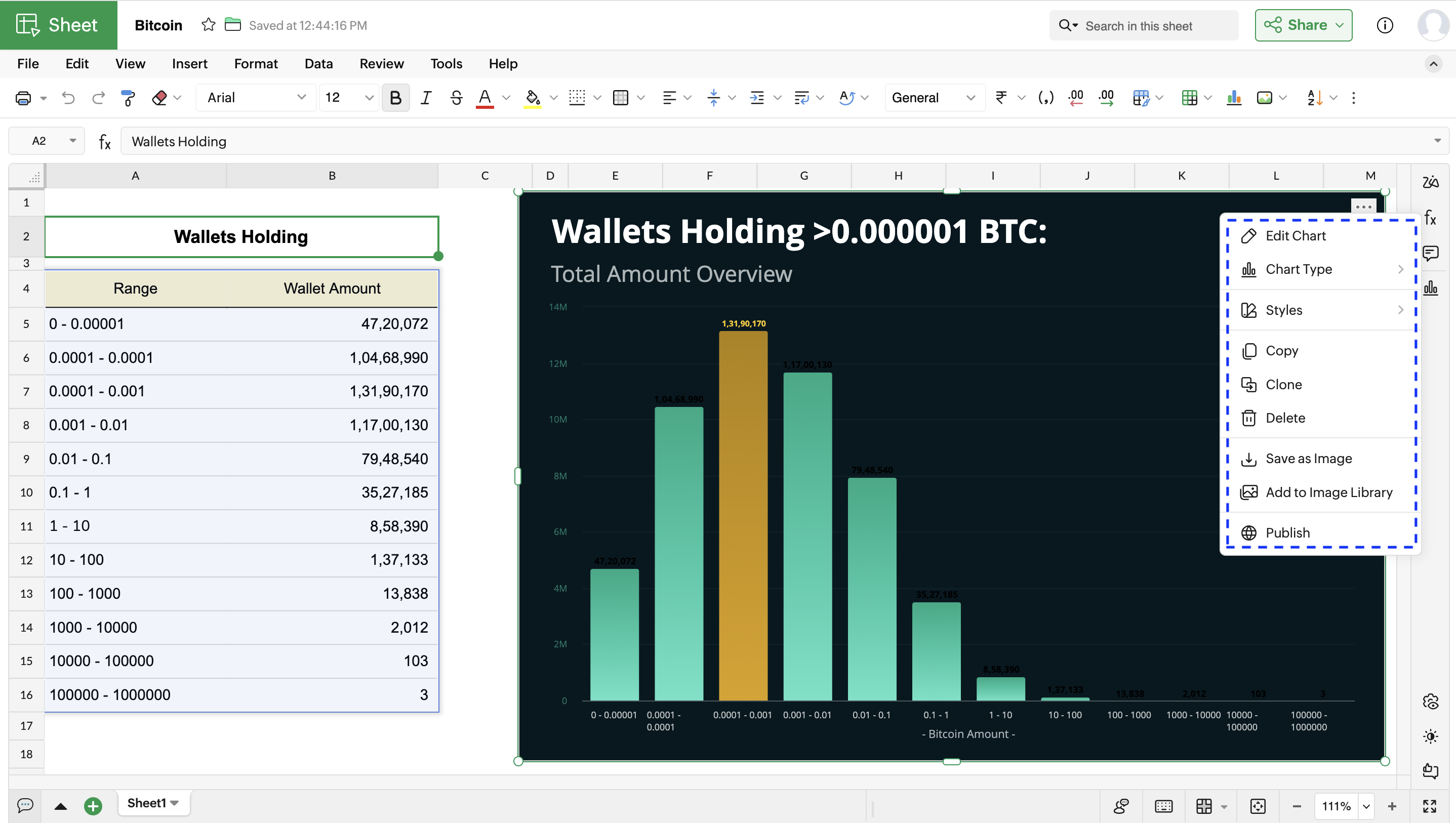
How to edit a chart
- Right-click on the preferred chart you wish to edit.
- From the chart side pane that opens, you can select the desired tab in which you wish to make the changes.
How to locate a chart
- Go to View > Navigation
- From the side pane, you can click on the preferred chart to locate it inside the spreadsheet. You can also hide/unhide or delete the chart from the side pane.
How to move a chart
- Right-click on the preferred chart and click Move.
- From the list of sheets shown, you can select the sheet to which you want the chart to be moved.
How to clone a chart
Right-click on the preferred chart and click Clone. An exact duplicate of the chart will be created.
How to delete a chart
Right click on the preferred chart and click Delete.
How to publish a chart
- Right-click on the preferred chart and click Publish.
- From the Published Chart URL dialog, you can copy the link and share it with others. You can also embed the charts in webpages or documents by copying the embedded code. You can always revert publish by clicking the Remove Public option.
How to save the chart as an image
Right-click on the preferred chart and select Save as Image to download any specific chart.