Webpage Sections
Overview
The Website Sections guide helps you understand how to build and manage the structure of your event website in Zoho Backstage. You can add various prebuilt sections like text, media, speakers, sponsors, tickets, venue details, and more to different pages of your site. Each section is designed to showcase specific content and can be customized in terms of layout, content, background, and visibility.
This guide walks you through how to add, rearrange, hide, delete, and style these sections. It also includes detailed breakdowns of each section type and their individual components—such as text fields, media options, buttons, and layout settings—so you can create an engaging and informative event website that suits your branding and event needs.

Customization options may vary based on your Zoho Backstage subscription plan. Advanced customization features are available starting from the Essentials plan. Some features may be limited or restricted in the lower-tier plans.
Managing Website Sections
Adding a Section
- Navigate to Design > Website from the Dock.
- Click Edit Website.
- Navigate to the page you want to add a section to using the navigation bar.
- Click the Add Section button, which is located between two existing sections. A pop-up window will appear with a variety of section options to choose from.
- Available section types include:
- Media with Text
- Media with Text Group
- Number Counter
- Testimonials
- Text
- Event Description
- List
- Embed Widget
- Gallery
- Speakers
- Sponsors
- Sponsor Category
- Featured Sessions
- Floor Plan
- Exhibitor Category
- Exhibitor Listing
- Tickets
- Venue
- Hotels
- Form
- Select the desired section and click Add. The selected section will be placed where you clicked the Add Section button.
- Customize the section by filling in the necessary information.
- Click Publish if the event is in draft status, or Republish if the event is live or running.
Rearranging Sections
- Navigate to Design > Website.
- Click Edit Website.
- Navigate to the page where you want to rearrange sections using the navigation bar.
- Hover over the section you want to move. Use the arrows at the top right of the section to move it up or down.
- Click Publish if the event is in draft status, or Republish if the event is live or running.

Note: You cannot place a section above the hero section or below the footer section.
Cloning a Section
- Navigate to Design > Website from the Dock.
- Click Edit Website.
- Navigate to the page where you want to clone a section using the navigation bar.
- Hover over the section and click the Clone icon at the top right of the section. The Clone Section dialog box will appear.
- Select the page where you want this section to be cloned.
- Click Clone. A duplicate of the section will be created immediately at the bottom of the selected page.
- Customize the cloned section as needed.
- Click Publish if the event is in draft status, or Republish if the event is live or running.
Adding Backgrounds to Sections
- Navigate to Design > Website from the Dock.
- Click Edit Website.
- Navigate to the page where you want to add a section background using the navigation bar.
- Hover over the section, and click the Background Icon at the top right of the section to change its background.
- Choose between Color, Image and Video.
- Color option:
- Pick a Background Color and adjust Background Opacity. Color can be either Flat Color or Gradient.
- Image option:
- Adjust Image Opacity and toggle Image Overlay.
- Choose Image Fit Options: Cover, Full Image, or Tile.
- Use the Image Positions tool to set the image alignment.
- If Image Overlay is enabled, choose Overlay Color and Overlay Capacity.
- To change the image, click Change and select from the library or upload a new image.
- Clip, crop, flip, or rotate the image as needed.
- Click Delete to remove the image.
- Video option:
- Enter the YouTube video thumbnail.
- If Video Overlay is enabled, choose Overlay Color and Overlay Capacity.
- Enable Loop Video if required.
- If you want to go back to the default settings, click Reset to Default.
- Click Publish if the event is in draft status, or Republish if the event is live or running.
Hiding or Showing a Section
- Navigate to Design > Website from the Dock.
- Click Edit Website.
- Navigate to the page where you want to hide or show a section using the navigation bar.
- Hover over the section and click the Eye icon at the top right of the section to toggle its visibility.
- Click Publish if the event is in draft status, or Republish if the event is live or running.
Deleting a Section
- Navigate to Design > Website from the Dock.
- Click Edit Website.
- Navigate to the page where you want to delete a section using the navigation bar.
- Hover over the section and click the Delete icon at the top right of the section to remove it.
- Confirm deletion in the popup.
- Click Publish if the event is in draft status, or Republish if the event is live or running.
Customizing Website Sections
Media with Text
The Media with Text section allows you to combine images or videos with supporting text and CTAs (Call-to-Action buttons).
Section Setup
- Hover over the Media with Text section and click the Settings icon that appears. The Media with Text Settings panel will open.
- You can now:
- Click Change and choose from the available templates.
- Use the Horizontal Alignment setting to align text and CTA.
- Enable or disable Button.
- Enable or disable Media. When media is enabled:
- Select Media Position: Choose whether the media appears on Top, Bottom, Left, or Right.
- Choose Media Size: Set the media size based on your content layout.
- Use the Vertical Alignment setting to align text and CTA.
- If your event is in draft state, click Publish to publish your event. If already live, Republish it.
Text Element
- Enter text in the text field.
- Select the text and format it using the following options:
- Header: Set the selected text as Paragraph, Heading 2, Heading 3, Heading 4, or Heading 5.
- Size: Adjust the font size.
- Font Family: Set the weight or thickness of the characters within a font.
- Bold: Make the text bold.
- Italic: Apply slanted styling to the text.
- Underline: Underline the text.
- Strikethrough: Add a line through the text.
- Alignment: Align the selected text (e.g., left, center, or right).
- Ordered List: Create a numbered list.
- Bullet List: Create a bulleted list.
- Indent -1: Decrease the indent level of the text.
- Indent +1: Increase the indent level of the text.
- Line Height: Adjust the spacing between lines of text.
- Letter Spacing: Modify the spacing between characters.
- Text Transform: Change text capitalization (e.g., uppercase, lowercase).
- Text Color: Change the color and transparency of the text.
- Text Background: Add a background color to the text itself (not the block).
- Link: Add a hyperlink to the text.
- Horizontal Ruler: Insert a horizontal line between text sections.
- Script Sub: Set the selected text as subscript (below the normal line).
- Script Super: Set the selected text as superscript (above the normal line).
- Backquote: Format text as inline code or quote, depending on context.
- Clean: Clear all text formatting without affecting text block properties.
- If your event is in draft state, click Publish to publish your event. If already live, Republish it.
Some of these options may not be available for certain fields.
Media Element
Adding Media
- Hover over the Media with Text section and click Add Media on the element. The Edit Media panel will appear.
- Choose between Image, Video, and Embed:
- Image:
- Upload an image or choose from the design library.
- Uncheck Use original image to edit (crop/flip/rotate).
- Video:
- Paste the video URL in the field.
- Click Remove and confirm if not needed.
- Embed:
- Paste the iframe code.
- To link an image.
- Click the Link icon under an image in the Image tab.
- Choose from available options:
- Page (select from dropdown)
- External URL
- Speaker
- Sponsor
- Session
- Event Listing
- Tickets
- None
- If your event is in draft state, click Publish to publish your event. If already live, Republish it.
Editing Media
- Hover over the image you want to edit and click the settings icon. The Media Settings panel will appear.
- Choose a Media Shape: Square, Circle, Rectangle, or Original.
- Choose a Media Fit: Fit or Cover (not available for the Original media shape).
- Set the media Border. If you don’t want a border, leave the value as zero.
- Enter the Border Radius.
- Choose the Border Color.
- Enable Media Background if needed.
- Choose a Background Color.
- Click Apply changes to all media to apply these settings to all media in the section you're editing.
- If your event is in draft state, click Publish to publish your event. If already live, Republish it.
Button Element
Setup
- Navigate to Design > Website from the Dock.
- Click Edit Website.
- Hover over the hero section and click the Setting icon associated with the button group. The Button Group Settings panel will appear.
- Click the Edit icon next to the button you want to edit.
- To add a new button, click Add New Button.
- To setup a button, click the Edit icon associated with a button. The Button Settings panel will appear.
- Go to the Setup tab.
- Choose a Button Type from the dropdown:
- Register Now: Direct attendees to the registration page.
- Configure Button Text
- Set Alternate Registration Link (Optional)
- Get in Touch: Allow visitors to contact you easily.
- Configure Button Text
- Add to Calendar: Allow saving event date to personal calendars.
- Configure Button Text
- Print Agenda: Enable visitors to download/print the event schedule.
- Configure Button Text
- Get Directions: Provide event location with interactive map.
- Configure Button Text
- Custom: Multiple linking options:
- For Page: Select from dropdown.
- For External URL: Enter URL and choose whether to open in new tab.
- For Speakers: Select from all set speakers.
- For Sessions: Select from all scheduled sessions.
- For Sponsors: Select from all confirmed sponsors.
- For Event Listing: Display event-related information.
- For Tickets: Select ticket class for purchasers.
- Become a Sponsor: Invite partnership/funding
- Configure Button Text
- Link a Custom Form: For inquiries or feedback
- Select Custom Form
- Configure Button Text
- Become an Exhibitor: For showcasing products
- Configure Button Text
- Submit Abstract: Allow users to submit abstracts for your event.
- Configure Button Text
- Sign In: Allow users to log in
- Configure Button Text
- Click Save.
- If your event is in draft state, click Publish to publish your event. If already live, Republish it.
Design
- Navigate to Design > Website from the Dock.
- Click Edit Website.
- Hover over the hero section and click the Setting icon associated with the button group. The Button Group Settings panel will appear.
- Click the Edit icon next to the button you want to edit. The Button Settings panel will appear.
- Go to the Design tab.
- Customize your button:
- Button Size: Tiny, Small, or Medium
- Button Style: Filled, Ghost, or Link
- Button Colors:
- Filled style: Customize Text Color and Background.
- Toggle Border option (adjust thickness and color when enabled).
- Ghost style: Customize Text Color.
- Toggle Border option (adjust thickness and color when enabled).
- Link style: Customize Text Color only.
- Click Reset to Default if needed.
- If your event is in draft state, click Publish to publish your event. If already live, Republish it.

You can customize button colors as solid or gradient. Click the color picker to choose between options.

- To customize the entire button group, go to the Design tab in the Button Group Settings panel.
- You can also hover over the button group section and click the Edit icon next to a button to open its individual settings panel.
Media with Text Group
The Media with Text Group section allows you to combine images or videos with supporting text and CTAs (Call-to-Action buttons).
Section Setup
- Hover over the Media with Text Group section and click the Settings icon that appears. The Media with Text List Settings panel will open.
- You can now:
- Click Change and choose from the available templates.
- Use the Horizontal Alignment setting to align text and CTA.
- Enable or disable Button.
- Enable or disable Media. When media is enabled:
- Select Media Position: Choose whether the media appears on Top, Bottom, Left, or Right.
- Choose Media Size: Set the media size based on your content layout.
- Use the Vertical Alignment setting to align text and CTA.
- If your event is in draft state, click Publish to publish your event. If already live, Republish it.
Text Element
- Enter text in the text field.
- Select the text and format it using the following options:
- Header: Set the selected text as Paragraph, Heading 2, Heading 3, Heading 4, or Heading 5.
- Size: Adjust the font size.
- Font Family: Set the weight or thickness of the characters within a font.
- Bold: Make the text bold.
- Italic: Apply slanted styling to the text.
- Underline: Underline the text.
- Strikethrough: Add a line through the text.
- Alignment: Align the selected text (e.g., left, center, or right).
- Ordered List: Create a numbered list.
- Bullet List: Create a bulleted list.
- Indent -1: Decrease the indent level of the text.
- Indent +1: Increase the indent level of the text.
- Line Height: Adjust the spacing between lines of text.
- Letter Spacing: Modify the spacing between characters.
- Text Transform: Change text capitalization (e.g., uppercase, lowercase).
- Text Color: Change the color and transparency of the text.
- Text Background: Add a background color to the text itself (not the block).
- Link: Add a hyperlink to the text.
- Horizontal Ruler: Insert a horizontal line between text sections.
- Script Sub: Set the selected text as subscript (below the normal line).
- Script Super: Set the selected text as superscript (above the normal line).
- Backquote: Format text as inline code or quote, depending on context.
- Clean: Clear all text formatting without affecting text block properties.
- If your event is in draft state, click Publish to publish your event. If already live, Republish it.
Some of these options may not be available for certain fields.
Adding Media
- Hover over the Media with Text section and click Add Media / Change on the element. The Edit Media panel will appear.
- Choose between Image, Video, and Embed:
- Image:
- Upload an image or choose from the design library.
- Uncheck Use original image to edit (crop/flip/rotate).
- Video:
- Paste the video URL in the field.
- Click Remove and confirm if not needed.
- Embed:
- Paste the iframe code.
- To link an image.
- Click the Link icon under an image in the Image tab.
- Choose from available options:
- Page (select from dropdown)
- External URL
- Speaker
- Sponsor
- Session
- Event Listing
- Tickets
- None
- If your event is in draft state, click Publish to publish your event. If already live, Republish it.
Editing Media
- Hover over the image you want to edit and click the Settings icon. The Media Settings panel will appear.
- Choose a Media Shape: Square, Circle, Rectangle, or Original.
- Choose a Media Fit: Fit or Cover (not available for the Original media shape).
- Set the media Border. If you don’t want a border, leave the value as zero.
- Enter the Border Radius.
- Choose the Border Color.
- Enable Media Background if needed.
- Choose a Background Color.
- Click Apply changes to all media to apply these settings to all media in the section you're editing.
- If your event is in draft state, click Publish to publish your event. If already live, Republish it.
Button Element
Setup
- Navigate to Design > Website from the Dock.
- Click Edit Website.
- Hover over the Media with Text Group section and click the Settings icon associated with the button group. The Button Group Settings panel will appear.
- Click the Edit icon next to the button you want to edit.
- To add a new button, click Add New Button.
- To setup a button, click the Edit icon associated with a button. The Button Settings panel will appear.
- Go to the Setup tab.
- Choose a Button Type from the dropdown:
- Register Now: Direct attendees to the registration page.
- Configure Button Text
- Set Alternate Registration Link (Optional)
- Get in Touch: Allow visitors to contact you easily.
- Configure Button Text
- Add to Calendar: Allow saving event date to personal calendars.
- Configure Button Text
- Print Agenda: Enable visitors to download/print the event schedule.
- Configure Button Text
- Get Directions: Provide event location with interactive map.
- Configure Button Text
- Custom: Multiple linking options:
- For Page: Select from dropdown.
- For External URL: Enter URL and choose whether to open in new tab.
- For Speakers: Select from all set speakers.
- For Sessions: Select from all scheduled sessions.
- For Sponsors: Select from all confirmed sponsors.
- For Event Listing: Display event-related information.
- For Tickets: Select ticket class for purchasers.
- Become a Sponsor: Invite partnership/funding
- Configure Button Text
- Link a Custom Form: For inquiries or feedback
- Select Custom Form
- Configure Button Text
- Become an Exhibitor: For showcasing products
- Configure Button Text
- Submit Abstract: Allow users to submit abstracts for your event.
- Configure Button Text
- Sign In: Allow users to log in
- Configure Button Text
- Click Save.
- If your event is in draft state, click Publish to publish your event. If already live, Republish it.
Design
- Navigate to Design > Website from the Dock.
- Click Edit Website.
- Hover over the Media with Text Group section and click the Setting icon associated with the button group. The Button Group Settings panel will appear.
- Click the Edit icon next to the button you want to edit. The Button Settings panel will appear.
- Go to the Design tab.
- Customize your button:
- Button Size: Tiny, Small, or Medium
- Button Style: Filled, Ghost, or Link
- Button Colors:
- Filled style: Customize Text Color and Background.
- Toggle Border option (adjust thickness and color when enabled).
- Ghost style: Customize Text Color.
- Toggle Border option (adjust thickness and color when enabled).
- Link style: Customize Text Color only.
- Click Reset to Default if needed.
- If your event is in draft state, click Publish to publish your event. If already live, Republish it.
You can customize button colors as solid or gradient. Click the color picker to choose between options.
- To customize the entire button group, go to the Design tab in the Button Group Settings panel.
- You can also hover over the button group section and click the Edit icon next to a button to open its individual settings panel.
Number Counter
The number counter section lets you display key metrics with animated counters to visually engage visitors.
Section Setup
- Hover over the Number Counter section and click the Settings icon. The Number Counter Settings panel will appear.
- Click Change to switch the layout template. Select the desired layout.
- Select the number of columns and the alignment of elements.
- Number Size: Pick the font size for the number.
- Enable Image: Toggle this on if you want to include images.
- Image Size: Specify the size of the image.
- Image Position: Choose from Left, Top, or Right.
- Solid Background: Enable if you want the section to have a solid background.
- Carousel Slider: Enable to display numbers in a sliding carousel format.
- Infinite Carousel: Enable to allow the carousel to loop infinitely.
- If your event is in draft state, click Publish to publish your event. If already live, Republish it.
Number Element
- Double-click on a number to open the Edit Number panel.
- Enter the number.
- Add a Prefix or Postfix if needed. For example, +, %, or hrs. The prefix and postfix cannot exceed 5 characters each.
- Select the Number Color.
- Click Apply to All Number Items to apply the color to all the number items.
- If your event is in draft state, click Publish to publish your event. If already live, Republish it.
Adding/ Deleting/ Rearranging the Number Counters
- Go to the Manage Items tab in the Number Counter Settings panel.
- To add a number counter:
- Click Add New Item.
- To rearrange the counters
- Click the Reorder icon on the left of the slide.
- Drag and place as you deem fit.
- To delete a counter:
- Click the Delete icon associated with a counter.
- If your event is in draft state, click Publish to publish your event. If already live, Republish it.
Media Element
Adding an Image
- Click Upload in the Number Counter section.
- Choose an existing image from your library or upload a new one.
- Adjust the image dimensions as needed.
- Click Done to apply the image.
Changing an Image
- Click the Edit icon associated with the image. The Edit Image panel will appear.
- Click Change.
- Choose a different image or upload a new one.
- Adjust the dimensions as required.
- Click Done to save your changes.
Adding a Link to an Image
- Click the Edit icon associated with the image. The Edit Image panel will appear.
- Click Add Link to open the Link Image panel.
- Choose the link type:
- Page: Select a page from the dropdown.
- External URL: Enter a URL and choose whether it should open in a new tab.
- Speakers: Link to a listed speaker.
- Sessions: Link to a scheduled session.
- Sponsors: Link to a confirmed sponsor.
- Event Listing: Link to event details.
- Tickets: Link to a specific ticket class.
Text Element
- Enter text in the text field.
- Select the text and format it using the following options:
- Header: Set the selected text as Paragraph, Heading 2, Heading 3, Heading 4, or Heading 5.
- Size: Adjust the font size.
- Font Family: Set the weight or thickness of the characters within a font.
- Bold: Make the text bold.
- Italic: Apply slanted styling to the text.
- Underline: Underline the text.
- Strikethrough: Add a line through the text.
- Alignment: Align the selected text (e.g., left, center, or right).
- Ordered List: Create a numbered list.
- Bullet List: Create a bulleted list.
- Indent -1: Decrease the indent level of the text.
- Indent +1: Increase the indent level of the text.
- Line Height: Adjust the spacing between lines of text.
- Letter Spacing: Modify the spacing between characters.
- Text Transform: Change text capitalization (e.g., uppercase, lowercase).
- Text Color: Change the color and transparency of the text.
- Text Background: Add a background color to the text itself (not the block).
- Link: Add a hyperlink to the text.
- Horizontal Ruler: Insert a horizontal line between text sections.
- Script Sub: Set the selected text as subscript (below the normal line).
- Script Super: Set the selected text as superscript (above the normal line).
- Backquote: Format text as inline code or quote, depending on context.
- Clean: Clear all text formatting without affecting text block properties.
- If your event is in draft state, click Publish to publish your event. If already live, Republish it.
Some of these options may not be available for certain fields.
Testimonials
The Testimonials section is designed to showcase quotes, endorsements, or feedback from speakers, attendees, or partners. Displaying testimonials can enhance credibility and create a more engaging website experience.
Section Setup
- Hover over the Testimonials section and click the Settings icon associated with it. The Testimonial Settings panel will appear.
- Click Change to select a different template layout. Choose the Testimonial Style:
- Lattice
- Trellis
- Frieze
- Set the Number of Columns.
- Choose the Alignment: Left, Justified or Right.
- For the Frieze layout, set the Image Position.
- Choose the Image Style: Round or Square.
- Enable the Carousel Slider if needed.
Adding/ Deleting/ Rearranging the Testimonials
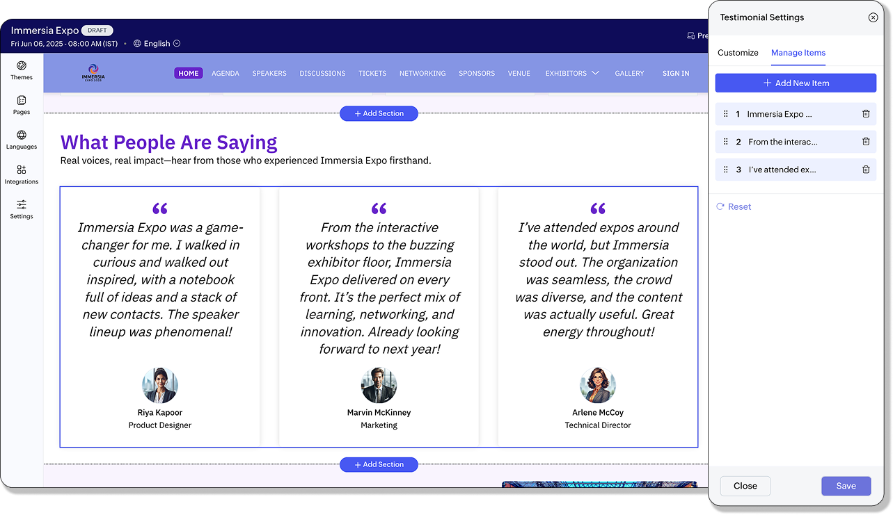
- Go to the Manage Items tab in the Testimonial Settings panel.
- To add a testimonial:
- Click Add New Item.
- To rearrange testimonials
- Click the Reorder icon on the left of the slide.
- Drag and place as you deem fit.
- To delete a testimonial:
- Click the Delete icon next testimonial.
- If your event is in draft state, click Publish to publish your event. If already live, Republish it.
Media Element
Adding an Image
- Click Upload in the Testimonials section.
- Choose an existing image from your library or upload a new one.
- Adjust the image dimensions as needed.
- Click Done to apply the image.
Changing an Image
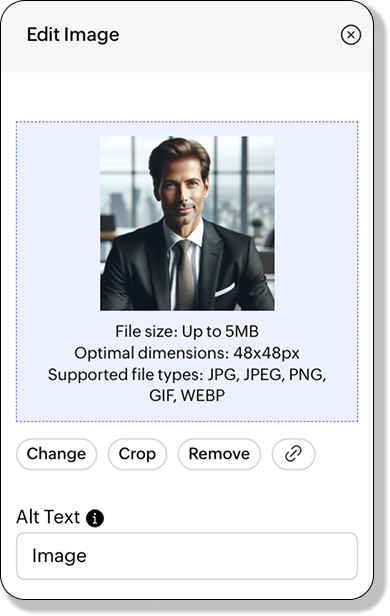
- Click the Edit icon associated with the image. The Edit Image panel will appear.
- Click Change.
- Choose a different image or upload a new one.
- Adjust the dimensions as required.
- Click Done to save your changes.
Adding a Link to an Image
- Click the Edit icon associated with the image. The Edit Image panel will appear.
- Click Add Link to open the Link Image panel.
- Choose the link type:
- Page: Select a page from the dropdown.
- External URL: Enter a URL and choose whether it should open in a new tab.
- Speakers: Link to a listed speaker.
- Sessions: Link to a scheduled session.
- Sponsors: Link to a confirmed sponsor.
- Event Listing: Link to event details.
- Tickets: Link to a specific ticket class.
Text Element
- Enter text in the text field.
- Select the text and format it using the following options:
- Header: Set the selected text as Paragraph, Heading 2, Heading 3, Heading 4, or Heading 5.
- Size: Adjust the font size.
- Font Family: Set the weight or thickness of the characters within a font.
- Bold: Make the text bold.
- Italic: Apply slanted styling to the text.
- Underline: Underline the text.
- Strikethrough: Add a line through the text.
- Alignment: Align the selected text (e.g., left, center, or right).
- Ordered List: Create a numbered list.
- Bullet List: Create a bulleted list.
- Indent -1: Decrease the indent level of the text.
- Indent +1: Increase the indent level of the text.
- Line Height: Adjust the spacing between lines of text.
- Letter Spacing: Modify the spacing between characters.
- Text Transform: Change text capitalization (e.g., uppercase, lowercase).
- Text Color: Change the color and transparency of the text.
- Text Background: Add a background color to the text itself (not the block).
- Link: Add a hyperlink to the text.
- Horizontal Ruler: Insert a horizontal line between text sections.
- Script Sub: Set the selected text as subscript (below the normal line).
- Script Super: Set the selected text as superscript (above the normal line).
- Backquote: Format text as inline code or quote, depending on context.
- Clean: Clear all text formatting without affecting text block properties.
- If your event is in draft state, click Publish to publish your event. If already live, Republish it.
Some of these options may not be available for certain fields.
Text
The Text section allows you to add richly formatted content to your event website. Use it to highlight your event’s mission, share announcements, or display any custom text with full styling options. This section supports a wide range of formatting tools to give you complete control over how your content looks and feels.
Text Element
- Enter text in the text field.
- Select the text and format it using the following options:
- Header: Set the selected text as Paragraph, Heading 2, Heading 3, Heading 4, or Heading 5.
- Size: Adjust the font size.
- Font Family: Set the weight or thickness of the characters within a font.
- Bold: Make the text bold.
- Italic: Apply slanted styling to the text.
- Underline: Underline the text.
- Strikethrough: Add a line through the text.
- Alignment: Align the selected text (e.g., left, center, or right).
- Ordered List: Create a numbered list.
- Bullet List: Create a bulleted list.
- Indent -1: Decrease the indent level of the text.
- Indent +1: Increase the indent level of the text.
- Line Height: Adjust the spacing between lines of text.
- Letter Spacing: Modify the spacing between characters.
- Text Transform: Change text capitalization (e.g., uppercase, lowercase).
- Text Color: Change the color and transparency of the text.
- Text Background: Add a background color to the text itself (not the block).
- Link: Add a hyperlink to the text.
- Horizontal Ruler: Insert a horizontal line between text sections.
- Script Sub: Set the selected text as subscript (below the normal line).
- Script Super: Set the selected text as superscript (above the normal line).
- Backquote: Format text as inline code or quote, depending on context.
- Clean: Clear all text formatting without affecting text block properties.
- If your event is in draft state, click Publish to publish your event. If already live, Republish it.
Some of these options may not be available for certain fields.
Event Description
The Event Description section is a dedicated space to present a detailed overview of your event. Ideal for giving visitors an engaging introduction to what your event is about, this section supports styled text, lists, links, and more.
Available Fields:
- Section Title: The main heading for the text section.
- Section Subtitle: A brief line of text that supports the title. Use it to give visitors a preview of the content below.
- Section Body: The main content area where you can enter detailed text. This field supports formatting options like headings, bold, italics, lists, links, and more. Ideal for describing your event’s mission, schedule highlights, or speaker lineup.
Section Setup
- Hover over the event description section and click the Settings icon associated with it. The Description Settings panel will appear.
- Choose between:
- Update text and sync with the 'Event Description' field used across website and other promotions.
- Update text only on the website.
Text Element
- Enter text in the text field.
- Select the text and format it using the following options:
- Header: Set the selected text as Paragraph, Heading 2, Heading 3, Heading 4, or Heading 5.
- Size: Adjust the font size.
- Font Family: Set the weight or thickness of the characters within a font.
- Bold: Make the text bold.
- Italic: Apply slanted styling to the text.
- Underline: Underline the text.
- Strikethrough: Add a line through the text.
- Alignment: Align the selected text (e.g., left, center, or right).
- Ordered List: Create a numbered list.
- Bullet List: Create a bulleted list.
- Indent -1: Decrease the indent level of the text.
- Indent +1: Increase the indent level of the text.
- Line Height: Adjust the spacing between lines of text.
- Letter Spacing: Modify the spacing between characters.
- Text Transform: Change text capitalization (e.g., uppercase, lowercase).
- Text Color: Change the color and transparency of the text.
- Text Background: Add a background color to the text itself (not the block).
- Link: Add a hyperlink to the text.
- Horizontal Ruler: Insert a horizontal line between text sections.
- Script Sub: Set the selected text as subscript (below the normal line).
- Script Super: Set the selected text as superscript (above the normal line).
- Backquote: Format text as inline code or quote, depending on context.
- Clean: Clear all text formatting without affecting text block properties.
- If your event is in draft state, click Publish to publish your event. If already live, Republish it.
Some of these options may not be available for certain fields.
List
The List section is perfect for presenting structured content such as event features or key highlights. Whether you’re showcasing benefits or organizing key information, this section helps keep things clear and visually appealing.
Section Setup
- Hover over the List section and click the Settings icon associated with it. The List Settings panel will appear.
- Click Change to select a different template layout.
- Choose the List Type:
- Rows
- Columns
- Choose the List Style.
- If your event is in draft state, click Publish to publish your event. If already live, Republish it.
Text Element
- Enter text in the text field.
- Select the text and format it using the following options:
- Header: Set the selected text as Paragraph, Heading 2, Heading 3, Heading 4, or Heading 5.
- Size: Adjust the font size.
- Font Family: Set the weight or thickness of the characters within a font.
- Bold: Make the text bold.
- Italic: Apply slanted styling to the text.
- Underline: Underline the text.
- Strikethrough: Add a line through the text.
- Alignment: Align the selected text (e.g., left, center, or right).
- Ordered List: Create a numbered list.
- Bullet List: Create a bulleted list.
- Indent -1: Decrease the indent level of the text.
- Indent +1: Increase the indent level of the text.
- Line Height: Adjust the spacing between lines of text.
- Letter Spacing: Modify the spacing between characters.
- Text Transform: Change text capitalization (e.g., uppercase, lowercase).
- Text Color: Change the color and transparency of the text.
- Text Background: Add a background color to the text itself (not the block).
- Link: Add a hyperlink to the text.
- Horizontal Ruler: Insert a horizontal line between text sections.
- Script Sub: Set the selected text as subscript (below the normal line).
- Script Super: Set the selected text as superscript (above the normal line).
- Backquote: Format text as inline code or quote, depending on context.
- Clean: Clear all text formatting without affecting text block properties.
- If your event is in draft state, click Publish to publish your event. If already live, Republish it.
Some of these options may not be available for certain fields.
Embed Widget
The Embed Widget section allows you to insert third-party widgets (like registration forms, videos, maps, or countdown timers) into your event website using custom iframe code.
Embedded Widget
- Enter code for a widget in the Add Iframe Code text box in the Add Section dialog box.
- Click Add.
- Enter a title and a subtitle if needed in the Embed Widget section.
- To edit the embed code again, hover over the Embed Widget section and click the Edit Embed Code button. Make the necessary changes.
- Click Save.
Gallery
The Gallery section allows you to showcase event images in a visually engaging format. You can enable participant photo uploads, allow downloads, and even offer face recognition search to help attendees find their pictures. Use this section to capture and share moments from your event in an organized and interactive way. Participants can also like, comment, and share these images.
Section Setup
- Hover over the Gallery section and click the Settings icon. The Gallery Settings panel will appear.
- Enable or disable the following options based on your requirements:
- Photo Uploads: Allow participants to upload photos to the event gallery.
- Choose the Upload File Type (e.g., JPG, PNG).
- Set Upload Period for Photos:
- Start Date: When uploads can begin.
- End Date: When uploads will be closed.
- NSFW Content Blocker:
- Choose categories of content to block automatically:
- Explicit nudity
- Racy or suggestive content
- Bloodshed, gore, or violence
- Drugs and substances
- Weapons
- Photo Downloads: Enable this option to let participants download photos from the gallery.
- Face Recognition in Search: Allows participants to search for their photos using face recognition. Attendees must upload or capture a selfie to find their images in the gallery.
Managing Images
Adding New Images
- Go to the Arrangement tab in the Gallery Settings panel.
- Click Add New.
- Select images from your local storage and upload them.
Deleting Images
- Navigate to the Arrangement tab.
- Click the Delete icon associated with the image you want to remove.
Rearranging Images
- In the Arrangement tab, click the Reorder icon beside the image.
- Drag and drop the image into your desired position.
Images uploaded in any Gallery widget are independent and not connected to the images in the Gallery tab on the event website.
Speakers
The Speakers section allows you to showcase the individuals presenting at your event. Display their names, images, titles, and affiliated organizations in a visually engaging layout.
Section Setup
- Hover over the Speakers section in the website builder and click the Settings icon.
- In the Speaker Settings panel, configure the following options:
- Design Layout: Choose a display format—Frieze, Polaroid, Trellis, Aura, or Mosaic.
- Background Style: Set the section background to Fill or Empty (transparent).
- Alignment: Choose how the speaker content is aligned within the section (e.g., Left, Center, or Right).
- Image Style: Display speaker photos as Round or Square.
- Carousel Slider: Enable this option if you want the speaker profiles to scroll horizontally like a slider.
Button Element
Setup
- Navigate to Design > Website from the Dock.
- Click Edit Website.
- Hover over the hero section and click the Setting icon associated with the button group. The Button Group Settings panel will appear.
- Click the Edit icon next to the button you want to edit.
- To add a new button, click Add New Button.
- To setup a button, click the Edit icon associated with a button. The Button Settings panel will appear.
- Go to the Setup tab.
- Choose a Button Type from the dropdown:
- Register Now: Direct attendees to the registration page.
- Configure Button Text
- Set Alternate Registration Link (Optional)
- Get in Touch: Allow visitors to contact you easily.
- Configure Button Text
- Add to Calendar: Allow saving event date to personal calendars.
- Configure Button Text
- Print Agenda: Enable visitors to download/print the event schedule.
- Configure Button Text
- Get Directions: Provide event location with interactive map.
- Configure Button Text
- Custom: Multiple linking options:
- For Page: Select from dropdown.
- For External URL: Enter URL and choose whether to open in new tab.
- For Speakers: Select from all set speakers.
- For Sessions: Select from all scheduled sessions.
- For Sponsors: Select from all confirmed sponsors.
- For Event Listing: Display event-related information.
- For Tickets: Select ticket class for purchasers.
- Become a Sponsor: Invite partnership/funding
- Configure Button Text
- Link a Custom Form: For inquiries or feedback
- Select Custom Form
- Configure Button Text
- Become an Exhibitor: For showcasing products
- Configure Button Text
- Submit Abstract: Allow users to submit abstracts for your event.
- Configure Button Text
- Sign In: Allow users to log in
- Configure Button Text
- Click Save.
- If your event is in draft state, click Publish to publish your event. If already live, Republish it.
Design
- Navigate to Design > Website from the Dock.
- Click Edit Website.
- Hover over the hero section and click the Setting icon associated with the button group. The Button Group Settings panel will appear.
- Click the Edit icon next to the button you want to edit. The Button Settings panel will appear.
- Go to the Design tab.
- Customize your button:
- Button Size: Tiny, Small, Medium, Large or Extra Large
- Button Style: Filled, Ghost, or Link
- Button Colors:
- Filled style: Customize Text Color and Background.
- Toggle Border option (adjust thickness and color when enabled).
- Ghost style: Customize Text Color.
- Toggle Border option (adjust thickness and color when enabled).
- Link style: Customize Text Color only.
- Click Reset to Default if needed.
- If your event is in draft state, click Publish to publish your event. If already live, Republish it.
You can customize button colors as solid or gradient. Click the color picker to choose between options.
- To customize the entire button group, go to the Design tab in the Button Group Settings panel.
- You can also hover over the button group section and click the Edit icon next to a button to open its individual settings panel.
Text Element
- Enter text in the text field.
- Select the text and format it using the following options:
- Bold: Make the text bold.
- Italic: Apply slanted styling to the text.
- Underline: Underline the text.
- Strikethrough: Add a line through the text.
- Size: Adjust the font size.
- Font Family: Set the weight or thickness of the characters within a font.
- Alignment: Align the selected text (e.g., left, center, or right).
- Text Color: Change the color and transparency of the text.
- Text Background: Add a background color to the text itself (not the block).
- Text Transform: Change text capitalization (e.g., uppercase, lowercase).
- Line Height: Adjust the spacing between lines of text.
- Letter Spacing: Modify the spacing between characters.
- Script Sub: Set the selected text as subscript (below the normal line).
- Script Super: Set the selected text as superscript (above the normal line).
- Clean: Clear all text formatting without affecting text block properties.
- If your event is in draft state, click Publish to publish your event. If already live, Republish it.
Sponsors
Section Setup - Section Level
- Hover over the Sponsors section and click the Settings icon associated with it. The Sponsor Settings panel will appear.
- Go to the Customize tab.
- Choose the Tile View: Grid, Slider, or Infinite Carousel.
- Enable Show Category Sponsor toggle to show the sponsor category names in the section.
- Change the Sponsor Category color if required.
- Enable the Show Sponsor Name toggle to show the sponsor name in the section.
- Change the Sponsor Name Color if required.
- Enable the Category Separator to add a horizontal line in-between the sponsor categories.
Reordering Sponsor Categories
- Hover over the Sponsors section and click the Settings icon associated with it. The Sponsor Settings panel will appear.
- Go to the Manage Items tab.
- Click the Reorder icon on the left of the slide.
- Drag and place as you deem fit.
Hiding Sponsor Categories
- Hover over the Sponsors section and click the Settings icon associated with it. The Sponsor Settings panel will appear.
- Go to the Manage Items tab.
- Click the Eye icon associated with a sponsor category to hide it.
- Click it again to show it on the event website.
Section Setup - Category Level
- Hover over the Sponsors section and click the Settings icon associated with it. The Sponsor Settings panel will appear.
- Go to the Manage Items tab.
- Click the Edit icon associated with a sponsor category.
- Go to the Customize Tab.
- Change the Tile View.
- Adjust the Tile Size.
- Enable Tile Background if required.
- Set the Tile Background Color.
- Enable Show Sponsor Category.
- Adjust the Sponsor Category Color.
- Enable Sponsor Name.
- Adjust the Sponsor Name Color.
Sponsor Category
Button Element
Setup
- Navigate to Design > Website from the Dock.
- Click Edit Website.
- Hover over the hero section and click the Setting icon associated with the button group. The Button Group Settings panel will appear.
- Click the Edit icon next to the button you want to edit.
- To add a new button, click Add New Button.
- To setup a button, click the Edit icon associated with a button. The Button Settings panel will appear.
- Go to the Setup tab.
- Choose a Button Type from the dropdown:
- Register Now: Direct attendees to the registration page.
- Configure Button Text
- Set Alternate Registration Link (Optional)
- Get in Touch: Allow visitors to contact you easily.
- Configure Button Text
- Add to Calendar: Allow saving event date to personal calendars.
- Configure Button Text
- Print Agenda: Enable visitors to download/print the event schedule.
- Configure Button Text
- Get Directions: Provide event location with interactive map.
- Configure Button Text
- Custom: Multiple linking options:
- For Page: Select from dropdown.
- For External URL: Enter URL and choose whether to open in new tab.
- For Speakers: Select from all set speakers.
- For Sessions: Select from all scheduled sessions.
- For Sponsors: Select from all confirmed sponsors.
- For Event Listing: Display event-related information.
- For Tickets: Select ticket class for purchasers.
- Become a Sponsor: Invite partnership/funding
- Configure Button Text
- Link a Custom Form: For inquiries or feedback
- Select Custom Form
- Configure Button Text
- Become an Exhibitor: For showcasing products
- Configure Button Text
- Submit Abstract: Allow users to submit abstracts for your event.
- Configure Button Text
- Sign In: Allow users to log in
- Configure Button Text
- Click Save.
- If your event is in draft state, click Publish to publish your event. If already live, Republish it.
Design
- Navigate to Design > Website from the Dock.
- Click Edit Website.
- Hover over the hero section and click the Setting icon associated with the button group. The Button Group Settings panel will appear.
- Click the Edit icon next to the button you want to edit. The Button Settings panel will appear.
- Go to the Design tab.
- Customize your button:
- Button Size: Tiny, Small, or Medium
- Button Style: Filled, Ghost, or Link
- Button Colors:
- Filled style: Customize Text Color and Background.
- Toggle Border option (adjust thickness and color when enabled).
- Ghost style: Customize Text Color.
- Toggle Border option (adjust thickness and color when enabled).
- Link style: Customize Text Color only.
- Click Reset to Default if needed.
- If your event is in draft state, click Publish to publish your event. If already live, Republish it.
You can customize button colors as solid or gradient. Click the color picker to choose between options.
- To customize the entire button group, go to the Design tab in the Button Group Settings panel.
- You can also hover over the button group section and click the Edit icon next to a button to open its individual settings panel.
Text Element
- Enter text in the text field.
- Select the text and format it using the following options:
- Bold: Make the text bold.
- Italic: Apply slanted styling to the text.
- Underline: Underline the text.
- Strikethrough: Add a line through the text.
- Size: Adjust the font size.
- Font Family: Set the weight or thickness of the characters within a font.
- Alignment: Align the selected text (e.g., left, center, or right).
- Text Color: Change the color and transparency of the text.
- Text Background: Add a background color to the text itself (not the block).
- Text Transform: Change text capitalization (e.g., uppercase, lowercase).
- Line Height: Adjust the spacing between lines of text.
- Letter Spacing: Modify the spacing between characters.
- Script Sub: Set the selected text as subscript (below the normal line).
- Script Super: Set the selected text as superscript (above the normal line).
- Clean: Clear all text formatting without affecting text block properties.
- If your event is in draft state, click Publish to publish your event. If already live, Republish it.
Featured Sessions
Button Element
Setup
- Navigate to Design > Website from the Dock.
- Click Edit Website.
- Hover over the hero section and click the Setting icon associated with the button group. The Button Group Settings panel will appear.
- Click the Edit icon next to the button you want to edit.
- To add a new button, click Add New Button.
- To setup a button, click the Edit icon associated with a button. The Button Settings panel will appear.
- Go to the Setup tab.
- Choose a Button Type from the dropdown:
- Register Now: Direct attendees to the registration page.
- Configure Button Text
- Set Alternate Registration Link (Optional)
- Get in Touch: Allow visitors to contact you easily.
- Configure Button Text
- Add to Calendar: Allow saving event date to personal calendars.
- Configure Button Text
- Print Agenda: Enable visitors to download/print the event schedule.
- Configure Button Text
- Get Directions: Provide event location with interactive map.
- Configure Button Text
- Custom: Multiple linking options:
- For Page: Select from dropdown.
- For External URL: Enter URL and choose whether to open in new tab.
- For Speakers: Select from all set speakers.
- For Sessions: Select from all scheduled sessions.
- For Sponsors: Select from all confirmed sponsors.
- For Event Listing: Display event-related information.
- For Tickets: Select ticket class for purchasers.
- Become a Sponsor: Invite partnership/funding
- Configure Button Text
- Link a Custom Form: For inquiries or feedback
- Select Custom Form
- Configure Button Text
- Become an Exhibitor: For showcasing products
- Configure Button Text
- Submit Abstract: Allow users to submit abstracts for your event.
- Configure Button Text
- Sign In: Allow users to log in
- Configure Button Text
- Click Save.
- If your event is in draft state, click Publish to publish your event. If already live, Republish it.
Design
- Navigate to Design > Website from the Dock.
- Click Edit Website.
- Hover over the hero section and click the Setting icon associated with the button group. The Button Group Settings panel will appear.
- Click the Edit icon next to the button you want to edit. The Button Settings panel will appear.
- Go to the Design tab.
- Customize your button:
- Button Size: Tiny, Small, or Medium
- Button Style: Filled, Ghost, or Link
- Button Colors:
- Filled style: Customize Text Color and Background.
- Toggle Border option (adjust thickness and color when enabled).
- Ghost style: Customize Text Color.
- Toggle Border option (adjust thickness and color when enabled).
- Link style: Customize Text Color only.
- Click Reset to Default if needed.
- If your event is in draft state, click Publish to publish your event. If already live, Republish it.
You can customize button colors as solid or gradient. Click the color picker to choose between options.
- To customize the entire button group, go to the Design tab in the Button Group Settings panel.
- You can also hover over the button group section and click the Edit icon next to a button to open its individual settings panel.
Text Element
- Enter text in the text field.
- Select the text and format it using the following options:
- Bold: Make the text bold.
- Italic: Apply slanted styling to the text.
- Underline: Underline the text.
- Strikethrough: Add a line through the text.
- Size: Adjust the font size.
- Font Family: Set the weight or thickness of the characters within a font.
- Alignment: Align the selected text (e.g., left, center, or right).
- Text Color: Change the color and transparency of the text.
- Text Background: Add a background color to the text itself (not the block).
- Text Transform: Change text capitalization (e.g., uppercase, lowercase).
- Line Height: Adjust the spacing between lines of text.
- Letter Spacing: Modify the spacing between characters.
- Script Sub: Set the selected text as subscript (below the normal line).
- Script Super: Set the selected text as superscript (above the normal line).
- Clean: Clear all text formatting without affecting text block properties.
- If your event is in draft state, click Publish to publish your event. If already live, Republish it.
Floor Plan
- Choose the type of floor plan you want to add in the Add Section dialog box, before adding the Floor Plan section.
- Select the floor plan For Exhibitors to allow them to book available booths directly from the floor plan. Filled and inactive booths will also be shown.
- Select the floor plan For Event Participants to only display booked booths and the exhibitors who have booked them.
If you haven’t created a floor plan yet, you can upload an image of one instead.
Exhibitor Category
Use this section to display the exhibitor categories available at your event.
Text Element
- Enter text in the text field.
- Select the text and format it using the following options:
- Bold: Make the text bold.
- Italic: Apply slanted styling to the text.
- Underline: Underline the text.
- Strikethrough: Add a line through the text.
- Size: Adjust the font size.
- Font Family: Set the weight or thickness of the characters within a font.
- Alignment: Align the selected text (e.g., left, center, or right).
- Text Color: Change the color and transparency of the text.
- Text Background: Add a background color to the text itself (not the block).
- Text Transform: Change text capitalization (e.g., uppercase, lowercase).
- Line Height: Adjust the spacing between lines of text.
- Letter Spacing: Modify the spacing between characters.
- Script Sub: Set the selected text as subscript (below the normal line).
- Script Super: Set the selected text as superscript (above the normal line).
- Clean: Clear all text formatting without affecting text block properties.
- If your event is in draft state, click Publish to publish your event. If already live, Republish it.
Exhibitor Listing
Section Setup - Section Level
- Hover over the Exhibitor Listing section and click the Settings icon associated with it. The Exhibitor Settings panel will appear.
- Go to the Customize tab.
- Enable Group by Category if required.
- Enable Exhibitor Name toggle to show the exhibitor names in the section.
- Set the Category Name Alignment.
- Set the Exhibitor Alignment.
- Choose the Number of Columns.
Reordering Exhibitor Categories
- Hover over the Exhibitor Listing section and click the Settings icon associated with it. The Exhibitor Settings panel will appear.
- Go to the Manage Categories tab.
- Click the Reorder icon on the left of the slide.
- Drag and place as you deem fit.
Hiding Exhibitor Categories
- Hover over the Exhibitor Listing section and click the Settings icon associated with it. The Exhibitor Settings panel will appear.
- Go to the Manage Categories tab.
- Click the Eye icon associated with an exhibitor category to hide it.
- Click it again to show it on the event website.
Section Setup - Category Level
- Hover over the Exhibitor Listing section and click the Settings icon associated with it. The Exhibitor Settings panel will appear.
- Go to the Manage Categories tab.
- Click the Edit icon associated with an exhibitor category.
- Go to the Customize Tab.
- Disable the Follow Global Settings toggle to make changes to a particular exhibitor category.
- Enable Exhibitor Name toggle to show the exhibitor names in the section.
- Set the Category Name Alignment.
- Set the Exhibitor Alignment.
- Choose the Number of Columns.
Tickets
Section Setup
- Hover over the Tickets section and click the Settings icon associated with it. The Ticket Class Settings panel will appear.
- Go to the Customize tab.
- Choose the Ticket Card Color: Theme Colors or Ticket Class Colors.
- Set the Number of Columns.
- Enable Carousel Slider if required.
- Customize your button:
- Button Size: Tiny, Small, or Medium
- Button Style: Filled, Ghost, or Link
- Button Corner Style: Rounder or Pill
- Scroll down to Offer Settings and choose from:
- Show current offers only
- Show previous offer
- Show next offer
- Show previous offer & next offer
- If your event is in draft state, click Publish to publish your event. If already live, Republish it.
Reordering Ticket Classes
- Hover over the Tickets section and click the Settings icon associated with it. The Ticket Class Settings panel will appear.
- Go to the Manage Tickets tab.
- Click the Reorder icon on the left of the slide.
- Drag and place as you deem fit.
Disable the Auto-Arrange Tickets toggle to customize the ticket order.
Designing the Ticket Class Widget
- Hover over the Tickets section and click the Settings icon associated with it. The Ticket Class Settings panel will appear.
- Go to the Manage Tickets tab.
- Click the Edit icon associated with the ticket class.
- To customize the ticket class details:
- Go to the Ticket Details tab.
- Set the Primary Ticket Color — choose either a Flat Color or a Gradient.
- Customize the following options as needed:
- Header Text Color
- Body Text Color
- Background: Choose a flat color or a gradient
- Border Color
- To design the ticket button:
- Go to the Button Details tab.
- Customize the button appearance:
- Button Size: Tiny, Small, or Medium
- Button Style: Filled, Ghost, or Link
- Button Colors:
- Filled style: Customize Text Color and Background.
- Toggle Border option (adjust thickness and color when enabled).
- Ghost style: Customize Text Color.
- Toggle Border option (adjust thickness and color when enabled).
- Link style: Customize Text Color only.
- Click Reset to Default if needed.
- If your event is in draft state, click Publish to publish your event. If already live, Republish it.
Venue
Text Element
- Enter text in the text field.
- Select the text and format it using the following options:
- Bold: Make the text bold.
- Italic: Apply slanted styling to the text.
- Underline: Underline the text.
- Strikethrough: Add a line through the text.
- Size: Adjust the font size.
- Font Family: Set the weight or thickness of the characters within a font.
- Alignment: Align the selected text (e.g., left, center, or right).
- Text Color: Change the color and transparency of the text.
- Text Background: Add a background color to the text itself (not the block).
- Text Transform: Change text capitalization (e.g., uppercase, lowercase).
- Line Height: Adjust the spacing between lines of text.
- Letter Spacing: Modify the spacing between characters.
- Script Sub: Set the selected text as subscript (below the normal line).
- Script Super: Set the selected text as superscript (above the normal line).
- Clean: Clear all text formatting without affecting text block properties.
- If your event is in draft state, click Publish to publish your event. If already live, Republish it.
Hotels
Adding Hotel Listings
- Hover over the Hotels section and click the Add Hotel button. The Add Hotel panel will appear.
- Enter the Hotel Name. If the hotel appears in the suggestions, select it to automatically fill in the address, photo, and website URL.
- If your hotel doesn’t appear in the suggestions, manually enter the following details:
- Hotel name (mandatory)
- Address (mandatory)
- Website URL (optional)
- Group code (optional)
- Click Choose Photo and upload an image of the hotel from your local storage.
- Use the slider to adjust the Distance from Event Venue.
You can edit or remove hotel listings at any time.
If you have any questions, please contact support@zohobackstage.com.