Working with Dashboards
Dashboards are used to monitor business performance and the reports are shown to provide a quick and easy overview of how your business is performing with the help of charts, KPIs. You can create a dashboard and share it with all the users or few selected users. You can also create private dashboards that will be accessible only to you.
Creating Dashboards
Depending on your business requirement you can create dashboards to get an overview of various business activities such as, email analytics, lead status, marketing metrics, activity stats and so on. Further, you can share these dashboards with selected or all users in your organization.
To create a dashboard
- Click the Dashboards tab.
- In the view dashboards drop-down, click +New Dashboard.
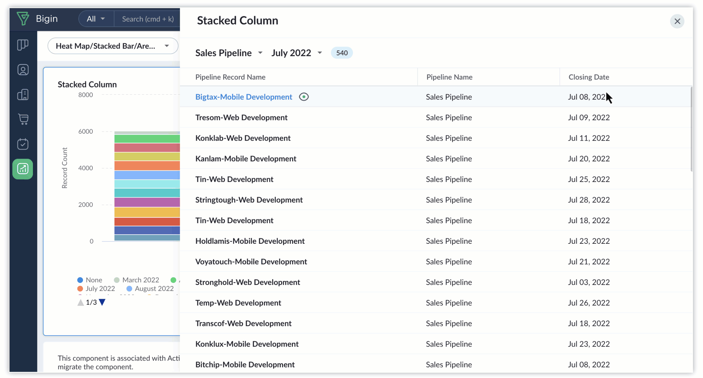
- Click + Component, to add different components to your dashboard.
- In the Dashboard Builder page, do the following:
- Enter the Dashboard Name.
- Select the users with whom you want to share the dashboard.
- Only me - Accessible only to you.
- All users - Shared to all users in your Bigin account.
- Custom - Select users from different sources like list of users, roles & subordinates or groups.
- Click Save.
Notes:
- Custom Dashboards are available only with paid editions.
- Supported editions include:
- Express - 10
- Premier - 20
- Bigin 360 - 50
Dashboard Components
Analytical components display your organization's data in a pictorial form making it more comprehensible. Bigin provides 3 different types of analytical components for your dashboards. They are:
- Chart
- KPI
- Target Meter
Charts
A chart presents data from various records of a module(s) in a visual or graphical representation for an easy analysis. The data is seemingly comprehensible as users can easily pick out the patterns, trends, etc., which may otherwise be difficult to interpret.
The different types of chart available are
- Column Chart
- Donut Chart
- Line chart
- Pie chart
- Bar chart
- Table chart
- Funnel chart
- Area chart
- Heat map
Create Charts
To create charts
- Click the + component button and choose chart.
- Select the chart of your choice.
- In the next page that appears, do the following:
- Enter the component name.
- Select the Module and the related module for the chart from the drop down list.
- Select an option, in the Measure (Y-axis) and Grouping, from the list of available components.
- Click +Criteria Filter, to remove specific records that doesn't meet the mentioned criteria.
- Click the More Options to select Sort by, Maximum grouping and Benchmark for y-axis.
- Click Save.
KPI
Key Performance Indicator (KPI) is a standard measurement that demonstrates the effectiveness of your sales team is achieving important business objectives, it also gives useful analytics to help sales personnel increase their productivity by measuring their performance on a regular basis. For example, a sales manager wants to monitor the top 10 sales reps in terms of average annual revenue each of them have achieved. He can easily accomplish this by creating a ranking style KPI by defining the average annual revenue as the KPI metric.
Based on your industry requirement, you can choose from five different types of KPI styles:
- Standard
- Growth Index
- Basic
- Scorecard
- Rankings
Create KPI
To create KPI
- Click the Dashboards tab.
- In the Dashboard Builder page, select the dashboard to which the KPI has to be added.
- Click +Component and select KPI
- In the Choose KPI Style page, select a KPI style.
- In the next page, do the following:
- Enter the component name.
- Select a KPI metric and Related module from the drop-down list.
- Click Criteria Filter, you mention the records that must be excluded.
- Select Duration from the drop down list.
- In the Comparison Indicator choose the Compare to and Objective from the drop-down list.
- If you want to group them by certain ranking method, select the appropriate options in the Ranking drop-down list.
Note that this option is available only for Scorecard and Rankings KPI style. - Click Save.
Target Meter
A Target Meter lets you set target for your team and monitor them in Bigin dashboards. It provides a convenient way to visualize critical metrics, such as this year's deal count, last quarter's revenue, or recent sales milestones, without the need to delve into exhaustive reports. Users can effortlessly set up a target meter, define the relevant parameters, and promptly obtain the desired data for analysis and tracking purposes.
The different types of Target Meter available are:
- Dial Gauge: The Dial Gauge, as the name indicates, is a graphical depiction of progress, resembling a dial. It displays the goal at the curve's end, while an arrow indicates the current progress towards that goal.
- Traffic Light: Traffic lights share similarities with dial gauge, but offer enhanced visual progress tracking by colored indicators. The colors red(well below target), orange (mid-way to target), and green (closer to target) are used to signify distinct levels of target achievement, and these color percentages can be manually configured. Employing color-coded target meters streamlines progress monitoring through visual cues, ensuring that we maintain alignment with our objectives.
- Single Bar: Bar meters consist of a main bar representing the overall target and a secondary, smaller bar indicating the current progress. These meters can be subdivided into various levels to enhance visual comprehension of the progress. Additionally, the color of the bar can be utilized to signify the extent of target achievement up to the present point.
- Multiple Bar: Multi-bar target meters serve as effective visual tools for comparing progress amongst multiple individuals in your team or entities. You can set targets individually for each user/entity or set a common target for all the users/entities. Multi-bars can be used in tracking progress of various metrics like Sales target amongst reps, Tickets closed by agents, and so on.
Create a Target Meter
- Click on +Component and select Target Meter
- Select the target meter type of your choice.
- On the next page that appears, do the following:
- Add a component name.
- In the 'Set Target for' field, you need to choose the entity for which you are going to set this target to. You can set target to specific users or roles or pick-list values like deal stages, lead sources, etc.
- Select the Modules and the related modules for the target meter from the drop-down list.
- Click +Criteria filter, to remove specific records that doesn't meet the mentioned criteria.
- Choose the duration for the meter and set a target.
- Click Save, and the meter will be added to the dashboard. Or else you can click on Add & Reorder to arrange your target meter in the dashboard and then click Save.
Note
- This feature is available only in Premier, Bigin 360 and Zoho One editions.
- You can click on Change Style to alter the target meter type, and all previously made configurations will remain unchanged.
Dashboard Drilldown
Dashboard drilldown facilitates more in-depth data analysis by presenting detailed information about specific points within dashboard components. By clicking on specific data within a Dashboard Component, you can view a record's details in a list view.
Furthermore, the quick preview icon allows you to edit record details within this interface.
You can also navigate between stages/picklist values within this interface.
Notes
- Dashboard Drilldown is available for all Charts, Target Meters, and KPIs
Display as shortened numbers
Use Display as shortened numbers to show large numbers in a simpler, shorter format on dashboards. For example, instead of showing €53,670.06 or €93,034.40, values can be displayed in a compact format that is easier to read and compare.
You can choose from these formats:
- K (Thousands) — 53K
- M (Millions) — 12.3M
- B (Billions) — 1.5B
- L (Lakhs) — 4.2L
- C (Crores) — 1.2C
Auto formats:
- K-M-B — Automatically picks Thousand, Million, or Billion
- K-L-C — Automatically picks Thousand, Lakh, or Crore
Managing Dashboards
Once your dashboards are saved, you can make changes to them anytime. Click the More icon to access the following options:
- Edit: Modify the component as per your requirements.
- Delete: Remove the component if it's no longer needed.
- Clone: Create a duplicate of the component.
- Print: Print the component if needed.
You can also modify the access permissions for the dashboard. Just click the Edit icon and select the appropriate permission level.