Transitioning to the Improved Zoho CRM for Everyone Interface
This improved version of Zoho CRM for Everyone is designed to give users a cleaner layout, better navigation, and quicker access to everyday actions. This upgrade focuses on creating more space on your screen, reducing clicks, and placing the most used tools where they are easier to reach. This guide explains what has changed and how you can transition smoothly to the updated interface.
Availability : This improved interface is supported only for standalone CRM accounts at the moment. It is not yet supported for CRMPlus or Zoho One.
What’s New
1. Single Sidebar Navigation
The earlier layout used a primary and secondary sidebar that took up screen space.
The new version uses one unified sidebar. Modules and folders now appear as a scrollable list. This gives you more space to view records and reduces the clicks needed to move between modules.
2. Global Search and Quick Create at the Top
The search icon in the Nextgen 2.0 UI is placed below the modules available in the sidebar which lacked visibility making it difficult for users to search for records across their account.
In this upgraded version, global search now lives at the top of your CRM screen. The Quick Create menu has also been merged with the '+' icon from the Modules Tab in this enhancement so all quick create actions can be carried out from one single place. From here, you can:
- Quickly find records, modules, or information across your CRM using global search.
- Create records directly from any module, create new team modules or create org modules.
3. Setup Moved to the Top Right along with the utility actions
The setup menu and the utility actions in the Nextgen 2.0 UI is at the bottom. The setup menu opens directly to the list of features available for users not giving users a bird's eye view of all the features CRM offers.
Now, Setup menu and the utility actions is moved to the top-right corner of your CRM account with the setup menu opening to a Setup homepage. All settings on the setup homepage are neatly organized into easy-to-understand categories, as shown in the GIF below. With everything brought together in one central view, you can navigate effortlessly, find the tools you need at a glance, and configure them with fewer steps.
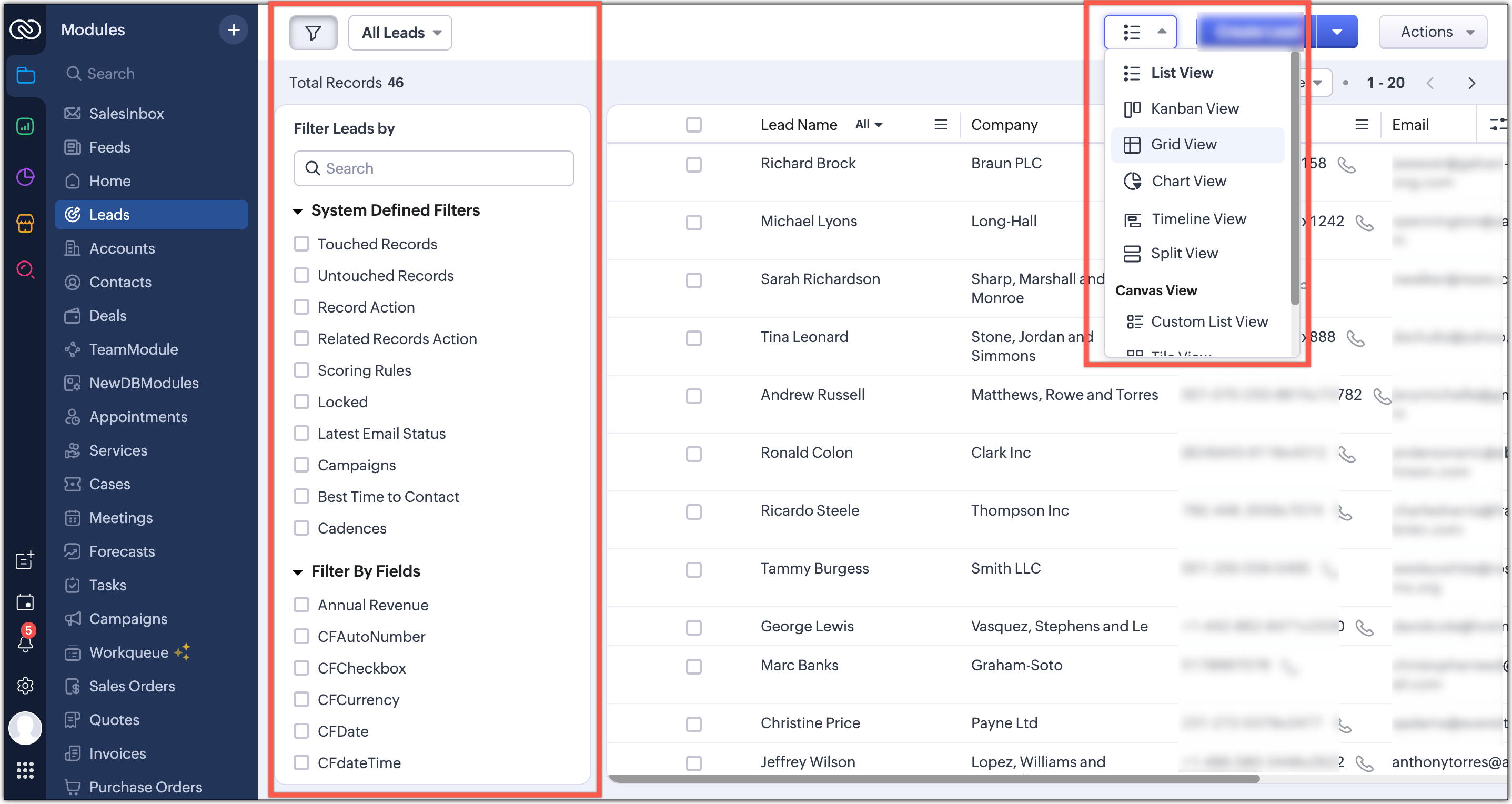
4. Reports and Dashboards in a Single Click
Earlier, Reports and Analytics modules will list the various reports and dashboards created on the secondary sidebar. Accessing other modules from reports and dashboards requires multiple clicks as shown in the GIF below.
In this enhancement, we moved this list into a drop-down menu from which you can choose the report or dashboard required. Earlier, navigating to other modules required multiple clicks, with this enhancement you need only a single click to move between modules.
You can also manage folders and dashboards created, use Zia and Zoho Analytics from the same drop-down menu option. Look at the GIF below to know where the list of reports and dashboards will now be located.
5. Show and Hide Sidebar
The option to hide or show the sidebar is still available. This helps you switch to a larger workspace when needed.
6. Easier Access to Teamspaces
Currently, the teamspace switcher is placed at the bottom as shown in the screenshot below.
Now, we’ve relocated the teamspace switcher for easier access. We have added a More(...) option from where you can access the below options:
- It’s now centrally positioned, making it quicker to navigate between teamspaces.
- Create new teamspaces, create folders, associate modules, managing and viewing teamspaces can now be done through the More Option next to the switcher tab.
- Managing CRM teamspaces will now open out into a pop-up at the far-right of your screen.
7. Filters, Sort, and Record Views Grouped
The filter option, currently, is available separately on top next to the custom view option. Similarly, record view for the module is also placed on top next to Create Record button and opens up as a drop-down for you to choose from.
In this enhancement, we’ve grouped the filter, sort, and record view options located on the action bar at the top of the list view just below the Module name.This creates a more consistent experience and makes these customization tools easier and quicker for you to access.
8. Custom Views as Tabs
We've introduced Custom View as Tabs from where you can choose to display your custom views as separate tabs to make them easy to spot and quick to open. This feature is available only for the improved Nextgen interface. It is not supported in Nextgen 2.0 UI or the old UI.
Transition Plan for Existing Users
Moving from Nextgen 2.0 to the Upgraded UI
When you are using the Nextgen 2.0 UI, you will see a banner that invites you to switch to the upgraded Nextgen UI. You can choose to switch immediately or select the option to do it later. The switch happens at a user level, so each user can choose their own time to move.
Forced Switching after One Week
If you choose the option to switch later, a pop up will appear after one week. This pop up will enforce the switch to the upgraded Nextgen UI. At this point all users who stayed on 2.0 will be moved to the upgraded version.
Moving from the Old UI to the Upgraded UI
If you are still using the old UI when this feature is released, a “What’s New in the Upgraded Version” pop up will appear. You can close it if you want. If you close the pop up, the first time you click Try CRM for Everyone you will be moved directly to the upgraded Nextgen UI.
If you tried the new UI earlier and switched back to the old UI, clicking Try CRM for Everyone will first take you to Nextgen 2.0. You will then see the option to upgrade to the upgraded Nextgen UI.
Switching Back to Old UI
After you move to the upgraded Nextgen UI, you will still have the option to switch back to the old UI. When you choose this option you will return to the old UI with the familiar top panel layout.
During the quick tour we will highlight only the changes that belong to the improved CRM for Everyone UI. A link to the transition document will be added inside the quick tour from where you can learn more about this UI improvements.
What this means for New Signups?
All new CRM signups after this release will start directly in the upgraded Nextgen UI. The default colour theme for new users will be blue.

Access your files securely from anywhere
Zoho CRM Training Programs
Learn how to use the best tools for sales force automation and better customer engagement from Zoho's implementation specialists.
Zoho DataPrep Personalized Demo
If you'd like a personalized walk-through of our data preparation tool, please request a demo and we'll be happy to show you how to get the best out of Zoho DataPrep.
- Zoho Workerly Home
- Forums
- Connect With Us:


- Zoho Recruit Home
- Forums
- Connect With Us:
New to Zoho Writer?
![]()
Create. Review. Publish.
New to Zoho CRM Plus?
Deliver unforgettable customer experiences
New to Zoho CRM Plus?
Deliver unforgettable customer experiences
New to Zoho Marketing Plus?
Everything you need to run your marketing
New to Zoho Marketing Plus?
Everything you need to run your marketing
You are currently viewing the help pages of Qntrl’s earlier version. Click here to view our latest version—Qntrl 3.0's help articles.
New to Zoho Survey?


Zoho Sheet Resources
Zoho Forms Resources
New to Zoho Sign?
Zoho Sign Resources
Sign, Paperless!
New to Zoho TeamInbox?
Zoho TeamInbox Resources
New to Zoho ZeptoMail?
Design. Discuss. Deliver.
New to Zoho Workerly?
New to Zoho Recruit?
New to Zoho CRM?
New to Zoho Projects?
New to Zoho Sprints?
New to Zoho Assist?
New to Bigin?
Related Articles
FAQ: Transition to the NextGen UI
Switching from old UI to the NextGen UI 1. Are Zoho CRM and CRM for Everyone the same? We are introducing an upgrade to your existing Zoho CRM, which we've titled CRM for Everyone. This isn't a new CRM, but a significant enhancement to the user ...Frequently Asked Questions on CRM for Everyone
Are Zoho CRM and CRM for Everyone the same CRM or is it a new CRM from Zoho? We are introducing an upcoming upgrade to your existing Zoho CRM, which we've titled "CRM for Everyone." This isn't a new CRM, but a significant enhancement to the user ...Why Switch to Zoho CRM's New UI
In a tough business world, a CRM is key for businesses to handle customer relations, boost sales, and run things smoothly. The tool needs to evolve to keep up with user expectations, enhance productivity, and improve the overall experience. But the ...CRM for Everyone — Availability Information
CRM offers varied licenses and editions, necessitating the need to educate users about the availability of its wide range of features. In this article we will explain the edition-specific availability of features in CRM for Everyone for users to ...FAQ: Grid View in Zoho CRM
What is Grid View in Zoho CRM, and how does it enhance record management? Grid View in Zoho CRM lets you work with your records in a convenient spreadsheet-style layout. It makes it easy to add or update data directly, quickly perform bulk edits, ...
New to Zoho LandingPage?
Zoho LandingPage Resources