How to select the right choice field type for your form
Choice fields are fundamental elements in form creation. It helps you collect clear and structured data by allowing respondents to select one or more options from a predefined set. Beyond the basic question-and-answer type fields, the choice field provides a user-friendly way to collect data from your respondents. Zoho Forms offers a diverse range of choice fields to suit your various data collection needs. Let's discuss each type:
Dropdown
Dropdown presents a single, scrollable list of options. The user clicks on the field to reveal the choices to select one. This is useful in situations where the screen space is limited, as it hides the options until interacted with. If you have a long list of mutually exclusive options like country, state, and age range, you can opt for this choice field.

Key Features:
- Single selection only
- Search functionality for easier navigation through long lists
- Can group your choices
- Supports pre-population of values
- Can apply conditional rules based on the selected option
- Can assign values to choices to perform calculations
- Can convert it to a radio choice field
Radio Choice
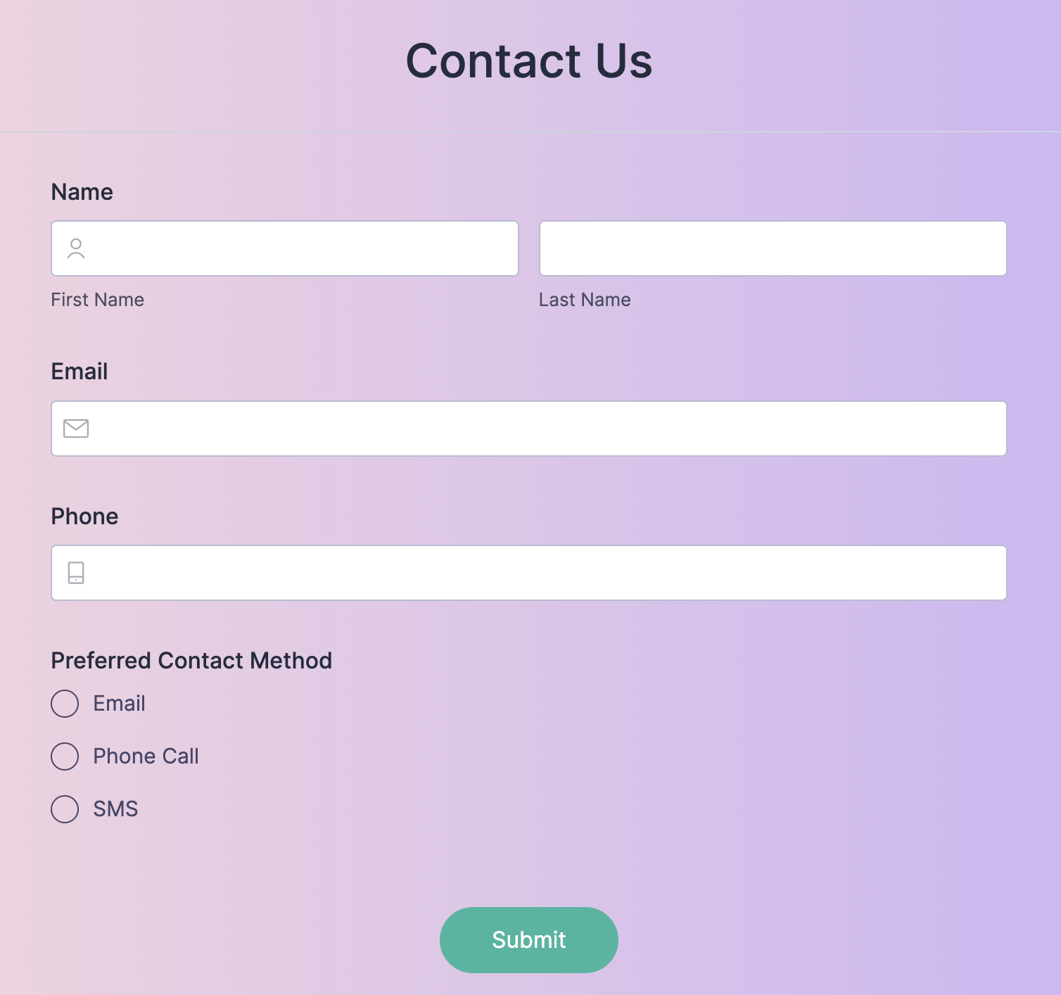
Radio choices display all available options at once, with a small circular button before each option. It collects a single preference from a limited set of choices. It is best used when the list of choices is short to medium and where it is important for users to see all choices upfront before making a selection, such as selecting a preferred contact method like email, phone, or sms.
Key Features:
- Single selection only
- All options are visible by default, so you can easily scan and compare options
- Allows you to control the layout of the options
- Can assign values to choices to perform calculations
- Can apply conditional rules based on the selected option
- Supports pre-selection of a default value
- Can convert it to a dropdown field
Checkbox:
Checkbox presents a list of options with a small square box next to each. Respondents can select multiple options by clicking the corresponding boxes. It is best used in situations where respondents can select one or more options from a given list for a single question, such as collecting interests or preferences.
Key Features:
- Multiple selections allowed
- All options are visible by default
- Can limit the number of choices that can be selected
- Can assign values to choices to perform calculations
- Can apply conditional rules based on the selected option
- Supports pre-selection of a default value
- Can convert it to a multiple choice field
Multiple Choice:
This is similar to a dropdown, but used when the user needs to select multiple options. It is best used when the choice list is long and you want to display more options without taking up too much vertical space. For example, selecting multiple product features that the user finds important.
Key Features:
- Multiple selections allowed
- Can limit the number of choices that can be selected
- Can assign values to choices to perform calculations
- Can apply conditional rules based on the selected option
- Supports pre-selection of a default value
- Can convert it to a checkbox field
Image Choices:
Image choices make the form more engaging and interactive by presenting choices as images. It is used in situations where visual identification is required, like selecting products based on appearance.

Key Features:
- Supports both single and multiple selection
- Can include text labels alongside the images
- Can assign numeric values to perform calculations
- Conditional rules can be applied based on the selected choice
Matrix Choice
Matrix Choice presents a grid of rows and columns. Typically, the rows represent questions or statements, and the columns represent answers. It is best used for presenting a series of related questions with a consistent set of responses, like rating different aspects of service using the same scale (Poor to Excellent).

Key Features:
- Presents multiple questions with the same set of answer choices
- Can be customized with different choice types to be displayed in the Matrix choice
- The type of selection allowed in each row is determined by the specific choice field used within the matrix
- Conditional rules can be applied based on the selections made in each row