New Features rolled out on March 30, 2017
New Packed Bubble Chart type for Zoho Reports
The Packed Bubble chart type is used to display data in a cluster of circles or bubbles. They are used to display the values disregarding the axes. The difference between a normal bubble chart and a packed bubble is that the latter is tightly packed rather than spread over a grid. You can use a packed bubble chart to visualize large amount of data in a small space.

Please do note that, this chart type is available only as a part of the New Charts feature which is currently in Beta .
Enhanced Chart chooser dialog for Dashboards and Embedded views
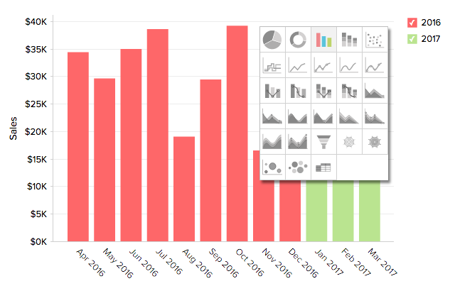
We have now revamped our Chart Chooser option for dashboards and Embedded Views. Our new intuitive and smooth Chart Chooser option will help previewing the chart types available and switch between them real fast.

New Edit view option in Explorer
You can now easily edit your reports and dashboards by invoking the Edit option in the contextual menu of the corresponding view in the Explorer. This will directly open the view in the Edit mode real fast, thereby saving few clicks.

Note
- Please do note that this option is not available for tables.
Support to Export upto 3 million cells in Excel file format
You can now export table like views (Pivot, Summary, Tabular View, Tables & Query Tables) with up to 3 million data cells as Excel files. Until now, it was possible only to export up to 1 million cells.