Introducing a Refreshed Design To Enhance Your Zoho Books Experience
Hello users,
We are excited to bring a refreshed design along with enhancements to the user interface in Zoho Books. You might have already noticed the new color themes with redesigned icons in your Zoho Books organization. Here’s everything you’d want to know about the recent changes.
New and Refreshed Themes
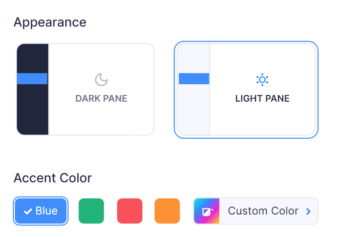
We have introduced classic, yet vibrant themes with red, blue, green and yellow accent colors in line with Zoho’s branding. With the new Custom Color option, you can choose a theme color that best reflects your business. You can use these themes with the Light Pane or Dark Pane mode to improve readability and visibility in Zoho Books.

Enhancements to UI
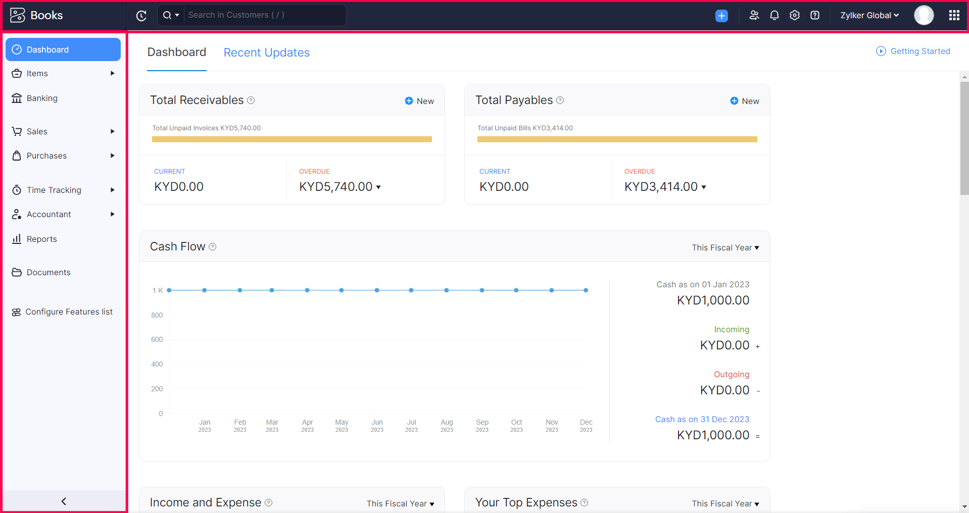
We have reorganized the top band and the side navigation bar with redesigned icons and tooltips to help you navigate Zoho Books effortlessly. Also, we have increased the contrast of grey widgets and fonts throughout the app for improved readability.

Customize the Themes
We have enabled the above mentioned updates to your Zoho Books organization mapping your existing theme with the closest primary color theme. You can change the theme color to suit your needs and reflect your brand better. Here's how:
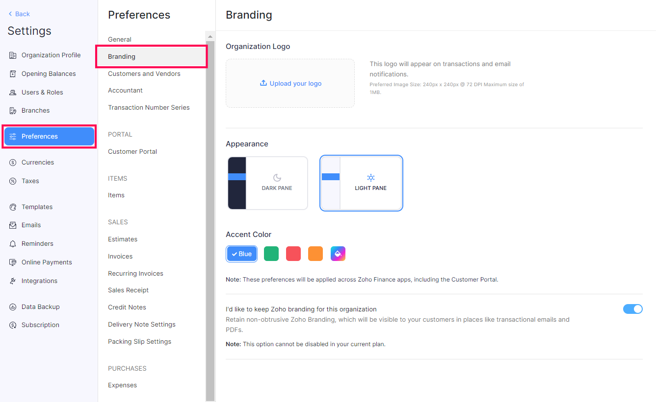
- Go to Settings on the top right corner of the dashboard.
- Select Preferences > Branding.
- Select your preferred themes under Appearance and Accent Color.
- Click the Custom Color option to customize the accent color for your organization using the color picker or the HTML color code.

The theme changes you make will be applied to your customer and vendor portals as well.
What’s Next
This new year, we will be introducing a few more design changes to enhance your experience with Zoho Books.
Cheers,
The Zoho Books Team