Grid
Overview
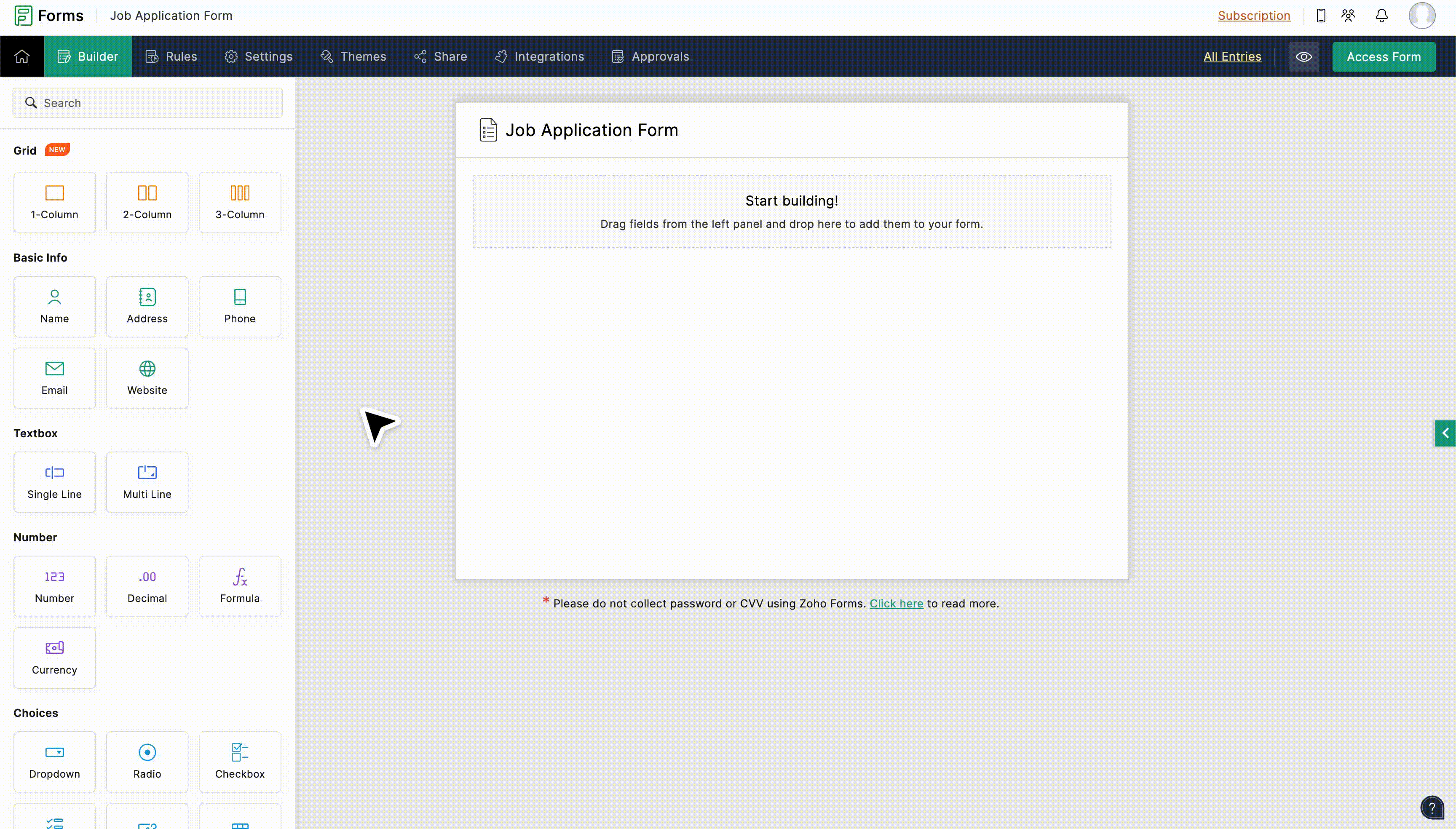
The Grid field allows you to organize your form fields in a column-based layout. It acts as a special section where you can add your form fields side by side in columns. Instead of all the fields stacked vertically, a grid allows you to place fields in two or three columns within your form. You can drag and drop the fields into these columns to create a more organized and compact layout.
Zoho Forms offers three different grid styles
- 1-Column
- 2-Column
- 3-Column
1-Column
This is the traditional stacked layout, where all fields in the Grid appear one below the other.

2-Column
Fields can be placed within this grid style will appear side by side in two columns. This is ideal for pairs of related fields, such as phone number and email when collecting contact information.
3-Column
Fields placed within this grid style will appear side by side in three columns, providing a more compact design. This is ideal for short related input fields, such as highest degree, years of experience, and employment status when collecting education and employment related details from candidates.

Configuring Grid Field
- In your Form Builder, under the Grid section, choose your preferred column layout.
- Drag and drop your existing or new form fields into the Grid field. Upon dragging the fields, you will be prompted with visual indicators showing where they will be placed within the columns.
- You can rearrange the fields within the Grid by dragging and dropping them to different positions within the column. You can also move fields into the Grid from anywhere on your form, and move out the fields from the Grid to the main form.
Notes:
- The Grid field is supported only in the form's latest version.
- You can add up to 50 Grid fields in a single form.
- A maximum of 30 fields can be placed inside a single Grid field, regardless of the column count.
- In 2-Column and 3-Column grids, the Field Size property is automatically set to 'Large', and is therefore hidden from individual field properties.
- The Field Layout property (allowing horizontal or vertical arrangement) remains specifically available for Name and Address fields.
- The following fields are not supported inside the Grid field- Grid, Matrix Choice, Unique ID, Random ID, Page Break, Subform, and Payment.
Grid Properties
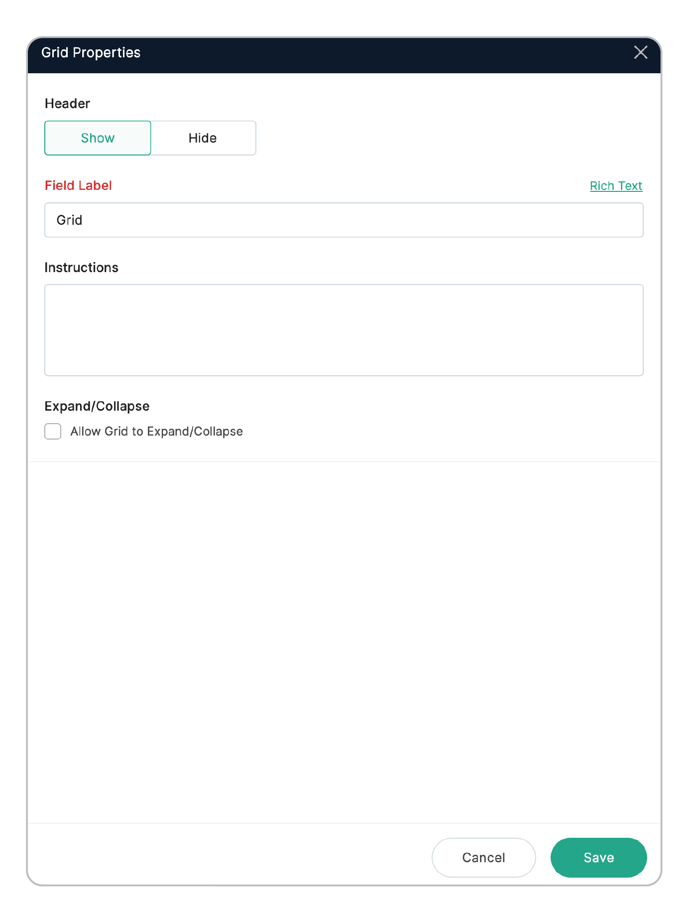
Header: By default, the Grid's header is hidden on the live form. You can choose to show it by clicking the Show button under field properties.
Field Label: Use the Field Label to provide a name or title for your Grid, helping to group the fields within it. If you choose to show the header, the Field Label supports Rich Text formatting, allowing you to insert various styles or even insert dynamic content from other form fields.
Reference Label: This acts as a field identifier and is crucial while configuring form settings, integrations, and other workflows. The reference label will not appear on the live form.
Instructions: You can specify the instructions or hints for the specific grid section to help your respondents fill out the form.
Expand/ Collapse: Enabling this option adds an arrow to the top-right corner of the Grid on the live form. Users can expand and collapse the Grid by clicking on the arrow.
Deleting a Grid Field
To delete a Grid field, hover over the Grid that you want to remove. Upon clicking the Delete icon, select your preference out of the two options that appear on the pop-up:
- Delete Grid: This option removes only the Grid container. The fields inside the Grid will not be deleted and will return to a standard, stacked layout on your form, appearing where the Grid used to be. The fields will appear in sequence, starting from the leftmost column and continuing to the right.
- Delete Grid with Fields: Choosing this option will remove the entire Grid along with all its fields. CAPTCHA validation must be done to proceed deletion with fields.