Configuring and managing search bar
What does this page cover
Learn to add and manage search elements on a page to enable speedy query search to filter records from a standalone report, or from a report embedded on a Page component.
Availability
- Search bar can be created in all plans of Creator.
- Only the super admin, admins, and developers can create and manage search bars.
1. Setting up a search element
A search element can be configured based on the two components:
1.1. Configure search element based on a report
1. Navigate to the page builder of the required page and click Search on the left pane. A list of search bar templates appears alongside.
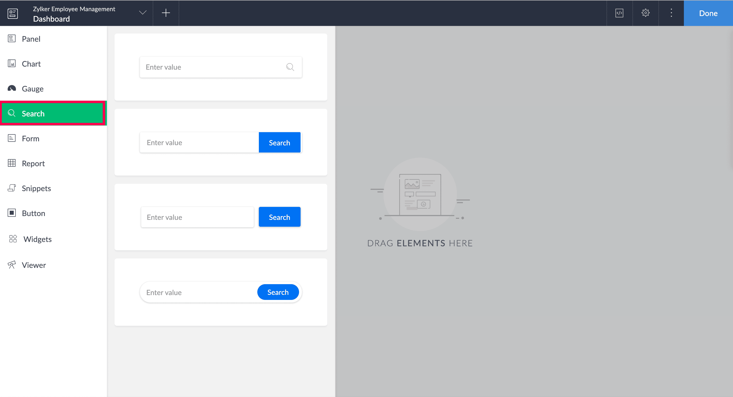
2. Drag and drop a search template from the list that appears alongside onto the building space. The Search Configuration pane opens, and you land on the Properties tab by default.

Note: If the search element was previously created, select it from the page builder and click Configure to open the Search Configuration pane. Alternately, you can also double click on the search bar to open its configuration.
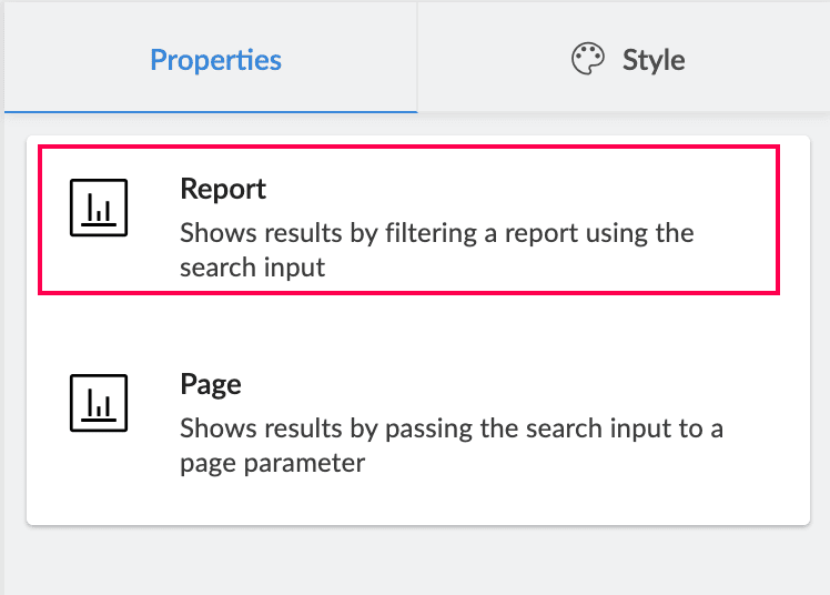
3. Choose the Report component to configure the search bar based on it. This configuration will display a filtered report based on the search input, in the same window, new window, or as a popup according to your preference.
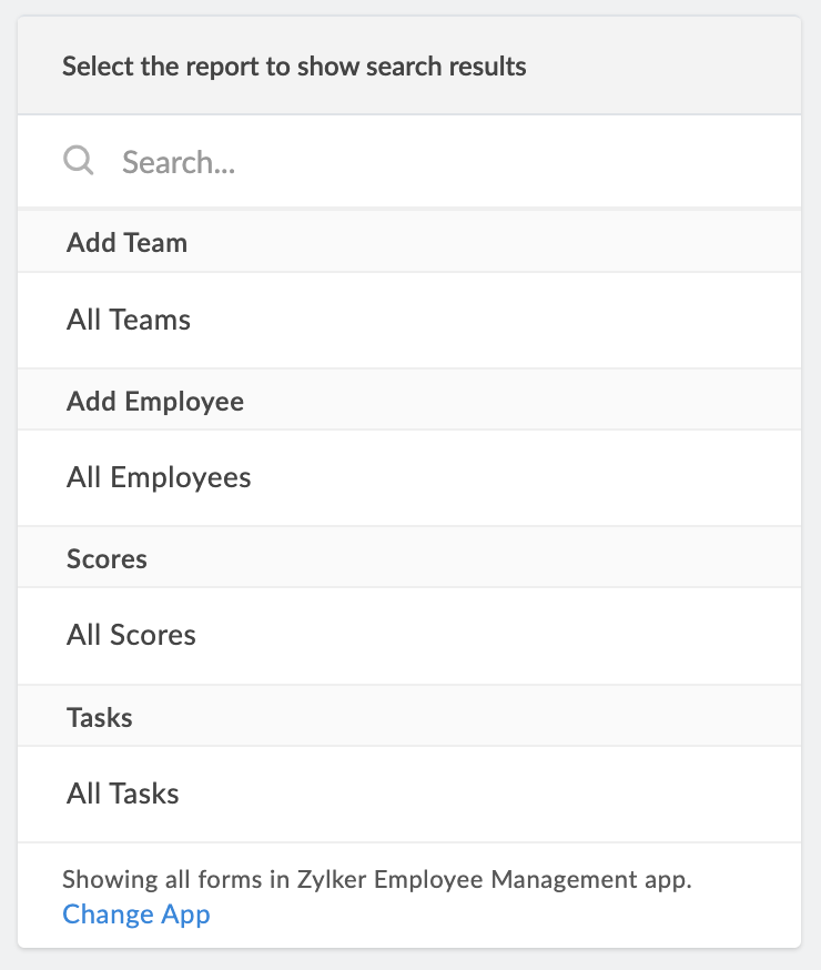
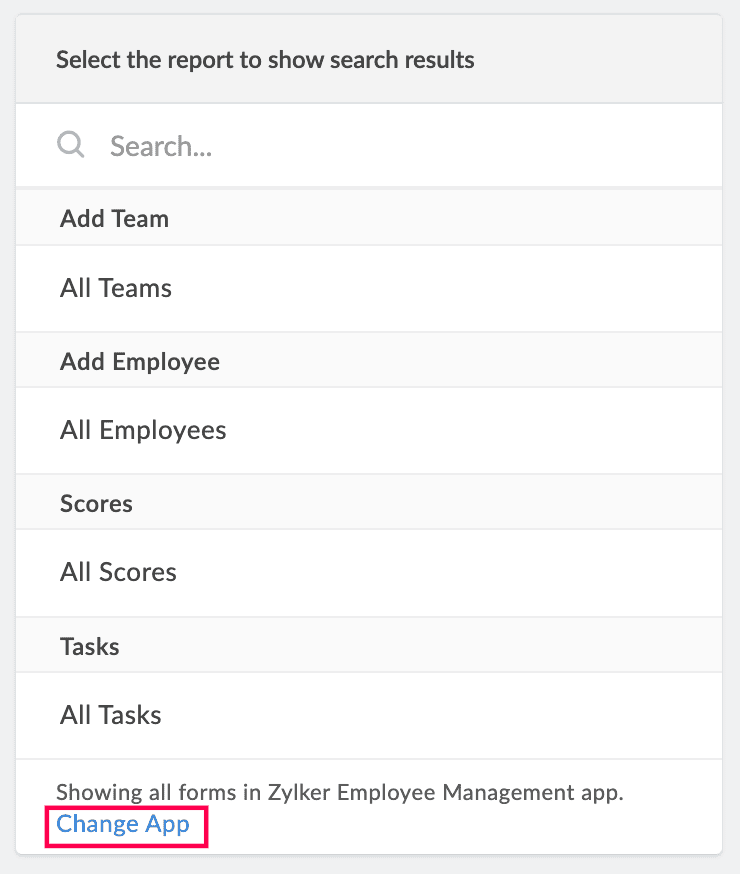
4. Select a report whose data should be filtered based on the search input.
Note: The dropdown lists all the reports in the application you are currently working on. To select a report from another application, click Change App in the footer of the dropdown. Select another application and click Done to view all of its reports.
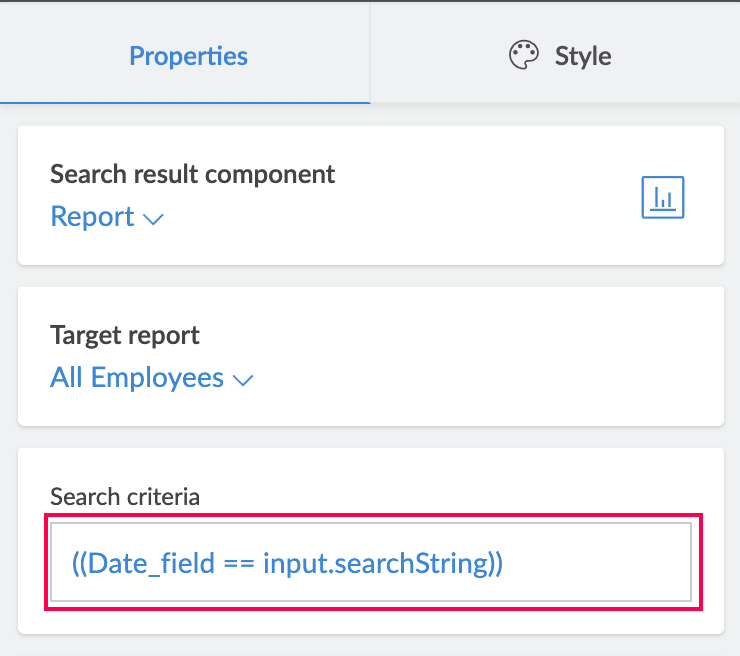
5. Set a condition based on which the records from the target report will be filtered.
- Choose a field whose field values will be evaluated from the Select Field dropdown
- Choose an appropriate operator from the Select Operator dropdown
- The value field will be autofilled with the system variable "input.searchString" which will act as the placeholder for the input value. This will appear disabled for all the criteria constructed.
Add more criteria if required, and once the condition is set, click Done.
Note: To edit the condition once it is saved, click on the Search criteria box.
4. Choose if you want the report to open in a New window (default value), Same window, or as a Popup. If Popup is chosen, you can customize the Width and Height in pixels.
5. Choose to enable Allow public access for the target report. If the page containing the search bar is published, the target report must also be published for its filtered results to be accessible. Additionally, the Allow Public Access option in the search bar’s configuration must be enabled to confirm that the published report can be shown.
Note: By default, Allow public access will be disabled, which can be switched if required.
6. Enter a default value that will appear autofilled on the search bar. This is useful when a specific search input is widely used.
7. Enter a value for the placeholder, which will appear in the input area of the search bar.
The configurations are auto-saved and will reflect in the live mode.
1.2. Configure search element based on page component
To set up a search element:
- Embed a report on the required page (if the embedded report already exists, skip to next step)
- Navigate to the page where the search element needs to be included
Before configuring a search bar based on a page component, follow the below steps:
1. Navigate to the edit mode of the required page component and embed the required report on the page.
2. Click the Page Variables and Script icon on the header strip of the page builder.
3. Click Add Variable and create a variable which will be linked with the field whose values are going to be matched with the search input to provide relevant results.
Note: If you've already added page variables in this screen, click Add New instead to create a new one.
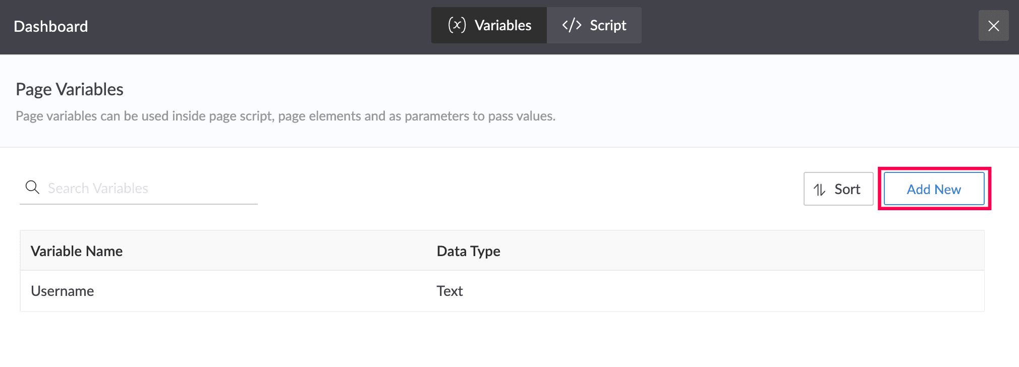
4. Enter the field link name of the target field as the variable name. In the live mode, this field's values will be evaluated to match the keyword entered in the search element.
5. Choose the datatype based on the target field whose values are to be evaluated. For example, if it is a dropdown field, the Data Type to be chosen is Text. Then, click Add.
6. Click the  icon to go back to the page builder.
7. Select the embedded report, and click Configure to open the Report Embed Configuration pane.
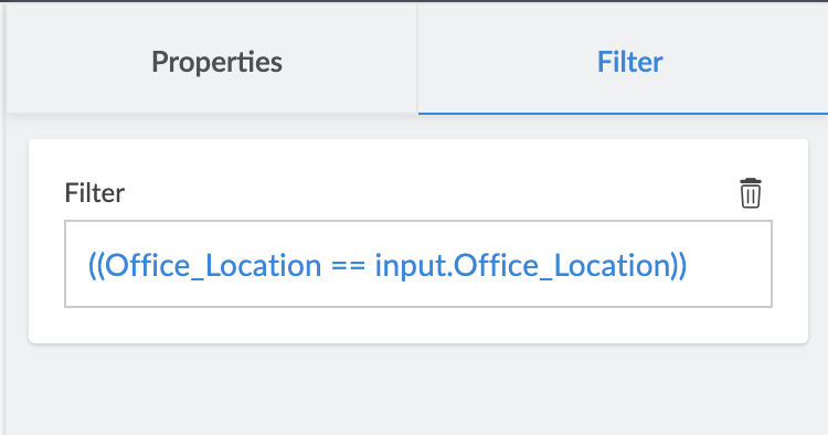
7. Select the Filter tab on the right pane and click Add Filter.
8. Set a condition based on which the records from the embedded report will be filtered.
- Choose a field whose field values will be evaluated from the Select Field dropdown
- Choose an appropriate operator from the Select Operator dropdown
- Supply the configured page variable (named as the field link name of the target report) as the value using the format "input.<page variable>".
Add more criteria if required and click Done.
Note: Once the condition is saved, click on the Filter box to edit it again.
9. Click Done to save the configuration of the embedded report.
Once the above configurations are done, navigate to the edit mode of the page where the search bar has to be inserted and follow the below steps:
1. Navigate to the page builder of the target page and click Search on the left pane.
2. Drag and drop a search template from the list that appears alongside onto the building space. The Search Configuration pane opens, and you land on the Properties tab by default.
Note: If the search element was previously created, select it from the page builder and click Configure to open the Search Configuration pane. Alternately, you can also double click on the search bar to open its configuration.
3. Choose the Page component to configure the search bar based on it. This configuration will display a page with an embedded report on it, based on the search input.
4. Select a page (which has the embedded report) in which data will be dynamically filtered and displayed based on the search input.
Note: The Target page dropdown lists all the pages in the application you are currently working on. To select a page from another application, click Change App in the footer of the dropdown. Select another application and click Done to view a list of all of its pages.
5. Once the target page is selected, the first page variable added to that page will be listed by default. For the search filter to work, the page variable specified here should be the one configured with the field link name of the field whose values will be evaluated (refer to step 4). Click + Add New if you've configured multiple such page variables based on the fields of the report and need to include them as well.
The page variable's value will be autofilled with the system variable input.searchString which holds the user search input, and appears disabled. So when the user enters an input value in the search bar, the embedded report's records will be evaluated using the page variable, which is linked to the report's filter.
Note:
- To choose a different page variable instead of the one already added, click on it and select the required one that was previously created and named after the target field link name.
- To remove a page variable from this configuration, hover over it and click the bin icon.
6. Choose if you want the target page to open in a New window (default value), Same window, or as a Popup. If Popup is chosen, you can customize the Width and Height in pixels.
7. Choose to enable Allow public access for the embedded report in the target page. This ensures that the embedded report is visible when the current target page is published, given, the report is published as well.
8. Enter a default value that will appear autofilled on the search bar. This is useful when a specific search input is widely used.
9. Enter a value for the placeholder, which will appear in the input area of the search bar.
The configurations are auto-saved and will reflect in the live mode.
1.3. Configure style
You can configure style options for the search bar and its container as below:
1. Navigate to the page builder of the required page and click Search on the left pane.
2. Drag and drop a search template from the list that appears alongside onto the building space. The Search Configuration pane opens.
Note: If the search bar was previously created, select it from the page builder and click Configure to open the Search Configuration pane. Alternately, double click the search bar to open the configuration pane.
3. Navigate to the Style tab on the section on the right and customize the search bar using the following options:
This table lists all the style properties for panels and panel containers, and their configuration steps.
| Property |
|
Steps
|
|
General
|
Search shape box
|
Choose if the search element should be Rectangular (default) or Rounded.
|
|
|
Font family
|
Choose a font for the user input and the Search button's label.
|
(The properties can be configured uniquely for each of the above structures)
|
Style
|
Customize the style properties of the input text and Search button, such as emboldening and italicizing it.
|
|
|
Color
|
|
|
|
Font size
|
Click the dropdown to pick a preset font size for input text and Search button, from options 12 - 40 px. Click on the numeric value to set a custom value anywhere between 1 and 99 pixels.
|
|
Padding
|
|
Enter the padding values for all four sides of the search bar to modify the space present between it and the container's margin. The default values are as shown in the below image.
|
|
Background color
|
|
Customize the background color of the container in which the search bar is situated.
|
|
Background
|
|
Set a background image for the search bar's container from My library or a Web link.
You can further customize the:
Note:
|
2. Managing the search element
From within the Search Configuration pane:
Apart from building the search bar, you can perform the following actions:
- Add Element Name - Click the pencil (
) icon in the top right corner of the Search Configuration pane to edit the element's name. This name can be used to locate the specific element in the page builder among others.
- Click the Search element types arrow (
) and choose another template to change it after the configuration is complete. The configurations are retained when the search bar type is switched.
Once you're done configuring the search bar, click the ( ) icon to navigate back to the page builder. You can further manage the search bar from there, such as relocating its position on the page, giving it a live mode title, and more.
From the edit mode of a page:
Click on a search bar to perform the actions mentioned below.
- Adding a search title - Click the T icon to give a title for your search element. This will appear as a heading above the search bar in the live mode of the application. Once inserted, click the search title to format it using the below options:
- Font family - Choose from six different font types in the dropdown.
- Font size - Choose a size from 12 - 40 px in the dropdown. The default value is 20px.
- Bold - Click the B icon to embolden the title.
- Font style - Click the I icon to italicize the title.
- Font color - Click the A icon to choose a matching color for the title.
- Update title - Double click the inserted title to update it.
- Remove title - Select the search element and click the T icon again to remove it.
- Deleting search bar - Click the bin icon to remove the element from the page.
- Relocating search bar - Drag and drop a search bar elsewhere on the page builder to relocate it.
Edit or configure an existing search element:
If you want to edit a previously inserted search element, select the required search bar in the page builder and click Configure.

3. Related topics
What's next
Previous
What's next
Learn about the embedded forms feature that allows you to insert a form within a page for centralized access.
Previous
Learn about the search element which can filter records directly from report, or from the embedded report, on a page.