Configuring a chart within a page
What does this page cover
Learn the steps to build various types of interactive and informative charts including column, bar, line, scatter, area, web, pie, and funnel, based on your specific business needs. They help display real-time updates and metrics with the help of data aggregation, filters, and more.
Availability
- Charts can be created in all plans of Creator.
- Only the super admin, admins, and developers can create and manage charts.
1. Setting up charts in Zoho Creator
In Zoho Creator, you can create various types of charts such as column, bar, line, scatter, area, web, pie, and funnel to visualize your data. The chart builder allows you to configure the source for the data, apply filters, and set chart-specific properties like axis labels, color schemes, and aggregation methods. You can also customize the appearance and behavior of the charts to ensure they effectively display real-time metrics and insights.
1.1. Chart configuration flow
1.2. See how to configure
1.3. Steps to configure a chart
3. Click Chart from the page elements menu on the left. A chart gallery will slide in displaying the various chart types and options.
4. Drag and drop a chart from the chart gallery. The Chart Configuration pane will slide in from the right.
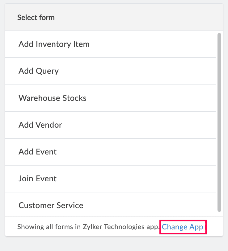
5. Select a form to represent its data visually on the chart.

Note: The Select Form dropdown lists all the forms in the application you are currently working on. To select a form from another application, click Change App in the footer of the form dropdown. Select another application and click Done to view all of its forms.
6. Select a field to be mapped with the x-axis of the chart. The chosen field's values will be used to plot data points horizontally on the x-axis.
Note: If a date field is chosen, you can group the x-axis values based on the time range selected under Group Date Values dropdown that appears below. The available options are Actual, Month & Year, Quarter & Year, and Year.
For example, if you select an Order Date field, you can group the record data by Month & Year to view monthly sales trends over time. All the recorded date values will be clubbed into this Month & Year structure for clear representation.
7. Enter a label for the x-axis that will be displayed on the live mode of the chart. This can either be a custom value entered in this field or a predefined page variable called using the format "${<pagevariable>}".
8. Choose a value type to be displayed on the Y-axis.
- Aggregate: Display the aggregate values such as Sum, the sum of the chosen field's values, or Count, the number of records that have a value for the chosen field.
- Actual data: Display the field value as it is.
9. Select a field to be mapped with the y-axis. The chosen field's values will be used to plot metrics or numerical values on the y-axis.
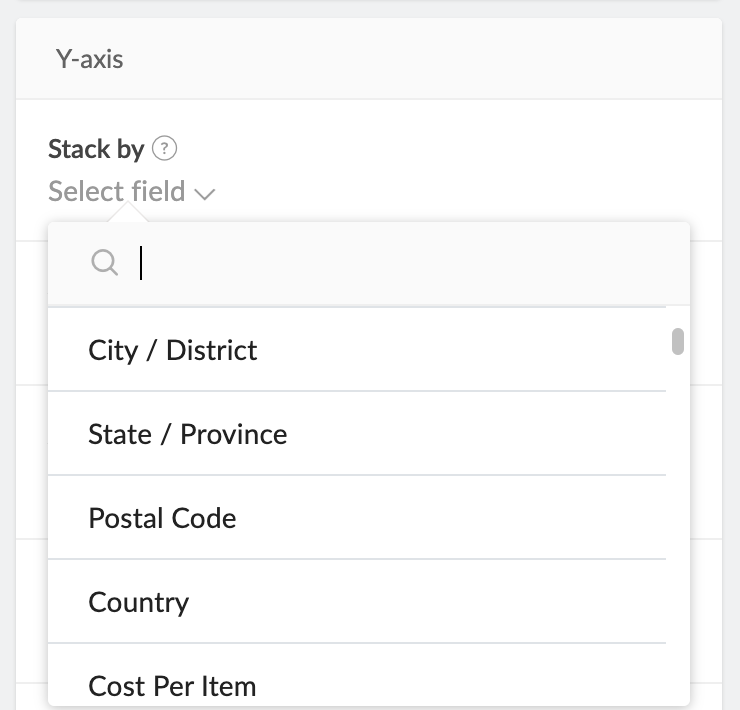
Note: If you're configuring a stacked chart, choose a field under Stack by to compare values of different categories by stacking them along the y-axis. This allows you to visualize the contribution of each category to the total value at each x-axis point. For stacked charts, the Value type can only be Aggregate.
10. Enter a label for the y-axis that will be displayed on the live mode of the chart. This can either be a custom value entered in this field or a predefined page variable called using the format "${<pagevariable>}".
11. Specify an Interval value to determine the spacing of the tick marks on the y-axis.
12. Choose All records to include all records from the selected form or Selected records to use a specific set of records that satisfy a criterion, to create the chart.
Note:
- By default, All records is chosen for evaluation.
- If Selected records is chosen, set a criteria based on which the records will be filtered: Select Field > Select Operator > Enter Value. Choose AND or OR to add further conditions.
13. Select fields under Filter Data Based On to create a filter dropdown in the live mode of the chart. The dropdown will list the values of the chosen fields, which can be selected by the user to display the chart accordingly.
14. Enable Data Label under the Chart Controls section to show the y-axis metrics permanently for each section displayed by a chart. This can either be a
- Count of the records based on the selected field for the y-axis.
- Sum of the values of a Number, Percent, Currency, Decimal, Formula, Prediction, or OCR field chosen for the y-axis.
Note:
- By default, Data Label will be disabled, which can be switched if required.
- If Data Label is disabled, the metrics can still be accessed when the sections are hovered upon.
15. Enable Underlying Data to show the associated records upon clicking a chart section. Use the Report dropdown to choose the specific report for displaying these records.
Note:
- By default, Underlying Data will be disabled, which can be switched if required.
- Only list reports are displayed in the Report dropdown for the Underlying Data configuration.
- If you've enabled Underlying Data, you can choose to enable Allow public access for the associated report. This ensures that the report is visible when the current page is published, given, the report is published as well.
16. Click Done to save the configuration. The chart will reflect its properties in the live mode of the application.
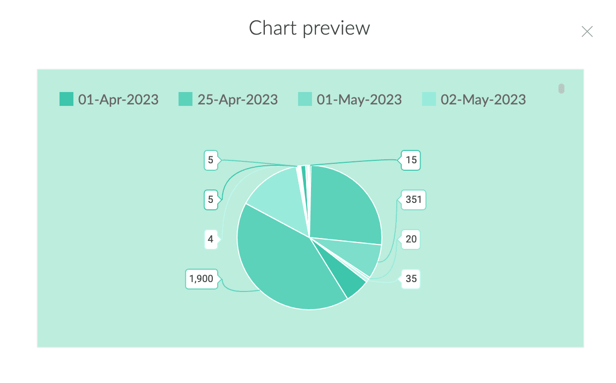
Note: Once the configurations are done, you can preview the configured chart by clicking Preview at the top right of the Chart Configuration pane.
1.4. Apply styling properties for a chart
- Click the color bar (
) above the chart and pick a color palette for the theme color of the chart. You can choose from the preset theme color of the application, preset colors, or the custom color picker.
- Click the colored square (
) above the chart and pick a background color for the chart. You can choose from the preset theme color of the application, preset colors, or the custom color picker.
- Click the
dropdown to decide the legend position, that is, the side where the key for the chart needs to be displayed. The available options are None, Top (default), Right, Left, and Bottom.
2. Managing charts
Once a chart has been added to a page, you can perform basic actions to manage these charts.
From within the Chart Configuration pane:
Apart from building the chart, you can perform the following actions:
- Add Element Name - Click the pencil (
) icon in the top right corner of the Chart Configuration pane to edit the element's name. This name can be used to locate the specific element in the page builder among others.
- Click the Chart types arrow (
) and choose another chart to change it after the configuration is complete. The configurations are retained when the chart type is switched.
Note: This option appears only when the chart's configuration pane is reopened after the chart is initially configured.
Once you're done configuring the chart, click the  icon to navigate back to the page builder. You can further manage the chart from there, such as relocating its position on the page, giving it a live mode title, and more.
From the edit mode of a page:
Click on a chart to perform the actions mentioned below.
- Adding a chart title - Click the T icon to give a title for your chart. This will appear as a heading above the chart in the live mode of the application. Once inserted, click the chart title to format it using the below options:
- Font family - Choose from six different font types in the dropdown.
- Font size - Choose a size from 12 - 40 px in the dropdown. The default value is 20px.
- Bold - Click the B icon to embolden the title.
- Font style - Click the I icon to italicize the title.
- Font color - Click the A icon to choose a matching color for the chart title.
- Update title - Double click the inserted title to update it.
- Remove title - Select the chart and click the T icon again to remove it. Alternately, use the delete key on your keyboard to remove the element.
- Adjusting height of the chart - Click the
icon to set the height of the embedded element to Auto or a Custom length.
Note:
- By default, the height of the embedded element is set to Auto.
- If Custom is chosen, the default value mentioned is 150 px which can be altered according to the requirement.
- Deleting chart - Click the bin icon to remove the chart from the page.
- Relocating charts - Drag and drop charts elsewhere on the page builder to relocate them.
- Resize chart - Drag along the vertical margins of a chart to resize the width of the element. This can be done only if more than one page element is placed adjacently in the page builder.
Edit or configure an existing chart:
Click on the required chart that was previously inserted in the page builder, and then click Configure to open the Chart Configuration pane. The chart's configurations can be edited or updated from here.
3. Related topics
What's next
Previous
What's next
Learn about gauges which are intuitive dials or meters that dynamically represent Creator form data as metrics, performance levels, and key performance indicators (KPIs) on pages.
Previous
Learn about charts which interactive elements that can be embedded inside pages of a Creator application, providing a visual representation of data.